Search the Community
Showing results for 'macro' in content posted in Resources.
-
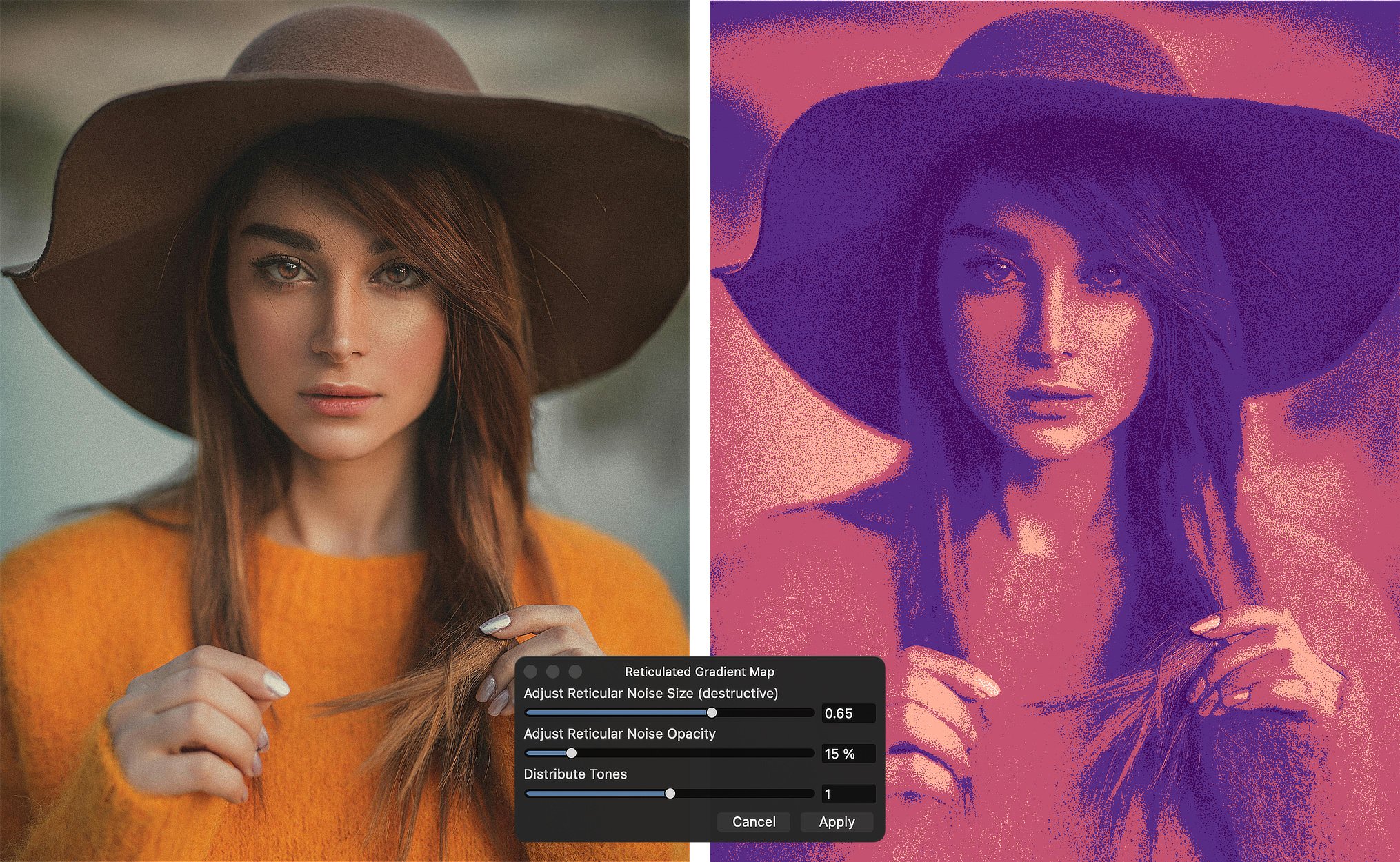
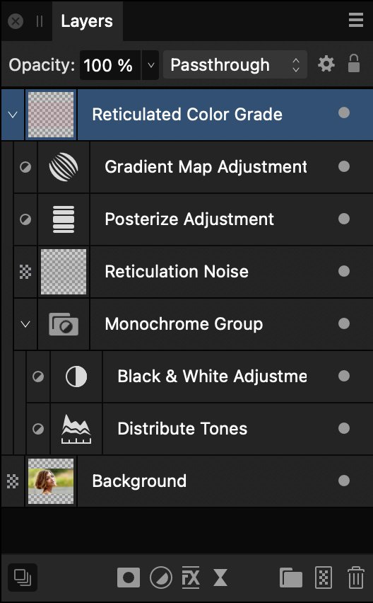
I am attaching a macro category called “Reticulated Gradient Map” which can be used for color grading or for creating an artistic rendition of a photograph. The look was inspired by a recently viewed YouTube video on the Texturelabs channel in which an image was posterized and gradient mapped, but with a specific type of grain applied to the borders of the colors. The original video can be found here. The effect relied on a filter found in Photoshop’s Filter Gallery called “Reticulation”. Although the Reticulation filter is not available in Affinity Photo, this macro duplicates the effect fairly reliably. Here is a before and after image, along with the User Dialog settings used during the image’s creation. The macro creates a number of adjustments and other layers inside a Group called Reticulated Color Grade. Because the effect is entirely contained inside the group, the effect can be turned on and off by showing/hiding the enclosing group. Also, the effect is entirely non-destructive (with one exception, discussed below) and will respond immediately to any additional edits made to the original image. I have also created a PDF (also attached to this post) with specific instructions for using this macro. However, in brief, invoking the macro will set up the Layers stack (as above) and present a dialog to the user for some initial settings. You will be asked to set the following: 1) Adjust Reticular Noise Size (destructive) The “Reticulation Noise” layer is a pixel layer in which a reticulated pattern of noise is applied. The macro invokes an “Equations” filter to increase or decrease the size of the noise. The default value is 0.8, and the slider will accept values between 0 and 1 (although anything above 0.8 is capped at that value, since the math falls apart above that value). In general, the default setting results in the largest reticular noise available, but the noise can be decreased in size by setting the slider to smaller values. 2) Adjust Reticular Noise Opacity This slider affects the opacity of the “Reticulation Noise” layer. The overall effect is that, at lower values, the graininess of the reticulation is held closer and closer to the borders between colors. The default value is 20% and the slider will accept values between 0% and 100%. In general, keeping the value to smaller numbers is usually going to be more visually pleasing. 3) Distribute Tones This slider affects the Gamma slider in a Levels adjustment. Because the Levels adjustment is applied prior to the Gradient Map, shifting the slider to the left or the right will shift the colors toward the lighter or darker tones respectively. Play with this a bit, watching for the appearance or disappearance of colors mapped to whites and blacks. * * * * * * * * * * * * * * * * * * * * * * The first setting, in which the “size” of the noise is adjusted, is a destructive change. It cannot be edited once the macro has been finalized. This particular slider should be set carefully. However, other values can be edited afterward. I would suggest the following edits after the macro has been allowed to complete. 1) Open the Distribute Tones layer. This is a Levels adjustment, and sits inside of the “Monochrome Group.” I have found it to be helpful to move the Black Level and White Level sliders inward so as to meet the left and right borders of the histogram. Also, you can adjust the Gamma slider so as to shift the gradient mapped colors toward the lighter and darker values. 2) Select the Reticulation Noise layer and fine tune the Opacity of that layer. You will find that adjusting the opacity of the layer will shift how much the graininess of the reticulation involves the individual colors. In general, keeping the Opacity low will keep the reticulation noise closer to the borders between the individual colors. 3) The macro uses a Gradient Map that uses purple and orange colors for its default. Obviously, you can change this (and you probably will want to!) Open the Gradient Map Adjustment layer and change the colors as you’d like. Using an adjustment preset will make this easier, but those presets are up to you. Be aware that the macro sets the Posterize adjustment to 5 levels, and the Gradient Map has stops at 0, 25, 50, 75, and 100%. This means that the end result will give 5 posterized colors, as represented by the colors chosen for those stops. * * * * * * * * * * * * * * * * * * * * * * The attached macro category should be imported into the Library panel, using the “hamburger menu” at the top right corner of the panel. The macro was created in Affinity Photo 2, and will not be compatible with version 1. Also, once the macro category is imported, you can drag the macro to any other category you already have set up. (I have placed the macro inside a Category that I created called “Color Grading” but you can set up your categories as you would like.) * * * * * * * * * * * * * * * * * * * * * * As with all of the macros that I have submitted please remember that I am one person working with one computer. I have tested the macro in a fairly limited fashion, and it works well for me. I believe that the macro functions as stated, but of course I cannot make any guarantees. On the other hand, if you like the macro you should keep it and enjoy it. It is free to use for personal and/or commercial work, and you do not need to credit me in any way. My only requests are these: (i) please post a response in this Forum topic to let me know that you are using the macro and (hopefully) enjoying it; and (ii) please remember to “pay it forward” by contributing to the forum in any way you can. It is by sharing your experience and your expertise that we all improve our skills and our enjoyment. Reticulated Gradient Map.afmacros Using the Reticulated Gradient Map Macro.pdf

- 18 replies
-
- 16
-

-

-
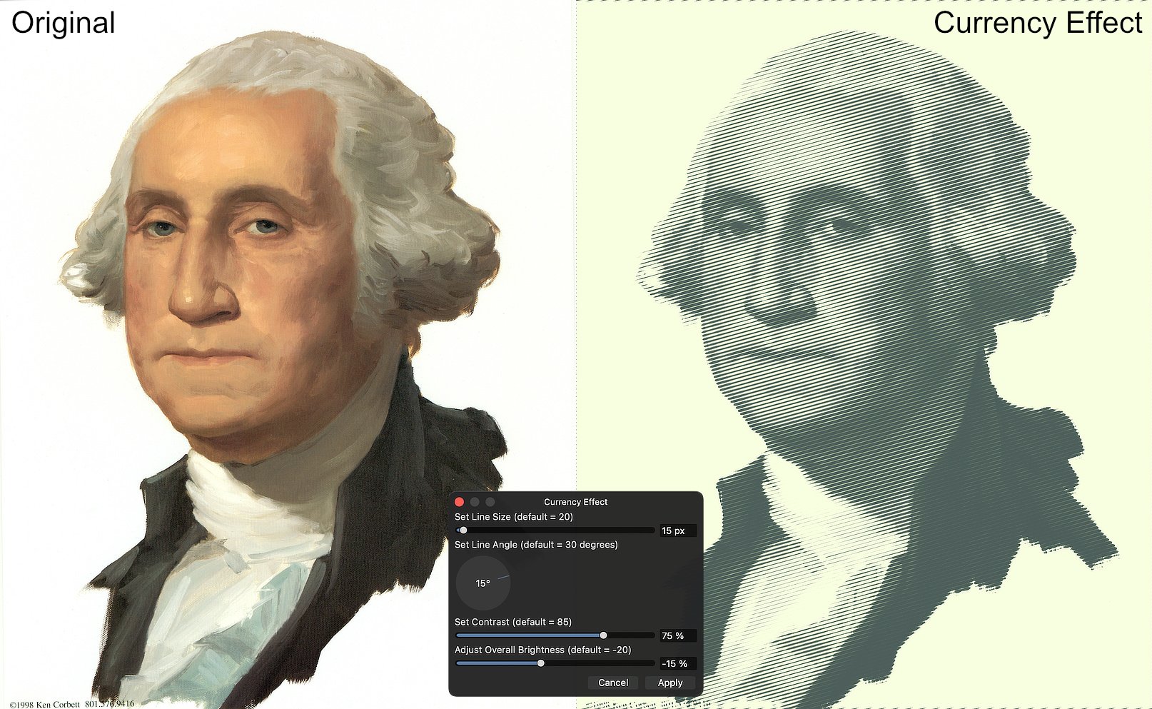
Updated Version Available (December 2023) Recently, @christerdk posted in the "Desktop Questions" forum about trying to achieve the engraved look of U.S. currency. He was given a variety of suggestions (including one or two commercial products). Because of this, I am attaching a macro that I created several years ago and have refined a bit more recently. It is meant to approximate the look of engraved currency. The macro uses a number of adjustments and filters, all enclosed within a Group. Because of this, the effect can be turned on and off by simply using the Hide/Show checkbox on the group itself. The attached .afmacros file is a Macro Category and therefore should be imported from the Library panel. It contains a single macro (called "Currency Effect"). Once imported, the macro can be moved to a different category, if desired. The macro was created in Affinity Photo version 2.2 which probably means that it will not be compatible with AP version 1. However, since it is provided as a category, it can be imported into Affinity Photo 2 for iPad. * * * * * * * * * * * * * * * * * * * * * * * * * * * * * * * * * * * Clicking on the macro will bring up a user dialog in which you can set certain parameters: 1) Set Line Size (default = 20) The macro uses a live Halftone filter, and this will vary the width of the lines used. In general, use larger lines for larger images. 2) Set Line Angle (default = 30 degrees) This affects the angle at which the lines are drawn. Try various settings to achieve subtle but important differences in output. 3) Set Contrast (default = 85) This setting also affects the embedded Halftone filter, and can change the contrast between the dark lines and the background. 4) Adjust Overall Brightness (default = -20) This affects a Brightness and Contrast adjustment, and will lighten or darken the final image, to your taste. When you hit the Apply button, the effect is added to your image at the top of the layer stack. Note that the effect contains only adjustments and filters; because of that, it is completely non-destructive. You can make changes to the underlying image and this will not adversely affect the result. Also, you can open the individual adjustment and filter layers to make changes even after you have hit the Apply button. Here is an example of a Before and After image, with the User Dialog showing the settings used to create this particular variant. * * * * * * * * * * * * * * * * * * * * * * * * * * * * * * * * * * * As always, I am one person using one computer and a single iPad. I have tested this macro on both of my devices, but cannot claim that this testing has examined every possible scenario. Nevertheless, I believe that it will work as suggested. Try it and, if you like it, keep it and enjoy it. It is free for you to use in any project you would like – personal or commercial. I ask only 2 things. If you've used the macro, please let me know by posting your impressions. Perhaps, even provide a before and after screenshot. Second, please remember that this forum is a wonderful way to learn, and an even better way to share that learning. Pay it forward. December 2023 Update The .afmacros file attached below is now an updated category. It can still be imported into the Affinity Photo Library panel (or into the iPad version) but it now contains 3 macros. (1) The original version of the Currency Effect is included. (2) An updated version 2 of the macro is also provided. This update adds a live Ripple filter which makes the engraved lines a bit wavy, better simulating true engraving. (3) There is an Instructions macro, which will place on-screen instructions into your Layers panel. Please feel free to download the new file, and to replace the previous Currency Effect category with the new one. Have fun! Currency Effects (v2).afmacros
- 10 replies
-
- 16
-
-
-
I am attaching a macro category called “Seth’s Relighting.” The relighting macro lets you selectively darken and lighten areas of an image to add drama, create areas of interest which draw the viewer’s eye, and make up for flat lighting. It is free for anyone to download and enjoy. The category includes two macros – one for setting up a set of layers and a second which provides on-screen instructions. The macro sets up a series of adjustments, filters, and masks, all of which are enclosed within a Group. In that way, the effect can be turned on or off by quickly showing or hiding the Group. The various layers inside the group are numbered, indicating the best order in which to use them. There are on-screen instructions (the second macro) as well as a video attached to this post. (Feel free to download the video too, if you’d like.) To summarize, the layers allow you to darken the overall photo with a Curves layer, then indicate areas that need highlighting. Both the amount of darkening and the amount of lightening are entirely customizable (and non-destructive). The color of the highlight is also editable. Using the Relighting Macro.mp4 The attached macro category should be imported into the Library panel, using the “hamburger menu” at the top right corner of the panel. The macros were created in Affinity Photo version 2 and, therefore, will not be compatible with version 1. * * * * * * * * * * * * * * * * * * * * As with all of the macros that I have submitted over the years, please remember that I am one person working with one computer (and one iPad). I have tested the macros as extensively as I can, and have been using them in my own work for several months now. However, there is no way to have foreseen all possible scenarios that another user might encounter. I believe that the macros function well, although I cannot make any guarantees. If you like the macro, please keep it and enjoy it. It is free to use in both personal and commercial work. All I ask in return is that you post a comment in the Forum (below this post) and let me know that you are using it and (hopefully) enjoying it. As you continue to get better and better in your editing skills, please try to “pay it forward” by contributing your expertise and your resources to others in the community. Seth's Relighting.afmacros
-
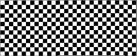
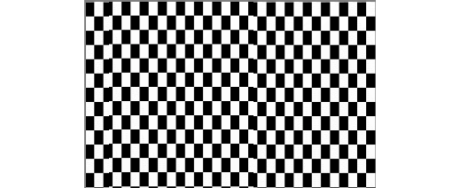
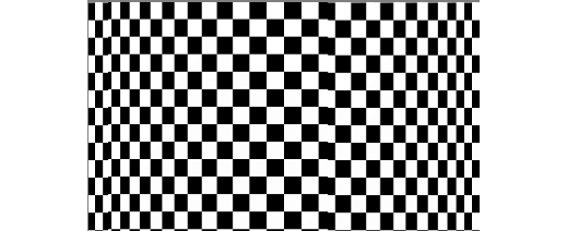
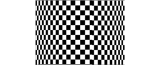
Some time ago I produced a macro to Wrap an Image around a Bottle or Mug. This involved some complex trigonometrical operations on the image. I present here an alternative approach for a macro to perform the same action. Here is my original image: o It is easily possible to produce an equation that contracts the image width-wise to emulate the reduction in perceived width as the image is wrapped. Such an equation has the form: x=w/2+(w/2-x)*pi/2 and has the result of: The contraction is uniform across the reduced width. The expression pi/2 is the appropriate scaling for a bottle diameter that accepts the image around its half-circumference. What I was aiming for was a function that would scale the edges so that they appeared contracted, whilst applying zero scaling to the centre of the image. After much trial and error, I came up with this: x=w/2-(w/2-x)*(1+1.571*(1-sqrt(1-(1-2*x/w)^2))) Edit: Note that this has a minus sign after the first w/2. The original had a plus sign. The value 1.571 is just half pi. The resulting image is: This is a single result. I have further refined by including a scaling parameter, a, which accentuates the compression at the edges. w/2+(w/2-x)*(1+(1.571/a)*(1-sqrt(1-(1-2*x/w)^2))) Here it is with the a parameter around half. Note that in these images, the central squares remain square. Edit: Like my previous version it has a parameter (in this case b) which affects the viewpoint, above or below. If you want to use this then you need to enlarge the canvas vertically beforehand to give room for the curvature. You may wish to use Document > Clip Canvas at the end in this case. Edit: various members had pointed out that the final image was flipped horizontally. This has now been fixed. I have also added Layer > Unlock and Layer > Rasterize at the start of the macro. I have not added a clip canvas at the end. Do you think that this is desirable? Here is the macro: WrapAroundV2.afmacro John
-
Hi again, @jmwellborn. I assumed you were talking about the "10,000 Feet" pdf only because we had talked about it so much at the time. Also, it didn't occur to me that I had included a pdf with the Reticulated Gradient Map macro. Anyway, you're right – the fonts are different. The pdf that I included with the Reticulated Gradient Map macro uses Goudy Old Style, boldface for the headers and regular for the body text. I think that the attractive thing about the font is the "old style" variation; it gives it a different look that I like quite a bit. Also, the Ten Thousand Feet book can be located at: Good to hear from you again.
-
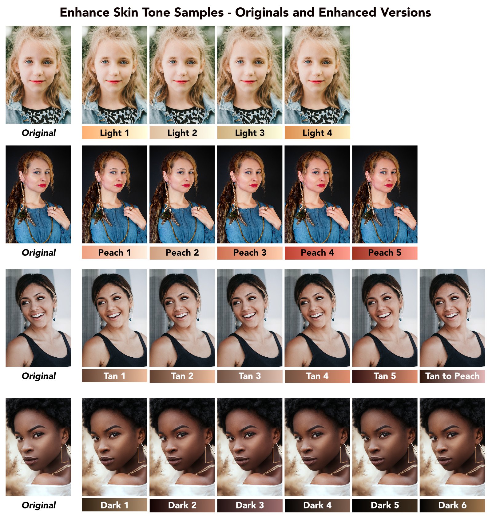
I have attached a macro category called "Enhance Skin Tones." This is a free download which will help add color and tone to the skin of your portraits. There are 21 different enhancement macros included, grouped for Light, Peach, Tan, and Dark skin. These macros are meant to enhance, not replace, skin colors. The macros are all based on the use of Gradient Maps, and use different dark and light colors along with setting opacity and blend mode for each adjustment. While the skin tone macros are grouped into Light, Peach, Tan, and Dark skin groups (roughly corresponding to Caucasian, Asian, Hispanic, and African coloration) they are certainly not exclusive. You may want to experiment using the adjustments from any (or all) of the groups to add different coloration and tone to your underlying portrait. The Light and Peach skin tone macros add a gradient map and set its opacity to 25%. The Tan skin tone macros set the opacity to 30%. The Dark skin tone macros set the opacity to 40%. All of the macros set the blend mode of the gradient map adjustment to Soft Light. You should also experiment with changing the opacity and blend mode of the adjustments, as these will create different effects that you might like. Try using blend modes such as Overlay, Linear Light, and even Multiply. The results can be subtle, but changing the default settings can often make them fairly dramatic. An important note: the macros work best when you have the skin selected prior to invoking the macros. This ensures that the gradient map adjustment uses your selection as a mask, and applies the changes to the skin only. As with all layer masks, however, you can edit the mask (by painting on the adjustment layer in black or white) after the fact. Here is a graphic that includes 4 portraits (labelled as Original versions) along with versions of each of the 21 different skin tone enhancing macros. The enhanced versions are all based on the default settings for the respective macros. Under each example is the name of the skin tone macro used, along with a gradient representing the dark and light colors used in the gradient map adjustment. Remember that these results look very subtle, but your results can be more dramatic simply by increasing the opacity slider. The attached macro category was created in Affinity Photo 2, and probably will not be compatible with version 1. It is a category and therefore should be imported into the Library panel (using the "hamburger menu" at the panel's top right corner). The category includes the 21 skin tone macros, but also includes a macro called "Try All Skin Tones" which will create a group (with sub-groups) that includes all 21 adjustments so you can try them all to see which one you like. There is also a macro called "Instructions - Enhance Skin Tones" which will display on-screen instructions for using the macros. These instructions are placed in a separate layer which you should delete after having read and understood the instructions. [These macros are loosely based on some of the gradients used in a recent YouTube video by Blake Rudis, whose f64 Academy channel has been quite helpful (especially for matters concerning color grading). Blake's videos are exclusively aimed at Photoshop users, but the methods he uses are almost always compatible with similar methods in Affinity Photo. So, a big thank-you to him.] As with all of my Resource uploads, these are the work of 1 person working on 1 computer. I do not pretend to have tested them extensively, but I believe they will function as they are supposed to. Try them and see if they work for you. If they do, they are free for your use without restriction. I have always encouraged users to "pay it forward" and help others in this forum as they themselves become more knowledgeable and adept at using Affinity Photo. This is how knowledge and good will spreads. Enhance Skin Tones.afmacros
-
Where did you read that? ZIP files have usually a "filename.zip" extension and this "Enhance Skin Tones.afmacros" file contribution doesn't. Further the online help usually tells how to deal with "*.macros" and "*.macro" files. "*.macros" files are usable in the Library panel and can be imported there. "*.macro" files (without an plural s at their extensions end) instead in the Macro panel and can be imported into that panel. one thus has to distinguish between "*.macros" and "*.macro" files here See also therefor in the online help ... Library Panel Macro Panel Macros
-
I often do forget and also have a hard time to find again resources that others or I have contributed over time here in the forum. In former times I've often oriented on MEB's Affinity resources page, which sadly nowadays isn't up to date any longer (probably it's too much work and too time consuming to keep that up to date). - Here are some links to my own resources section contributions, so I have and keep myself sort of an overview for these. Assets: A few Paper Effect Assets AI chip logo icon assets Cat-Silhouette assets Common callout assets Hairstyle Assets Halloween I + II Assets Fall assets & styles set I'am Groot - Vector assets Numbering assets OS X El Capitan UI Kit assets Protractors back to school assets new Ruler back to school assets Some BW arrow assets Some Easter Assets Some Firework assets Some Fruit Assets Some Nicholas/Santa Claus assets Some plain + vintage Badge Assets Some Snowmen vector assets Star Wars - Mandalorian assets Washi Tape assets Xmas cutout assets & sample Xmas silhouettes Xmas cookies/gingerbread Xmas trees vector assets Macros: B&W play macros Matte Color Macro Rusty Boost Macro Styles: Div Metal Styles Fabric styles Fall assets & styles set Fire Styles Fur styles 1+2 Knock on Wood Styles Rust Styles Some Metal Styles Valentine texture styles Wild animal texture styles Xmas texture styles 1+2 Tools: A few Forum Helper Tools (various Python3 scripts) updated afthumbs - Extracting PNG Thumbnails from .afphoto and .afdesign files Affinity Designer Shortcut Mapper Affinity OpenCL Disabler (Windows tool) A visual shortcuts explorer for Affinity Tools Delineate - A Raster/Bitmap to SVG Converter Thinning multi architecture Affinity apps under MacOS via Python to reclaim disk space whatFileType - Detects file signatures and tells what sort of file it is Various: 2024 Months Calendar Template & Assets in EN new Calendar day as Affinity template/assets & a daily showup SVG file new Christmas Photo Storyboard Chalk brushes Daily Planner DE/EN localized - Letter (ANSI A) print template Daily Log DE/EN localized - Letter (ANSI A) print template Desk Calendar for 2019 Desk Calendar DE/EN/GR for 2022 Desk Calendar DE/EN/GR for 2023 Prism Desk Calendar 2024 DE/EN/GR new Fall Photo Storyboard Halloween Polaroid Photo Storyboard OS X El Capitan UI Kit Pocketcalendar 2019 Reusing filmstrips as photo borders updated Round Calendar Reminder Stickers Xmas Card & Envelope Xmas cutout assets & sample Xmas FB Cover Xmas mug mockup Xmas Trees And most importantly ... Quick Tips: for finding Affinity content with Google Search List of some third party calendar generator tools new List of some third party vectorization & tracing tools
- 42 replies
-
- 28
-
-
-
I have updated the Currency Effect macro to version 2. This new version adds a live Ripple filter, which will give the engraving lines a bit of wave. This can be turned off (naturally!) but I think the added touch gives the engraving a bit more authenticity. There is also an Instructions macro, which will place on-screen instructions into a new layer. The new version can be downloaded from the first post in this thread. The .afmacros category includes both the original and new versions of the macro, along with the instructions macro. You can safely delete the old version of the Currency Effect, since that original macro is included in the v2 category above.
-
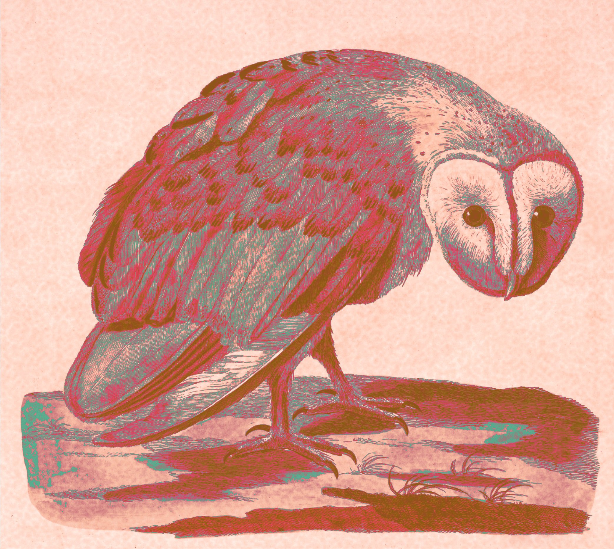
@smadell I have just tried your macro for the first time. What fun! Here is a first stab. No self-respecting owl would ever claim this relative! (Or the one in the old print from the British Library — on the left — for that matter.) On another subject entirely, would you be willing to share the name of the font you used for your PDF? I am translating a very long book into English and have been considering Adobe Garamond Pro, but I like yours so much better — it has a cleaner look!
-
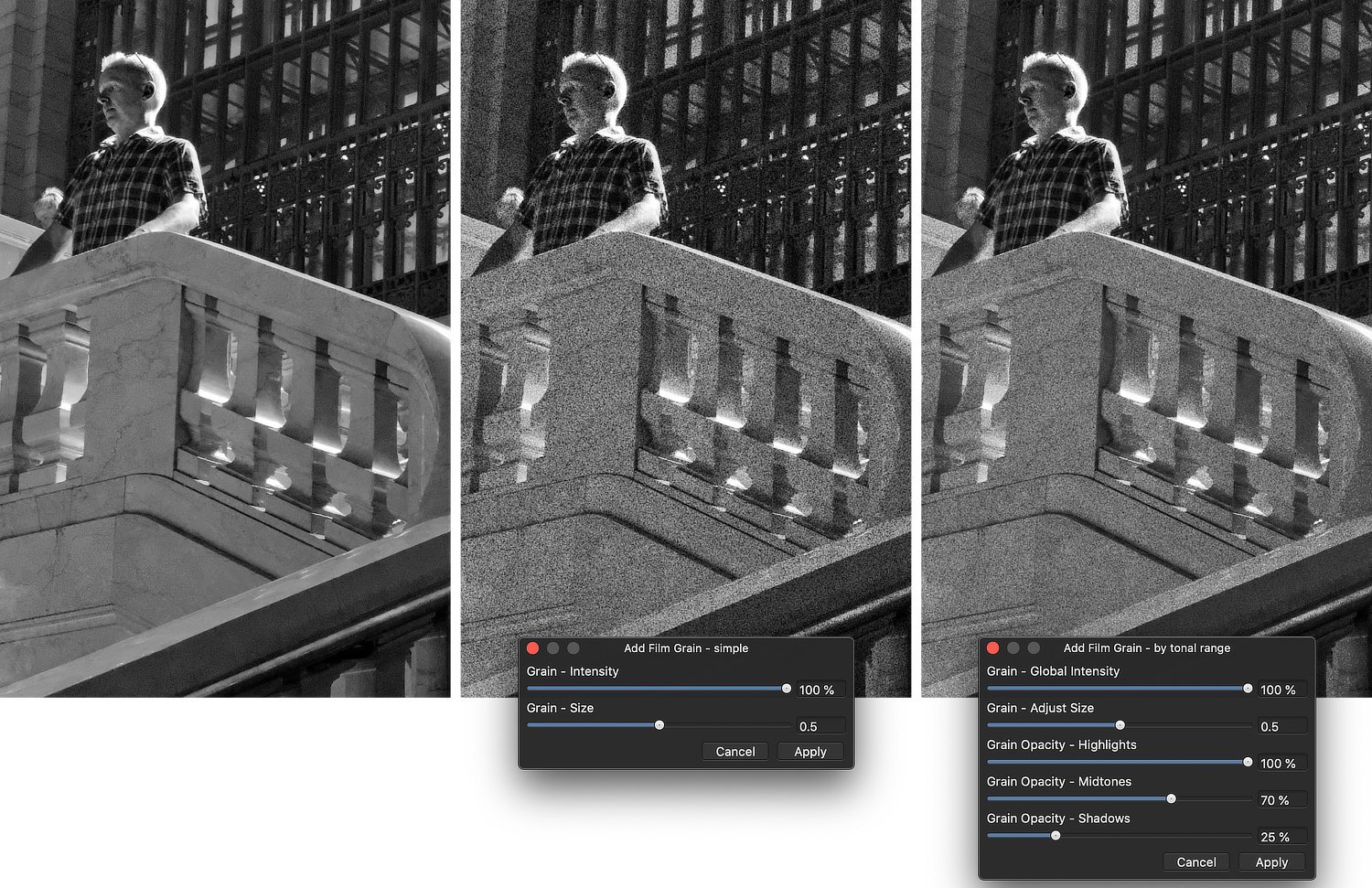
Adding grain to a photo is a nice way to emulate vintage images, especially older black and white photos. It has always bothered me a bit that Affinity Photo does not include a mechanism to introduce grain, other than to use the “Add Noise” filter. While adding noise is nice, it adds such a fine amount of variation that it is often quite literally unnoticeable. I have admired the Film Grain effect that is available in other software, such as Nik’s Silver Efex. These filters can often vary grain size and intensity; sometimes grain can be added to shadows, midtones, and highlights in differing amounts. What I’ve attached is an .afmacros file called Film Grain. This is a macros Category and should be imported into the Library panel. It includes two macros. The first is called Add Film Grain - simple. It allows the user to add grain with 2 parameters – intensity and size. Grain - Intensity The grain intensity defaults to 100%, but can be set to any value between 0 and 100. At 0% intensity, the grain effectively disappears. To understand intensity, think “contrast.” Grain - Size The size slider accepts values between 0 and 1, with the default being 0.2. The appropriate value will differ based on the image being treated, and the same perceived size might need higher values when the overall dimensions of the image are larger. Also note that values above 0.8 are rounded down to 0.8 (and this forms an effective upper limit to the slider). This is done primarily because the math breaks down at higher values. The second macro is called Add Film Grain - by tonal range. It includes the same intensity and size parameters, but also lets the user set opacity levels for highlights, midtones, and shadows separately. Grain Opacity - Highlights, Midtones, and Shadows There are three separate sliders for highlights, midtones, and shadows respectively. Each defaults to 100%, but can be set to values between 0 and 100. While the “simple” macro creates a single Film Grain layer, the “tonal range” version creates a group containing 3 layers, one each for the three tonal ranges. The Grain Opacity sliders simply vary the opacity of the corresponding layers within that group. Finishing Touches When each of the macros finishes, the Blend Range for the result (the Film Grain layer in the case of the “simple” macro, and the Group in the case of the “tonal range” macro) is set to diminish the effect of the grain on the highlights slightly. This is an aesthetic choice on my part, and I think you will agree. However, you can set the Blend Range to anything you might like, as desired. * * * * * * * * * * * * * * * * * * * * * * * * For most users, the “simple” macro will be enough. It lets the editor vary the Intensity of the grain and also the Size. I have always liked adding grain that was a bit larger, because it becomes more noticeable. For other users, the “tonal range” macro will allow you to add some additional nuance to the grain, by letting you emphasize grain in the shadows, midtones and highlights. Do this by first setting a global Intensity and Size, and then adjusting the opacity of the 3 tone ranges as desired. * * * * * * * * * * * * * * * * * * * * * * * * Here are samples of the two macros, along with the settings as applied. The differences between the two results is quite subtle, but might be worth the effort in some cases. * * * * * * * * * * * * * * * * * * * * * * * * As with all the macros I have posted, I have tested these on one computer under a limited number of conditions. I cannot guarantee anything, but I have no reason to think they will not work for you just as they have for me. The macros are free, with the suggestion to “pay it forward.” As you become more proficient, be sure to share your experience and your work with others. By the way, happy holidays to everyone. Here’s hoping that 2021 is a more positive, uplifting year than 2020. And maybe, just maybe, we’ll be able to ring in 2022 in a crowd without any masks! Film Grain.afmacros
- 17 replies
-
- 15
-
-
-
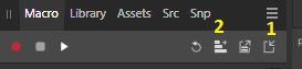
Starting from this video, I made two macro. https://www.youtube.com/watch?v=LdxXq0aaaXQ In order to import them, open Affinity Photo, open Macro tab (enable it if nedeed), then click Import Macro icon (marked with 1 in below pic), after that, click on Add to Library icon (marked with 2), choose where you want to save it, change the name (if you want). Then test it, by applying it to a picture, open the procedural text, adjust the variables, opacity and blend mode. HDR-1.afmacro HDR-2.afmacro
- 8 replies
-
- 2
-
-
-
- affinity photo
- hdr
- (and 1 more)
-
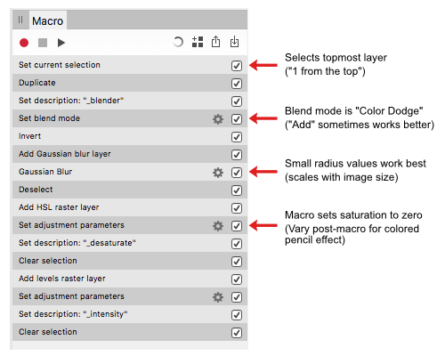
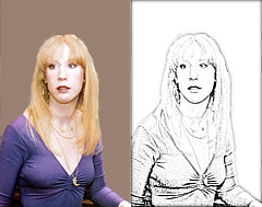
This Sketch effect.afmacro is my attempt to convert the technique demonstrated in the Affinity Revolution Transform any Photo into a Pencil Drawing (Affinity Photo Tutorial) into a useful Affinity Photo macro. These are the steps I came up with: Since the first step selects the top layer regardless of its name or type, for best results it should be the only layer in the document & a pixel layer. The macro does not alter this layer so if you don't like the effect you can delete the layers it creates. The two user adjustments adjust the radius of the Gaussian blur & the Black Level of the Levels Adjustment layer. They can be tweaked after the macro is applied in the usual way. Adding some saturation back to the HSL "_desaturate" layer creates a colored pencil effect. A couple of 'before & after' examples of what you can expect: Comments, criticisms, & questions welcomed.
-
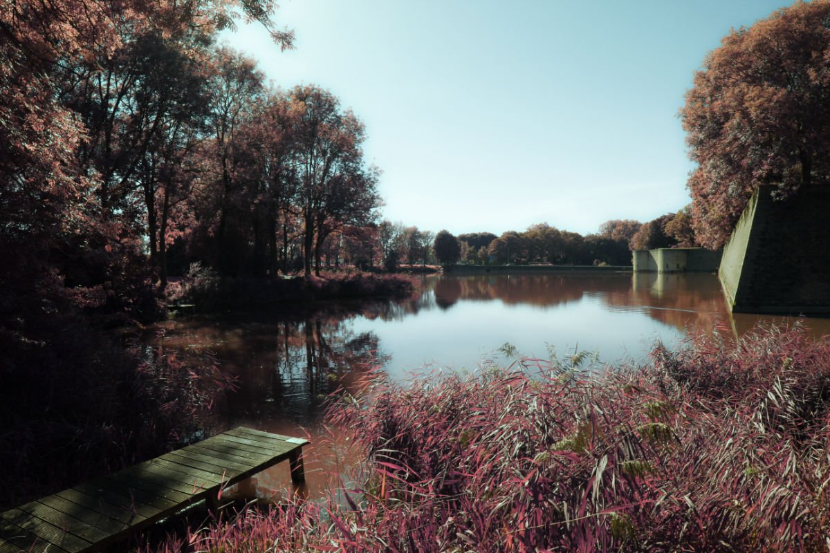
Recently migrated to Affinity Photo and I found an interesting tutorial for infrared. I decided to turn it into a macro (in fact, my first macro with APh). You can download it here: Ivans Infrared Macro.afmacro Here are two results: This is the original video tutorial:
-
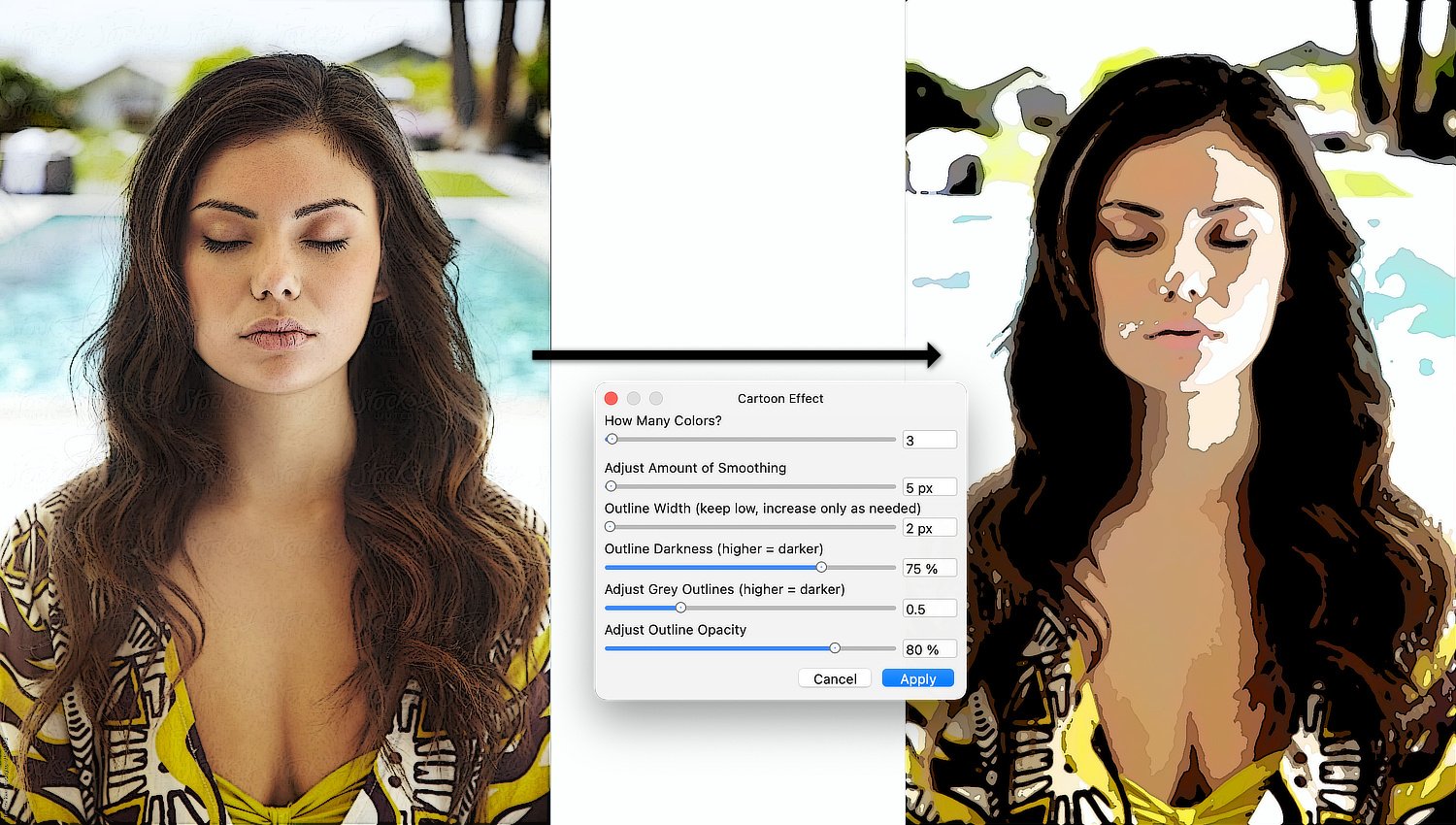
I haven’t posted any “artistic filter” macros in a while, and I needed to break my dry spell. So, I tackled an effect that, until now, I’ve never accomplished in a way that I considered satisfactory. Today, I’m posting a Cartoon Effect macro that I’m happy with, and that I think will satisfy some users. The macro is attached as an .afmacros file, which must be imported into the Library panel of Affinity Photo’s desktop version. It can also be imported into the iPad version (although I have not tested it on my iPad as of yet). Once the category resides in your Library, you can move the macro to a different category if you like – click and drag it to the destination you desire. * * * * * * * * * * * * * * * * * * When you invoke the macro, it will create a Group named “Cartoon Effect” and all of the edits reside within that group. Because of this, you can turn the group on and off to show and/or hide the effect entirely. If you look at the contents of the group, you’ll find a reasonably complicated multi-level collection of layers. The important ones are labelled, so you can edit the effect after the fact. When you click on the macro, you will be faced with a dialog box that allows you to make 6 different choices. As you use these sliders, each change will run the macro again in order to invoke your change. The final effect is written to the image only when you click the “Apply” button. The choices you can make during the macro’s run are: 1) How Many Colors? This is a Posterize adjustment, and the default value is 3. I’ve found this to be the best value for most images, but feel free to experiment. 2) Adjust Amount of Smoothing This slider simplifies the edges of the colored areas formed by the Posterization. Higher values will simplify (smooth) the edges more. The default value is 4 px, but this can potentially be turned up quite high. At some point, though, increasing the edge smoothing will make the image unrecognizable. Change this slider as needed, but the practical upper limit is far lower than the slider will allow! 3) Outline Width (keep low, increase only as needed): Outlines are placed at the edges of the posterized colors. They are black, or shades of grey. This slider allows the user to increase the width of the outlines, as needed. In general, keep the values fairly low (the default value is 1 px). Like the smoothing slider above, once you get above a certain value, the results will be atrocious. 4) Outline Darkness (higher = darker) This slider defaults to 60% and affects the “blackness” of the outlines created. It corresponds to the Black slider in a Levels adjustment. Values over 90% will start to have an adverse effect on the overall colors of the image, and setting the darkness to 100% will turn the entire image black. Values of 90% or lower are generally OK. 5) Adjust Grey Outlines (higher = darker) This slider defaults to 0.75, and corresponds to the Gamma slider in that same Levels adjustment. The effect of the slider is to make the grey outlines (those that are not entirely black) either more or less prominent. 6) Adjust Outline Opacity This slider affects the overall opacity of the outlines. The default value is 100%, and setting this slider to 0% will effectively make the outlines disappear. However, once you have made adjustments to the sliders for outline width, darkness, and grey values, this slider can decrease the overall prominence of the outlines. * * * * * * * * * * * * * * * * * * I’ve attached two images below, showing the original photo, the Cartoon Effect settings used, and the cartoon result obtained. You should be aware that this macro may not look great on every single photo, mostly based on the overall complexity of the photo and the number of different colors in the original. Also, smaller photos (in my experience, images of less than about 800 x 800 pixels) don’t end up looking great. As with all the macros I have submitted, please remember that I am one person with one computer, testing on a limited number of images. There is no way to have foreseen all possible scenarios. I believe (but obviously cannot guarantee) that you will be happy with the results. If you like the macro, please keep it and enjoy it. It is yours to use freely. I have learned a great deal from the users on this forum, and their continuing generosity helps my ongoing efforts at learning. I encourage you to “pay it forward” and contribute to the forum in whatever ways you can. Be one of the good guys. Cartoon Effect.afmacros
-
Downloaded but not tested yet. Looks like you put a lot of effort into this macro and I really appreciate you sharing it. Many thanks!
-
I hope you enjoy the macro, @romeosoroka.
-
Glad you like this, @Lorox. The reticulation noise is a actually sampled straight out of Photoshop! In the YouTube video you mentioned in another post, Brady linked to some sample files on his website (https://texturelabs.org/tutorials/grain-shaded-gradient-maps-in-photoshop/) where I downloaded a Reticulation Noise file. I took a 256x256 piece of this (to keep the macro size smaller) and had Affinity Photo. create a Pattern Layer out of it. So, you see, the “reticulation” is not actually an Affinity Photo construct but rather a Photoshop sample.
-
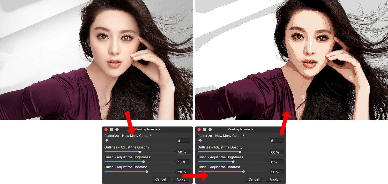
I am attaching an Affinity Photo macro that turns a photo into a “Paint by Numbers” image. The attached file is a macros category, and should be imported through the “hamburger” menu at the top right of the Library panel. The category can also be imported into the iPad version of Affinity Photo, although there is one important limitation (more on this later). When you use the macro, it creates a Group called “Paint by Numbers Effect.” All of the changes are inside of this group, so you can turn it on and off simply. Once you look inside the group, you will see multiple layers. From bottom to top, these are: 1) Original Image - Merge Visible This is a “merge visible” version of your photo. It includes all of the editing you may have done up until that point. 2) Posterization Adjustment This is a Posterize adjustment layer, and is meant to reduce the number of colors/tones used in the effect. 3) Outlines This is a separate layer, created (in part) by using a Detect Edges filter. It provides outlines for the areas of color. This mimics the outlines that were present on the Paint by Numbers boards we used as kids. 4) Normalize Colors This is a copy of the original Merge Visible image, and has its blend mode set to Color. This is used to reset the posterized colors to more natural ones. 5) Adjust Brightness & Contrast This is a finishing adjustment, and can provide a better final effect. * * * * * * * * * * * * * * * * * * * * Once you click the macro, you will be presented with a default version of the effect. A dialog box allows you to set a number of parameters. As you change each of these parameters, the Paint by Numbers effect is updated. You are asked: Posterize - How Many Colors? The default value is 4, but values between 3 and 6 generally give good results. If your image is a portrait, judging the final result by looking at what the different values do to the subject’s face is a good idea. Outlines - Adjust the Opacity The default is 50%. Adjust this upward to make the outlines more prominent; adjust it downward to make the outlines less obvious. Set to 0 to make them go away entirely. Finish - Adjust the Brightness Finish - Adjust the Contrast The default is 10% brightness, and 20% contrast. Adjust these up or down to give you final effect the desired finish. When you click Apply, the effect is finalized. Obviously, you can manually change any of the settings after the fact. However, you should know that while the number of posterization levels for the image is non-destructive, the originally chosen number is also used to create the outlines, and this is a destructive change. Although you can change the posterization level after the fact, it is not advisable to do this. The outlines might no longer line up with the individual areas of color. Also, for some reason, the iPad version of Affinity Photo handles the macro pretty well but will not allow you to change the number of posterization levels before finalizing the effect. It is baked in at 4 levels. You can change this after the fact, but (as above) the number of levels in your posterized image may not match your outlines very well. Here is the macro in action. The original image is top left; the parameters dialog is shown in its default state, and then changed during the course of the macro; the final effect is shown top right As always, I am one person with one computer and have not tested this in every possible scenario. Try it and, if you like it, keep it and enjoy it. This forum has provided me with so many good ideas and answers to questions; this macro is my attempt to “pay it forward.” [Note: Credit where credit is due. I am indebted to Dave Straker, whose recent YouTube video gave me some excellent ideas for this macro. Dave’s channel is called “InAffinity,” and is a steady source of helpful information. Thanks, Dave!] Paint by Numbers.afmacros
- 17 replies
-
- 15
-
-
-
I made this Macro to extract detail from an image for a tutorial and then I made it available for everyone. If you want, you can check the tutorial related to this Macro in the following link: https://www.youtube.com/watch?v=JdaySWNEpY0 Pedro Detail Extractor.afmacros.zip
- 5 replies
-
- 3
-
-
- affinity photo
- macro
- (and 2 more)
-
I recently watched one of @dmstraker Dave Straker’s InAffinity tutorials about “Pastel Colour Grading…” and it gave me some ideas. So, thanks to you for the inspiration, Dave! I’ve attached another macro for creating a specific Artistic Look – this one called a Pastel Watercolor Effect. The attached file is a macro category (even though it only contains a single macro); you can import it into the Library Panel in the Desktop version of Affinity Photo, and it is compatible with the iPad version as well. (In my own preliminary testing, the macro works fairly well on an iPad, although there are some issues with missing items in the dialog box that appears for setting parameters.) When you click the macro, it creates a number of layers inside of a group. The group is called “Pastel Watercolor Effect” and it can be turned on and off by simply showing or hiding the entire group. When you invoke the macro, you will be presented with a number of options in a dialog: 1-6] Lighten Color - Cyan, Magenta, Yellow, Red, Green, Blue All of these color ranges are initially set to a value of -200%. As you move each of the sliders to the right, that particular color range will be selectively lightened. If you set any of the sliders all the way to 100% then that color range will go to white. 7] Set Amount of Pastel Blurring This slider defaults to a value of 25 px. Setting it higher or lower will adjust the amount of “smudging” that the pastel layer displays. 8] Set Intensity of Outlines This slider defaults to a value of 0.7. You can set it to values between 0 and 2, with higher values giving you darker and more intense outlines. If you set the Intensity slider to 0, the black outlines will effectively disappear. 9] Adjust Brightness Brightness defaults to a value of 20%. You might want to increase it if (i) you have increased the outline intensity significantly, or (ii) to compensate for changes (particularly decreases) you might make to the Contrast. 10] Adjust Contrast Contrast defaults to 0%. Adjust this to taste. I’ve attached 2 photos (below) to show Before and After versions using this effect. Included in the photos are the settings that were used (which are a bit different from the default values). * * * * * * * * * * * * * * * * * * * * * * * * * * * * As with all of the macros I have submitted, please note that I am only one person and have tested this on a limited number of images on a single computer. There is no way to have foreseen every possible scenario. I am hopeful (but obviously won’t guarantee) that you’ll like the results. If you do like the macro, please keep it and enjoy it. This is “pay it forward software,” the happy result of an abundance of learning gleaned from the members of this forum who are so generous with their time and expertise! Pastel Watercolor Effect.afmacros
- 20 replies
-
- 23
-
-
-
I think so, @BiffBrown… The days when I shot on film are ancient history, and to be honest I really never knew all that much about what was going on when I dropped off my film at the drug store. However, that doesn't really answer the question. There's a fundamental problem emulating film grain in digital media. Film grain was more or less randomly sized, and pixels are uniform in size and shape. Without some real fancy programming (way more than my little mind can handle) the only way to get "film grain" in a digital image is to start with Noise. it's an imperfect solution right from the start. I believe that color film uses "dye particles" rather than silver halide and, therefore, the grain ought to be colored rather than monochrome. I'm not sure how one would emulate that in a digital world and, therefore, I'm stuck with using "Add Noise" as a starting point. There's one thing you could try, but I'm not sure it will give you anything you're going to like. With the Film Grain macros in the Library, right click on the macro and choose "Edit Macro" from the drop down menu. Find the step labelled "Add Noise" and click on its gear icon (on the right side of the line). Uncheck the box labelled "Mono" and then, optionally, save the altered macro to the Library with a different name. Basically, this lets you start with Color Noise rather than with Luminance Noise. However, the color noise you introduce is entirely random, and has no connection to the image it's affecting. Does that give a result that you like? I've tried this, and I've found that the only way to make this even approach being acceptable is to lower the "Grain Intensity" when the macro is run. Let me know what kind of results you get if you should try this!
-
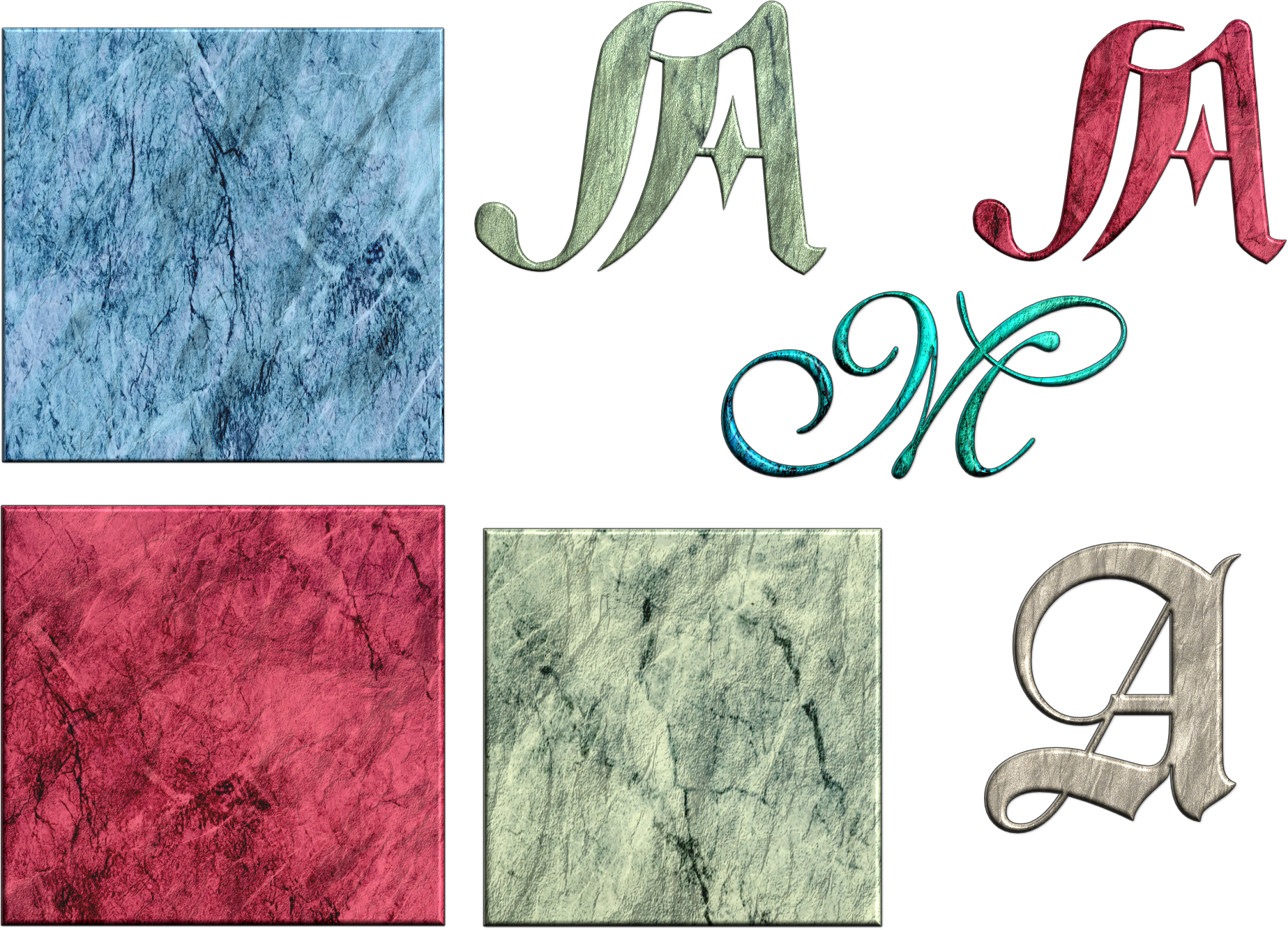
I have been working on textures to apply to text to imitate old illumination techniques -- perhaps with marginal success. Anyway, here are some styles and also a macro that I made and use to create a raised effect. If you apply the macro twice, you get an enhanced effect, as shown in the letter A below. texturized marble-1.afstyles textured marble-2.afstyles texture effect.afmacro
- 3 replies
-
- 14
-
-
-
 I am a young 84-year old who, despite being no expert, still exercises his little grey cells by programming his PC, and I read AdrainLambert's comment on @buddingphotographer's calendar with interest because it has some similarity to my own experience. I have produced a macro enabled Excel file which automatically produces the necessary csv file (including the Public Holidays) for producing a monthly calendar for any given year. I am pleased to report that it appears to work very well. However, when I add the extra data to produce a suitable image for each page I get a strange problem. Whilst using the preview button on the Data Merge Manager the images (and all the other data - Birthdays, Holidays, Etc.) show up correctly, the generated copy had February's image on the January page, March image on February page, etc., and the December page had no image at all. I assumed this was caused by some fault in the amended csv file and I have tried every variation i can think of but so far, nothing has had any effect on the output. The images are still appearing on the wrong page even though everything else is correctly placed, and after weeks of experimentation, I am beginning to suspect there is a bug somewhere. Either that or I am getting past it!
 -
I have become so accustomed to sharpening with Vivid Layer and Gaussian Blur that I rarely use any other method. https://youtu.be/efJ-j3cnO-c So I create a macro to make my life a little easier. The radius for the blur filter should be at 1-2 px in my experience. VividSharpen.afmacro