joost
-
Posts
80 -
Joined
-
Last visited
-
 ngolay reacted to a post in a topic:
Character, paragraph and text styles - thoroughly confused
ngolay reacted to a post in a topic:
Character, paragraph and text styles - thoroughly confused
-
ngolay reacted to a post in a topic:
Character, paragraph and text styles - thoroughly confused
-
 DesignByAdrian reacted to a post in a topic:
Adding anchor points on curve
DesignByAdrian reacted to a post in a topic:
Adding anchor points on curve
-
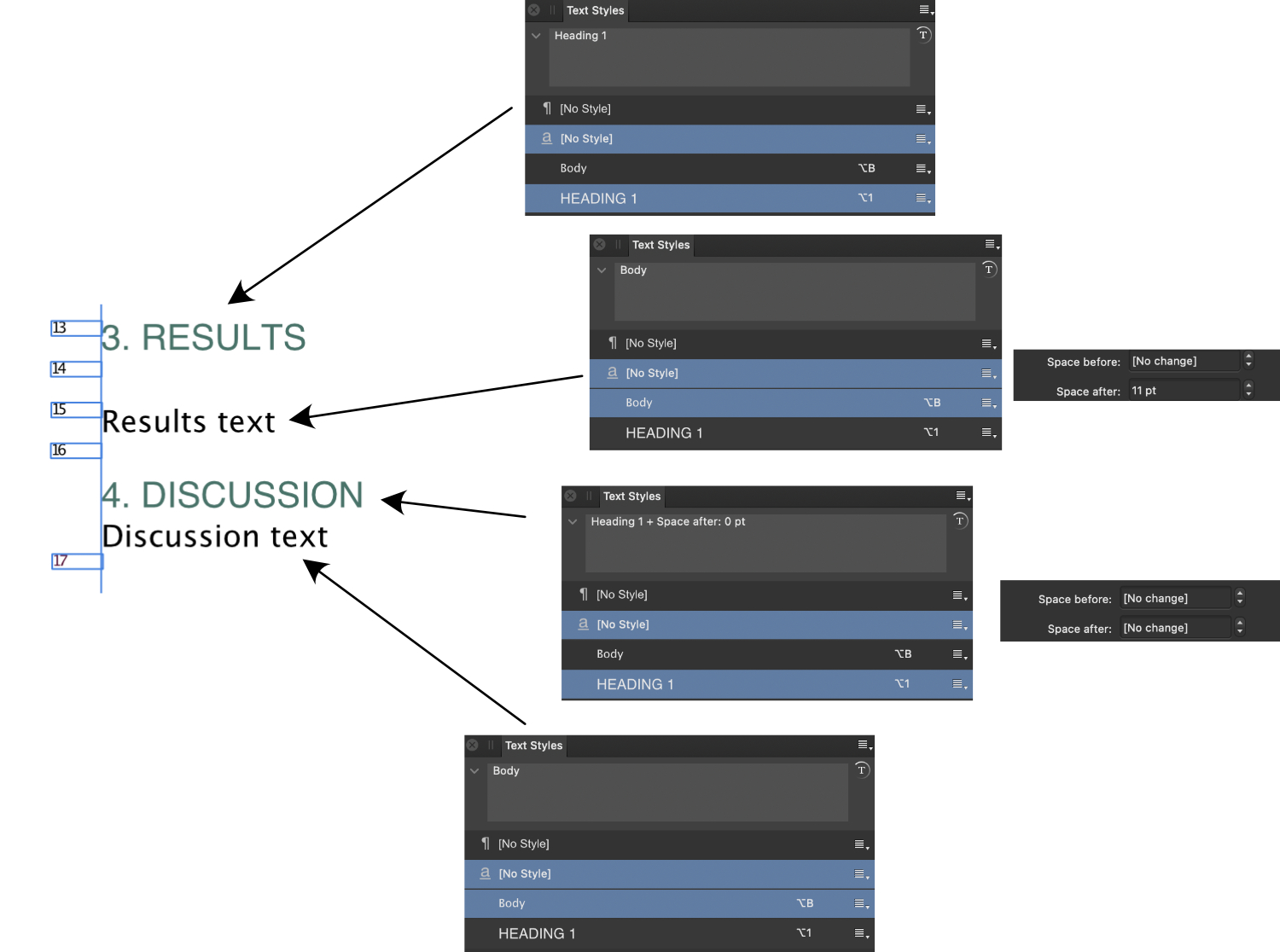
 See image below. The green is a heading 1 "style", the black is "body". I placed my cursor at each of the 4 lines and copied the text style box to show you what AP thinks the cursor is on. (ignore the small boxes with numbers). The intended behavior is the first two lines; space between H1 and body and then between body and H1 (3rd line). Clearly, there is no space between 3rd line and 4th even though these two are both "header 1" and "body" as are line 1 and 2. But wait, the text style box associated with line 3 does show "Heading 1 + Space after: 0 pt". Perhaps something I messed up? Fine, but reapplying the "header 1" style does nothing to change this i.e., the "+ Space after: 0 pt" continues to be applied automagically. Also poking through the header and body styles you can clearly see that the body has 11pts after (as I desired) but the header 1 style has "no change". I have reviewed every aspect of that text style and there is no difference between the "header 1" of line 1 "3. RESULTS" and the "header 1" of line 3 "4. DISCUSSION". I have found no way to fix this, nor do I understand how or what I did that might have started this.
-
This... is ... confusing! Whether one approaches the CP panels directly or through text panel, is the same and (expletive) confusing and inconsistent. Considering also the thread mentioned above I see; a) the toolset does not consistently and uniquely identify the styles of "text" ("text" interpreted in the most broadly possible sense). Landing the cursor/caret on any particular part of a character/word/paragraph may or may not update the various panels to indicate what is under the cursor/caret. b) Text styles is a conjumbling of a suggested link between character and paragraphs - it is not a link, yet it sorta is as the manual attempts to make one belief. Text styles themselves have no names that can be used as shortcut to invoke them, groups do and seem to work more/better as a single application entity. Item a) is a bug - big one in my opinion. Item b) is UX mistake. The *big* problem with a) is that I cannot use the cursor/caret position to learn where my styles are off/need correcting i.e., the program does not explain itself. Thats a big no no. Truly, I have no idea what you meant by this.
-
Perhaps ... but reading that is even more confusing. No answer to my questionS in that thread as far as I can see.
-
C, P, and T styles seem straightforward but have me thoroughly confused. To get a better handle on it, I looked at how these are applied in the example docs; specifically the "Lifestyle Magazine Poise". On page 16 there is a text frame with regular text as well as two bold lines the first one being "Why did you create Juic?" This is where I have questions. With the C, P and T studio dialogs open and cursor placed on the regular text, the selections for CPT are character style 'Placeholder", paragraph style "Body+" and the text style shows "Placeholder" and "Body" selected. What is "Body"? Why not "Body+"? When I place my cursor on the bold line "Why did you create Juic?", the CPT studios show no (freakin') change! Yes, the text style studio shows that this is a bold text but its selection remains "Placeholder" and "Body". What is happening? The bold line has space above and below, where is that set i.e., which CP or T option is driving that? I poked through all the settings and nothing is different between the regular text and bold text. I keep thinking that text styles are in essence a grouping of character and paragraph styles i.e., one defines a C, then P style and group them together as a Text style with its own name - but this is not how it works (right?). It seems a text style is something all by itself but it does not have its own name and has some vague link to already defined character and paragraph styles. Nobody is asking these questions so I must be dummy (certainly feels that way), humbly ask for your time to sprinkle a few wise words on this to get me out of this rut.
-
+ (@sfriedberg^10)
-
 Wosven reacted to a post in a topic:
Is automatic captioning like inDesign possible in publisher?
Wosven reacted to a post in a topic:
Is automatic captioning like inDesign possible in publisher?
-
Dan C reacted to a post in a topic:
Is automatic captioning like inDesign possible in publisher?
-
Interesting choice of words - a career in politics certainly might be in your future. 😄
-
Archangel reacted to a post in a topic:
Turn media folder into clipart library?
-
Hopkin Watson reacted to a post in a topic:
Adding anchor points on curve
-
Soooh, any reaction from you Affinity guys to put this on the map? You understand how maddening (stupid) this is right?
-
Is there a (simple) way to create a "contact shadow" effect as e.g. KeyNote can do? At the moment I copy my vector drawing to KeyNote (which rasterizes it) and add a contact shadow. This is a bit clunky and I end up with a pixelated image. A way to do this directly in affinity designer would be much preferred.
-
I like to be able to replace a specific color in my photo with a specific other color. Ideally, be able to use the picker to select the color to be replaced and pick a swatch representing the replacement color and all pixels in the photo are adjusted. Possible?
-
I have color negatives that are ~30years old i.e. some significant fading going on. Any best/better techniques to revitalize these as well as possible?
-
joost reacted to a post in a topic:
New Version 1.7 Update
-
Beltane63 reacted to a post in a topic:
Double-click to zero everywhere, please
-
Double-click to zero everywhere, please
joost replied to dmstraker's topic in Feedback for the V1 Affinity Suite of Products
+1 -
guides across art-boards, possible?
joost replied to joost's topic in Pre-V2 Archive of Desktop Questions (macOS and Windows)
ok, to answer my own question - in part; I noticed that I shapes do show across art-boards although they only belong to one of the art-boards. So I use two rectangles to draw from art-board A to art-board B. Then a copy of that rectangle so it sits on top of the first one but now running from art-board B to A. This way I it appears as one 'bar' in two art-boards. Moving these up/down, left/right, allows me to align my art work in the boards. A bit cumbersome, a bit silly, but it works. Any better ways? -
MRoodenburg reacted to a post in a topic:
Affinity Photo and Designer in the workplace
-
I have my own startup, all the company's money comes from one certain wallet :-) I am a strong believer in getting the right tools for the job and not suffer through working with half-baked stuff. It brings efficiency down and worse; employee moral down which in turn brings efficiency down and in turn ... oh well you see the cycle I am sure. For the small amount affinity is asking for AD and AP I would not have much hesitation if at all. More importantly would be for me to judge if the employee is passionate about workflow, quality of work and "moving the needle". If the purchase request comes from that background and drive, a couple of bucks for the affinity tools may open the flood gates of innovation, creativity and productivity. Which in turn adds the the atmosphere at work. So _you_ need to be convinced that these tool are going to propel you into that guy who makes high quality, great art. Your boss needs to see that energy in you. If he doesn't see that, but you remain convinced you need this - time to move to another company. Affinity's tool set is good, I use them myself although not as intense as others. I will be very critical if they do not fit my workflow, if they become a hindrance (see my notes on the lack of a good color picker some time ago) But in general, AD and AP are certainly worth their price tag in my opinion.
-
I like to be able to line up elements across multiple art-boards in AD. Within an art-boards, guides help do that. But guides don't extent across art-boards as far as I can tell. If they do, how can I engage that 'mode'. If they don't, what are your recommendations for quick and precise alignment of graphics?
-
DBMiller reacted to a post in a topic:
Color picker / Eyedropper
-
Affinity Designer Customer Beta (1.5.2 - Beta 3)
joost replied to MattP's topic in [ARCHIVE] Designer beta on macOS threads
Exporting slices to pdf is still not working in beta 3 (https://forum.affinity.serif.com/index.php?/topic/20120-export-ignores-slices/) - is this this on the radar at all?