Rocketdrive
-
Posts
257 -
Joined
-
Last visited
Everything posted by Rocketdrive
-
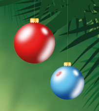
I just encountered some strange export quirks. The first screenshot is out of Publisher, the second is from the PDF. Definitely not what I want Oh and file sizes... We really need the PDFs to be smaller than the source files. Right now, the Publisher file is over 60 MB, and so is the PDF. Sorry to bring that up, but Indesign squishes that down to 4 MB, tops. That is the benchmark

-
 I tried linking a Designer file, but Publisher will always embed it. This is unintended behaviour IMO. Is that something that will be addressed in future updates? A dedicated pallette/list of all linked and embedded files is also needed to keep track in larger projects
 -
Shape export to Apples Motion
Rocketdrive replied to Scrubelicious's topic in Feedback for Affinity Designer V1 on Desktop
For assets that do not scale too much a solution that works just fine is to export them as layered PSDs. Motion should easily handle double or triple resolution assets. While I agree that vectors would be a more elegant approach, I've been successfully using exported layered PSDs and single PNGs in Motion for an animation project. What I'm saying is: there is a path from Affinity to Motion right now -
Procedural textures
Rocketdrive replied to Belmont's topic in Feedback for Affinity Photo V1 on Desktop
Learning a few new tricks from time to time is a healthy thing I got used to nodes pretty quickly, and they are a better approach to solving many problems. They better describe the flow of information than stacked lists or layers and are also visually a lot more pleasing. I need to be honest, I got hooked on Fusion and do a lot of work in 3D apps. Most of them have such an elegant approach to complexity (including nodes, or other forms of procedural building tres), I have been wondering why the classic 2D content creation apps never adopted some of their tricks. -
A good DAM would finally let me see/preview any of my files on as many devices as possible. That includes not only 2D image files but also pre-rendered or realtime rendered 3D assests. And ideally not stop there but also support (via plugins) office documents, HTML files, of course PDFs and all text based files. Digital content creation is more than 2D image files, even if they make out a big part The DAM should play nice with cloud storage providers, work on at least Win, Mac, Android and iOS, and be nothing less than a better, visual file explorer for each OS. It should support plugins which can take care of rendering previews for more exotic files. It should have a nice and fast cache (independently synced catalog?) for thumbs and previews and play nice with any apps needed for actually editing the assets. I wouldn't mind if it had it's own set of basic (RAW) editing tools for images. It must let me see the original folder structure, but also support tags and standard metadata and let me build smart folders (based on tags or other properties). It needs a lightning fast search.
-
OK I think I get the "logic" now. The list we see is one of brush PRESETS, right? It appears that as soon as I change any setting, like brush size, the highlight is gone because the current settings do not match the original settings. It would be nice if the preset stayed selected, like is the case with text styles, even if they get overrides.
-
I'd love to customise Photo (or Designer). A combination of the following would be useful: a custom shelf, or persona with say, up to 9 positions that can be anything, and I really mean anything: a brush preset, a tool (e.g. brush, spline or lasso selection), or just a toggle like "protect alpha". Or rasterize layer. You get the idea. directional gestures, or flicks. The sweet spot for these seems to be 6, which means I can have super fast access to 6 more controls that I find important. Could again be brush presets, filters or any command/menu within Photo. Background: I am painting a lot in Photo. This means that I use some tools quite often, while others I hardly touch in weeks. Things like the polygon lasso tools force me to switch personas in order to create a selection, and switch back in order to move the selection. This is crude. I'd rather customise an additional persona to my needs and never look back What do You think?
-
Scripted Layers?
Rocketdrive replied to wulkanat's topic in Feedback for Affinity Designer V1 on Desktop
I like the idea of scriptable alot. Why not expand it to make Affinity Scriptable Everywhere? Opening access to all objects and creation methods would let people finally tweak and create their specialized tools and presets and shortcuts and take away pressure from devs, who could concentrate more on a solid core and care less about every special need that certain people have. Not that those are not important, au contraire, it is imperative to allow for more exotic solutions. Thats what many people like and need. Having a thriving third party developer community can be a big boost for software. 3dsmax was and is so strong because all sorts of specialized plugins helped expand the core for special needs. Blender is scriptable down to the bones, as are all major (3D) digital content creation packages. Photoshop, Indesign, Illustrator have all some sort of API for scripting. This is a huge bonus for all. It would be gread if version 2.x of the Affinity suite opened up to dev access. Preferably with some sort of industry standard like Python (but don't take my word for it, I just read, but do not develop myself ) -
Maybe we can agree that anythig should be assignable to a shortcut? I'd like to map brush presets, toggles (like protect alpha) or other paint/illustration related toggles and brush tweaks to keyboard shortcuts.
-
Ability to draw in 3d
Rocketdrive replied to Baz40's topic in Feedback for Affinity Designer V1 on Desktop
Go check out Blender 2.8 alpha and Greasepencil. While I can totally understand the wish for a one-stop-shop (which may never happen), You can start building You own pipelines right now with the tools best suited. Look at the teaser below. The full tutorial ( $ on Gumroad ) from Jama Jurabaev explains a process that starts with 3D sketches in Blender and goes further in ... any painting app that You prefer, Photoshop in his case. Disclaimer: I am not affiliated with him in any way, I just find this a very unique way of creating concepts and art. -
Brush Cursor does not rotate
Rocketdrive replied to postmadesign's topic in Feedback for Affinity Photo V1 on Desktop
I'd like to see that, too. It is not terribly important, since I see more pressing ToDos, but would be nice to have in a future update. -
+1 for that one, too
-
Totally agree. Temporary keys can be very useful. +1
-
Thanks, mate.To be honest, it was the wisdom of many good teachers that I could tap, and a lot of ongoing practice that brought me somewhere.
- 4 replies
-
- 1
-

-
- digital paint
- illustration
- (and 1 more)
-
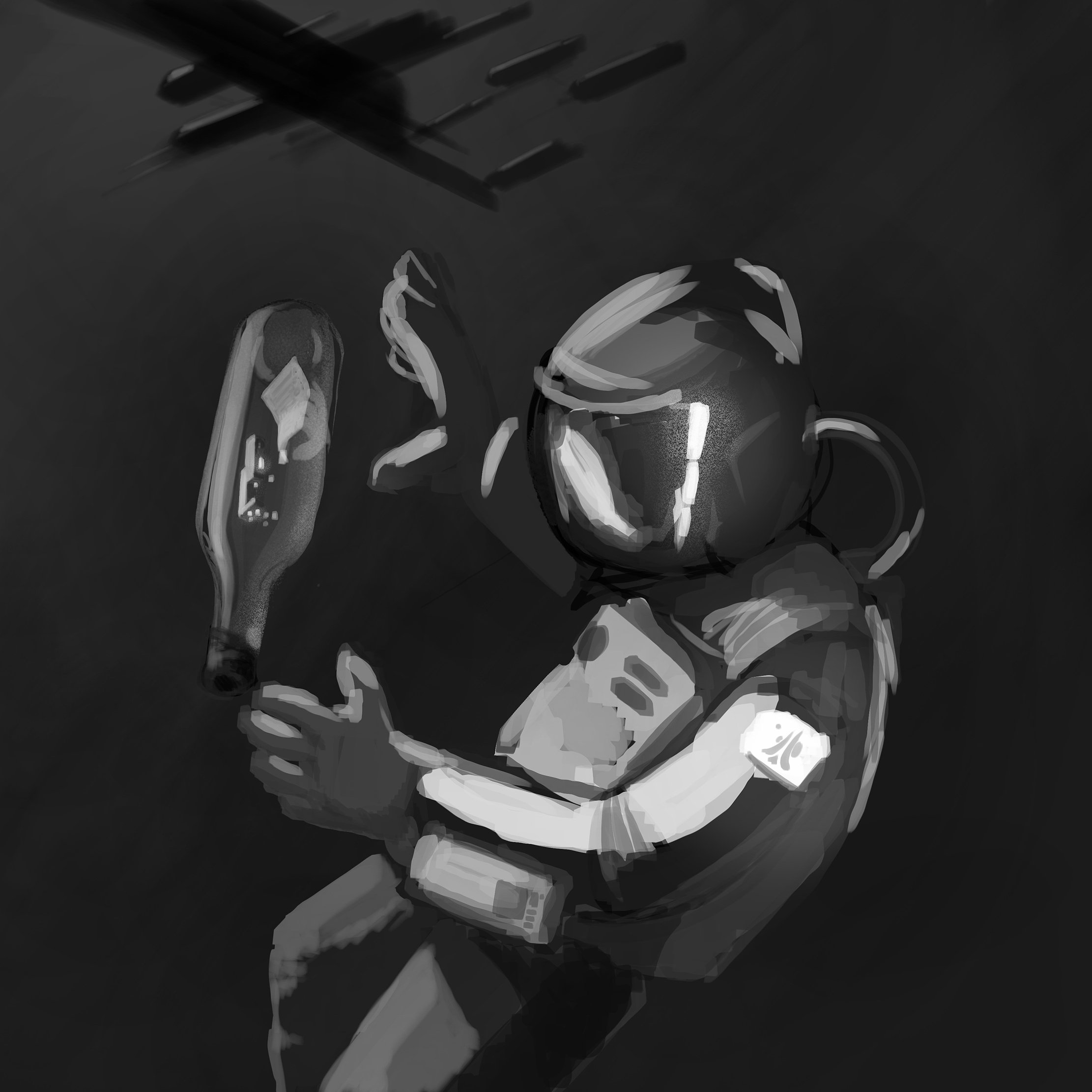
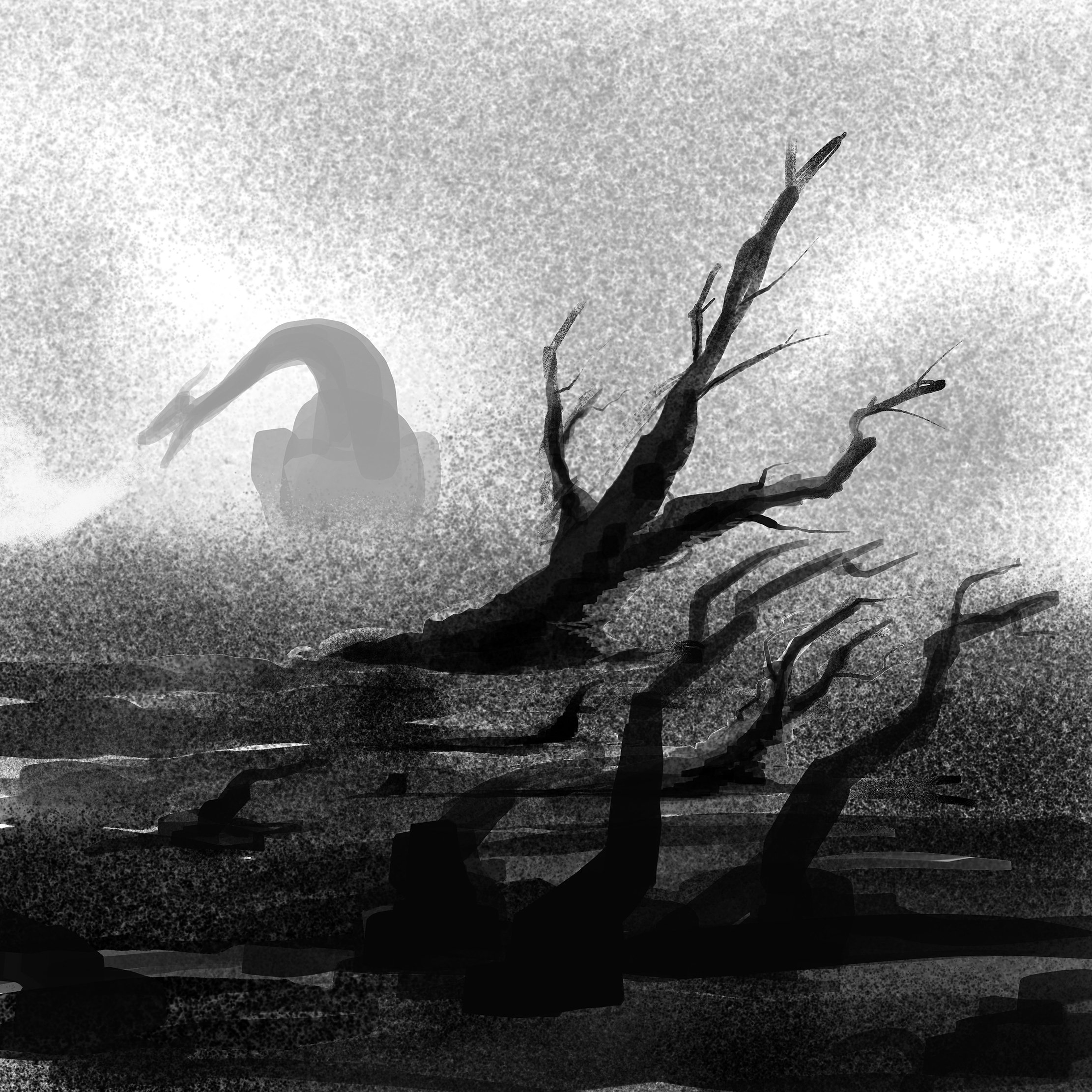
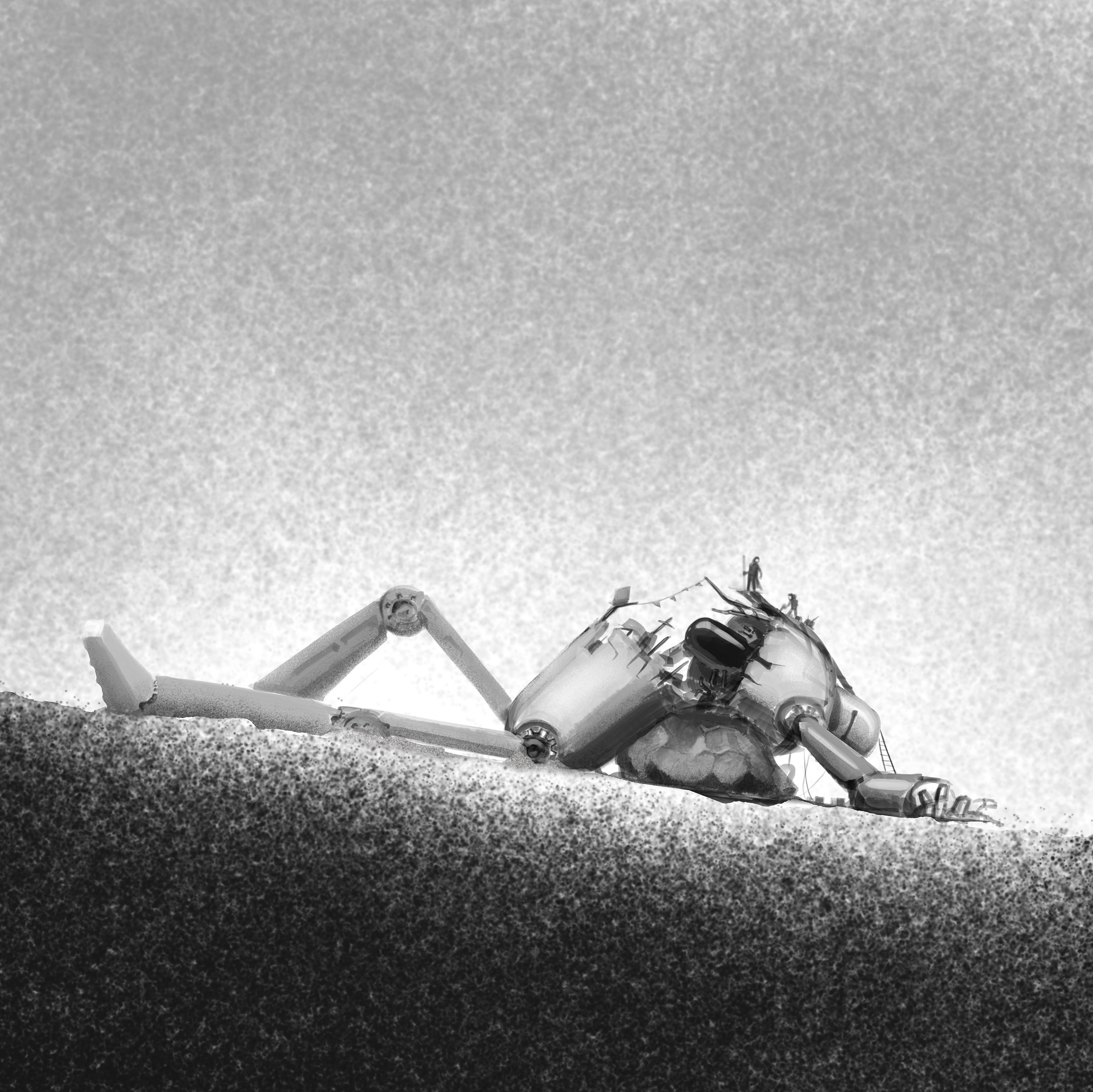
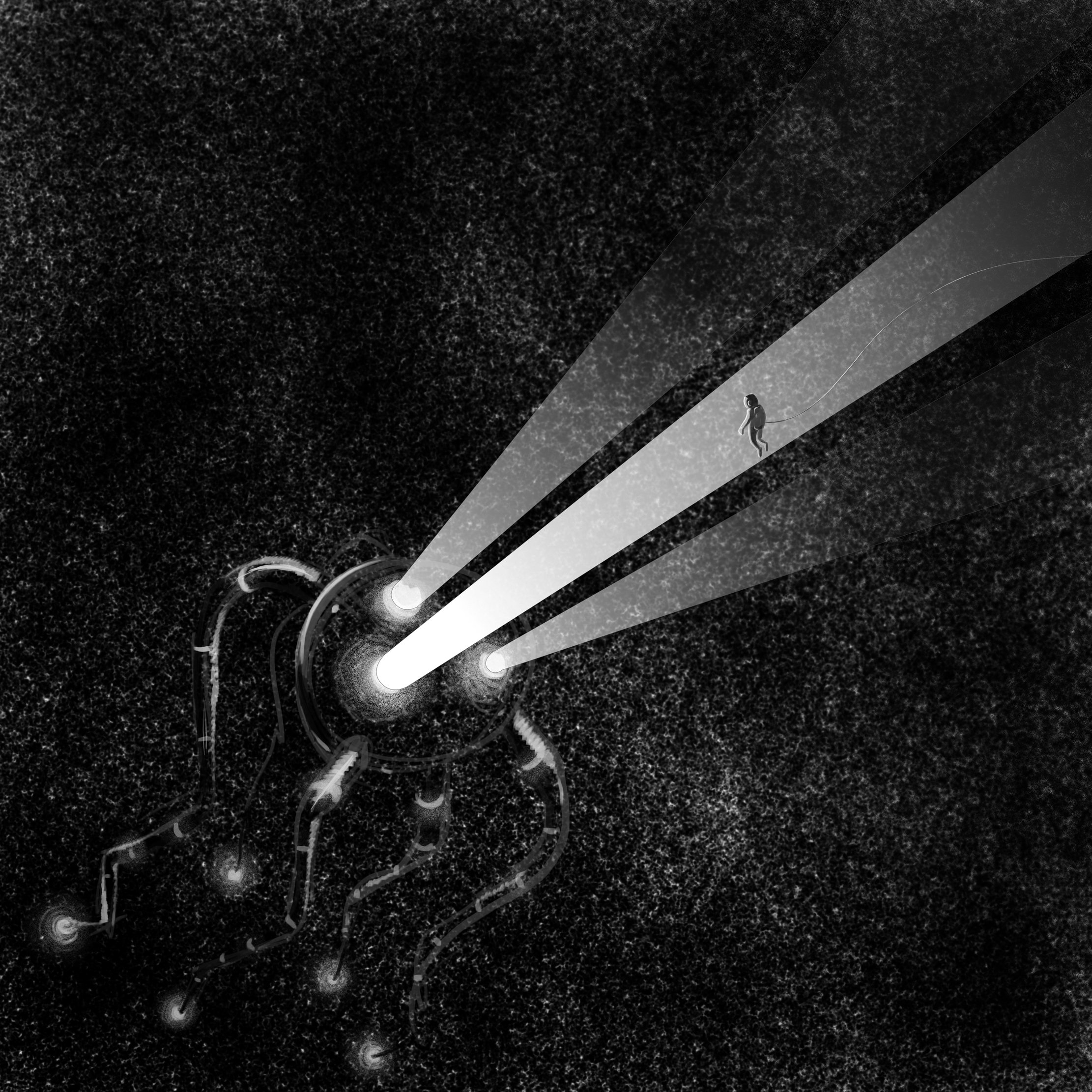
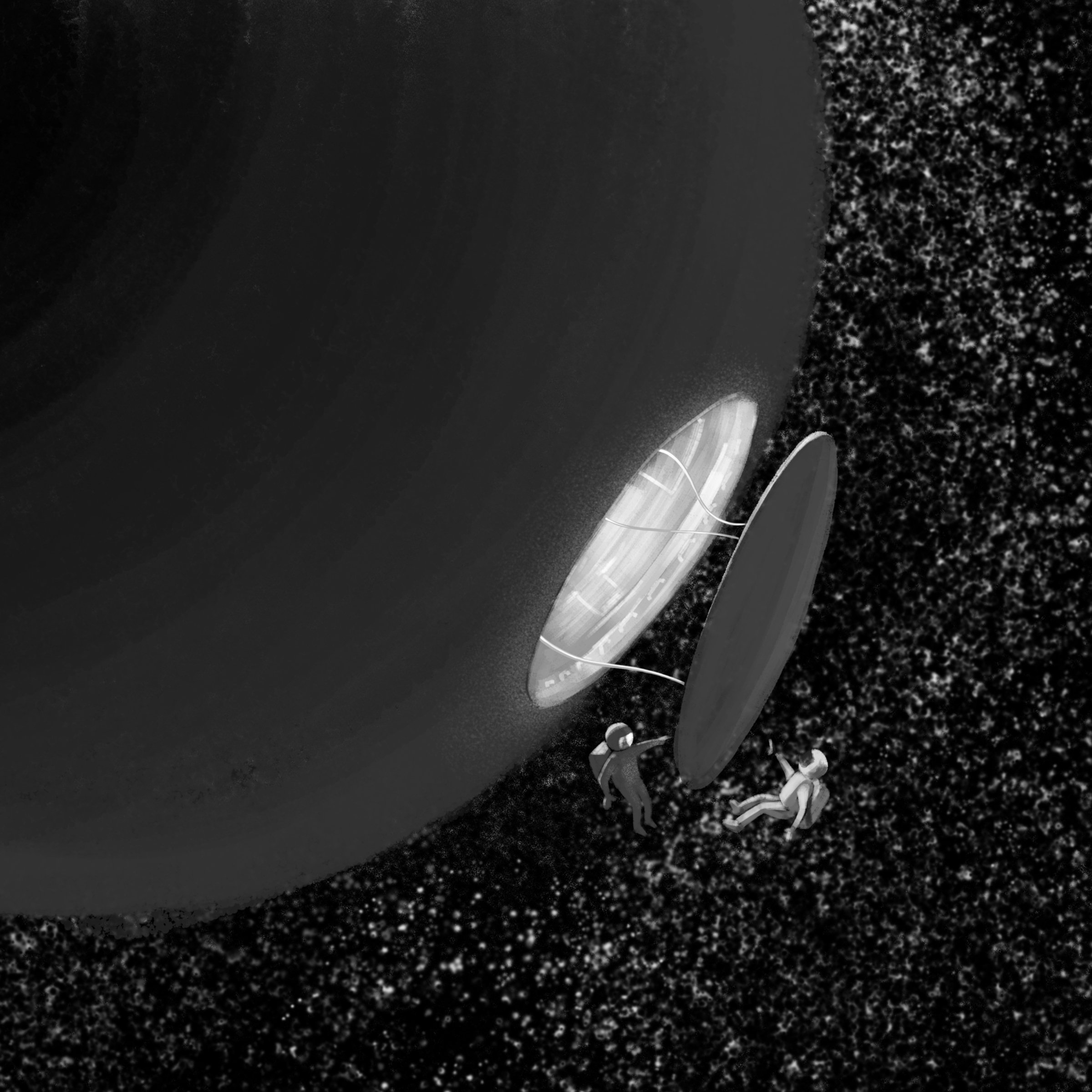
As Inktober 2018 continues I decided to stay a bit longer with Photo. I am pretty happy with the mood and look of those three illustrations
- 4 replies
-
- 10
-
-
- digital paint
- illustration
- (and 1 more)
-
I've actually been drawing for this Inktober mainly in Blender 2.8 with grease pencil. However the last three days I needed a deeper, more painterly and textured look - perfect for the painting tools in Photo. Ironically, it was the special prompt list from Adobe, which made me switch back to Affinilty for those days
- 4 replies
-
- 8
-
-
- illustration
- space
- (and 1 more)
-
Symbols, Superscript
Rocketdrive replied to Rocketdrive's topic in [ARCHIVE] Publisher beta on Windows threads
Thanks, Chris. I can't check the glyphs right now, but I know that the same font can be set to superscript in Affinity Designer. -
I noticed two minor things today: 1) When detatching a symbol, the corresponding objects in the layers palette still have the orange bar that denotes a symbol 2) Highlighting two characters (asterisk and closing bracket) and clicking on the Superscript button didn't do anything to the characters. They just stayed as they were.
-
Not happy with White balance tool
Rocketdrive replied to Atindra's topic in Pre-V2 Archive of iPad Questions
Hi @Atindra, on my monitor the upper image appears well balanced, even if a bit on the warm side of the spectrum. The lower one appears to have a red tint, and at the same time a colder white balance. I guess I know what You are missing in AP, however since I never shoot with a proper greycard I learned to balance the color with the usual temperature and tint sliders present in AP as well as in LR (which I use for 99% of my shots). LR has deeper control, since You can adjust hue, saturation and lightness of individual colour groups - which really helps with complicated lighting situations and unintended tints in parts of the image. I wouldn't mind if Affinity got this amount of control, too. -
Thanks, @GabrielM, that's it. Much appreciated
-
Hey guys, it would be great if I could choose to save the settings for the last new document. Like, width, height, doc type, units.. in short, everything As far as I remember that is the default behaviour in the desktop version, and I find it very useful. Those who don't should of course be able to turn that off. And next step would be template files or document presets. But until then the above would help a lot.
-
I am using English as the main language on my iPad, but edit many Designer documents that contain german text. Now, some spellchecker does it's job and underlines most of the text with red dots in Designer. I have all spellchecking features under iOS settings turned off, and can't find any in Designer. Is there any other place where I can look? TLDR: I want all spellchecking turned off by default in Designer. And Photo, should it behave the same.
-
Yea, once You think about it it's the most obvious way to go. But You have to cancel out some of the philosophical ballast as well as resist the urge to follow every hype
-
The comparison between Affinity and Resolve is pretty far fetched IMO, but that's totally fine as long as it works for You . I use Affinity together with Fusion (standalone) without problems, by creating and exporting assets as PNG or EXR, and using them for compositing and animation in Fusion. As long as both companies play nice and adhere to industry standards, I can build my pipeline to my liking. About Linux ... I wouldn't mind if one day everything just worked, every driver needed was there and stable, and I had all the apps that I need without spending night after night browsing forums and hacking the hell out of the shell . Until last time I tried it there was at least one major dealbreaker, maybe nonexistent driver, wonky wacom support, and of course missing pro apps like, well, Affinity. For the time being I choose like that: which app does the job best? Which OSes does it run on? On which OS does it run best? Which hardware does the OS run on? Which hardware is the best compromise of power, stability and price?