Lorox
-
Posts
347 -
Joined
-
Last visited
Everything posted by Lorox
-
Yeah, that would feel quite natural. Otherwise it would be helpful to be able to really select a guide (like in InDesign) and then delete it (or change its position via the ”Transform“ panel like with any other object).
-
Interesting point(s), Paolo! I tend to agree, actually and it seems to support my notion that the Affinity apps should indeed put a strong(er) focus on "professional" features, which will help secure a smooth and hassle-free production process – like e.g. really foolproof colour management and (accordingly) error free PDF output. I have the impression that it is still way too easy to produce productionwise faulty PDFs using Publisher while in InDesign it used to be almost foolproof once you had set up your Creative Suite apps correctly once and for all in the initial setup (especially concerning colour spaces and profiles). Furthermore I tend to think that Adobe’s offering the possibility to entend/complement inbuilt features on quite a grand scale by helpful and powerful 3rd party plugins and scripts in Photoshop, Illustrator and InDesign has really created some serious creative atmosphere or ecosystem around the apps, which had made them all the more attractive to all creative users. In my opinion you cannot for example underestimate the positive effects which some 3rd party plugins (or plugins collections) have had for the attractivity of PhotoShop to creatives over the years: KPT (back in the day), Alien Skin, Mr. Retro and many others. Or – e.g. – those by Astute Graphics for Illustrator. Having used some of these to my benefit back in the day and having learned about many others which I might have tried some day I can't help but feeling more than a bit limited every now and then after having switched to Affinity a couple of years ago... Last but not least: of course Adobe will try to make students and amateurs sort of dependent on their software, which – as you say correctly – they will have often learned to use in school or other education and have been able then to subscribe to at drastically reduced educational discounts. Many of them will obviously be hesitant to learn yet another software after having learned to feel sort of at home in CC. it If you want to make someone addicted that's the way to go I'd say...
- 655 replies
-
- 1
-

-
- automation
- scripting
- (and 3 more)
-
Absolutely so! It's been in Photoshop for years and years now and it's super handy to have for certain applications. We also need Affinity to have additional instances of an applied effect so that changes in the „master“ effect will reflect in all instances of that master and we don't have to do them all separately. This – as well – has been possible in Photoshop for a long time by now. Features as these can boost productivity quite a lot and I think that better than just being special or different [for difference’s sake] you really DO have to „learn from your enemies“ (or competitors) and eventually beat them at what they supposed were their advantages.
-
I think this is a valid notion. I’m not 100% sure, however, which kind of user Serif/Affinity are really targeting as of now: do they really (still) want to lure professional InDesign (and – as market shares come into it – to a lesser extent Quark) "power users" – preferably in the print design area – away from their industry standard apps which they have maybe been dealing with for decades? Then it makes perfect sense to go for a script language these users may well have some experience with. If these users are being targeted (more than before) now or in the future the developers should, howver, certainly address several issues (which I won't repeat here) in the Affinity apps that have been requested time and time again over the last years. Scripting is just one of them.
-
@ Nizer: well that's quite elaborate, I’d say! But honestly: it's a shame that we're still left to calculations like that. As I wrote quite some time ago: this kind of job (doing that arithmetic) is exactly what computers have been invented for in the first place and we can only hope the devs at Serif finally come to this conclusion as well... It may be comparing apples to oranges but really: this kind of everyday problem in a lot of general design jobs should certainly have been prioritized to – e.g. – enabling users to do fancy astrophotography editing (even if possibly millions of AP user would have dearly missed THAT 😉)...
-
You're perfectly right! Although I'm happy to have left the A****-universe behind and to have found a very decent alternative with the Affinity apps I find myself despairing over the Affinity UI (and the workflow implied by it) times and times again. The handling of colours is certainly not the only but a prime example. Having worked in InDesign for many years I do know from that experience that you obviously can get colour handling right. Swapping a global CMYK colour to Spot (PANTONE or self assigned) couldn't be much easier – also InDesign’s feature to just pick a replacement colour when you delete a colour swatch is so helpful and intuitive. Unfortunately I have often got the impression that the guys at Affinity/Serif wanted to make certain things different from the A****-apps for the sake of just being different while not really caring for a smooth and intuitive user experience, which, however, should be the very foremost objective when designing a professional app. Which designer would object if Publisher's handling of colours were actually similar or even identical to InDesign‘s? It's a proven concept that WORKS and I cannot really imagine that a general way of doing things like this can actually copyrighted...
-
I tried to verify this via their website but I honestly could not find actual proof for this. As you can obviously check overprinting by activating the proper kind of view mode one would have thought that being able to inspect colour separations would have been a point worth mentioning in the features list...
-
I, too, just encountered problems with pinned objects: in my case the pinned objects were just snippets of "artistic text“ (a simple "www" and an opening quotation mark set in 60 pt and 120pt respectively). No problems at first: the pinned objects flowed with the text correctly – no matter if I added or deleted the odd line or a chunk of text for testing. Just as it should. Then, however, after having decided to set my text to align with the baseline grid I had to adjust the height of my textframes and as a result my "floating" (as opposed to "inline") pinned objects became visibly distorted. As these objects definitely float outside the text frame – while pinned, however, to some character inside – I find this quite surprising (and annoying, actually). Why do they become affected in terms of scaling, when another object which they are only connected to in terms of position is modified? Any ideas about how to understand /avoid this behaviour? _ Affinity Publisher 1.9.3 on Mac (Mojave 10.14.6)
-
I do acknowledge this. However, I do also think that being able later to identifify the „original“ brush used on/with a vector path can be beneficial in many cases. And as I wrote earlier, one could think of some sort of mark in the brushes palette when a path/curve is selected whose properties have been modifified so it's no longer the default version of that brush. But you would still know that the stroke you see on that vector element is based on e.g. „Oil 3“ and not on ”Acrylics 5“. As of now you don't have almost ANY idea where to start when – especially after some time – you want to recreate or make variations of a given design using such strokes.
-
I wasn't thinking of raster brushes leaving (pixel) marks on a pixel layer – once applied they are indeed just pixels as any other one on that layer. I'm talking about those so called (albeit falsely) "vector brushes" that you actually do assign to a path (or curve) as the stroke's appearance and at any time can change as to its colour and thickness and which will be transformed accordingly when you manipulate the the curve's nodes (including their handles). Although these brushes, especially those meant to look like natural media marks, unfortunately are not real vector brushes (like those you have in Illustrator or VectorStyler) but are made from pixel images (and thus regrettably are not resolution independent) they nevertheless can be assigned as strokes to vector curves. They are not happening on a pixel layer but on a vector layer as part of a vector curve.
-
Exactly! I find this very annoying, too and it's long overdue for correction/implementation!
-
That's actually too bad. I don't really think it would amount to something like rocket science to implement this. If I have assigned a certain oil paint brush (or whatever) to a stroke I don't see why this information doesn't remain connected to the object it has been expressively assigned to (like e.g. its colour which obviously isn't that "volatile"...). Even if modifications have been done to the brush via the Properties panel this doesn't alter the fact that the basis is still a certain individual brush (which even had a name). It could even be indicated by some symbol (red dot or whatever) added to the brush in the brushes panel, that this brush with the object selected has been modified.
-
Can't find brush or style used on active vector
Lorox replied to k_au's topic in Feedback for Affinity Designer V1 on Desktop
This is an important observation and I really wonder why there hasn't been an answer in almost 2 years! I found myself in exactly the same situation today and I feel it's really annoying not to be able to identify a brush used for some curve after the fact. Even if there possibly have been some modifications done via the Properties panel the brush used should still be highlighted in the brushes panel (and possibly its name should be indicated somewhere in its properties panel, too). If there have been modifications (except from stroke weight) this could be indicated by some symbol (like a red dot after its name). -
Sorry, I didn't pay enough attention... That having been said, I completely agree to your initial post. I actually think that it's generally a bad thing when the inclusion of basic features like these is handled differently for an app if there is a Desktop version and an iPad version. Especially as a feature like this doesn't really seem to depend on device specific peculiarities...
-
Which kind of palettes do you mean? It's obviously been possible to import palettes (and export) from or to any Affinity app using the .afpalette file type for some time now.
-
I guess you're right – and I think it's the same with any stroke around any curve/path. The bad thing is that corners will obviously be completely ignored by default. Accordingly they all look different as to how they are hit (or not) by a dash or dot. The only way a dotted or dashed line can be applied to an angular curve in an aesthetically satisfying way would be to draw it separately from one corner point/node to the next while putting an equal amount of the stroke length to each side of the corner. Then on the section between two corner points/nodes a calculation should happen which equalizes the gaps in a way that an overall even appearance is achieved. This should be possible with any reasonable ratio of stroke weight and section length. As I wrote before: this nothing but pure and rather elementary mathematics and should by no means be an impossible task for a modern and aptly programmed app. I even did that kind of calculation myself when a dashed stroke wouldn't "close" satisfyingly on a circle (though I have to admit it's relatively easy with a circle only because the precise length of the circles's circumference (2 times pi times radius[=half of width]) is always known).
-
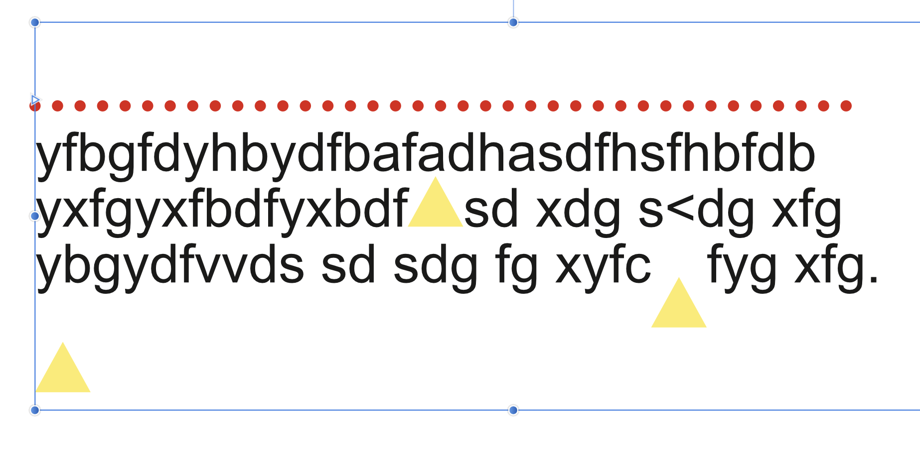
@ firstdefence: Using (small) square or round bullets is an interesting idea as a line of those can be finetuned quite easily regarding their size and spacing. When they form a separate line (of text, actually) that line can also be adjusted vertically by setting its line height or baseline shift. I tried another workaround (see screenshot) by pasting a curve into the text frame (this should be quite convenient as you can still modify it according to your wishes afterwards). While this generally works with "normal“ shapes (see the yellow triangles; one of them shifted down via baseline shift) I had some unexpected difficulties pasting that straight dotted line into the top (empty) line of text. It didn't show up at all first! When I added another node before copying & pasting to make it temporarily triangular it worked, however. I even could delete the excess node afterwards to make it straight again. But it seems to be a bit unpredictable what's exactly happening there – Publisher even freezed once while I was trying this...

-
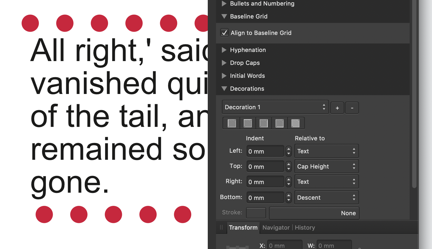
@Ken Hjulstrom: The top row of the decoration is visible outside (over the top of) the text frame because of its negative top indent. This is just a vertical shift and it doesn't have anything to do (at least as far as I see) with the left or right alignment.
-
Ah thanks, firstdefence! I've actually tried to do so, but it's quite fiddly – you have to try out really small variations in the numbers you enter for the indents. Although it may eventually produce something more or less acceptable I found it really unnnerving... As this – to me at least – seems to be exactly the sort of problem computers are here for to solve for us in the first place (it looks like pure math to me, anyway) it actually appears to be quite anachronistic when we are forced to manually enter those miniscule decimals in various input fields to finally approximate a halfway decent result...
-
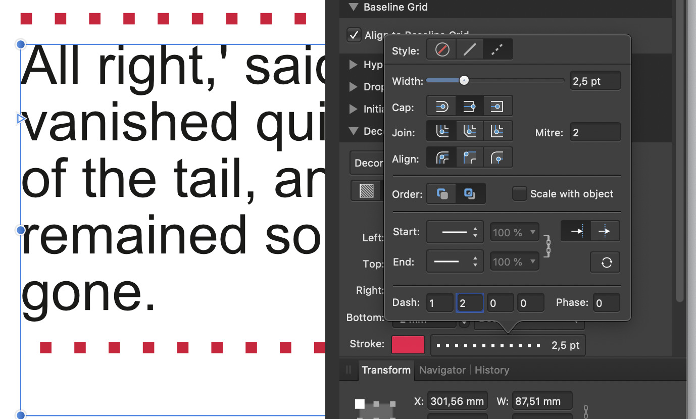
This is actually quite a nuisance – you can fiddle around a bit with the „Phase“ setting to influence where the dots/dashes begin, but it's not much use, actually... As this is Publisher 1.9.3 I wonder if this issue has been addressed in v 1.10 or if it's just tha same there. It's obviously related to the issue of dashed/dotted strokes not aligning correctly with a rectangle's (or any angular object's) corners. They just meet those corners randomly with some part of dash or gap... This hasn't been a problem anymore in Illustrator or InDesign for ages now and I'm really disappointed that the Affinity apps don't seem to be able to get it right.
-
Yes, but unfortunately, I did not manage to display the overprint elements correctly this way. You're right – if overprinting is part of your design, it will not work. Obviously Affinity Photo does not translate the "overprint property" from the PDF into its rendering of the design. I checked with a simple file using overprinting versions of CMY and they block out completely what's below them. In this regard I have to add to my post above: whereas you can actually check whether your blacks are 100% K blacks or all-component "rich" blacks, you – due to this method’s failure at handling overprinting correctly – unfortunately CANNOT check whether your 100 K black is overprinting (as it usually should with type elements). Too bad!
-
Object Overprint for Fills and Strokes
Lorox replied to CraigS's topic in Older Feedback & Suggestion Posts
Hi MEB, as you say so I do suppose this will work. I'm quite certain, however, that the vast majority of designers will actually NOT think this way (and not only because they possibly may have years of practice in InDesign, where this is handled in a more obvious and intuitive way). If we (please excuse me for brazenly generalizing) as designers think of using overprinting, we almost certainly and intuitively will think first in terms of specific objects (= their fills and/or their contours) which are meant to overprint – using whatever(!) colour that's been assigned to them. Designers will NOT primarily think of the assigned COLOUR as such to be the carrier of the "overprint information" but they will think of the OBJECT (or more precisely of the object's fill and/or contour). Accordingly it would make very much more sense if in Publisher (and Designer as well, of course) the overprint property could be assigned directly to an object's fill or contour no matter what colour those may be. Why on earth should I e.g. populate my colour palette with "quasi-duplicates" of even basic colours like Cyan, Magenta or Yellow which then are set to overprint (as opposed to their "regular" non-overprinting standard counterparts) if I just want to achieve an overprinting effect with just one, two or three particular objects? I really don't get the "thinking“ that's behind Publisher's and Designer's way of handling this (and why it should or could be reasonable to do it this way), while it just seems so natural the way InDesign lets me do this: select the object in question, set its fill's or contour's attribute to overprint and there you have it! Could you possibly elaborate on this? -
Well said (and I actually did accordingly...) Unfortunately, Inkscape 1.1.2 tends to be so "lethargic“ on my 2019 Mojave iMac that it isn't exactly fun. BUT: you get it done and the options Inkscape’s offering for customizing spirals are very useful indeed. If Inkcape's performance on Mac would be as fluent as it seems to be on PC I'd actually do quite a few things Designer doesn't offer (yet) in that app...
-
Thank you, this is actually a very interesting (and in its simplicity somewhat surprising) take on the issue of preflighting colour separations in Publisher generated PDFs. As it is so easy to drag/import rich black text into Publisher without really wanting to, checking the blacks (for all black text elements) is – at least for me – of primary importance when viewing the colour separations. And your method seems to make this possible without resorting to any third party apps. So far I've only checked (on desktop AP) with strict CMYK PDFs (which I almost solely need these days), but back in the day I've done quite a lot of spot colour jobs, so it would be worthwhile to know how solid colours from PDFs are handled in AP and if the method works with them as well.
-
Yeah, absolutely so. But please let them include REAL vector brushes, a blend tool, gradient meshes, a shape builder tool as well. If another "budget" app like VectorStyler has got all these (and a few others as well) it shouldn't be impossible for the Affinity team to offer these to us as well... Ah, well: image tracing would also be great!