Lorox
-
Posts
391 -
Joined
-
Last visited
1 Follower
-
 Kal reacted to a post in a topic:
Gradient with global colour
Kal reacted to a post in a topic:
Gradient with global colour
-
Another thing I wouldn't have thought of… Thanks for pointing this out!
-
@lacerto Thanks a lot for your interesting take on the Noise subject. I wouldnt't have thought of going to the Live Noise Filter in the Photo Persona under these circumstances – it's certainly worth a try in the future!
-
@lacerto Thank you very much for your insights! Actually, those four RAL color swatches in the "HH Grautöne RAL-like" palette had been created first according to some info about the (approximate) CMYK values of several RAL-colour tones. And yes: according to the charts which I had consulted, the last in line of these swatches ("RAL 9007 Graualuminium") should be just 60%K and nothing else. However, the guy at the printer’s was a bit anxious that a larger flat area in the "design"printed as monochrome tint of just ONE printing colour (K here) might be more delicate and any subtle flaws (should there be any) e.g. with the printing head for K might possibly result in visible "scanlines" or the like whereas an area of grey colour mixed from all 4 CMYK colours might be not so easily damageable. So I created – just visually – a full CMYK equivalent of that 60K tint (resulting in 23/19/18/45). However, I forgot to add it this version as an extra swatch to my "HH Grautöne RAL-like" Document Palette and just used that mix directly on the square behind the number... To further make it a bit more "fuzzy" I later added 50% Noise (with that slider in the "Colour" Palette) to it (the square, that is). [Aside: Those 2 "pre Noise" versions of the colour – K only and full CMYK – are visually undistinguishable on my system, in Publisher as well as in e.g. PACKZVIEW. Also in Acrobat Pro on my old iMac. Provided, though, all apps are using the same CMYK color profile. If you add that 50% Noise the two versions of the colour will look a bit different – but I guess that should be expected given their different "mix"! In "Preview"(not using profiles?), however, there is a visible difference, even with no Noise added.] Supposedly simple things can obviously get quite complicated… Anyway: as those different print runs which I mentioned have been done with the very same PDFs of the files (which, as we have seen, eventually even have that grey area as a rendered and identical image in them) it still seems strange enough that the colours in the prints should visibly vary on each iteration and PDFs which printed this way the first time print differently the second time. I cannot quite see, what influence anything that has or has not happened before outputting the PDFs in Publisher should have at this point in the process… It's the same PDF that's beeing printed and yet the colours differ! So meanwhile I really tend to think – as I said before – it's probably something with the printer itself (or its RIP).
-
Yeah, I actually could have thought of that… And yes, the rectangles with that grey Noise fill have obviously been rendered as images to their respective PDFs. And: when I copy one of those images to one of the other files and place it just over the image there in "Difference" blend mode it is showing 100% coverage (with just a bit of 99% flickering) in every single CMYK channel, which seems to prove that the images are virtually identical in each PDF... The original grey colour is 23C/19M/18Y/45K with 50% Noise assigned. I'm attaching one of the signs as .apub & PDF. As I said before: the other .apub ones had all been derived/copied from such an original via "Save as…" with just the number changed each time. Meanwhile I almost tend to think that maybe there actually has been some issue with the (foil) printer at the printers' shop as in different print runs colours changed with different ones of the PDFs. When the grey images in the PDFs are virtually the same in any one of those PDFs I cannot see why they should print differently were it not for some flaw in the printer itself (or its RIP). Sign_0_180x180+3_grey-NOISE.pdf Sign_0_180x180+3_grey-NOISE.afpub
-
Maybe someone can shed a light on this: I recently had some files for a signage project printed and my printer encountered mysterious problems because one of 5 signs showed a slightly but noticeably different shade of grey as its background when printed than the others. The grey in question was a CMYK fill (consisting of all 4 base colours in different percentages) with a 50% Noise in the colour stettings. However, all 5 files had been laid out totally the same – in fact the element containing that grey fill had been the "same" in all of them (just handed on via files created by "Save as…“ from the original first file. The first thought had been that maybe one of the files had been damaged/corrupted in one way or another thus producing a different shade when printed, but when they printed all files again, it was a different one of those 5 files than before which was printing a different grey than the others. So far my printer is clueless as to what may be reponsible for these inconsistent results from basically identical files/elements – they said they never had encountered something like this before… Is there a possibility that the process of random generation of "Noise" of a certain percentage on a fill is somehow preserved in the PDF used for printing? Making the RIP produce slightly different shades in different print runs? I actually would have thought that these "Noise" fills were rendered as rastered pixel content when exporting to PDF… or don't they?
-
sbgraphic reacted to a post in a topic:
Object Overprint for Fills and Strokes
-
Exactly. One wishes, though, the guys at Serif would take a closer look at it as it's got quite a few features we'd love to see in AD. (And it's got those for ages as it seems…)
-
Every now and then I tend to feel a bit sorry about not having given Inkscape more attention – the app has so many features we've been waiting for forever as Affinity users. If it weren't for Inkscape’s often (at least for me) cryptic UI, it being RGB only and its long time sluggish performance on Mac I'd certainly be a somewhat regular user...
-
Torstein reacted to a post in a topic:
Convert a selection to a path
-
Hangman reacted to a post in a topic:
"Balanced dash“ option for stroke doesn't make it to PDF (corners not respected…)
-
I actually noticed that effect when I first experimented with exporting those supposedly balanced dashed lines to PDF. With open paths the first and last dots seemed to be more or less mangled. Sometimes dots on sharp corners also looked a bit "funky"...
-
Convert a selection to a path
Lorox replied to peexel's topic in Feedback for the Affinity V2 Suite of Products
Me, too! The aspects you’re listing are definitely worthwile. I remember that I always liked to use the ”(Pixel-)Stroke on path“ function in Photoshop (maybe that's kind of what you're hinting at with your 3rd point). According to my experience being able to actually combine advantages of vectors and pixels on the very same object in a design often opens interesting creative ways. -
 GarryP reacted to a post in a topic:
"Balanced dash“ option for stroke doesn't make it to PDF (corners not respected…)
GarryP reacted to a post in a topic:
"Balanced dash“ option for stroke doesn't make it to PDF (corners not respected…)
-
Yeah, actually the preview does look OK but the output PDF is definitely lacking the "Balanced Dash" setting – it's positively gone when you open the PDF again with Designer and take a look at the stroke panel… I'll attach the PDF here. corner_dotted-line_balanced-dash_designer-vs-pdf_2.pdf
-
I just found that post by @Hangman (posted March 14, 2024 in https://forum.affinity.serif.com/index.php?/topic/200826-pdf-export-of-dotted-line-different/ ) saying: "Balanced strokes up to and including 2.5 pt are being exported as unbalanced strokes". "Balanced strokes above 2.5 pt are being exported as expanded strokes". My stroke is 2 pt whereas GarryP's stroke is 5,9 pt – which might explain that his PDF is OK because of just that and mine isn't (and that the version of AD or AP might not be crucial after all).
-
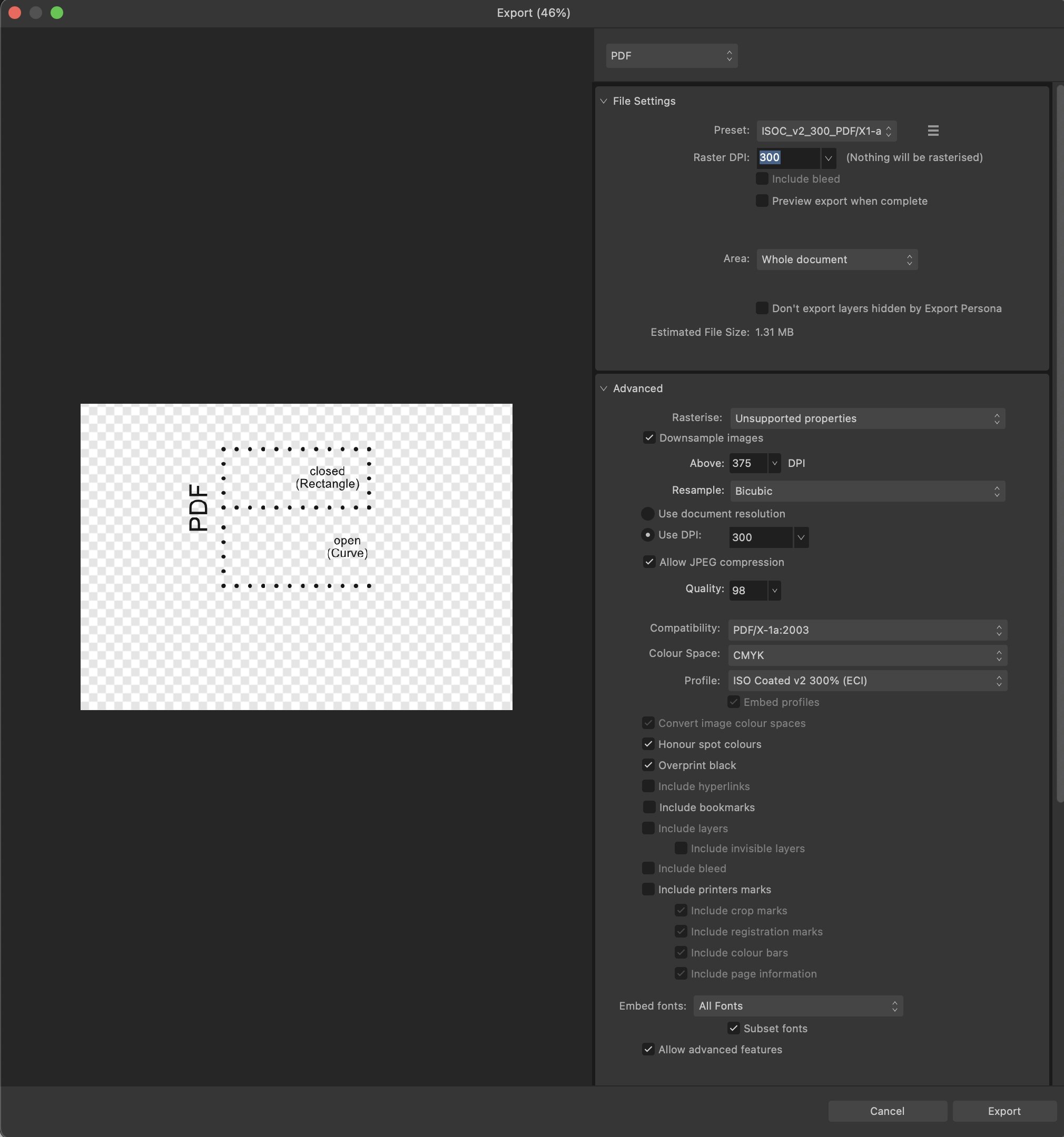
Thanks to y'all – @Pšenda for pointing out via Google all those other posts concerning the issue and @GarryP for pointing to v 2.6 (Presently I'm still on v 2.5.6 and I'll certainly check again after updating my apps to v 2.6 – I hadn't found the time yet…). I'll attache a screenshot of my Export settings, nevertheless.

-
Convert a selection to a path
Lorox replied to peexel's topic in Feedback for the Affinity V2 Suite of Products
In principle you're right, of course. Nevertheless my understanding is that those users really needing 1-bit TIFF support do so because they actually want to (or just have to) use those high resolution bitmap files (for whatever reasons – but there most certainly are some which are totally legitimate). If they were happy with their 1-bit images just being converted to paths they'd probably already had chosen other tools available which can just do that (e.g. Inkscape) and then placed the resulting vectors in Publisher for final output. -
Convert a selection to a path
Lorox replied to peexel's topic in Feedback for the Affinity V2 Suite of Products
I'm not sure if this (if you mean some sort of on the fly "conversion of 1-bit TIFF to path" to deal with it) will actually meet the needs (as to pixel perfet accuracy) of those users really needing the 1-bit feature. -
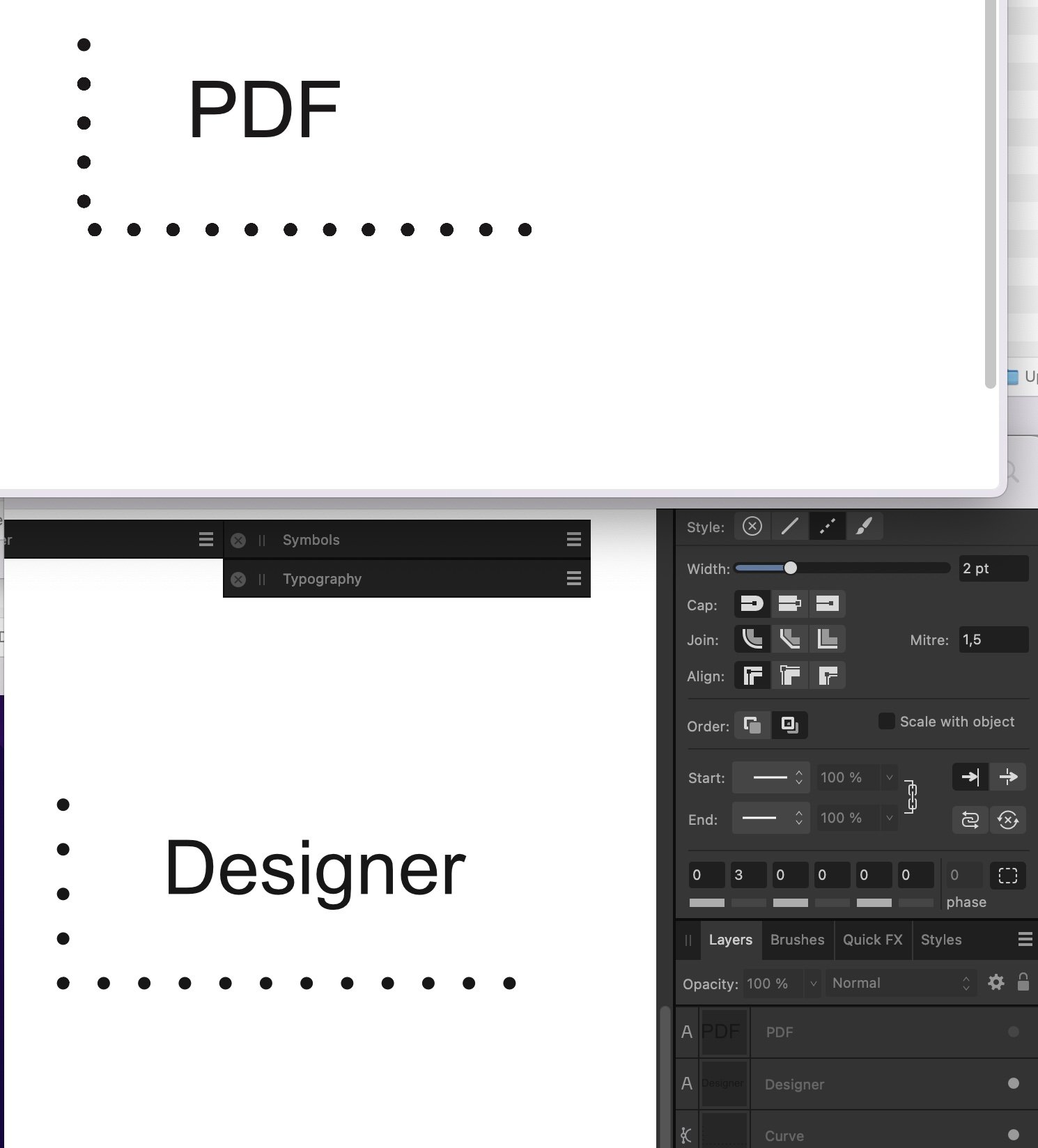
Just yesterday I notice that while some paths with a dotted stroke looked perfectly (or as intended) in my Publisher docoment/file they didn't transport correctly to PDF at all making the option of a "balanced dash“ as offered in the stroke panel effectively useless… – please see the attached screenshot. What's going on here? Obviously it doesn't really help workflow-wise if for a workaround you'll have to revert to two separate strokes again which have to be carefully aligned at the corner... It will look OK, but that's not what we expected when we got the ”Balanced Dash" option, I guess.