

AffinityJules
-
Posts
795 -
Joined
Posts posted by AffinityJules
-
-
On 6/8/2025 at 2:07 PM, Ldina said:
Another image taken using a similar approach. The background album cover on this one is from "Hot Tuna" (Jorma Kaukonen and Jack Casady, from Jefferson Airplane). This is an sRGB JPG for "accurate" presentation on the forum. Again, the DCI-P3 version is much more vibrant, especially the reds, but will not display properly here.

Apart from the fact that this picture is rather stunning, what is even more stunning (yes, I'm stunned again) is the fact that yet again you brought up a musician I absolutely love. Gold ole Jorma. Right now I'm reading his self penned Bio which is signed.
Pity his Fur Peace Ranch has moved on to new owners
-
-
"add a Recolour Adjustment layer by dragging it to the bottom of the group"
Actually the Recolour is dragged to the top of the group where it should be.
-
-
-
-
7 minutes ago, DelN said:
Finally, after a few hours (sometimes days😁), constantly saving as I go along, I see something developing... Often, it is not what I intended
Now that rings a bell. That's exactly what I tend to do as well. I start out trying to create something but in the end it tends to be entirely different to what I had imagined. Sometimes my silly pictures end up exactly as I intended, but that's a rare beast indeed. Being a hobbyist myself (definitely not pro) I have a lot of fun passing the time trying to be creative, I tend to avoid AI at all costs because I want to retain control of each and every outcome of the things that I do - but that's me.
-
-
-
-
-
-
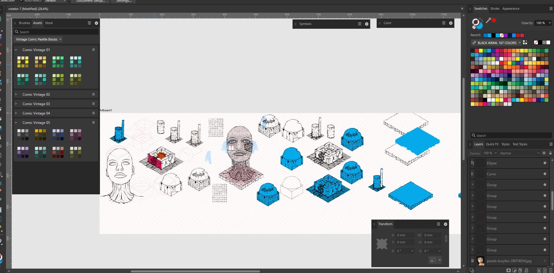
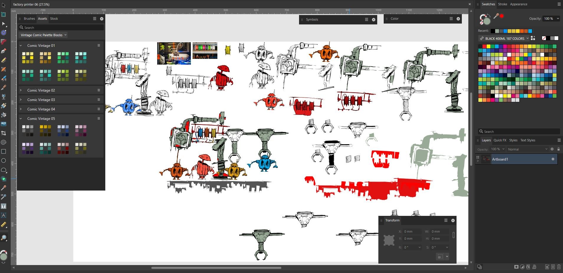
4 minutes ago, StuartRc said:
The creator File is here...Just trying to establish its content!:
I'm just a sucker for more information which I obviously don't know about.
Those files, are they really big or really small? I know that vectors can be enlarged without loss, but what is a happy medium when it comes to a starting file size?
-
6 minutes ago, StuartRc said:
It's not really a mistake..... It' just how the base fill turned out from the conversion (i.e. 'Fill Holes') Sometimes I just leave it in...
The actual sketch is a bit wider for factory and does include a fill version. All these drawing with the exception of 'First' are interim sketches. So the final drawing could look a lot different (and I get lots of vector resources to mess with!)
You can see it in the middle of the screen shot (all the objects are vector on screen)
Same apples to Creator..it is just 1 element of an isometric drawing....have not finalised what it will ultlimately contain but there are other vectors just not shown
Oh wow. . .I see what you mean.
-
3 minutes ago, StuartRc said:
It's not really a mistake..... It' just how the base fill turned out from the conversion (i.e. 'Fill Holes') Sometimes I just leave it in...
The actual sketch is a bit wider for factory and does include a fill version. All these drawing with the exception of 'First' are interim sketches. So the final drawing could look a lot different (and I get lots of vector resources to mess with!)
Fill Hole? Sounds dangerous to me.
I'm just glad you got my humour concerning it. 😄
-
-
-
-
Could you tell me what is meant by 'zine' and 'MOR?'
I'm lost in alien terminology!
-
34 minutes ago, j3rry said:
It has become pretty quiet around Affinity and its products, reminds me a bit of the last time with Aperture... I'm afraid something not so nice is coming our way
That's a crystal ball kinda thing.
But if silence is golden, then Affinity is lead!
-
-
-
2 minutes ago, Gianni Becattini said:
I already bothered you on this point but I cannot fix it - it is not a big problem but very annoying.
The problem is that the pen assumes a white fill and black stroke even if I set and synchroniza defaults, then save. For a while it works then starts again.
Grateful for help
I'm with you on this one.
I wish I could tell you how to fix it after trying everything, but after a while it comes back and rears its ugly head again.
It all started when those 2 new buttons appeared on the context tool bar. I would like an option where I can totally remove them and revert back to a time when the pen tool actually worked without hindrance.
-
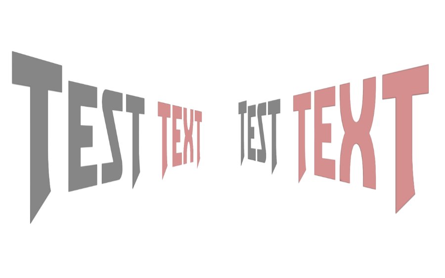
There may be other ways to do this other than the one I will describe here.
It works for me. . .
In this example I rasterised the text layers.
1. Create text
2. Duplicate text and flip it horizontally. (text will now be in reverse).
3 Select both text layers and turn off the reversed one ( so you can see what you're doing.
4. Warp text to how you want it etc. . .
5. Flip the reversed text layer.
6. You should now have two text layers with identical warp features.


Doone 2
in Share your work
Posted
LOL. . .don't ya just love it when a typo can take on such an amusing play on words.
Trouble is I don't think the author of the comment can amend it?