AffinityJules
-
Posts
795 -
Joined
Everything posted by AffinityJules
-
LOL. . .don't ya just love it when a typo can take on such an amusing play on words. Trouble is I don't think the author of the comment can amend it?
-
Apart from the fact that this picture is rather stunning, what is even more stunning (yes, I'm stunned again) is the fact that yet again you brought up a musician I absolutely love. Gold ole Jorma. Right now I'm reading his self penned Bio which is signed. Pity his Fur Peace Ranch has moved on to new owners
- 5 replies
-
- 1
-

-
- affinity photo
- macro
- (and 3 more)
-
 "That would recolour the whole canvas" No sir. The recolour will only effect those layers in the group and nothing else. Make sure the recolour is placed inside the group at the top of the stack
 -
"add a Recolour Adjustment layer by dragging it to the bottom of the group" Actually the Recolour is dragged to the top of the group where it should be.
-
affinity designer March of the Robots and Comic Book Template
AffinityJules replied to StuartRc's topic in Share your work
No cruising the waterways for this poor fellow then? I hope the next time you feature this fellow you'll give him a suitably larger tank to wallow around in. 😁 -
Top picture makes me think of a stick of rock (the sweet variety) which is melting, not like glass at all. . .interesting. Did I just say glass!? I meant water. . .Doh!
- 5 replies
-
- 1
-
-
- affinity photo
- macro
- (and 3 more)
-
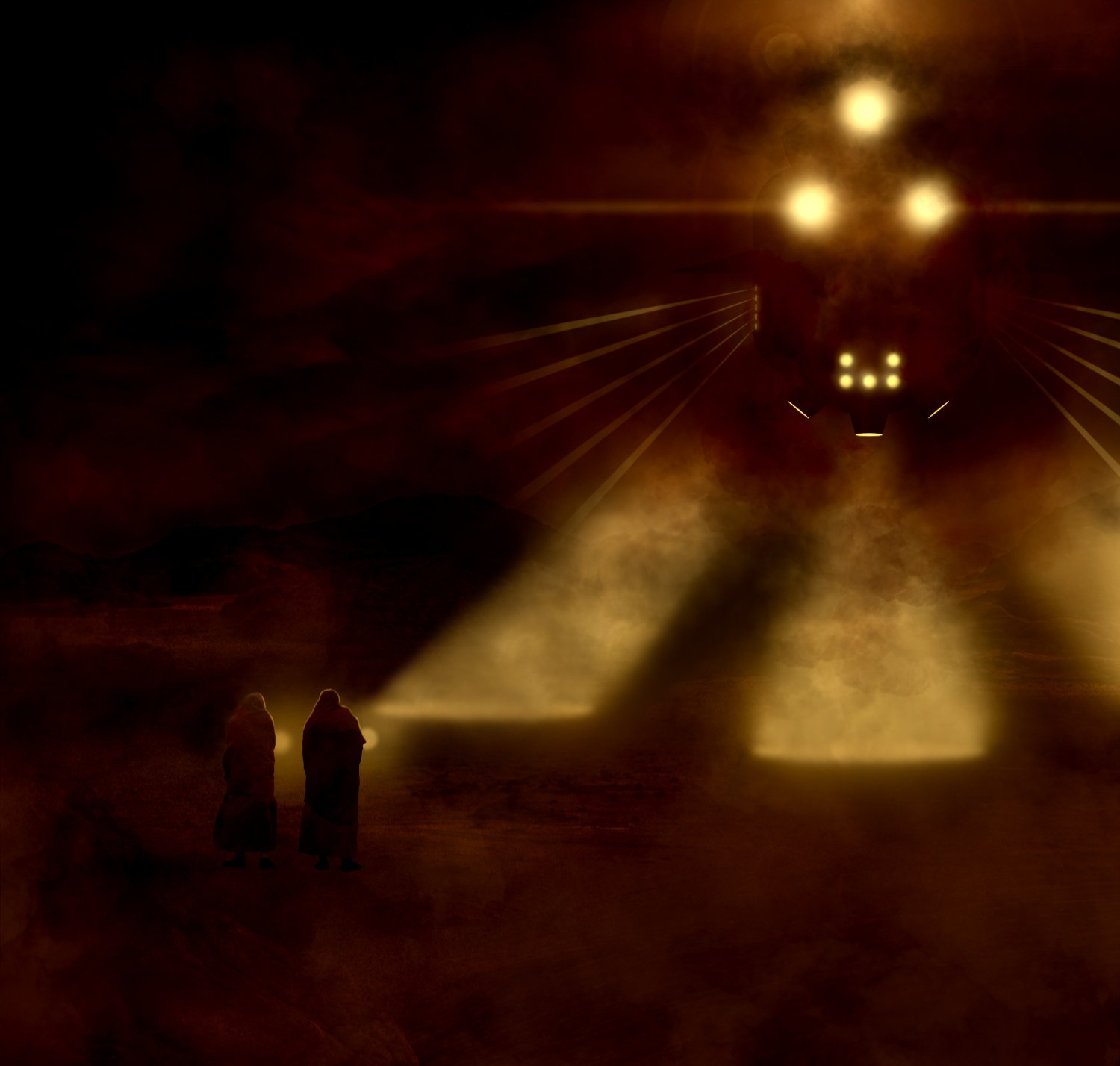
This one took its own flight path, I just pressed buttons and adjusted sliders when I was told to. And again, although not strictly copied from the Dune universe, the inspiration came from it.

-
Now that rings a bell. That's exactly what I tend to do as well. I start out trying to create something but in the end it tends to be entirely different to what I had imagined. Sometimes my silly pictures end up exactly as I intended, but that's a rare beast indeed. Being a hobbyist myself (definitely not pro) I have a lot of fun passing the time trying to be creative, I tend to avoid AI at all costs because I want to retain control of each and every outcome of the things that I do - but that's me.
- 6 replies
-
- 1
-

-
- anunnaki
- affinity photo
- (and 3 more)
-
When I look at your pictures I'm always reminded of Spirograph. 🙂 Oh what fun I had with that! And I'm sure it's the same with you when you put these pictures together.
- 6 replies
-
- 1
-
-
- anunnaki
- affinity photo
- (and 3 more)
-
affinity designer March of the Robots and Comic Book Template
AffinityJules replied to StuartRc's topic in Share your work
"Team" makes me wonder whether they're taking something apart or building something - lots of exposed wires. . .Zzzzzzap! All good. 😀 -
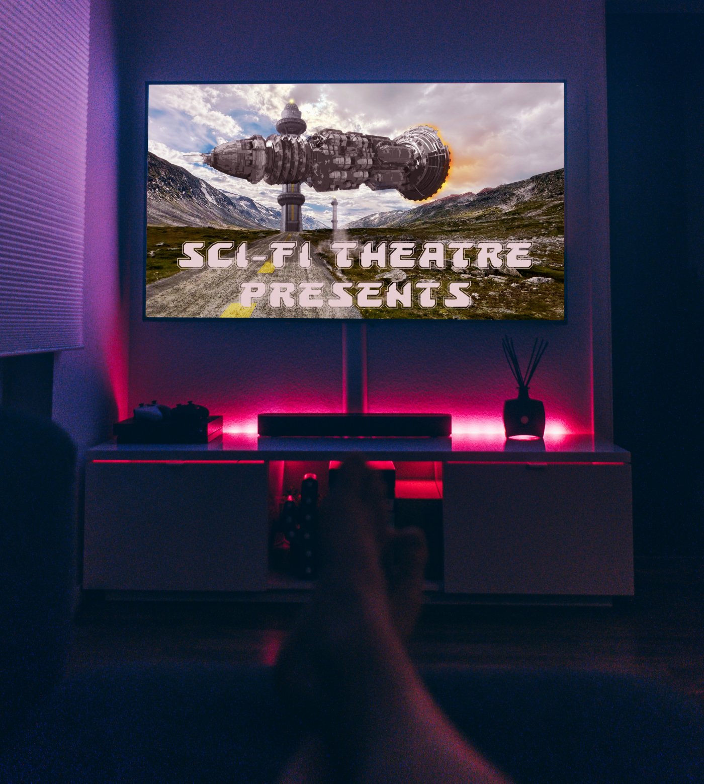
Follow up to a recent composite (Outer Gimmicks). This again is a double composite; the main picture being that displayed on the tv.
-
Make what you will of it, but somewhere in there a message waits to be acknowledged.
-
My chosen colour of the month turned out to be green. . .with a dash of orange. So be it.
-
affinity designer March of the Robots and Comic Book Template
AffinityJules replied to StuartRc's topic in Share your work
I'm just a sucker for more information which I obviously don't know about. Those files, are they really big or really small? I know that vectors can be enlarged without loss, but what is a happy medium when it comes to a starting file size? -
affinity designer March of the Robots and Comic Book Template
AffinityJules replied to StuartRc's topic in Share your work
Oh wow. . .I see what you mean. -
affinity designer March of the Robots and Comic Book Template
AffinityJules replied to StuartRc's topic in Share your work
Fill Hole? Sounds dangerous to me. I'm just glad you got my humour concerning it. 😄 -
affinity designer March of the Robots and Comic Book Template
AffinityJules replied to StuartRc's topic in Share your work
What!? Stuart made a mistake with the colouring in. . .no surely not? It might have been intentional - you don't know. Well tell him to check out the lefthand side blue cable spool - the top part is blank. Now you're just being a bit too picky! 🫣 Hehe... -
affinity designer March of the Robots and Comic Book Template
AffinityJules replied to StuartRc's topic in Share your work
I don't know why but 'Story' gives me a Venus Flytrap vibe, and going by the look on the woman's face I think she gets it too. All good. 😀 -
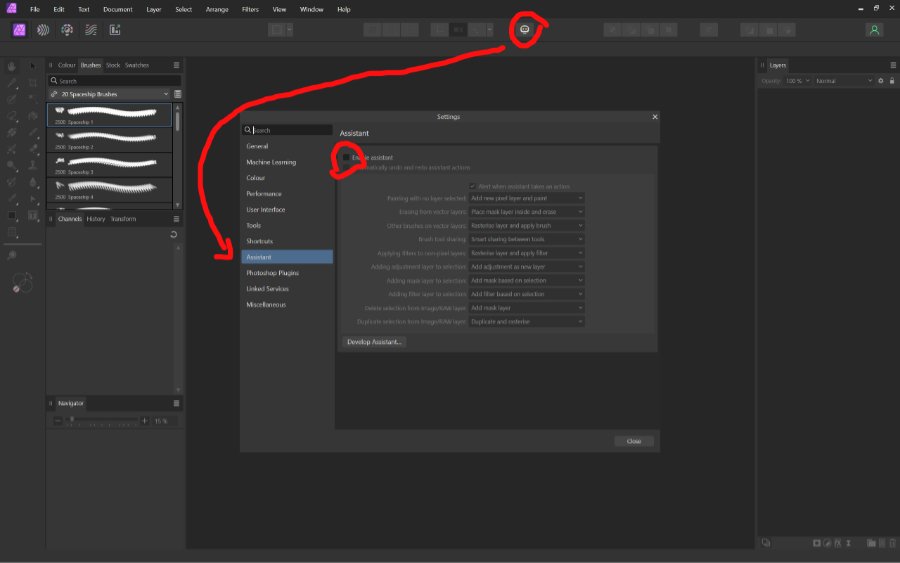
Turn off Assistant
AffinityJules replied to trixiesirish's topic in Desktop Questions (macOS and Windows)
-
affinity designer March of the Robots and Comic Book Template
AffinityJules replied to StuartRc's topic in Share your work
Could you tell me what is meant by 'zine' and 'MOR?' I'm lost in alien terminology! -
Too quiet …
AffinityJules replied to j3rry's topic in Feedback for the Affinity V2 Suite of Products
That's a crystal ball kinda thing. But if silence is golden, then Affinity is lead! -
affinity designer March of the Robots and Comic Book Template
AffinityJules replied to StuartRc's topic in Share your work
Ah! So it's all in a state of development. I get it for the most part but there is some terminology I don't understand, but there again I'm not a Vector user or designer. Anyway, thanks for a very detailed and comprehensive reply. -
affinity designer March of the Robots and Comic Book Template
AffinityJules replied to StuartRc's topic in Share your work
All good once again. I wonder when I look at all the comic book based pictures that you do whether or not you intend to create a full comic (word balloons too) with a story and recurring characters? Or is it your intention to create stand alone examples that are experimental based? -
AP defaults for pen
AffinityJules replied to Gianni Becattini's topic in Desktop Questions (macOS and Windows)
I'm with you on this one. I wish I could tell you how to fix it after trying everything, but after a while it comes back and rears its ugly head again. It all started when those 2 new buttons appeared on the context tool bar. I would like an option where I can totally remove them and revert back to a time when the pen tool actually worked without hindrance. -
Duplicating and mirroring perspective text
AffinityJules replied to rrrgee's topic in Desktop Questions (macOS and Windows)
There may be other ways to do this other than the one I will describe here. It works for me. . . In this example I rasterised the text layers. 1. Create text 2. Duplicate text and flip it horizontally. (text will now be in reverse). 3 Select both text layers and turn off the reversed one ( so you can see what you're doing. 4. Warp text to how you want it etc. . . 5. Flip the reversed text layer. 6. You should now have two text layers with identical warp features.