-
Posts
3,560 -
Joined
-
Last visited
Everything posted by toltec
-
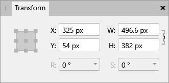
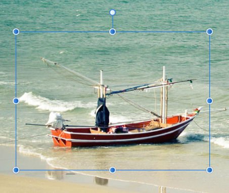
Ah. You mean transforming the selection boundary (area). Well, as you said, to transform (resize/rotate etc) press Q (Quickmask) then V (Move tool) to resize, stretch, move, reshape etc. Press Q again to return to normal. You can also just click inside the selection area and drag it or use the nudge arrows. Unless the Selection Brush is active, in which case you just need to select a Marquee Tool (M) first. You can also resize, move, squeeze or stretch the selection area with the Transform panel. Enter a numeric value in the box, press and drag on X Y W or H or turn the mouse wheel over the entry box. I use that quite often to fit an eye or something similar as it is very precise.
-
I think the problem is, that you and I interpret the word 'page' differently. OK, I have a project that requires me to be able to describe the differences of each (or identify each) with a single word. 'Canvas', is well used for Photo and Photoshop to describe the area upon which an image is placed on, or cropped to. That is so well established it would be stupid to try and change it. 'Page', is well used to describe a Publisher or InDesign area, organised into pages. A page in other words. Artboard describes a Designer or Illustrator area, which is sort of half page/half canvas. "XXX" a one word description for a standard Designer area that would help new users. You can't call it a canvas because it has very different properties to a Photo/Photoshop type canvas (in particular the lack of a trim option) and we need to distinguish the two. It is obviously not an Artboard unless we make it so I know that Adobe (Illustrator) used to describe this entity as a page, but you don't like that. So what single word would you use to describe it ? I will admit I am a bit biased towards 'pages' because I have been creating pages for 30+ years. Even now, although they are mostly web pages, they are still pages. I am open to sensible options though.
-
You have totally twisted (or totally misunderstood). I have been trying very hard to make this simple for new uses (or ex Adobe users) to understand the difference between a Designer, page based document and a Photo, canvas based document because that affects the ability to layout (bleeds etc) and "Trim" the page. Affinity Designer users should bear the difference in mind before starting work and decide whether to create a standard page or an artboard. Ideally! How are your arguments in any way helping them ? Getting back to basics, are you still saying Affinity Designer is based on the canvas metaphor ? Your first argument or could the Adobe description be more accurate (or at least, far more common} ? A simple yes or no would be appreciated.
-
I'm not 100% sure what is going wrong for you. First of all, you must Ctrl + click on the layer thumbnail, which I guess is Cmd + click on a Mac. Alignment Outside (or Alignment Centre) will only work if the layer is smaller than the canvas. Remember that the OP wanted to place a border around 'floating' images. It won't work if there is no space to fit it. So, using the 'floating' layer for the deer (floating on a transparent canvas) press Cmd + click on the layer thumbnail to get a selection (as shown). You can then use the Outline Selection (Outside) to make a selection border all round the deer image (say 50 pixels) Click apply, then you can fill the outline with colour. Edit > Fill. You will have to press Cmd + D to deselect afterwards. As I said, Outline will only work for images where there is space on the canvas to apply the border. Hope that explains it better ?
-
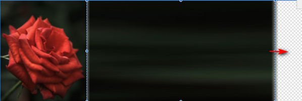
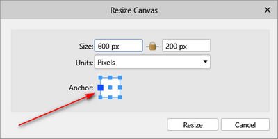
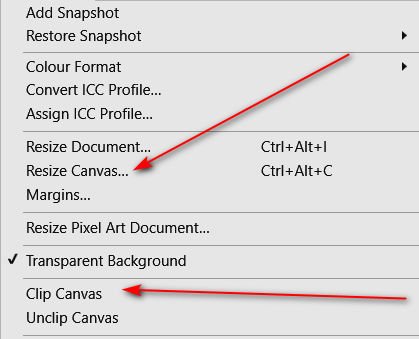
Very hard to say without seeing an exact example but one method is to select one edge and draw it out Make the canvas wider, based from one edge Make a pixel selection of the edge of the image and use the Move Tool to stretch the selection out You will probably have to clean it up quite a bit. The other alternative is to make the canvas bigger, then just copy and paste loads of times.
-

Inverted Cog?
toltec replied to Steel Rat's topic in Pre-V2 Archive of Affinity on Desktop Questions (macOS and Windows)
I'm just not geared up to answer those types of question. -
I think you have to give people a bit more credit, just as long as you don't mislead or confuse them. Would you describe a Corvette to a visitor from Mongolia as 'like a sedan' or as a 'family car' (small family of two)? Most people would still call it a car and park it in a 'car' park and if not misled, they would soon work out the rest if you just described it as a car. i.e "how many seats ?" In common Adobe speak ... A single sided Indesign or Publisher document is a 'Page' An single side Photoshop or Photo document is a 'Canvas' A sided Illustrator or Designer document is a 'Page' A single sided Illustrator or Designer Artboard is 'Like a Page' I do agree that Artboards confuse things slightly because although they are described as 'Like a Page' they behave somewhat 'like a canvas' If you want to know whether the page can be resized later (pages, like Quark, InDesign or Word pages are very hard to resize) look in the help files, or ask. That's what I would do unless someone confused me by saying a Designer page is a canvas and I expected it to work like a Photoshop canvas. There are a lot or former Adobe users out there.
-

Inverted Cog?
toltec replied to Steel Rat's topic in Pre-V2 Archive of Affinity on Desktop Questions (macOS and Windows)
Yes, it's nice when people can mesh to come up with new ideas -
Ah, but you said When it is clearly not based on the canvas metaphor. Neither Adobe Illustrator nor Affinity Designer are. I am not sure why you are talking about Artboards? I would point out that neither the original posts by the OP or by me were talking of Artboards. We were both talking about using a "standard" Affinity Designer page. The only mention of Artboards was using them as a solution to the OP's "Trim" question. Tens of millions of Adobe Illustrator users have been referring to pages as pages since March 1987 (I think) and adopted Artboards as "like pages" when they came along. You can call them flamingos if you want, but it will only cause confusion to the millions of Adobe Illustrator users who listen to you. I'm sure they all do
-
I have just read my official Adobe published, Illustrator CS5 book and I quote "Artboards represent the regions that can contain printable artwork, similar to pages in InDesign". Note the use of the word "pages" not "canvas". That the way I have been thinking of them for the last 30 years and I think that is the only sensible way. And Adobe agree (Adobe who ? )
-
I have to respectfully but completely disagree with you on that. Designer is NOT based on a Canvas !!! I appreciate that both programs sometimes confusingly refer to Page or Canvas but the correct (historically) and least confusing term for Designer type pages is Pages. EDIT. I have just read my official Adobe published Illustrator CS5 book and I quote "Artboards represent the regions that can contain printable artwork, similar to pages in InDesign". Note the use of the word "pages" not "canvas" You can't resize a canvas in Designer ? The OP was confused because they wanted to resize the "canvas" to an object, which is not possible. Photo does refer to resizing Canvas, which you can resize to an object (a common term). We have always referred to an image in a Photoshop type program as being on a canvas, a mixture of pictures and artwork on an Illustrator type program with bleed and crop marks as being on a Page. Photoshop is definitely based on a Canvas and Adobe Illustrator pages are based on pages or maybe Artboards ? And if you think of canvases in Designer, how would you translate them into multi-page PDF documents Of course, there is some overlap with the two programs but your argument will only confuse people even more. BTW. How will I set up a 6 canvas tri-fold document in Publisher or Designer. And is the canvas on the middle called "Canvas 3" or "Canvas 4"? And of course, what about the canvasination? So what would you call them to avoid confusing new users and why is your name better than Adobe's name ?
-

Inverted Cog?
toltec replied to Steel Rat's topic in Pre-V2 Archive of Affinity on Desktop Questions (macOS and Windows)
You could play around with a cog and a donut as @v_kyr suggests. See the attached file cognut.afdesign -

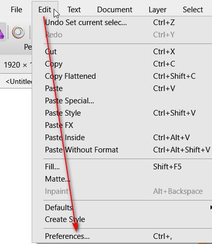
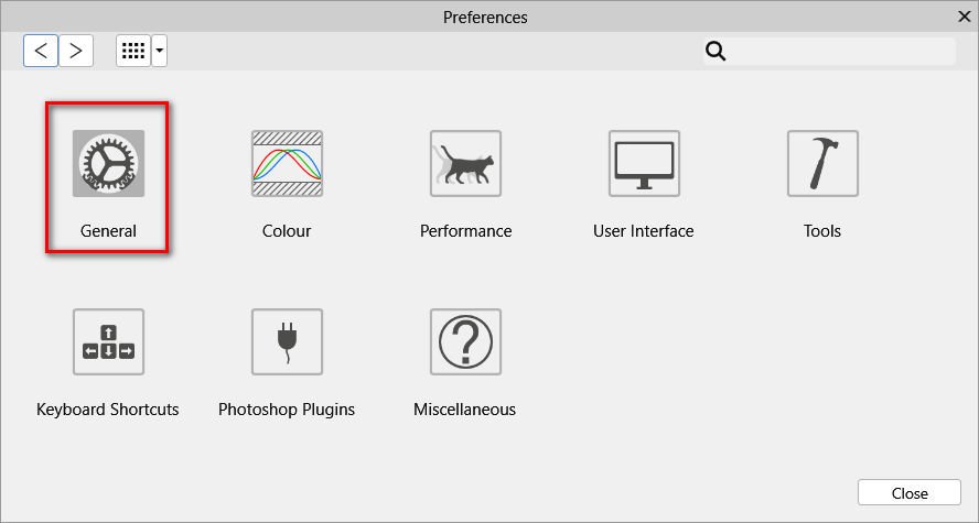
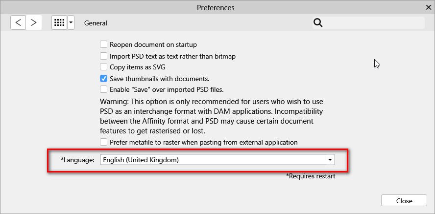
Change Language
toltec replied to Tinta's topic in Pre-V2 Archive of Affinity on Desktop Questions (macOS and Windows)
-

Text Box
toltec replied to Jimmy Rapp's topic in Pre-V2 Archive of Affinity on Desktop Questions (macOS and Windows)
-
I think I would start with: Cropping for better image composition / straightening Perspective correction Colour balance / Exposure correction (demonstrate the Auto filters and manual correction). Red Eye Removal / Blemish removal / Inpainting Sharpening (Unsharp Mask and Clarity). To give an idea of something a bit more advanced: Change the colour of something (that always impresses). A lens blur or Gaussian blur to lose a messy background. A bit of composition. Cut out/refine edges and composit. Those three are pretty easy to do but have a good impact on new users. Nothing that can't be done in just about any editor but AP does them all very well. One more. A bit of body shaping with Liquify never hurts !


