GarryP
-
Posts
14,670 -
Joined
-
Last visited
Everything posted by GarryP
-

2-color shape
GarryP replied to TokyoMike's topic in Pre-V2 Archive of Desktop Questions (macOS and Windows)
You can use the Fill Tool to achieve this. See attached video. Make sure you edit the gradient from the Context Toolbar – rather than directly on the layer – otherwise this ‘trick’ doesn’t work. 2020-06-11_08-48-50.mp4 -
Separating converted fonts
GarryP replied to Rickydicky's topic in Pre-V2 Archive of Desktop Questions (macOS and Windows)
You're welcome. -
Welcome to the forums. Right-click on the Image layer and choose “Release Mask” (the image is currently a “cropping mask”). That should make the image a ‘normal’ Image layer again.
-
Collecting E-signature
GarryP replied to AlanAF's topic in Pre-V2 Archive of Desktop Questions (macOS and Windows)
Welcome to the forums. The short answer is currently (as of 1.8.3): No, not within Publisher itself. However, someone might be able to give you some idea of other software which you can feed your PDF into to get that working. -
Separating converted fonts
GarryP replied to Rickydicky's topic in Pre-V2 Archive of Desktop Questions (macOS and Windows)
Welcome to the forums. With the “i” selected, try menu “Layer → Geometry → Separate Curves”. -
Unless I have misunderstood your requirements, you can use the Alignment Handles to align multiple layers to the fixed position of one layer if you have Snapping switched ON. See attached video for some examples. 2020-06-10 09-53-02.mp4
-
Flower - stuck!
GarryP replied to Callum Elliott's topic in Pre-V2 Archive of Desktop Questions (macOS and Windows)
You're welcome. -
Flower - stuck!
GarryP replied to Callum Elliott's topic in Pre-V2 Archive of Desktop Questions (macOS and Windows)
In addition to the advice above, my attached video might give you some ideas. 2020-06-09_09-44-56.mp4
-
Brush tools wont work
GarryP replied to oatniq's topic in Pre-V2 Archive of Desktop Questions (macOS and Windows)
Would you be able to provide a video of this happening? That would help us to see what was going on a lot better. -
You're welcome.
-
From one to another!
GarryP replied to Dmacb's topic in Pre-V2 Archive of Desktop Questions (macOS and Windows)
Welcome to the forums. Make sure that you won’t break the license agreement https://affinity.serif.com/en-gb/licence/ (Windows version, couldn't find Mac version) before you try to install the software on another machine: Quote: “As a private individual, you can download, install, use and run for personal use, one copy of the Serif Software directly on each computer running either (depending on your purchased license) Microsoft Windows (“Windows Computer”) or macOS (“Mac Computer”) that you personally own or control.” Quote: “(i) if you are a private individual, to download, install, use and run for personal use, one (1) copy of the Serif Software directly on each computer running Microsoft Windows (“Windows Computer”) that you personally own or control. Commercial use is permitted but only use by you and not by any other users of any Windows Computers that you own or control. For example, other members of your household that use your Windows Computers may make personal use of the Serif Software whereas, if anyone other than yourself needs to make commercial use of the Serif Software, the other user will need to make a separate purchase.” (I'm assuming that this relates to Macs too.) I don’t know if you will be okay in your particular case but it’s worth making sure before you try installing anything on a machine that you don’t own or control (whatever 'control' means), just in case. -
brianAB
GarryP replied to brianAB's topic in Pre-V2 Archive of Desktop Questions (macOS and Windows)
Welcome to the forums. The trial versions are only limited by the amount of time you can use them. All the functionality is the same as the non-trial versions within that time period. Can you give us a full-screen screen shot showing the issue please? Important Note: Old tutorials may not be kept up-to-date with the way the software works now. -
Brush tools wont work
GarryP replied to oatniq's topic in Pre-V2 Archive of Desktop Questions (macOS and Windows)
Welcome to the forums. When you say “hover the paint cursor over the stuff”, what do you mean by “hover”, what do you mean by “paint cursor” and what do you mean by “the stuff”? Can you give us a video and/or a more precise description of exactly what you are doing please? -
Paste in Place on Facing Pages
GarryP replied to Jim_Tim's topic in Pre-V2 Archive of Desktop Questions (macOS and Windows)
You’re welcome. It might be worth saying that you don’t need to apply a master page to every page, only the pages you want to use it on. My example was just to show that you can use the same thing on all pages if you need to. If you don’t need to use a master page on a ‘normal’ page then just don’t apply it or, if it’s already applied and you don’t want it to be, then remove it via the Layers Panel (right-click and choose Delete). -
Paste in Place on Facing Pages
GarryP replied to Jim_Tim's topic in Pre-V2 Archive of Desktop Questions (macOS and Windows)
Here’s a simple example where I create a single-page master and apply that to a facing-page master. Note how you can edit all of the pages at the same time via the Edit Linked function. 2020-06-07_13-09-04.mp4 -
Paste in Place on Facing Pages
GarryP replied to Jim_Tim's topic in Pre-V2 Archive of Desktop Questions (macOS and Windows)
I don’t think you can easily do what you want. The paste function takes the spread as the place you are pasting to and so the pasted layer is placed exactly where it was originally. If you want the same thing in the same place on multiple pages then you might be able to use master pages – depending on your precise requirements – but I’m pretty sure you can’t do what you want on a normal spread. I’d be happy to learn otherwise though. -
Menu Items and Prices
GarryP replied to Dai777's topic in Pre-V2 Archive of Desktop Questions (macOS and Windows)
Have a look at my attached document. In particular, look at the Tab Stops settings for the “Menu Items” Text Paragraph Style. tab-stops-for-menu.afdesign
-
Image with caption
GarryP replied to foto-grafic's topic in Pre-V2 Archive of Desktop Questions (macOS and Windows)
You need to add your captions manually with either a Text Frame or Artistic Text. If you have lots to do then consider making some Assets to make the process quicker. -
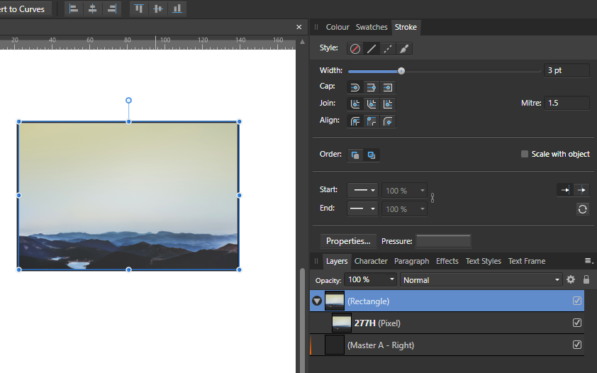
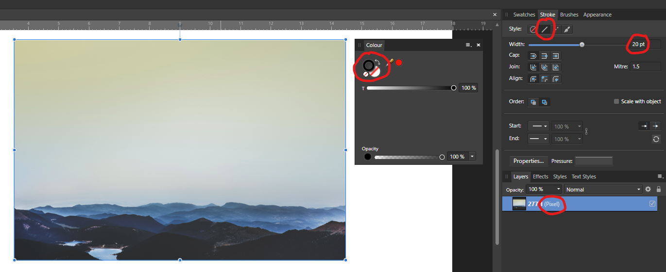
I think we may need some clarification from the team on whether we are supposed to be able to add a Stroke (or a Fill) to a Pixel layer. If we should be able to then the software doesn’t seem to allow this, which sounds like a problem to be fixed. If we shouldn’t then the software is fooling us unto using functionality that has no purpose (in this case) which, again, is something that probably needs to be fixed. Either way, it looks like something needs ‘fixing’ here. MikeA: I’m not sure what you want now – I don’t know if the first thing is related to the second thing, one was outlines the other something to do with Geometry(?) – but it sounds like you could put your image layer(s) inside a Rectangle layer and give that Rectangle layer the Stroke outline, see attached image.
-
I think you should be able to add a Stroke to the boundary of a Pixel layer in Publisher (or the other Affinity apps) but I can’t seem to be able to do that for some reason, see attached image (from Designer, but same thing in Publisher). Maybe it’s too early on a Sunday morning but this doesn’t make sense to me at the moment. Surely I must be doing something wrong, or forgetting something basic/important.
-
Thanks dannyg9. I was going for something ‘punchy’ so I’m glad that came across.
- 2 replies
-
- 1
-

-
- experiment
- comedy tour
- (and 3 more)
-
Poor old Bob. He’s taking his comedy tour on the road but doesn’t know where he’s going. Two posters, both experimental ideas along the same lines, just for a bit of fun. Done in Designer and Photo (probably could have been done in either alone). The main image – which I (quickly) isolated from its background – can be found here: https://gratisography.com/photo/crazy-eyes/
- 2 replies
-
- 5
-
-
- experiment
- comedy tour
- (and 3 more)
-
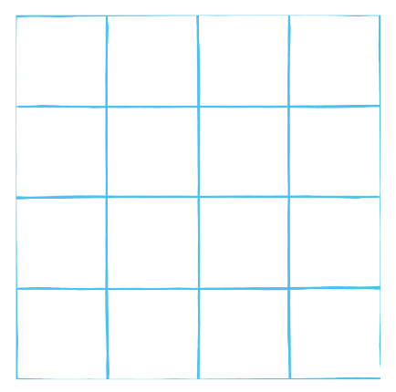
You can get a quite decent ‘hand-drawn’ look by using a brush on a vector line. See attached image and document. Have a look at how I have used the different line lengths to simulate the pen line being drawn differently. Not perfect by any means, but quick. P.S. The ‘Minor’ group of objects in my attached example shows one way to create dashed lines in a similar way but it’s very messy and I wouldn’t advise using the same method, but it might be useful to know about. hand-drawn grid test.afdesign
- 6 replies
-
- 1
-
-
- affinity designer
- grid
- (and 2 more)
-
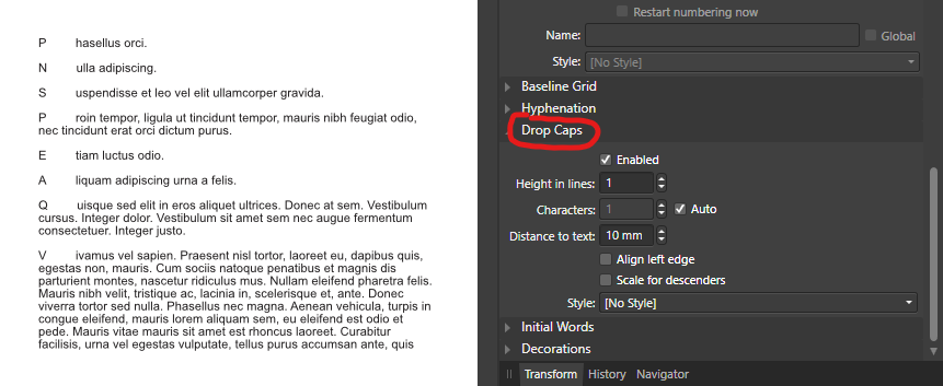
Welcome to the forums. It looks like you might have accidentally used Drop Caps in your Paragraph formatting but it’s difficult to tell without looking at the document. Would you be able to supply the document, or a cut-down version of it?
-
Another newbie question
GarryP replied to Espen A's topic in Pre-V2 Archive of Desktop Questions (macOS and Windows)
As an alternative, you can create a large rectangle, then create a grid of lines over the rectangle. You can then select all of the lines, use Expand Stroke, then use the Geometry Divide function to create a grid of squares. One issue with this is that the resultant squares will be slightly smaller than the ‘grid’ you made with the lines, but that might not be a problem in some circumstances.