GarryP
-
Posts
14,682 -
Joined
-
Last visited
Everything posted by GarryP
-

Interactive brush size
GarryP replied to Dmi3ryd's topic in Pre-V2 Archive of Desktop Questions (macOS and Windows)
You can use the “[“ and “]” keys to resize the brush instead. -
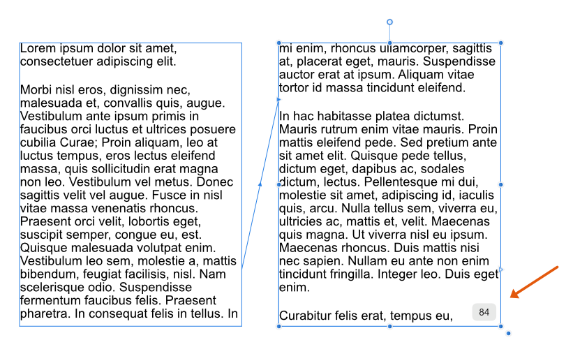
I think it might be useful if, when using Filler Text (see note below), the last frame of the chained Text Frames displayed the word count, see attached image (word count not exact, just a mock-up). This would be helpful in situations where the writer, editor and layout artist wanted to be fairly sure that the text will fit into the layout. For example: * Editor tells the writer to produce, say, 1000 words; * Editor tells the layout artist to use a certain layout; * Layout artist creates the layout and uses filler text while the copy is being prepared; * Layout artist notices that the text frames will either probably not hold the prescribed number of words or will probably leave a big gap; * Layout artist advises the editor; * Editor tells the writer to either cut their copy down to fit or write more copy. This may allow the layout artist and writer to be able to reasonably ensure that the copy which is submitted is nearer to the required length earlier in the production process and, therefore, lessen problems later on when deadlines are nearer. This isn’t a major thing for me – I probably won’t use it at all personally – but I think some people might benefit. Note: I am not requesting that this word count is provided for non-Filler Text, this is just for when Filler Text is used. (A word count for ‘normal’ text has been discussed elsewhere and I don’t want to go over all that again.)

-
- 1
-

-
- publisher
- word count
- (and 1 more)
-
Welcome to the forums. It will help us to diagnose the issue if you can let us see your document, your export settings and your exported output. It will also help us if you say what you are trying to do, rather than what you are doing, as we might have advice for better workflow.
-
Linking and embedding
GarryP replied to Lupo76's topic in Pre-V2 Archive of Desktop Questions (macOS and Windows)
In Photo, placed images can be considered to be embedded and so can be edited in-place. However, the type of editing that you can do to an (Image) layer is slightly restricted until you Rasterise the layer so it becomes a (Pixel) layer. Restrictions vary depending on what kind of editing you want to do. Sometimes the Assistant will automatically rasterise an (Image) layer to a (Pixel) layer for you, but not always. Just try editing each image until you can’t do what you want, at which point you will probably need to rasterise it, which ‘converts’ the (Image) layer to a (Pixel) layer with the same DPI as the document. -
Linking and embedding
GarryP replied to Lupo76's topic in Pre-V2 Archive of Desktop Questions (macOS and Windows)
The Help you linked to is for the Publisher application. Publisher is the only Affinity application which has the Resource Manager. Is this the application you are using? -
Duplicating Live Filter (Perlin Noise) Crash
GarryP replied to Sarper's topic in V1 Bugs found on Windows
I could not replicate this with Photo 1.8.3.641 on Windows 10. Procedure used: * Create new file (SVGA web preset with no background transparency); * Create white Rectangle layer which covered the canvas; * Add Live Noise Filter (intensity 50%) - not Perlin Noise, there is no Live Perlin Noise Filter; * Duplicate the Rectangle layer. Tried a few different settings and different ways to get it to crash – add a fill layer instead, duplicate the filter layer instead, use different intensity, etc. – but could not get it to crash. Can you give us the exact – step-by-step, click-by-click – method that causes the crash? -
Without being able to look at your actual document it’s difficult to tell what is going on but are you sure that you have the correct page/spread set-up? It looks like you have a facing-pages spread of two landscape pages. In other words, it looks like your “Page 1” and “Page 2” are on a left-hand page of a facing-pages spread while your “Page 3” and “Page 4” are on a right-hand page of the same facing-pages spread. If that is the case, then you will probably need to change the page sizes (and their orientation) and reorganise your content accordingly. If that is not the case, would you be able to make a copy of the document with the content stripped out that you can upload?
-
Text Frame
GarryP replied to Harnaak's topic in Pre-V2 Archive of Desktop Questions (macOS and Windows)
To rephrase my earlier question, what do you mean by “inside”? Do you mean the ‘visually within the bounds of’ or ‘contained within as a child layer of’, or something else? If you mean the former then you seem to have that already. If you mean the latter then please explain why you need this. If you mean something else then you will have to explain further. -
To add to what anon2 said above, if you downloaded the application from Serif – rather than from the App Store – you will need to install the application before you use it. To install the application see this post: https://www.howtogeek.com/177619/how-to-install-applications-on-a-mac-everything-you-need-to-know/
-
Saving
GarryP replied to Sherwood's topic in Pre-V2 Archive of Desktop Questions (macOS and Windows)
Welcome to the forums. Are you sure that you are sending them the correct file? If you send someone a file, say a PNG, it cannot be ‘magically’ converted to an Affinity document via the transmission or opening process. If you really are sending them a PNG then what they will get is a PNG. It might be somehow corrupted by the transmission process (if you are unlucky) but it will not change into a different type of file. If the PDF or PNG (or another file type) opens with an Affinity application then that will probably be because you, or someone else, or the machine itself (somehow), has told the operating system that that sort of file should be opened by an Affinity application. (How you would change this depends on your OS and has been answered a number of times in the forums.) P.S. Saving with a different filename extension does not save the file in a different format, it just saves the same sort of file but with a different extension. -
Thanks for the extra information but I’m still not clear as to what is causing the confusion and I am also a bit more confused about your document myself now. The red rectangles (are these the margins?) for page 1 and page 2 in your first image do not match the red rectangles in your second image in relation to where they seem to be on the page (small gap in first image, large gap in second image). Also, the red rectangles don’t seem to have the same top/bottom distances from the top/bottom of the pages they are on which makes me wonder what they are. Also, if your pages contain text and images – like most documents – in a decent layout then whether there is a line between ‘pages’ or not should not really matter. For instance, a takeaway menu is usually a sheet of paper folded in a couple of places. It is normally perfectly readable whether it is folded or spread out, the reader not having any need to have a line where the fold should be. I don’t understand why there is any confusion about not having a line between the pages in your document. Can you supply us with a document (AFPUB) which displays the issue(s) so we can see how your document is constructed?
-
Text Frame
GarryP replied to Harnaak's topic in Pre-V2 Archive of Desktop Questions (macOS and Windows)
Thanks for supplying the mock-up Harnaak. Is there some reason why you need – or think you need – the figure Image and Text Frame to be “inside” the larger Text Frame? I only ask as your mock-up seems to do a reasonable job as it is so I am wondering what extra you would achieve by putting the other layers “inside” the larger frame. If you need the figure text and image to move with the text (after editing perhaps) inside the larger frame then Pinning – as mentioned by Wosven above – would give you what you want (put the image and text frame inside a group and then pin the group within the larger frame) but you might not need to do this. What you should do really depends on exactly what you need and we don’t have enough information yet to be sure that we are giving you the best advice. -
Text Frame
GarryP replied to Harnaak's topic in Pre-V2 Archive of Desktop Questions (macOS and Windows)
Welcome to the forums. Would you be able to show us a mock-up of the sort of thing you want to do? It sounds like you might be trying to do things ‘the long way round’ but I cannot tell from your description. (E.g. Putting a Text Frame inside another Text Frame is not a ‘usual’ thing to do.) The more information you can give us as to what you want and what you want to do with it the better. -
If you want to do that sort of thing well, and often, I would probably recommend getting some brushes that have been created specifically for that sort of thing. I’m sure someone with experience in this area can point you towards some good resources but this may be a good place to start: https://affinity.serif.com/en-gb/store/product/daub-watercolours-and-washes-brush-pack/
-
Marquee select
GarryP replied to Algebraist's topic in Pre-V2 Archive of Desktop Questions (macOS and Windows)
Oops. Sorry. Completely forgot about the various Marquee Tools in the Pixel Persona (I don’t go in there much since buying Photo). I don’t think you can add/subtract multiple layers from an existing selection with the Move Tool. You can use SHIFT to add/subtract individual layers from the selection but not multiple layers at the same time, as far as I know. I’ve had a bit of a play around and I can’t figure out a way to do it but I could be wrong and someone could correct me. -
You’re welcome. I don’t think you should have needed to think about the alignment type; it should have just worked (unless I’m missing some important information). As R C-R said above, it could have already been reported as a bug (however the same problem is still evident in the 1.8.4.650 beta).
-
The issue I tried to highlight was that the Stroke of the ellipse was not being drawn around the edge of the ellipse, it was being drawn somewhere ‘outside’. See the video where the position of the Stroke doesn’t match the shape being dragged about (the blue outline). Also, the Fill of the ellipse doesn’t seem to ‘fill’ the whole shape according to the thumbnail in the Layers Panel. Or, to look at it another way, the Fill may be correct while the Stroke is ‘wrong’ somehow.
-
Like watching a teleprinter!
GarryP replied to J L's topic in Pre-V2 Archive of Desktop Questions (macOS and Windows)
Text editing can sometimes be quite slow in Publisher and the developers are aware of it. E.g. https://forum.affinity.serif.com/index.php?/topic/90298-very-sluggish-performance-with-lots-of-text-loaded/ Have you tried the latest Beta version of the software? (Work on a copy of your document just in case you need to go back to the pre-beta version.) -
I have been able to replicate the problem by using “Align Stroke to Inside”. When that is set the problem occurs, but when “Align Stroke to Centre” is used the problem does not occur. See attached video. I have no idea why this should be. 2020-06-27 08-59-47.mp4
-
I believe the problem is something to do with how the white ellipse is being drawn where the Stroke no longer follows the outline of the shape, see attached video. (Note also, if you can see it, that the ellipse thumbnail in the Layers Panel has a small black ‘dot’ in the centre where what looks like the Fill doesn’t match the extents of the shape.) Unfortunately I have no idea how this has happened, or what can be done to fix it, or stop it from happening again. 2020-06-27_08-50-51.mp4
-
Are you sure that your keys are working? Have you tried this key combination with other software? (It’s a long-shot since it happens on two machines but worth asking.) Do you have alternate SHIFT/CMD keys that you can try? (I don’t know what you have on your keyboard.) We might need a video to see what’s happening.
-
Marquee select
GarryP replied to Algebraist's topic in Pre-V2 Archive of Desktop Questions (macOS and Windows)
Just so we have a better idea of what you mean, are you using the Move Tool or the Node Tool, or something else? (There is no “Marquee Select Tool” or “Marquee Tool”). Also, do you want to select/deselect Layers or Nodes? -
This could happen for a number of reasons, if you mean that you see crosses at the sides and corners of the Text Frame boundaries. One could be that your Text Frame is Locked (look at the layer in the Layers Panel). Another could be that your Text Frame is on a Master Page (next step depends on what you want to do). If you see something else then we may need to see it for ourselves in a screen shot.
-
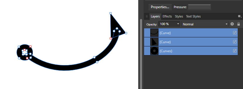
This works okay for me in Designer 1.8.3.641 on Windows 10. With a double-arrow-head line I get three layers after expansion, one for the curve and one for each arrow, see attached image. I think this is the first time I’ve tried expanding the stroke of a curve with arrow-heads, that I can remember, so I might just be lucky this time.
-
I guessed you were kidding. If I used emojis it might help to get my point across better sometimes but I don’t know how to use them properly. I probably need to try and adjust my style of writing. Thanks. I’ve had some great help in these forums so I do what I can to help others when I can.