Kasper-V
-
Posts
419 -
Joined
-
Last visited
Everything posted by Kasper-V
-
 Nope! Definitely the latest 1.7.1 versions, still doesn't work after a restart. (And for some reason the Edit in Designer/Photo are greyed out in Photo & Designer.)
 -
Not working for me!
-
I have the latest 1.7.1 versions, and Publisher doesn't see them for me either.
-
But definitely a good move with this one, Stuart.
-
I love it too, but it's SO tempting! I have to stop myself TM-ing everything, but sometimes it's great if you just do a little bit.
-
No-one else seems to have reported these, as far as I can see, which seems curious to me. Edit in Designer (or Photo in Designer) is greyed out. Cropping tool is inconsistent. For this 600px x 400px image, setting the 1 x 1 preset, or entering a custom ratio of 1 x 1, produces this, while entering any absolute size sets the width to the actual width on the image. In Develop Persona, clipped areas disappear as soon as Saturation is changed from 0 (but reappears if Saturation is reset). The scroll bars don't always scroll properly with large-ish images such as RAWs and panoramas, like the following: This has reverted to displaying correctly: The image can be moved normally with the View tool or the Navigator, but as soon as the scroll bar is moved, the image reverts to its previous position. And a couple of niggles ... Filters with parameters don't apply when Enter is pressed any more. (I know Resize never did, but the others used to.) Sometimes a previous image appears briefly when loading new RAW (CR2) The Develop progress bar would be better as actual progress bar, not 'wait'. I am running Windows 10 Pro on a Dell Latitude E5550 laptop with a 500GB hard disk and 8GB of memory.

-
Oh yes!
-
Thanks Jowday. I learned that from a Serif DrawPlus tutorial, I think -- quite a while ago now. You can build up very complex (or very simple) forms using just the basic shapes, and it's very satisfying when you find you've made something that's both effective and fun.
-
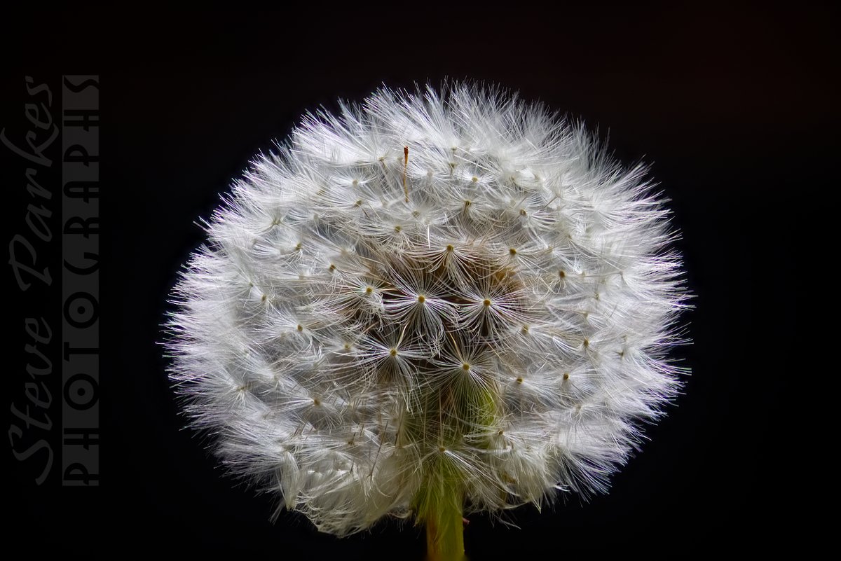
All quiet in the garden just now; the dandelions are starting to seed. I've been waiting for one to practice on.
- 2 replies
-
- 11
-

-
I nearly forgot to post this, as everyone seemed to be starting Easter early on Good Friday. Based on the Tin Chooky that stands in our hearth, here's this year's Easter greeting card. Made mainly from primitives in Designer, with a little bit of Photo. No birds were harmed in the making of this image. Nor chocolate!
-
I don't know if this will help, but ... many, many years ago when I was a kid, my grandfather, who was a talented draughtsman, told me if I was short on inspiration to make a doodle -- just scribble a few lines or loops -- then see what it inspires. This is more use to an artist than a designer, maybe -- but if you're desperate it might just help.
-
Thanks gdenby! What I did for the blur was, for instance, to duplicate the body layer, then delete all the nodes except the nearer back foot, so I could then blur the duplicate foot. It's a matter of thinking out the effect you want, then working out how you could do it, the trying it till you get it right. Motion blur -- radial in this case to suggest swinging movement -- and then moving and/or rotating the layer for the best effect. Patience is a definite advantage! These are the two stills I chose (saved fro Serif MoviePlus) ... You'll see I've rotated the top image to align it with the bottom one. And here are the first two vectors, traced around the bodies and the head ...
-
My spellcheck doesn't like 'rasterised' -- it suggests pasteurised!
-
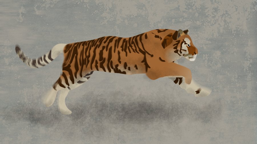
I'm working through the AD Workbook, and the first example seemed a little too easy for an old hand (or do I mean know-all?) like me, so I decided to try something a little more ambitious. So I did a tiger. It wasn't bad, but I thought I could do better ... so I did another one. Here it is ... This is reduced to about 70% of the original size. In the book, Ben The Illustrator says he often works from videos rather than still photos, so I looked out one or two videos on the internet. This image is made from two stills, as the real thing didn't look exciting enough! I made vector shapes on separate layers of: the body and nearer legs; the tail; the head; the further legs; and the stripes -- the stripes I clipped to their layers so i didn't have to fiddle about with the edges. I saved that as an AD file, then as an AP file, which I then edited with some motion and radial blur to give a sense of movement. As I went along, I duplicated some of the layers and rasterised them, so I could add some shading and clip them. Finally, I made up a background from a couple of texture images, and added a shadow underneath the animal.
-
Hi, and welcome! We were all new once ... I'm very old now ...
-
affinity designer Some of my work with Affinity Designer
Kasper-V replied to Leo Hoang's topic in Share your work
Terrific work, Leo! I learned to draw with a pencil, but I had to learn to draw with a mouse years ago when I started using computers. When I got a laptop I had to learn to draw with the trackpad -- and it's not that difficult to be delicate, once you get used to it. I've got a Wacom tablet, but I don;t bother with it very often. -
If I can work out what specifically is causing it I'll get back to everyone.
-
They were quite small ones, as I was trying out some of the new features -- 800 x 500 px, in the last three or four.
-
I'm trying out the AP beta on a Windows 7 laptop. I've been attempting to use a perspective projection, but it keeps shutting down with no error message. It's also crashed on other occasions; there doesn't seem to be any common factor here, and I haven't been able to report the problem in the usual way. I have nothing else running apart from Windows Explorer to keep track of files.
-
affinity photo A Newbie at Affinity - Paint Splatter Effect
Kasper-V replied to melissak62's topic in Share your work
Nice work, Melissa! As a long-time computer user (I go back to punched cards and paper tape!) I've always found the best way to get the hang of new software is simply to play with it and see what happens. It looks as if you're already getting to grips with AP looking forward to seeing what you do next! -
I'm a day early, but you might be busy tomorrow! My New Year video, made in the usual way ...
-
Symmetry Numbers/Values
Kasper-V replied to JokeRat's topic in [ARCHIVE] Designer beta on Windows threads
I think they are powers of two: 2^1 = 2, 2^2 = 4, 2^3 = 8, 2^4 = 16, 2^5 = 32. Obviously designed by programmers, not graphic designers! -
I was impressed by your using the milling machine table! As you say, the proper kit is expensive. I wonder who might have a lathe or something among my acquaintances?
-
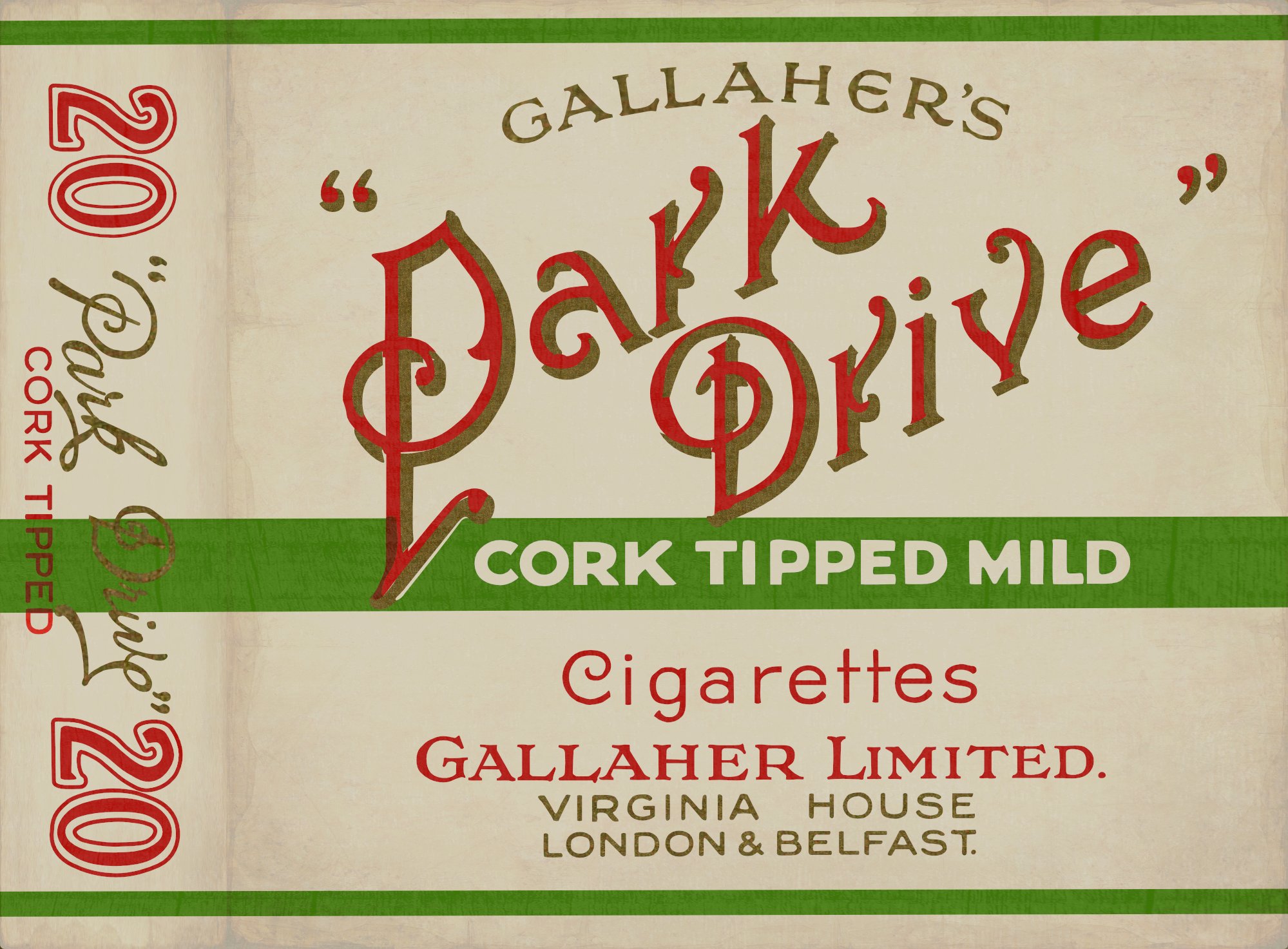
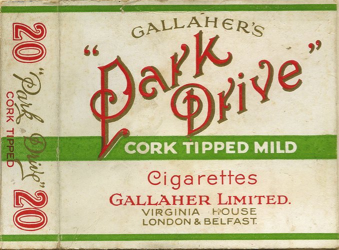
I said in an earlier post (https://forum.affinity.serif.com/index.php?/topic/75089-vintage-cigarette-packets/) I'd started a little project to reproduce some old cigarette packets (or packs, if you're on that side of the Pond). Here's another: Park Drive. Once again, I've used vectors to make the letter shapes, with a bitmap fill for the gold shadows, made by sampling the original image, and I've finished off in Photo with Merge visible and a couple of pixel textures to make it look a bit 'lived-in'. This time I thought I'd be a bit more ambitious... and try a twenty instead of a ten! And the original looked like this:
-
- 2
-
-
- vector
- affinity designer
- (and 1 more)
-
Breath-taking!