

steve_m
-
Posts
27 -
Joined
-
Last visited
Posts posted by steve_m
-
-
Hi Timber. Thanks for flagging this up. Could you please let me know what hardware and operating system you're running?
-
-
-
-
On 12/10/2017 at 9:44 AM, A_B_C said:
This one is for Steve …
")
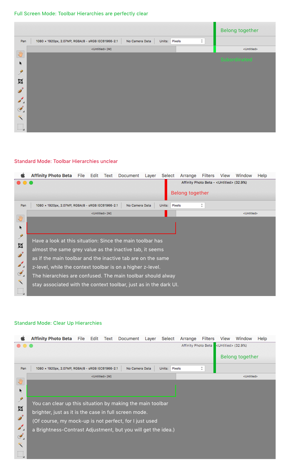
It’s nice to see the light UI develop! Well, here is a basic observation regarding the main framework of the light UI. I have noticed that some of the background greys have changed since the last iteration. But I still have a problem with the visual hierarchies, and I hope you will see this as well. I believe the background of the main toolbar in standard mode is too dark. Have a look at my illustration below. It should make clear that it would be beneficial to brighten the main toolbar background in standard mode, up to the point, where it conforms to the grey value of the main toolbar in full screen mode.
Furthermore, I would suggest that you care for the inactive state of Affinity Photo as well. It looks a bit heterogenous at the moment, compared to the standard macOS interface.
Hope that makes sense …
Cheers, Alex
Thanks A_B_C. Makes perfect sense. Thanks again for the suggestions. I'll see what I can do :-)
-
Hey Steve,
Nice polish on the UI. A few more notes if you care:
I was checking out the User Interface Preferences pane in the latest beta and noticed something interesting. The type on the top of the pane is rendered using an RGB anti-aliasing method, while the text on the bottom of the panel (where all the check-marks are located) are anti-aliase using only grayscale.
Screen Shot 2017-07-12 at 11.38.07 AM.pngFor those of us on non-retina Macs, the grayscale anti-aliasing provides sharper text. Apple by default uses the RGB method, but since I noticed your UI is using grays to anti-alias parts of the UI, I thought I would mention it in case it's something you can roll-out across the entire UI...
Also, the baseline for the line reading Decimal Places for Unit Types: is getting cropped; the decenders for the y and p in type are truncated.
Keep up the great work guys!
Thanks for the info Ronnyb - You've got a sharp eye for detail! This kind of observation really helps us make the software better.
-
-
actually no after closing, opening :ph34r:
on my iMac the issue did not occur at all, interesting, ok..
cheers
Ok. Could you post here if you notice the issue again? Many thanks.
-
-
loving the new contrasty look, really makes the icons stand out :wub: :D
Hi MBd. Thanks for flagging this up. Could you please let me know which OS you are running?
-
Posted Today, 04:52 AM
Timber, on 06 Jul 2017 - 12:07 PM, said:
Hi Timber. Thanks for that. Could you let me know which version of macOS you're running?
This is in OS X 10.9.5 Mavericks. - TimberThanks Timber.
-
Affinity Designer Beta 2.1 Mac reliably crashes every time I go to switch between light UI and dark UI. Just like clockwork.
2.5 ghz Intel Core i5 with 8 GB ram.
Hi Timber. Thanks for that. Could you let me know which version of macOS you're running?
-
Hey Steve if I can jump on Alex's train here — hope you don't mind Alex ;)
I've noticed in several places in the UI in the Preferences panel specifically but generally in the UI as well, the lower parts of the UI text fields (set to Large in the UI section, and I have a non-retina MBP) seem to be cropping the fonts descenders... Again it's minor, but I whole-heartedly agree with Alex that the UI refinement via consistency and attention to details and polish translates for a more efficient and professional tool to use.
Attached are some places to look into when you have time...
Also my account is reaching it's total upload quota... can one of the Admin's up my quota again? Thanks!
Thanks very much for this Ronnyb. Good spot!
-
Hi Steve,
great to hear from you. It is really so nice to see this evolving, and though these are all minor things, they will make the user experience so much better. Well, I think one of my main suggestions for the next iteration would be caring for the distances, the alignment, and the distribution of the elements on a pixel level.
When you take out your pixel ruler, you will see that many of the distances among the elements of the toolbars and in the panels are quite random. Just have a look at the Pencil context toolbar or the Character panel, for instance. I would really suggest that you take measure of these things in every part of the interface, and though the required adjustments are very subtle in most cases (very often only +/– one pixel), you will see that slightly correcting these disparities will clean up the interface considerably.
As an example, let me append a review of the context toolbar for the Pencil tool. You will find similar thingies in many other parts of the interface as well. As I said, these are pretty small ones, but I think you will agree that getting these straight (compare my rough attempt in the screen shot below) will be beneficial to the overall user experience.
Great work! Love it …
Alex :)
Thanks again Alex. Really appreciate your feedback and suggestions. They really help.
-
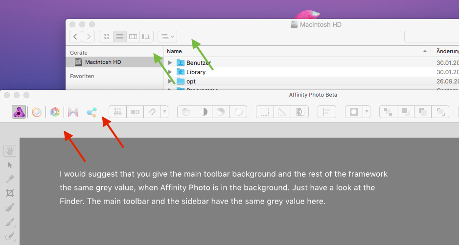
Now I have the time to look at it a little closer. The crashes I reported seem to be gone, thanks. The UI improvements are subtle but they do help; for example the borders around the side panels now make them stand out a little more against windows in the background.
I don’t know if the background gradient in the top toolbar in separated mode changed but it feels very natural for the OS now. However, one thing that could still be improved is the contrast/difference of the top area of the window chrome in separated mode of active versus inactive (or foreground vs. background) windows. In AD the only difference between an active window and a window in the background is the colored buttons at the top left. In other applications active windows have a stronger gradient while inactive windows have an apparently flat light gray background at the top (see comparison with system preferences window in the attached screenshots).
Another bug I just noticed: I have no idea how this happend or how it can be reproduced but the topmost layer is outside of the viewport of the layers panel and I can’t scroll up any more (see third screenshot). If I expand other layers so they cause an overflow the scrollbar is cut off at the top. And said scrollbar shouldn’t even take any space with my current preference settings and no mouse attached. It should be an overlay scrollbar that only appears on scroll.
VIPStephan - Agree totally about the active/inactive titlebar gradient. Great suggestion.
-
I am not sure I see the difference with light UI. I have beta 1 and beta 2 side by side and it looks about the same.
As Matt said, zoom in on the details and you will notice quite a difference. It is certainly more noticeable on non-Retina devices, but the changes will include:
- Increased contrast on the main toolbar buttons
- Toolbar button borders now sharp
- Distracting gradient on main toolbar removed
- Vertical sizes of UI elements (menus, inputs) harmonized, for the most part
- Increased contrast for the panel dividers (sidebar)
- Ruler ticks have all the same color now, numbers are better centered
- Streamlined use of borders (sidebar, sidebar to canvas)
- Blurry icons largely gone
- etc.
All in all, this is already a great improvement, to my eyes … :)
Alex
Thanks Alex - Fantastic observations!
-
I can see the change now, it's the difference of maybe a 0% grey to perhaps a 10%-15% grey on the side tool bar. What I was mainly looking at was the buttons across the top that to my eyes look extremely close. Glad to see progress in this area though!
KipV - Don't worry, the changes are very subtle and difficult to spot. I must admit, I've used the zoom tool quite a bit while working on this!
-
Hi Matt … and Steve,
wow! The light user interface is getting lovely! It is already looking *so much better* now. Isn’t it remarkable how these seemingly little tweaks improve the overall appearance? I am really happy to see this unfold … :) :)
Now I wonder if we should still report some of those minor UI details, since I am sure you caught the users’ intentions. For instance, the UI fonts are still looking somewhat jagged and low-quality on non-retina devices (anti-aliasing). Would you still be interested in such small observations? :unsure:
In any case, this is going to be really nice! Your hard work is definitely paying off … :D
Cheers, Alex
Thanks again for your comments Alex. It's really helpful to get such detailed feedback and suggestions. We're definitely interested in any observations, no matter how small. As you say, they all add up to make it better overall.
-
-
Thanks everyone for all the testing you've been doing. It's much appreciated. Thanks also for the suggestions. We'll have another beta ready fairly soon which will include updates to the light UI. In the meantime, please keep the comments / feedback coming, it's all very helpful.
-
Hi steve_m,
wow … great to see these improvements! Your draft featuring the increased contrast is definitely better from a usability point of view. Would you mind sharing a non-Retina version of that screen shot? I would guess that a whole lot of people still have non-Retina screens on their desktops … :)
But this is, once again, a proof that Serif is different from other software companies! You are listening to the users … :)
Thanks, Alex
Hi Alex, here's a non-retina version of the screenshot.
Steve
- JGD, Gear maker, ronnyb and 2 others
-
 5
5
-
For me, it would be enough if the button & selected tool background was not even quite as dark as in your screenshot, like somewhere in the 40 to 50% black region. I don't mind if I can't pick a custom grayscale level, & I believe it would be a bad idea to allow picking custom colors that could be the same as some of the tool or button icon colors. As long as there is enough contrast between the surrounding panel or menubar background & the selected tool or enabled button that it is reasonably easy to see the difference, I would be a happy camper.
Thanks again for your feedback, R C-R.
-
No problem Alex,
I'll upload a non-retina screenshot later on today.
Steve
Hi steve_m,
wow … great to see these improvements! Your draft featuring the increased contrast is definitely better from a usability point of view. Would you mind sharing a non-Retina version of that screen shot? I would guess that a whole lot of people still have non-Retina screens on their desktops … :)
But this is, once again, a proof that Serif is different from other software companies! You are listening to the users … :)
Thanks, Alex
-
MBd - Sorry, that's not something we're planning to do. The reason is that the icons have been designed for specific background colours.


Export Rounded Corners and SVG Shadow
in Pre-V2 Archive of Affinity on Desktop Questions (macOS and Windows)
Posted
Thanks for flagging this up Wiredframe. We'll get it logged as an issue and look into it.