steday
-
Posts
69 -
Joined
-
Last visited


-
 Giovanni Pietri reacted to a post in a topic:
How do you break up a single paragraph into smaller ones?
Giovanni Pietri reacted to a post in a topic:
How do you break up a single paragraph into smaller ones?
-
Oufti reacted to a post in a topic:
How do you break up a single paragraph into smaller ones?
-
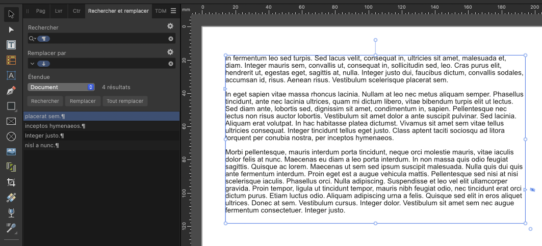
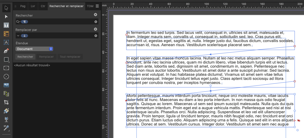
Hello Another solution, something quick to do : 1- Use "find and replace" to replace the character Break Paragraph with the character Break Text Zone (screenshot1). 2- After, you will have to create chained text boxes to display all paragraphs (screenshot2). The disadvantage of this method is that you have to let the text zone chained. But not necessarily a problem. Sorry for my poor English, hope I'm clear.

-
Alfred reacted to a post in a topic:
Help with the Move Tool and Rectangle Tool
-
Help with the Move Tool and Rectangle Tool
steday replied to boelens218's topic in Desktop Questions (macOS and Windows)
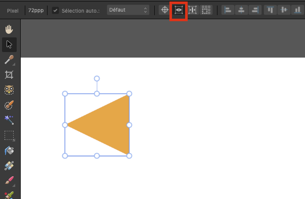
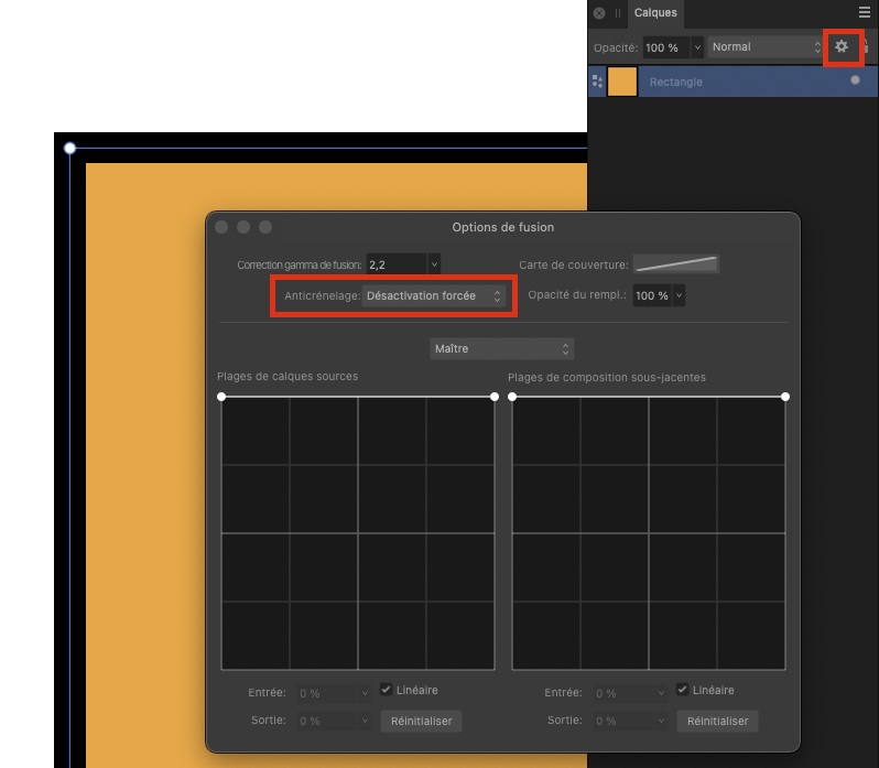
Hello 1/ Click the eye icon in the Move options bar to hide the highlight when moving (see screenshot 1). 2/ The reason is the size of the stroke doesn't meet the pixel grid of your document. There is some tools in Photoshop to force objet to align on the pixel grid (a lot of discussion about that on the forum), but for a rectangle drawing, the simplest is to go to the cog icon for the rectangle layer and use the option with no antialiasing (see screenshot 2). 3/ You could use the shift key with your mouse (as in Photoshop) to constraint a vertical / Horizontal / 45° move. Hope it will help you
-
aagha reacted to a post in a topic:
Designer - Line / Bullet spacing
-
George-Frazee reacted to a post in a topic:
Designer - Line / Bullet spacing
-
Old Bruce reacted to a post in a topic:
Designer - Line / Bullet spacing
-
Designer - Line / Bullet spacing
steday replied to aagha's topic in Desktop Questions (macOS and Windows)
Hello On the paragraph panel, use Space before and / or Space after. -
Hello You can remove a mask from an adjustment layer : Click on the built-in mask Fill it with white (Edition > Fill) - so the mask as no effect Now it is erratic : sometime AP delete the mask immediately, sometimes you have to make an operation on the layer panel to refresh the panel and see that the mask has been deleted At least that's how it work on AP 2.6.2 MAC
-
Hello I can make it work OK if I follow these steps : Select the curve on the layer panel Force the fill to be None on the color panel Select the Pen tool on the tool panel Click the Sélection button > OK I try to redraw the selection with the pen tool, transform it to selection and it work OK, whatever the fill is Plain with a color or None. I suspect a corrupted Curve in your document. Hope that can help you.
-
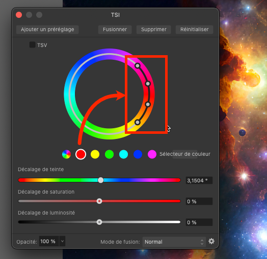
Hello, you can do it with the TSL adjustment (Photoshop has the same on his TSL adjustment). See the screenshot : here if you want to replace red (or near red) choose the nearest color in the row (sélecteur de couleur) and adjust the white dots to target the color to replace. The external dots adjust Fuzziness. Then you can change the color with the TSL slider. See Affinity Help if I'm not clear enough.
-
Dominique Perchet reacted to a post in a topic:
Publisher ; passer du fond noir de l'application au fond blanc.
-
Bonjour C'est dans les Préférences (ou Réglages sur MAC) > Onglet Interface Utilisateur > Style d'UI > Foncé / Clair / OS par défaut.
-
NotMyFault reacted to a post in a topic:
Rotation setting for image brushes in Affinity Photo
-
carl123 reacted to a post in a topic:
Rotation setting for image brushes in Affinity Photo
-
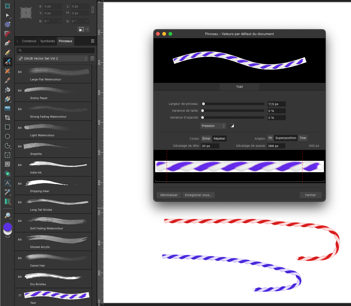
Hello Carole As far as I know, what you want is possible only in Affinity Designer, not in Photo. So the stoke is vector, but it render with pixel (not truly vector like the one in illustrator). See screenshot (you have to choose the primary color to the color you want the brush stroke).
-
Text styles based on this style
steday replied to Ed Lyons's topic in Desktop Questions (macOS and Windows)
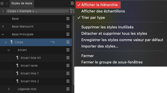
Hello Show hierarchy in the text styles panel show with style(s) is (are) based on which one. Here "Encart texte" is based on "Encart", which is based on "Corps", which his based on "Base principale".
-
Good to know, thank you.
-
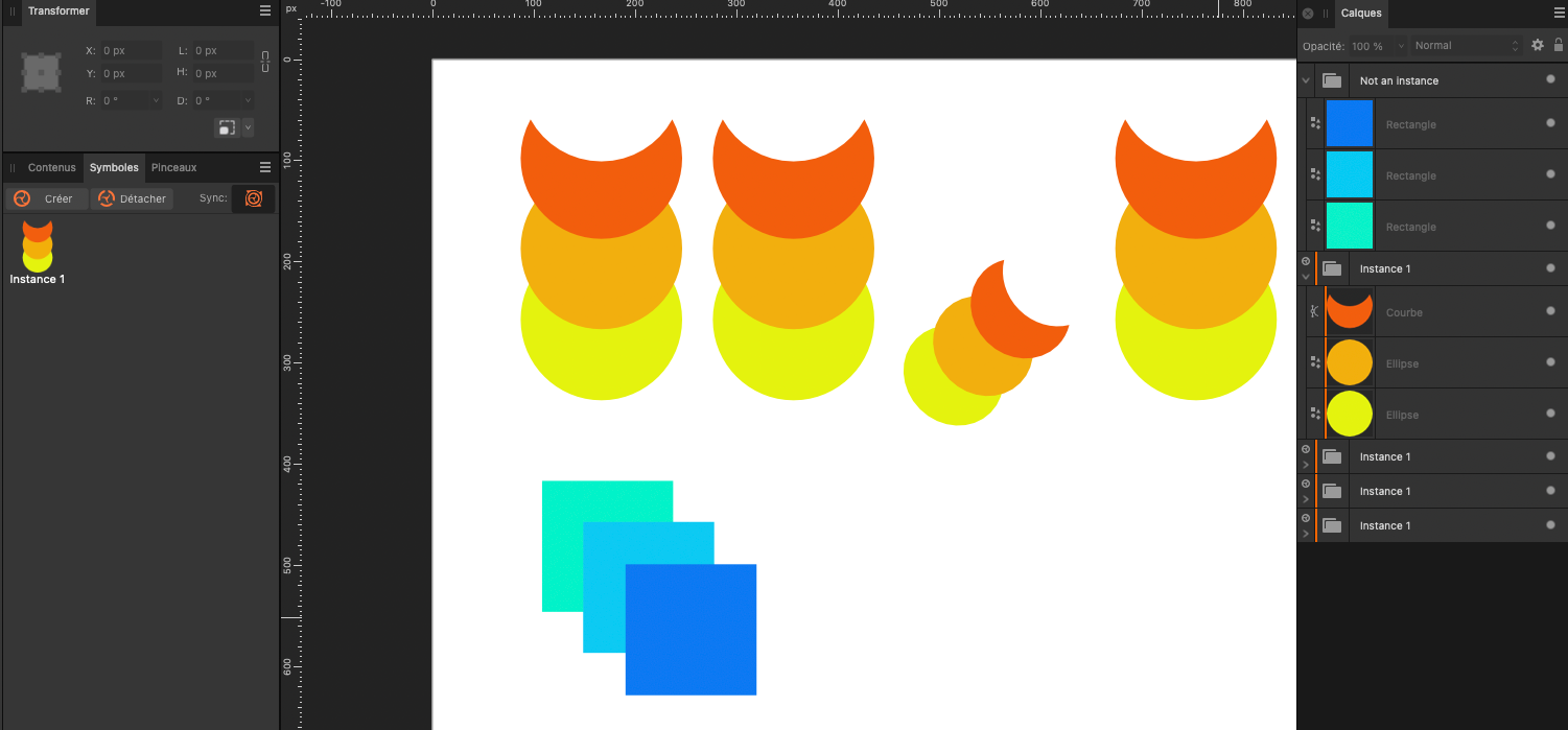
Hello If I understand clearly your question : If you want to create a symbol made of several shapes, you have to group them before creating a symbol, because if you don't do that, every shape will be a symbol. Alt + dragging, copy-pasting, power-duplicating a symbol create a symbol. You won't see them individually in the symbol panel because these new symbol are instances of the first symbol you create, and every instance are synchronized bu default (if you modify one, all the synchronized instances will be modified - you can de-synchronized some instances if you want to edit them with different color, shape. Transformed instances with scale, rotation, keep synchronisation ). You can see in the layer panel that a group is a symbol if it has an orange bar. See attached. See Affinity doc on symbol for more infos. All of this work correctly on Affinity Designer 2.6 Mac.
-
It seem to me that it is OK on 2.6.2 (Mac version).
-
Hello This question has been asked many times in the forum. There is no special tool to do that. So, no good surprise !! The only way is to cut-paste the text before (or after) the break in another set of linked frames. Many people are facing this problem and would like a faster and better solution. It's the same problem in InDesign.
-
Cannot see page 1 in document.
steday replied to Ray C's topic in Desktop Questions (macOS and Windows)
Hello See the attached screenshot. Cordialy
-
Oui c'est très pénible, je confirme que parcourir le cadre de sélection ne fonctionne pas sur AP 2.6.0 (version MAC).