h_d
-
Posts
1,629 -
Joined
-
Last visited
Everything posted by h_d
-

Updating via Mac App store fails
h_d replied to Marclez's topic in Pre-V2 Archive of Desktop Questions (macOS and Windows)
If you bought your original application from the Apple App Store, then you will get your application updates from the Apple App Store. It's that simple. If (and only if) you register your Apple App Store purchase and ownership with Serif, then you will have access to any free content (incredible or otherwise) that Serif choose to distribute. -
Convert photo to B&W logo
h_d replied to Bud Brown's topic in Pre-V2 Archive of Desktop Questions (macOS and Windows)
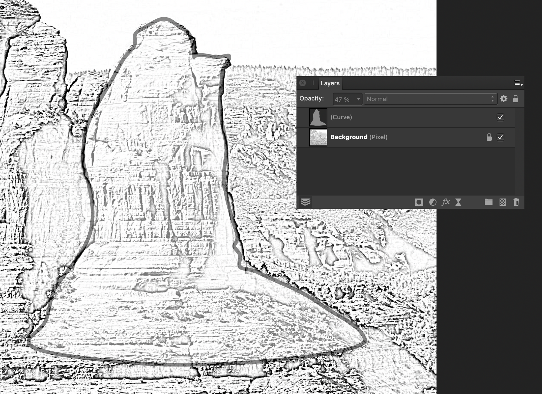
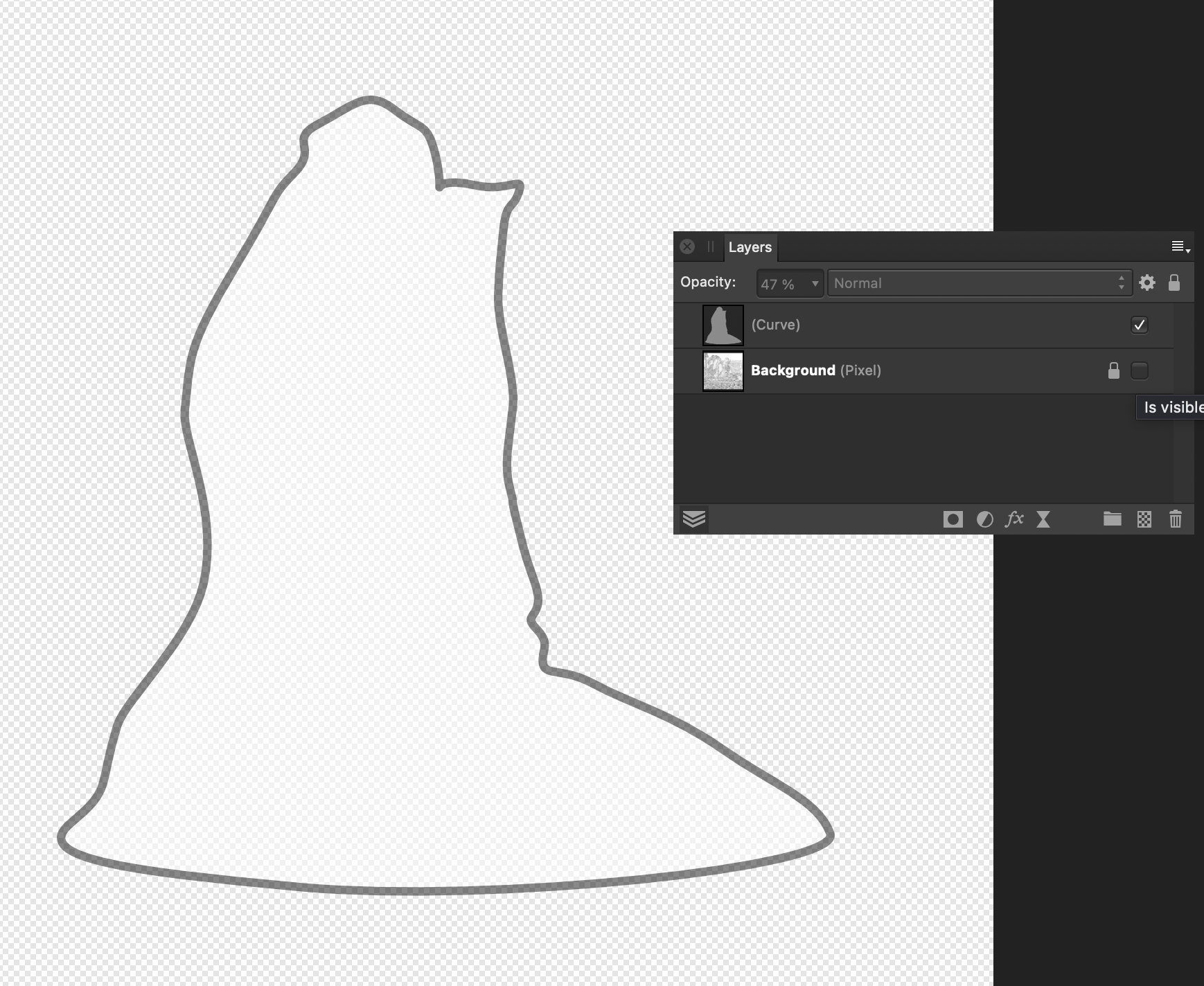
Maybe use the Pen tool, draw a closed curve to trace over the area that you want to use as a logo, then delete/hide the background image: \
-
Updating via Mac App store fails
h_d replied to Marclez's topic in Pre-V2 Archive of Desktop Questions (macOS and Windows)
Thing is that when you buy any software from Apple or Microsoft, you are their customer, not Serif's. Apple/MS transfer a proportion of the purchase price to Serif (minus marketing, distribution, tax...) and Serif benefit from world-wide distribution, marketing and sales networks that they couldn't hope to emulate themselves. But Apple and Microsoft don't pass on customer details to the software developers, so even if they wanted to (for sentimental reasons or whatever), Serif couldn't transfer your Apple/Microsoft licence key to their own store, let alone turn you into a marketing prospect. However, consider the case of extra content (brushes, overlays, backgrounds, macros...) Serif could have gone down the road of in-app purchases from the Apple/MS stores for this, but right now they ask for an optional registration to their own store for all the extra goodies. And this is a smart move, because it gives them direct access to customers who have bought their products from the Apple/Microsoft stores. For example: I bought Photo and Designer from the Apple App Store, and Publisher from the Serif Store. I thus have an account with Serif. When Photo 1.9.0 offered me free content (fog, snow, clouds etc) I logged in to my Serif account and downloaded them. Serif now know that I have Photo, even though I didn't buy it from them. And they can target their marketing accordingly. Prime example of British ingenuity... -
I was fiddling. Doing what you did works for me too.
-
Just tried that (Big Sur, AMD Radeon Pro Vega) and the Blur Brush works as it should with Display set to OpenGL. It's not a tool I use very often, though, so I'll switch Metal back on and hope Serif fix it
-
It's knackered in Big Sur too. Screen Recording 2021-02-27 at 23.23.05.mov Cheers, H
-
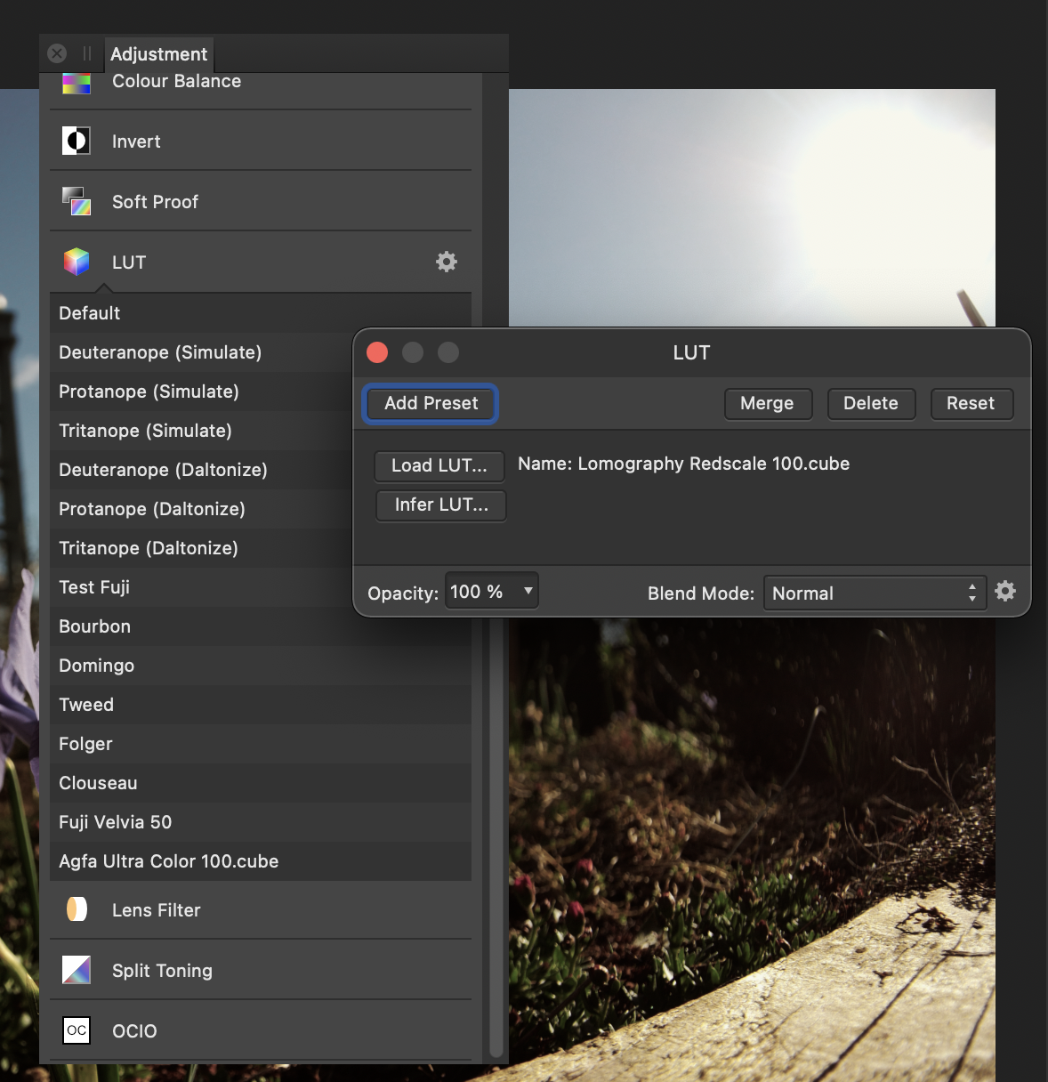
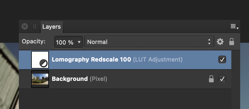
If you choose a preset (rather than Inferred) or import one then the name should appear in the Adjustment controls: This is on Big Sur, I would hope Catalina would work the same way. You can also manually rename the adjustment layer in the Layers panel, although it's a bit more of a chore: If you're processing a lot of images in the same way, then using a Macro coupled with a Batch Job might be the way to go. Seems right to me Cheers, H
-
Formatting Tables
h_d replied to Dai777's topic in Pre-V2 Archive of Desktop Questions (macOS and Windows)
If you don't need the automatic updates, you can also use File-Place to drop an Excel spreadsheet into your Publisher document. It will come in as a table which can then be formatted. As I say, there's no link back to the original spreadsheet, but the upside is that the content is still editable. -
Yes. Who knows? We may get 1.10, 1.11, 1.12 before 2.0 appears. Yes. Yes.
-
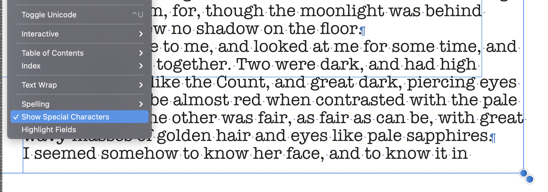
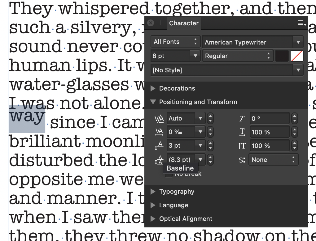
Cursor and spacing issues
h_d replied to 'Chele's topic in Pre-V2 Archive of Desktop Questions (macOS and Windows)
Try displaying Special Characters (Menu bar - Text - Show Special Characters) and see what shows up: This will display paragraph marks, word spaces, section breaks etc. Also select the text "AOM" and check the Baseline settings in the Character panel:
-
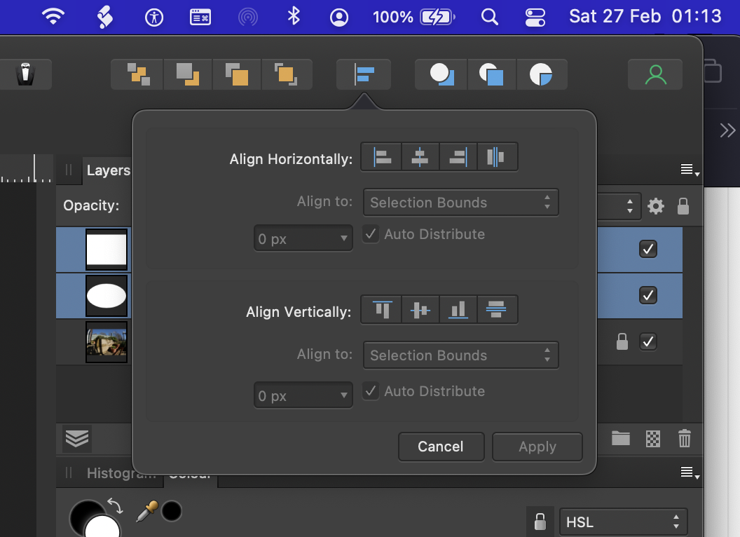
I don't know what happens when you choose Auto-Align-Layers in Photoshop, or what you expect to happen in Affinity Photo. But in Affinity Photo, you can click the Alignment button in the toolbar: Or you can choose various options from the Arrange menu: Cheers, H
-
Updating via Mac App store fails
h_d replied to Marclez's topic in Pre-V2 Archive of Desktop Questions (macOS and Windows)
To delete your App Store copy: in Finder, go to your Applications folder, drag it to the Bin, confirm you want to delete it, and empty the Bin. Alternatively, in Launchpad, hold down on the application icon until it starts to jiggle, and then click the cross in the top left-hand corner. To download direct from Affinity with product key, create an account on the Affinity Store and buy it. The 'small fee' will be the current purchase price. -
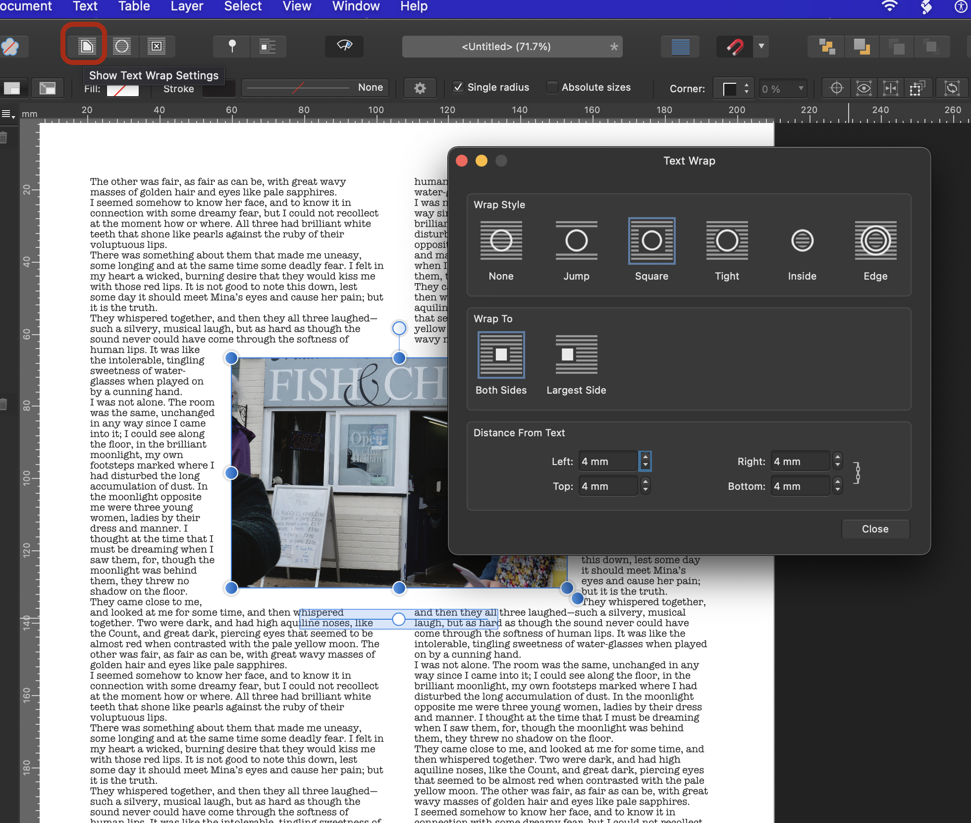
Text wrap question.
h_d replied to Tom Beach's topic in Pre-V2 Archive of Desktop Questions (macOS and Windows)
Hi @Tom Beach and welcome! Select the image with the Move tool and then click the Show Text Wrap Settings button in the contextual toolbar: Cheers, H
-
+1
-
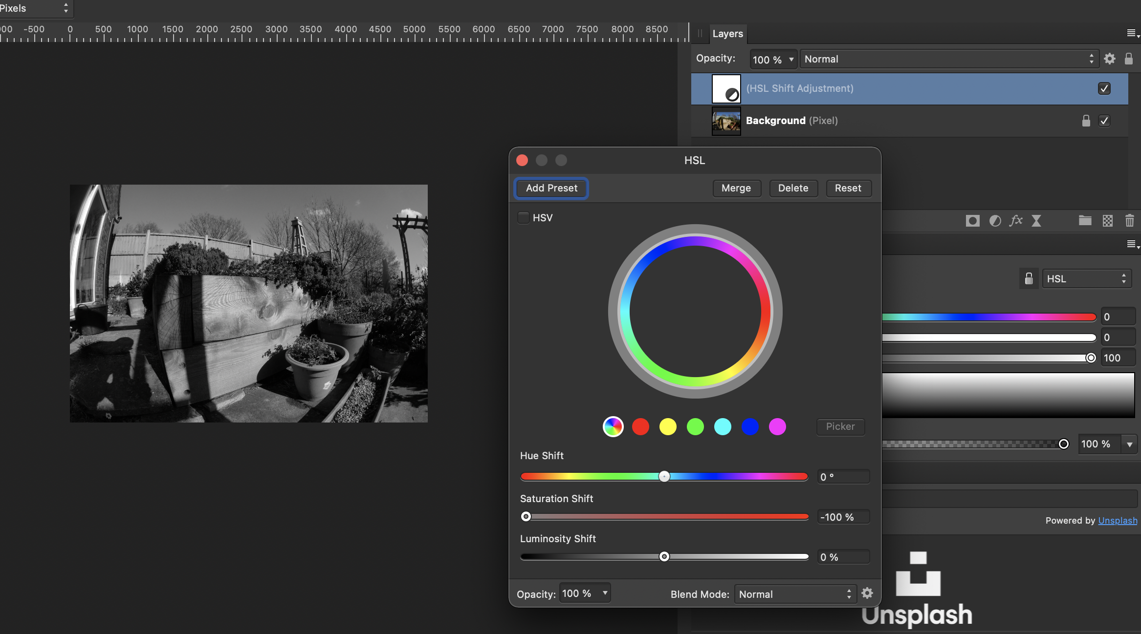
Yup. Add an HSL Shift adjustment, set the Saturation Shift to the left: With the HSL Adjustment layer selected, choose the Gradient Tool and drag it across the image: White is full effect, black is no effect. (I did mine right to left but the principle is the same.) Cheers, H
-
Bwukvincent
h_d replied to bwuk vincent's topic in Pre-V2 Archive of Desktop Questions (macOS and Windows)
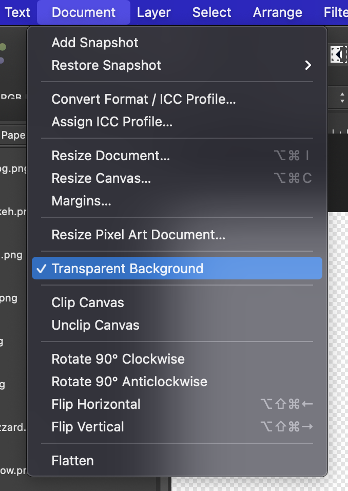
Hi Mr or Ms Vincent and welcome! First, can I suggest that as a matter of urgency you change your user name to something other than your email address, or it will get harvested by spammers. The checkerboard indicates a transparent background - the .png files you're inserting may or may not have transparency. If you don't want it, then go to Document in the menu bar and uncheck Transparent Background: Cheers, H
-
Publisher "Authorize global"
h_d replied to BeeWinters's topic in Pre-V2 Archive of Desktop Questions (macOS and Windows)
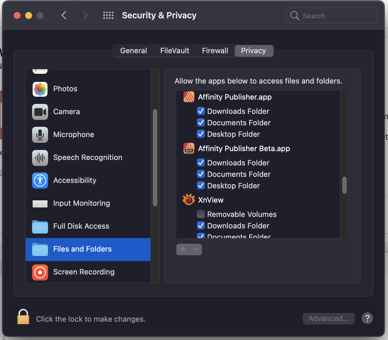
(This is Big Sur, I'm not sure if applies to earlier versions of macOS.) From the Apple Menu, try opening System Preferences - Security & Privacy - Privacy and checking down the list: This should show you which applications have access to which folders. If you can't see Publisher, then also check the Full Disk Access section. Cheers, H
-
Issues since 1.9 (mac)
h_d replied to Amosjl's topic in Pre-V2 Archive of Desktop Questions (macOS and Windows)
Can't really help with (1) but I would suggest updating to 1.9.1 if you haven't already done so. It was released a couple of days ago. (2) is a deliberate change on the part of Serif and you're not the first to remark on it. Clicking the Default preset in any of the adjustments panels brings up the sliders. You can also click the Adjustment button in the Layers panel: which is marginally quicker than going to the main menu bar. Cheers, H
-
Insert shape into cell of a table
h_d replied to Norman44's topic in Pre-V2 Archive of Desktop Questions (macOS and Windows)
You'd have to draw it on its own layer, but you can then cut or copy and paste into a table cell: Cutting will remove the original layer. Cheers, H
-
Formatting Tables
h_d replied to Dai777's topic in Pre-V2 Archive of Desktop Questions (macOS and Windows)
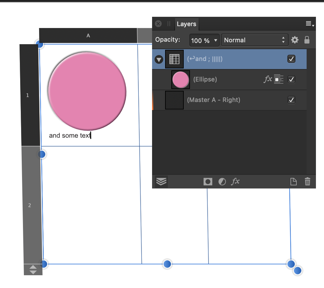
I appreciate it's a learning exercise, but if I were doing a job like this for real then I wouldn't use a table. The orange shape at the top is a half-depth rectangle placed over a full-depth rounded rectangle. I then used Layer-Geometry-Add to combine them into a single resizable object. The black text is in a single frame with the spacing adjusted with the leading controls. The white text is in four separate frames. The grey shape is a separate rectangle. The three vertical rules have their blend mode set to Divide, as does the grey rectangle, to achieve the knockout effect but to allow quick repositioning. I drew a single circle with the Ellipse tool and then duplicated and aligned for the blobs. I then grouped the vertical columns of blobs with the word above, again to allow easy repositioning. As a vet might say, it's horses for courses... vetsbills.afpub
-
PDF not showing headers/footers
h_d replied to SheilaL's topic in Pre-V2 Archive of Desktop Questions (macOS and Windows)
Hi @SheilaL, your sample file won't download - would you be able to upload it again? -
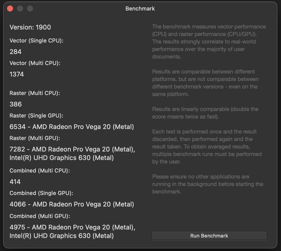
You can also get some insight into GPU performance by running Help-Benchmark (switch of all other apps and disconnect from the internet first): Which (I think) means that for raster operations my multi-GPU combination is nearly 20 times faster than CPU-only would be.
-
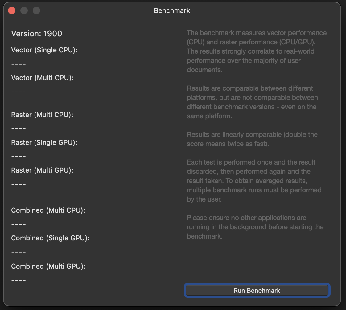
In Preferences - User Interface I set UI Style to Light. I then run Help - Benchmark: The explanatory text is white on a light grey background and there is not enough contrast for it to be readable. It's marginally better when I turn to the Dark Side: But there's still a lack of contrast. Cheers, H
-
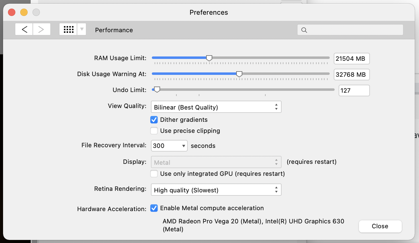
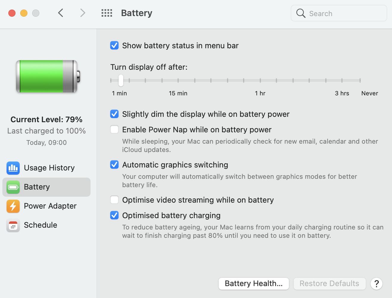
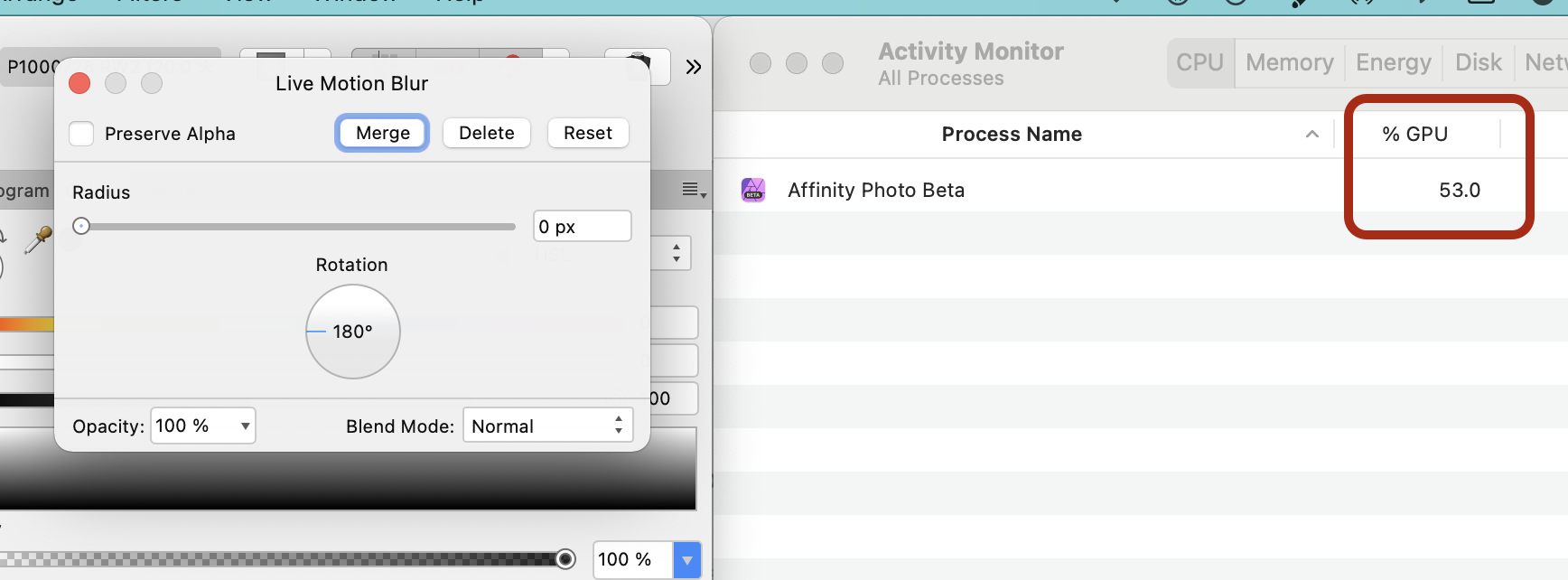
Just did a very quick and unscientific investigation... Like @Norway16 I have a 2018 MacBook Pro, albeit with a Radeon Pro Vega 20 GPU. My Affinity Photo performance settings are as follows: You might want to ensure that "Use only integrated GPU" is turned off. And in System Preferences/Battery: Automatic graphics switching is on. (Same for Power Adapter but I'm currently unplugged.) If I run Activity Monitor and Affinity Photo side-by-side and use a high-demand live filter as in the linked video, the GPU will kick in if and when it needs to (eg when rotating a live Motion Blur filter). It's certainly not on all the time, and it switches off and on pretty smartly: Adjusting the radius of the motion blur, as opposed to rotating it, doesn't appear to activate the GPU. Which is good for my battery life if nothing else... So it's pretty selective, and it may depend on individual system settings too. Also worth noting that if I play graphics-intensive games then the GPU is on all the time, the laptop turns into a lapscorcher and the fans sound like a Saturn V on blastoff. Affinity Photo appears to be a bit more conservative about when it uses the GPU. Cheers, H
-
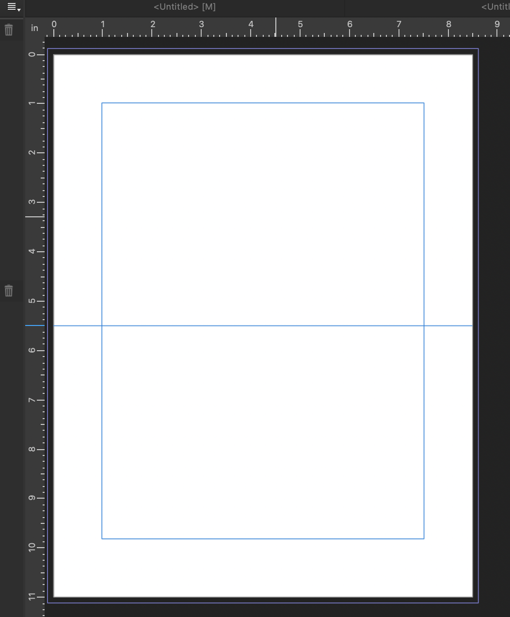
Note Cards
h_d replied to Mabel Lucy's topic in Pre-V2 Archive of Desktop Questions (macOS and Windows)
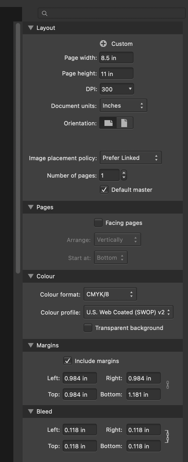
Hi @Mabel Lucy and welcome! The default print presets in Affinity Publisher are geared towards multi-page publications with a vertical fold/binding edge, but there's no reason why you can't create your own custom presets and templates. In the New Document dialog you could set the the height to twice the depth of the card and the width to the full width, in the units you want. (Presumably inches?). You'd also need to set margins, bleed, colour format etc as required : This gives me a document like this, into which I've drawn a horizontal guide for the fold line: I'm not familiar with Microsoft Publisher but I suspect that Affinity Publisher doesn't 'hold you hand' quite as much, so you may need to do some experimentation. For "forming text round an image", have a look in the Help for "Text on a Path", if this very rough example is the sort of thing you're after: Hope this helps, H