MikeW
-
Posts
6,209 -
Joined
Everything posted by MikeW
-
 Doesn't happen in any other software I tried the sample file in. The Word style definitions are correct as far as I can see. APub should be using/translating the styles properly.
 -
Designer Find/Search & Replace
MikeW replied to Clayton King's topic in Affinity on Desktop Questions (macOS and Windows)
As Walt says, APub only. And depending on what functionality you are using in CD, probably not available anyway. But what f/r is in APub, it really should be in Designer too. -
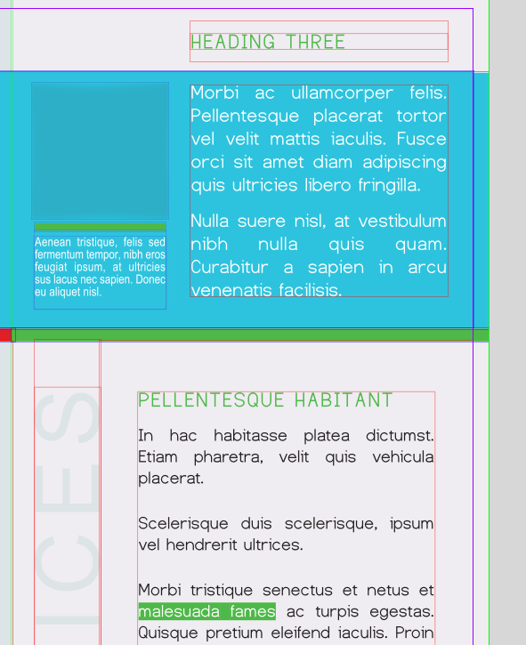
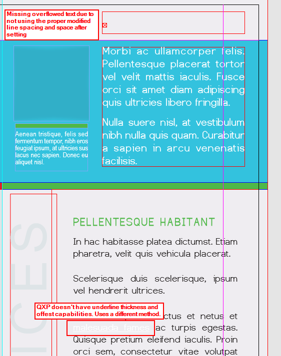
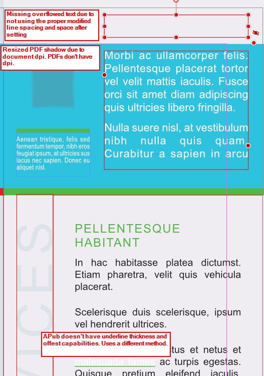
Because I got work done that was due this afternoon last night and I'm somewhat bored, I made this little comparison. I grabbed an InDesign sample brochure and packaged it along with an .idml file. The sample filed used a certain free font. For ID, the font doesn't actually need to be installed if these fonts reside in a folder named Document Fonts. The Viva Designer sample opened the InDesign file (versus the .idml, but the results are the same as opening the .indd version in this case). The main font used was reported as missing. VD handles these missing, uninstalled fonts different than ID or QXP (more on QXP's handling later). With VD, one can just drag and drop such fonts onto the open file and they become available for that publication. Neat feature, but I would prefer the folder method of ID and QXP. VD handled this publication better than either APub and QXP. Mainly for one reason: VD can/does include ID's method of using the custom underline property as a text highlight method. With APub or QXP, the white text that should be highlighted shows with a normal underline whereas VD has the colored background with the white text. In order to display this properly in QXP or APub, one would need to know, firstly that this text is suppose to a background of a certain color and size--what this highlighted text is suppose to look like--and secondly, replicate it using their respective methods for this effect. This highlighted text is used three places in the brochure using different color each time. But all QXP and APub display is white text with a white underline versus the brochure using yellow, red and green highlight via the underline property. As with QXP, VD properly displays the shadow PDF used. I've hidden the image that sits on top of this PDF shadow to demonstrate that VD and QXP, neither having a document DPI (as ID also) the shadow is full size whereas APub shrinks it due to the use of having a document DPI. VD also handled the overridden space after and the line spacing for the headline at the top of the column versus APub and QXP requiring adjusting the height of the text box for the heading to display. As regards the font issue, APub would need for the fonts to be installed. QXP requires a slightly font folder naming, so I copied the Documents folder and renamed the copy Fonts. However, both ID and QXP can use a master fonts folder place where these document specific fonts are available for the application to use for any publication without the need to install them. While not shown, the first page of this brochure has a map as a graphic. APub properly used the map image box's run-around property, pushing a column's text over to its right side. VD and QXP requires wrap-around image boxes to be higher in the layer order it is suppose to affect. This map in VD/QXP needed moved to the Tex layer and above the text in the layer order for the text wrap to work. In addition, I had to play with the run-around properties in VD. Once moved, the values were reset to zero so those values needed re-entered. In short, there were differing issues in all three applications. However, I believe with this particular publication, VD handled it best. If I was more bored, I would have hunted down some of my other test publications that showed where APub was near perfect and QXP/VD fell short, or specific publications where QXP was the best versus APub/VD. Viva Designer: QuarkXPress: Affinity Publisher:

-
That aside from the fact that one cannot guarantee there won't be text reflow issues between disparate versions of ID using .idml because the paragraph composer--how it works in conjunction with other things--is one of the items Adobe is always updating between versions. As regards Markzware's IDMarkz, all it does is automate the conversion, especially if one doesn't have access to CC. However, renting (subscribing) ID for a month and using a batching Javascript that is freely available is a less expensive option. The .idml files are identical whether generated from ID or IDMarkz. With .idml, some applications do a better job translating particular .idml than others. So for instance, APub might do the best job on .idml A, versus other applications, but with .idml B, one of the others may be more faithful. In general, APub does a decent job of it, with the exception of oddness when it come to weird font size changes too often. I blame that on the difference in how both handle document DPI-ID does not use such a thing but Publisher does (and shouldn't).
-
Affinity Designer shows imported PDF in Black-and-White, no colors
MikeW replied to Guntis's topic in V2 Bugs found on macOS
Looks like they are nested in the objects affected. -
Affinity Designer shows imported PDF in Black-and-White, no colors
MikeW replied to Guntis's topic in V2 Bugs found on macOS
I suspect the curve adjustments visually at the bottom of the layers menu account for this blackness. PDFs have no concept of text on a path--nor of paragraphs/paragraph styles, character styles, etc. Just objects at x,y coordinates. -
Excellent work!
-
Sounds like you have installed the variable font version. Affinity applications do not support these variable fonts. Remove them and only install the font files from the Static font folder.
-
Publisher 2.2 Text lines joining
MikeW replied to Northstar's topic in Affinity on Desktop Questions (macOS and Windows)
Then perhaps it'll make it back in one day. -
Publisher 2.2 Text lines joining
MikeW replied to Northstar's topic in Affinity on Desktop Questions (macOS and Windows)
Just a note here. PDFs have no concept of paragraphs. PDFs are only aware of "text runs" which often mean lines of text but sometimes even just words and/or letters. What APub and other applications capable of attempting to reconstruct paragraphs from these "text runs" is actually remarkable--but not infallible. Some applications have the ability to make paragraphs from selected lines of text. That capability I believe think would be a good addition one day to Affinity applications. -
Affinity Publisher - Failure to open a new PDF file.
MikeW replied to BillKress's topic in V2 Bugs found on Windows
I was wrong. Once the password is removed, the files will open/place in APub. APub will strip the ghost form fields. -
Affinity Publisher - Failure to open a new PDF file.
MikeW replied to BillKress's topic in V2 Bugs found on Windows
The type of password security means it can only be opened in Acrobat/Reader version 10 or newer. This pdf also technically has fillable form fields--I took a quick look and didn't find any so this is just how InDesign created the pdf. Both those things make the pdf not gonna open or place in APub for different reasons. First is the interactive form issue. Once that has been removed they should place. But you'll need to remove the password to change the type of pdf from interactive to say a print pdf. -
I agree. Serif did offer a upgrade discount upon the initial release of version 2, but it was relatively short lived versus the ongoing upgrade discount many other software companies offer. If there is a major dot release, Serif could/may off a discount at that time else the discount would await a major release. And, there could be a discount over a black Friday period, cyber Monday, etc. But one needs to be ready and watching for such an event. Unfortunately.
-
Hah hah... About a dozen times a year, I get requests to resurrect old work into this century's software...So I know what ya mean!
-
AI cannot do any better opening a pdf with the .ai extension. The extension doesn't matter as it is still a pdf and a PDF is generally filled with masks on many/most objects that all need released and deleted to do much. AI has never done well opening pdfs. Many printers of packaging have plug-ins requiring the use of AI. They generally need to work on the native files for their processes.
-
You will probably need to subscribe to Adobe Creative Cloud for a month, transfer your design into it, fix the problems, add your needed embellishments, then send them the .ai file. That will be the least painful process for both of you.
-
That's not how all this works. Resizing the as-is image literally spreads the pixels apart, making each individual pixel larger by whatever the percent of enlargement. Can one resample and resize to obtain more pixels per inch (ppi)? Sure. Some applications do it better than others, but with the high percentage of enlargement this small image requires, details such as the hair, etc., will be noticeable. The image above will be a mere 66 ppi once sized to a 6x9" page.
-
And what do you think that will do for an undersized image? It will still have the same number of pixels.
-
Is that image the size Wikipedia shows--440x618 px--then resized to fit a 6x9 in cover (presumably with bleed)? If so, it will have too few pixels per inch for a decent print.
-
Yes, but... As noted above, that setting found by pressing the More button has to be unchecked for a pdf to open in CD. The add-ons work within CD and are usually glorified print drivers for the vector stuff. The other main add-ons for bitmap work are used in conjunction with CD for final output, again, through the print process.
-
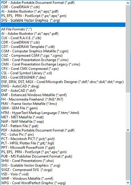
Here's the message they are likely getting when attempting to open your pdf: This happens because of a setting when exporting a pdf that will be opened in CorelDraw. Uncheck the setting below and it will import just fine in CD: So you know very little about CorelDraw and yet enough to detest it? CorelDraw is very widely used in screen printing, often with add-ons to handle spot colors in bitmaps. But for flat work like this, I just output negatives and the screen film is made direct. Here's CD's file types it can open...
-
Variable fonts support
MikeW replied to Athanasius Pernath's topic in Feedback for the Affinity V2 Suite of Products
You can also add VivaDesigner, a layout application, to a small list of applications supporting OT Variations: Video_2023_09_08-1_edit_2.webm -
Look up the help topic for creating spot colors. Once created, and when applied to a grayscale image, it will export as Opaque White spot color. But do check with your print establishment as to what name they require, if any, for the white ink. Some print establishments require a specific name. I would look at the sample file you have, but I use APub v.1 I've attached a palette containing the Opaque White swatch you can import into your APub file. Unnamed.afpalette
-
Pantone actually doesn't specify a solid White swatch. Pantone says to create a swatch named Opaque White as a spot color: How can I specify white for printing purposes? Although opaque white inks exist, Pantone does not provide a reference for white. Generally, if you are printing on white paper and apply no ink to an area, you will achieve white. When ink is needed, it should simply be specified as opaque white, without a PANTONE Reference. ------------- Here's an attached pdf using an Opaque White swatch. opaque white.pdf
-
White, unless it is a spot color, is simply the paper color. i.e. no color.