MikeW
-
Posts
6,352 -
Joined
Everything posted by MikeW
-

Lining Figures (AD)
MikeW replied to smth's topic in Pre-V2 Archive of Desktop Questions (macOS and Windows)
Nearly every other application manages to comfortably fit such things into a single dialog for paragraph and character style dialog boxes. AD should be no different. They would need changed how they are, of course, but it is doable. But if the present scheme hits APub, there will be push-back. -
Text AD vs. AI
MikeW replied to SunRiseMoon's topic in Pre-V2 Archive of Desktop Questions (macOS and Windows)
Horizontal scale probably wasn't needed. Likely just the tracking and kerning. Unless they used the horizontal scaling in AI as well anyway. But I wouldn't know what the creator did without seeing the AI file. Until Serif fix this, any pdf...or AI file with live text...where kerning/tracking and leading overrides (likely leading that is different from AD's default) have been done will need fixed. -
Text AD vs. AI
MikeW replied to SunRiseMoon's topic in Pre-V2 Archive of Desktop Questions (macOS and Windows)
It is perhaps the fact that the AI file has kerning and/or tracking applied to the text. AD only opens the PDF portion of the AI file. AD has an issue with this and can apply wide/narrow spacing to text and even the spacing between lines of text. I believe it is on Serif's radar to fix. Mike -
Lining Figures (AD)
MikeW replied to smth's topic in Pre-V2 Archive of Desktop Questions (macOS and Windows)
Yes. Understood about text style creation. There are 4 panels associated with text. This is not efficient. There should be 2. All features should be accessed from either of those two. -
Lining Figures (AD)
MikeW replied to smth's topic in Pre-V2 Archive of Desktop Questions (macOS and Windows)
Yes, I have argued that the typographical features should be exposed to the paragraph panel as well. This should be rectified before APub is in beta. It certainly should not operate as AD, but AD should not, either. -
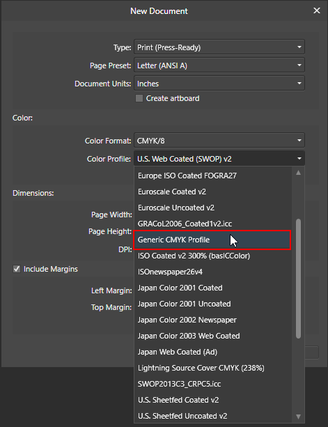
I'm on Windows. The file I showed was all vector. The file with generic in its name was using the profile you provided. Mike
-
I don't use AD for the same exact work I use other vector editors for. So I ported some designs to AD just to compare file sizes of AD files. The below is just an example and the results shown hold true for the half-dozen designs I ported to AD. The difference is small, but does favor the US SWOP profile as regards the smallest AD file sizes. But should the small difference even matter? I dunno. It certainly doesn't to me. And I guess I am still getting hung up on: I really do not understand this at all. I send stuff to a service like a quick print establishment, a wonderful and local offset two-color place, to only god knows who a half a world away in India and China, and to establishments like RR Donnelley. I send stuff off to get proofed by client's local printers that I have no idea what is being used. For clients, I will still use a PDF that has the print intent's profile--I could care less if their office printer can handle it properly or not. While some of the above specify specific profiles, some do not. Seeing how I never, ever, send native files, I do not understand how using a PDF without an embedded profile cannot work for you. Do you send the native AD files?

-
Affinity Publisher
MikeW replied to properso's topic in Pre-V2 Archive of Desktop Questions (macOS and Windows)
Er, that is Serif. Affinity is a product range encompassing at this point two applications on (currently) two OS platforms. Also, Serif ain't young. Not quite middle age, but beyond being a "twenty-something." They shouldn't have announced APub until, well, there was something in the near term. But Serif's marketing department has never learned its lesson in overstating facts, etc. All I can think of is it (an announcement) was to generate interest. Unfortunately, the people actually doing the work could not meet those expectations the marketing hype generated. That said, anyone awaiting vaporware to get work done is allowing that enthusiasm to boil over to disappointment at best. There are options, just not as inexpensive. Mike -
Typography special features
MikeW replied to Timber's topic in Pre-V2 Archive of Desktop Questions (macOS and Windows)
Lobster Two has the Access all Alternates, Ligature (standard) and Stylistic Alternates (SALT) OpenType features. They all work as designed here. There are 38 characters that can be changed in the Access all Alternates feature. There are 63 characters that can be changed in the Ligature feature--but see below. There are only 6 characters that can be changed in the SALT feature. As regards the ligatures, they are tied to what is called "chaining context" rules. There are two chaining context features in the ligature feature. These types of features (chaining context) only activate when certain characters are next to each other or otherwise appear in proximity to each other within the same word (they cannot cross word boundaries). Because all the extra characters are not also assigned to the Private Use Area nor many even mapped to a unicode point, they are also likely not accessible in something like Windows' Character Map (I didn't try BabelMap). But that font does work as designed in AD as far as a quick test can reveal. As do all other of my fonts with OpenType features. Mike -
That is not my experience. Nothing gets rasterized with an embedded document here if the original document can export without rasterizing. You'll probably need to upload your file at some point. But try to export the original document (not as an embedded one) and see what is causing the rasterization. Export using the More button and choose to rasterized Nothing.
-
Everything in the effects panel will be rasterized.
-
I'm still not sure I am following along, so thank you for your patience. Is this what you would like on the Windows side? Mike
-
Can you attach the Apple generic CMYK ICC profile? I would be interested in inspecting it so see what it contains. Mike
-
Guess I got hung up on your file size comparison, completely missing it was the AD file size.
-
I don't know what the contents of the Generic CMYK Profile on the Mac contains. But on Windows, if you want a generic CMYK PDF, click the More button and do not embed a profile. The resulting PDF will be a couple kilobytes, will still be CMYK if that is the color space desired, and will not contain a profile. Same goes with an RGB document, just a couple KB, RGB, and no profile. Mike
-
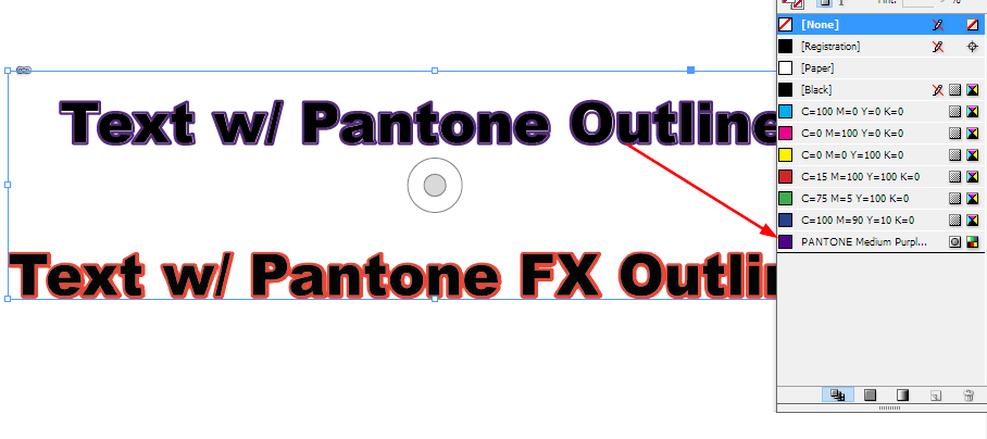
no pantone colour on outline?
MikeW replied to wonderings's topic in [ARCHIVE] Designer beta on macOS threads
As far as I know, AD cannot export Pantone color to an EPS. -
Exporting Multiple Artboards with Bleed
MikeW replied to lexislav's topic in [ARCHIVE] Designer beta on macOS threads
Only thing I can think of would be to create a second document, a single real page, and then copy/paste the art board document to it. I dislike the art board concept enough I avoid them. However, increasing the first art board and copying the other two art boards to should also work. Mike -
no pantone colour on outline?
MikeW replied to wonderings's topic in [ARCHIVE] Designer beta on macOS threads
Either you're not exporting with the Honor Spot checkbox checked (More button), or perhaps you are not choosing the Pantone from a spot color palette. That is, unless the Mac version does have a bug the Windows version doesn't. The FX outline does not export the Pantone as a spot color. But adding a spot color to the stroke as in the above screen shot does here. BTW, as can be seen, aligning the stroke to the outside is crap. At least on Windows... Mike
-
Designer 1.6 Beta – when?
MikeW replied to Matthias's topic in [ARCHIVE] Designer beta on macOS threads
Uh. Just about anything beyond "Hello World" is going to have a bug or ten. -
Exporting PDF with Bleeds
MikeW replied to leethomas's topic in Pre-V2 Archive of Desktop Questions (macOS and Windows)
I just downloaded the file and looked at it. In document setup, choose A5 and opt to anchor to the page. This will have the background image so it bleeds off the page. But there will be some detail clipped off when trimmed. I would personally redraw that background image so the top left and bottom left elements can be positioned without the chance of being trimmed off. Then, like I mentioned, use the More button and set the options for including bleed and the printer's marks. Mike -
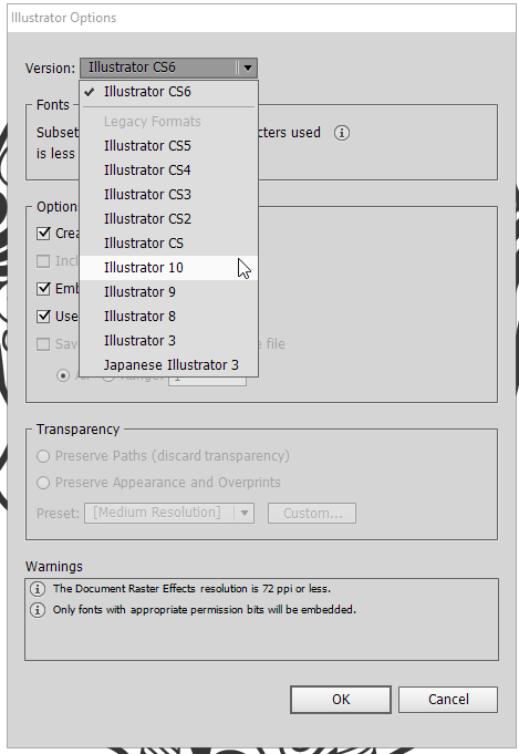
Open Vector in Illustrator 10?
MikeW replied to Reneeci's topic in Pre-V2 Archive of Desktop Questions (macOS and Windows)
Hey, no worries. Glad I could help. -
Exporting PDF with Bleeds
MikeW replied to leethomas's topic in Pre-V2 Archive of Desktop Questions (macOS and Windows)
In the document setup, set the bleed for 2 mm a around. When you export, click the More button, perhaps scroll down a bit and include the bleed and set the printer marks there. I am assuming you have your elements that bleed already extended off the page as well. Mike -
Open Vector in Illustrator 10?
MikeW replied to Reneeci's topic in Pre-V2 Archive of Desktop Questions (macOS and Windows)
Then I guess I was confused as to why you wanted to trace it in AD... In Illustrator, when you either go to save it or a copy, just choose the version of the file you want to save it to. But then, you likely know this too. Mike
-
Open Vector in Illustrator 10?
MikeW replied to Reneeci's topic in Pre-V2 Archive of Desktop Questions (macOS and Windows)
If you have much of this type of thing to do, I do recommend at least installing InkScape. I hate the application, but its Potrace module, while seemingly obtuse to use at times, can do a decent job. There are better trace utilities and even on-line ones available. Here's the AD file. You should be able to export it as an EPS and it open in Illy version 10. I cannot remember how well Illy 10 opens PDFs. Mike skull.afdesign -
Open Vector in Illustrator 10?
MikeW replied to Reneeci's topic in Pre-V2 Archive of Desktop Questions (macOS and Windows)
You have a couple options. One would be to import it and lock it. Then manually draw over it. Another option if you don't have Illustrator to auto trace it is to download and use InkScape to auto trace it. Or, if you would like, I can auto trace it and upload it and you can do any necessary cleanup of it.