Eroica
-
Posts
28 -
Joined
-
Last visited
Recent Profile Visitors
1,597 profile views


-
 imagodespira reacted to a post in a topic:
(Windows) Dark theme in v2 is very inaccessible
imagodespira reacted to a post in a topic:
(Windows) Dark theme in v2 is very inaccessible
-
PunishedRaulito reacted to a post in a topic:
(Windows) Dark theme in v2 is very inaccessible
-
Brian_J reacted to a post in a topic:
(Windows) Dark theme in v2 is very inaccessible
-
rvst reacted to a post in a topic:
(Windows) Dark theme in v2 is very inaccessible
-
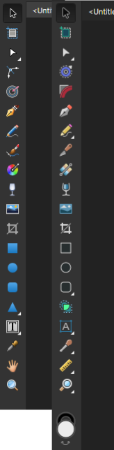
I am happy to see a new release of Affinity, however I think the UI theme on Windows has degraded. I find it very hard to decipher buttons on the dark theme. Compare v1 (top) with v2 (bottom): v2 has gone the wrong way of simplification and removed every subtle "accessibility" hints like a highlighted border on the top. This amplifies the already low contrast between button color and dialog background. There are also no hover states. This was already the case with v1, but v2's button now seem even less "pressable" than before. I also think that v1's toolbar icons (left) are much better because the color's are strong and distinct. I could easily find the shape tools because they are all blue. I understand that there is/was a "flat" movement going on in UI design. However, it seems other dark-themed professional tools were much a little bit more conservative when chasing this trend (e.g. compare Blender's UI). Microsoft also introduced a much more visually "interesting" design with WinUI 3 (no more flat buttons). In comparison, Affinity still looks a lot like Windows 8 or 10. While I don't expect a large design update to match Windows 11, it would be nice to have at least better accessibility and legibility in Affinity's UI.

-
AMD Radeon RX Hardware Acceleration
Eroica replied to Mark Ingram's topic in V1 Bugs found on Windows
Recently upgraded to 2.0 and enabled OpenCL on a 5600 XT. When I use a drawing tablet (older Wacom Intuos) and enable any pressure-based jitter (e.g. size), the brush lags behind heavily. Turning off hardware acceleration makes the brush lag-less again. Can anyone else confirm this? -
Thanks for the suggestions and thanks to the Affinity team for keeping an eye on this issue. I will forward your hints to our development team and check which workarounds work!
-
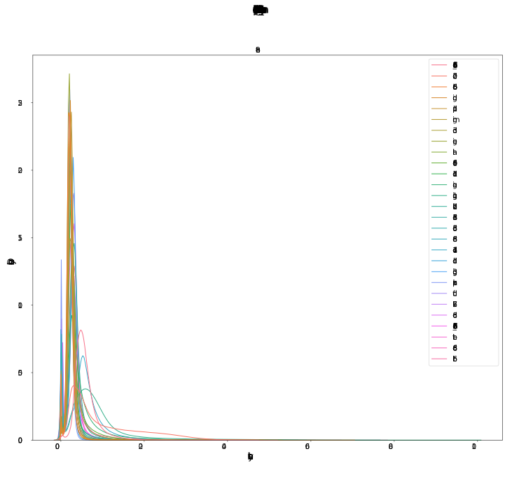
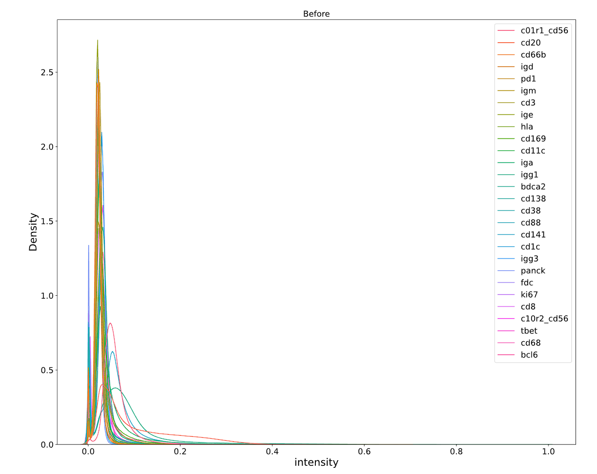
The SVG in the attachments was exported by matplotlib. How it looks in Affinity Designer (1.10.5.1342): How it looks in Google Chrome (correct): Do you see anything wrong in the SVG or could this be an issue of Affinity Designer? density_plot_63-pos.svg
-
 olly1240 reacted to a post in a topic:
AMD Radeon RX Hardware Acceleration
olly1240 reacted to a post in a topic:
AMD Radeon RX Hardware Acceleration
-
Tormy reacted to a post in a topic:
AMD Radeon RX Hardware Acceleration
-
AMD Radeon RX Hardware Acceleration
Eroica replied to Mark Ingram's topic in V1 Bugs found on Windows
Any good news on this issue? Perhaps something on a HIP backend, some pre-release notes, a silent nod, a lifesign? Anything? -
AMD Radeon RX Hardware Acceleration
Eroica replied to Mark Ingram's topic in V1 Bugs found on Windows
Any update on a possible fix? -
Affinity Designer for Windows - 1.10.1
Eroica replied to Patrick Connor's topic in News and Information
Obligatory AMD 5XXX hardware acceleration question -
Affinity Designer for Windows - 1.9.2
Eroica replied to Patrick Connor's topic in News and Information
Any updates to hardware acceleration for AMD 5xxx cards? -
Thank you for your ongoing process in delivering stunning applications with Designer, Photo, and now Publisher. Please keep support for older versions (e.g. 10.9) for the release version, and for the near future. My life depends on it!
-
But that won't select some of the black pixel that are colored red a little bit, will it? The nice thing about Photoshop's inversion was that the white pixel (or light gray to be exact) also get tinted red a little bit. Good to know, thanks for the correction!
-
Hello! Please have a look at the following image: https://drive.google.com/file/d/1O8yEvxtFKmYVeJZn5QgdxLKUXv_eRsdO/view?usp=sharing It's a low-res artwork of a neuron, often found in scientific contexts. The left part is the original image, the right part is the original image where black has been replaced by white (so that this image can be put on dark backgrounds). The right part is also the result of Photoshop, where I've simply used "Replace Color", chose full black to be replaced by full white, tweaked a little bit with the tolerance, and that's it. I'm having trouble getting the same result with Affinity Photo, unfortunately. I think the fact that the image is basically low-quality makes it a little bit harder. The goal would be to replace the black stroke with a white one, but leave the red color inside exactly the way it is, just like Photoshop did. Here's my first naïve approach using Curves: https://drive.google.com/file/d/140_HbrpTRi7PwpjuwgKQmbqCb6zA78k9/view?usp=sharing As you can see, I can keep most of the red color, but I'm getting some chromatic abberation around the red circle (why?). Second approach, using Gradient Maps: https://drive.google.com/file/d/1AwJtaEAy58O-O0ZWMno89S0sLIc1xbpC/view?usp=sharing The problem here is that I have to hit the same shade of red of the original image at any specific value point, which means I'm recoloring the red circle unfortunately. Any other approaches I missed, and which I could learn? I'd greatly prefer a non-destructive way (compared to Photoshop's) and keep using Affinity Photo/Designer (as always), so I'd be thankful for any help! Affinity Photo's Color Replacement Brush doesn't seem to work at all, it will try to do this: https://drive.google.com/file/d/101TrlMsApn2OfKwgkvKsM1bTs8M9-eEk/view?usp=sharing
-
Eroica reacted to a post in a topic:
Avoiding pixel "aliasing" when creating objects out of smaller shapes
-
Thanks for your in-depth explanation and the example file. Incidentally, my construction from step a. is the same to your construction! One follow-up question: When designing UI elements such as toolbar icons and the like, I learned that you should always try to align your elements on a pixel grid so that they don't get blurry. So when I create a 36x36 px icon, for instance, I also create a 36x36 document and design my icon there, even though it's a vector file in the beginning. Given that some (Mac) icons get as large as 1024x1024 px, and if you were to use your approach of downsampling the final image, would you still try to align all shapes to a pixel grid? Or can you get a little bit more deliberate if the final icon size won't be as small as 36x36 pixels?
-
Hello, I have a general question about creating objects with Affinity Designer. Here is a picture that hopefully helps you understand my issue: https://drive.google.com/file/d/1jDIYYxd9ya5fS_qSuebt781eShcrj-Bj/view?usp=sharing I was trying to recreate a kind of lens which is shown in step a. This object itself is made up of several smaller shapes (b.), one of which is a large blue area which also serves as the outline of the object. The other shapes, e.g. the white "lens," is a child object of the blue shape. My problem now is that--when enabling pixel view--some blue pixels appear at the edge of the white objects (displayed in c.). This is of course because the white shape is still inside the blue shape. Instead of the blue shape outlining the whole object, I guess I could create the object out of several smaller shapes, e.g. what I did in d. I then just move every shape close together until they snap to each other. However, now this leads to the issue that some of the background (e.g. a strong red) will be slightly visible where the shapes touch each other (shown in e., again more visible in pixel preview). Also, when subtracting the blue shape, Affinity Designer often fails to create a "clean" object, and often leaves some stray nodes when subtracting shapes (shown in the red part of step d.). My question as someone new to this kind of illustration/graphic design would be: How would professionals go ahead to recreate this? Is there a "standard" way which avoids these kind of issues? My goal would be to some day create "semi-realistic," skeuomorphic icons such as Mac's Automator: If you have any other hints or tutorials that can teach me more about this kind of design, I'd be happy to know them as well!
-
gdenby, thank you for your explanation and sample file. Specifically, "Posterize" is the thing that I needed. I'm glad that you showed me this option!
-
Hello! A picture probably says more than thousand words. Please have a look at the attached image. I'm trying to recreate this "polygon" look. I know how to create a gradient over several objects by selecting them at the same time. Is it possible to add these artifical "steps" over the gradient's colors? Similar to the orange-to-red gradient in the attached image. Or is it all done manually? If you know any other hints on how to create this or similar polygon looks, I'd be happy to know them as well!