justwilliam
-
Posts
189 -
Joined
-
Last visited
Everything posted by justwilliam
-
 Quite correct! Obviously, the ideal situation would be more user customisation abilities in the tool bar. Now, if there were some key one could depress when drawing out the rectangle which would cause it to become a rounded rectangle (in a manner similar to how the ellipse becomes a circle when holding the shift key) then I would likely not argue for a separate tool. I just try to keep in mind that it would be impossible for the developers to completely please every single one of the users while at the same time I have the confidence that they are trying to please as many as they possibly can after having looked at the roadmap.
 -
Jiggity-Jaggedy Lines
justwilliam replied to justwilliam's topic in Pre-V2 Archive of Desktop Questions (macOS and Windows)
MattP, Thank you ever so much for the suggestion and for taking the time to test it and answer. I had wondered if it might have something to do with the 'extra' stroke layers which I had added. Being very much a beginner, I had to attempt solve an issue where the blur and opacity levels of my highlights and shadows was causing a problem with the stroke on the underlying layer. A 'new' stroke layer above quickly solved that little problem for me but I didn't see until after export that it was causing its own problems. (I am also pretty sure that the blurring and opacity changes which I made are likely not the best way to do those highlights and shadows; but I am learning as I go.) Thanks again for the suggestion; I will have to try that out immediately! :D -
Perhaps I misunderstand your question/comment, but if you go to View - Media Browser - [the folder where you have your images] you can see your images, choose the one(s) you want to edit, and even zoom the viewing size if wanted. Maybe that helps you.
-
Yes, both tools currently remain there seperately; sorry to have been unclear, but I was referring to a suggestion made early in the thread to "fusionate the rounded corner box simbol and the corner box into one simple element". I merely wanted to voice my opinion against such a change, Both programs are quite complex (as they need be) but they need not be unnecessarily complicated. IMO
-
Jiggity-Jaggedy Lines
justwilliam replied to justwilliam's topic in Pre-V2 Archive of Desktop Questions (macOS and Windows)
Hi MEB, Hopefully MattP has a simple suggestion to help me avoid this issue in future. (BTW What happens when a forum member has uploaded their 200MB limit of images; do the oldest ones just disappear or something?) -
Could someone please explain to me why there appears such jagged edges on all of the curved (non-straight) lines in this image. The original document is 1300x580; was that choice too small? If so, how large a document size should I have for something that would only be viewed on a display? Was there some other thing I should have done differently? (Not referring to the image itself - this was just 'doodling around' and is yet incomplete) Thanks for your help.

-
Vielen Dank für einen anderen feinen Video-Tutorial !
-
Uhmm; just another opinion here but, I like having both the 'rectangle' and the 'rounded rectangle' in my tool bar - for a couple of reasons: When I want a rectangle with rounded corners, I like simply to click-drag and be done - no extra fiddling required. My toolbar only extends to less than halfway down the left side, so there is plenty of room to have both; it is not as if there is a lack of real estate there requiring the removal of a tool to make more room. Removing the specific 'rounded rectangle' tool makes about as much sense to me as would removing the 'smart' mode available for when using the pen tool. One of the things I like best about Affinity D & P is the ease and simplicity with which I can do things quickly; maybe I am missing something here but what is being discussed (from the beginning of this post, anyway) would seem to be a large step backwards.
-
Me three :rolleyes:
-
evtonic3, thank you for sharing.
-
Amazing! You are getting closer to the top on my xmas list, MEB. Definitely one for my bookmarks! :D
-
Did it. Played with it. Will definitely find uses for it. Many thanks MrDoodlezz for sharing this. And thank you, too, MEB for explaining to me how to import them. (now there are a couple of more styles which have been posted here that I must find again and get...) :)
- 18 replies
-
- 1
-

-
- letterpress
- embossing
- (and 3 more)
-
MrDoodlezz (or anyone else who knows), I have seen these and other 'styles' (as well as some nifty brushes) posted here; but exactly how do I bring these into Affinity Designer & Photo?
- 18 replies
-
- 1
-
-
- letterpress
- embossing
- (and 3 more)
-
Very nice and very well done; you went far beyond jack's excellent tutorial! That must have been quite a masking effort on the original photo of the statue.
-
I am sure that there are enough Affinity Photo and Designer users that there are likely a number of people working on producing books; but nothing is available yet. As Rodney stated, there already is an abundance of tutorials presently available on the interwebs and this increases all but daily. One very good resource for my learning has been this very forum; ask a question and you get answers. One option that many of us fail to utilise (or even consider) are the help files included with the app; although possibly not an exciting adventure by any stretch of the imagination, any afternoon spent in a lounge chair leisurely reading through the help files would certainly be productive. And even more so done in front of the computer so one can try out each new thing one reads about.
-
These may be of some help:
-
Конструктор, Спасибо за ссылку на свой очень глубокого рассмотрения Affinity стока - это было очень хорошо сделано и довольно исчерпывающим. Thank you for posting the link to your very in-depth and comprehensive review- a lot of time and thought must have gone into this.
-
Wow!, wonderfully textural sky and with harmonious tones throughout; going all the way white with the light of the sun and positioning the left of the Lion close to centre beautifully balances the composition. Although I personally tend to prefer monotone over colour, your economic colour manipulation merges marvellously with this majestic cat. Very well done, as always!
-
These are just some questions I have and are NOT to be taken as an endorsement of this app in any manner. I noticed a new app on the MAS called “Tutorial for Affinity Photo” and so I took a quick look at its ‘table of contents’. It did not appear to be very comprehensive at all but seemed as if it would cover what might be needed to perform the most basic ‘one-layer’ edits. Perhaps it could be something for someone who has done no further editing than what can be done in Apple's Photos, for example. Has anyone here downloaded this? Do you feel it could be useful for those who might be new to editing and who have posted wanting to find tutorials that ‘start from scratch’? I do not have a need for it, and have many other uses for my 95 SEK, and therefore will not be downloading it but I would be interested to know what anyone who did have (and need) it thought of it. Both for the benefit of those who are looking for such and in the event that the same developers ever offer a tutorial for Affinity Designer (which I could possibly make use of). Again, I am just asking about this and have neither an affiliation with the group who made this app nor a desire to promote it whatsoever. Just a 'heads up' and a bit of curiosity on my part.
-
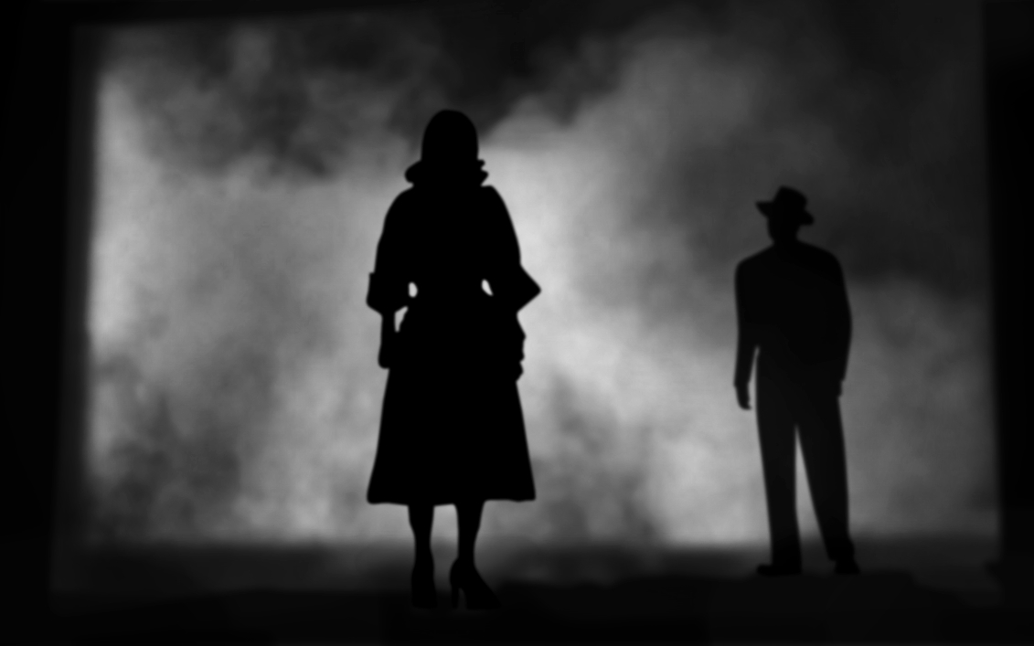
Very good points. I will try to add appropriate highlights to the woman and a bit of mist in front of the man tommorow after work. Yes, about the only thing I 'took' (via the pen tool) from the original still were the sillouettes of the characters and the structure. I desperately tried to make my own fog, but ended up sampling and blending some various fog textures from online. The horizon being slightly off might help bring in some creaking sounds but I couldn't figure out how to bring in the smells of the docks...yet.
-
Thank you, bamboo8R.
-
I wanted to have a little play around bringing some vector shapes created in Designer into Photo just to see how it all worked and what I could do from there. Quite fun! So, here's a bit of 'film noir'. Enjoy! (as always I welcome critique, criticism, comments and helpful suggestions)
-
うわー!どのように良いこれは説明するボキャブラリーがありません。私は確かに日本語でそれを言うことはできません。 Wow! Words fail me. The detail in the crimp at the end of the tube, the cap, and even the small fold where it looks as if this tube has already been used are fantastic. All of the shading is so very well done; until I saw the word 'sunstar' was a wee bit too straight I could have believed it was 'real'. Excellent work as always bamboo8R and thanks for including the video again also (so I can take a peek and learn something more from you) 素晴らしい仕事を bamboo8R とビデオありがとうございました
-
Danke für diesen wundervollen Tipp! Ich habe sie als separate Dokumente zu öffnen und dann tut ein Copy-Paste maneouver. Dies ist viel einfacher.
-
As a matter of fact, peter, they actually do have something to tell...I very carefully hid it in the highlights (but I did not do this very successfully, as it cannot really be seen in the .jpg and it was all but barely visible in the .afdesign file. I would like to return to this file sometime and fix what my 'resizing' messed up, but it was just another one of my little 'experiments' in learning Designer and I am currently highly overreaching myself in a new 'experiment'. (I even have something planned that, to me, is ostensively the very definition of 'film noir'. But whether I can I pull it off is another question entirely.) Thank you, Denny; spooky/creepy was the plan (If you have never yet done so, take a look at the photographs of Diane Arbus; quite creepy/spooky/odd, indeed). I really like this quotation of her.