pbasdf
-
Posts
74 -
Joined
-
Last visited
Everything posted by pbasdf
-
Font Manager in Designer 2
pbasdf replied to Clayton King's topic in Desktop Questions (macOS and Windows)
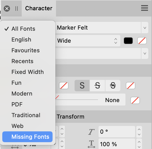
In V2, in the Character Panel, click the Collection box (typically showing "All Fonts"). From the list of Font Collections that is displayed, select "Missing Fonts"). Then click the down arrow on the right of the Font Family box. It should then show the list of missing fonts. This is in the Help file for the Character Panel: "About the Character panel The Character panel is unique in providing the ability to: List typefaces within particular collections (including Missing Fonts)."
- 11 replies
-
- 6
-

-

-
- designer 2
- fonts
- (and 1 more)
-
@David Rich Just a thought. I notice in your second screenshot that iCloud is showing the symbol which indicates that it is syncing your Mac with the cloud. Could it be that process is taking some time? If you download the file first, does Publisher then open it correctly?
-
Text Wrap - Yet another text wrap bafflement
pbasdf replied to SteveMcDonald's topic in Desktop Questions (macOS and Windows)
@SteveMcDonald, This may be irrelevant, but... In the screenshots, you appear to have the text frame selected, so the text wrapping settings are those of the text frame itself, not the image. Select the drop cap image, and check the text wrap settings for that. From @firstdefence's post, it looks like the image might have text wrapping set to Edge. -
Keeping text within frame
pbasdf replied to Jim Saunders's topic in Desktop Questions (macOS and Windows)
One suggestion - in the character panel, check whether you have "No break" enabled - that forces text to ignore the frame boundary. -
B&W Photo becomes rich black on a CMYK page
pbasdf replied to Stephen Babb's topic in Desktop Questions (macOS and Windows)
If you apply a Black and White Adjustment layer to your photo, it will be rendered as Pure K. Note though there are various posts about pure K being converted to rich black at export time. To avoid the conversion, ensure that your export profile is the same as your document colour profile. -
In your workflow, would it work to use Expand Stroke on the separate curves, and then Geometry Add to combine them?
-
You can reset the rotation. AFPub: View menu: Rotate: Reset Rotation AP: View Menu: Reset Rotation AD: View Menu: Reset Rotation If you "right click" on the canvas, the context menu includes "Reset Rotation". There are also keyboard shortcuts for it (the default seems to be Ctrl-Shift-Cmd R in AP/AD). You can also disable trackpad rotation in (Affinity) preferences: Tools: Enable Canvas Rotation with Trackpad. See here for more information: https://affinity.help/designer/English.lproj/pages/DesignAids/rotateCanvas.html
-
From a quick (and possibly ill-informed) look at the PDF log, it seems like the problem lies with the embedded ICC profile in an image named "PdfIm_804.jpg" (though that might be an internal name for an embedded image??).
-
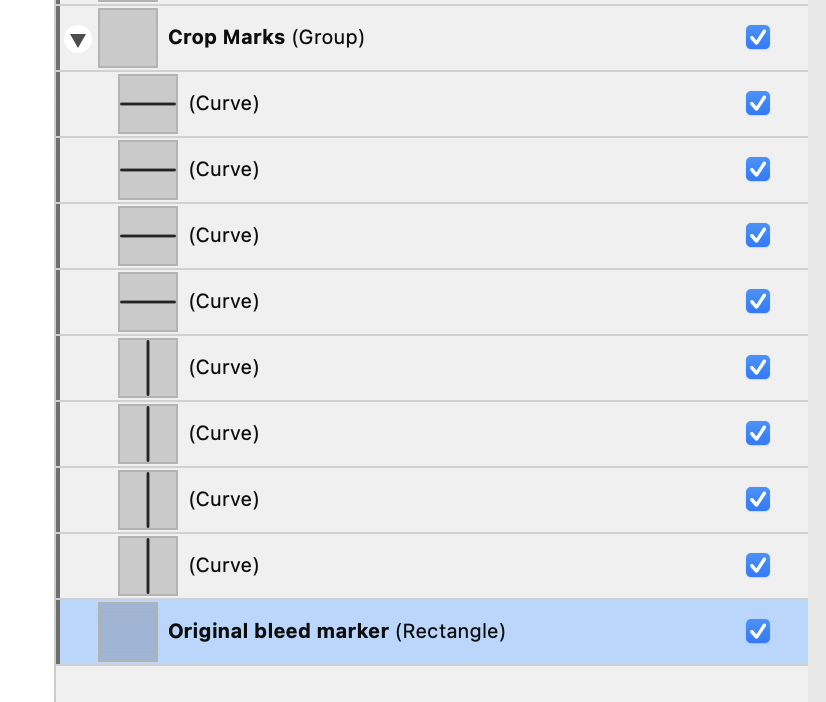
Regarding (3), could you make your own crop marks, as follows: In your master page(s), create a rectangle which extends from the very top left of the current bleed area of your spread to the very bottom right. For example, if your current (and desired) bleed is 3mm (top, bottom, outside) and 0mm (inside), and your page size is A4 (210 x 297mm), then the rectangle will start at (-3,-3) with dimension (426, 303). Give this rectangle a transparent fill and a narrow stroke in a distinctive colour, to act as a visual (and possibly snapping) guide when placing items that extend beyond the edge of the page. In the document setup, increase the size of the bleed, to say 10mm (top, bottom, outside) and 0mm (inside). With the pen tool, draw short vertical lines from the very top of the new bleed area down to the top edge of the rectangle, placed in line with the left- and right-hand edges of the spread. Repeat at the foot of the spread. Likewise draw short horizontal lines from the very left of the new bleed area to the left-hand edge of the rectangle, placed in line with the top and bottom edges of the spread. Repeat on the right of the spread. (The picture shows the crop marks and the (red) rectangle marking the original bleed area, and the new bleed area in lilac). When you export now, in the export options, include bleed but not crop marks (nor any other printers' marks). The niggle with this will be if you have any page content which currently extends so far into the new bleed area that it overlaps and obscures the crop marks. You might need to juggle the layer order in those cases, or create equivalent marks local to the page rather than on the master.
-
Affinity Publisher Error
pbasdf replied to Priyantha's topic in Pre-V2 Archive of Desktop Questions (macOS and Windows)
Do you have any hyperlinks in your document? I believe there’s an ongoing issue which causes exporting to fail if the document has any invalid hyperlinks (eg. poorly formatted email or web URL). -
I don’t think the text frames are moving per se - but by inserting one page, a LH page becomes RH and vice versa. So what was inner margin becomes outer margin (and vice versa), which makes it look like they moved.
-
Which app are you using, Publisher, Designer or Photo? How did you create the ellipse text? Did you start from scratch, or have you used a template or other file from somewhere else?
-
If you need to run it a second time, first use find/replace to change all instances of the Body First format to Body.
-
How do you identify a "new scene"? If you can prescribe some rules for that, it might be possible to prepare a Regex find/replace that applies a different paragraph style to the first paragraph.
-
I suspect you have a hyperlink defined on the text frame, as well as the text itself. If you open the Hyperlinks studio panel (View --> Studio --> Hyperlinks) you should be able to check through and find the incorrect one - and delete it using the Wastebasket icon at the bottom right of the studio panel.
-
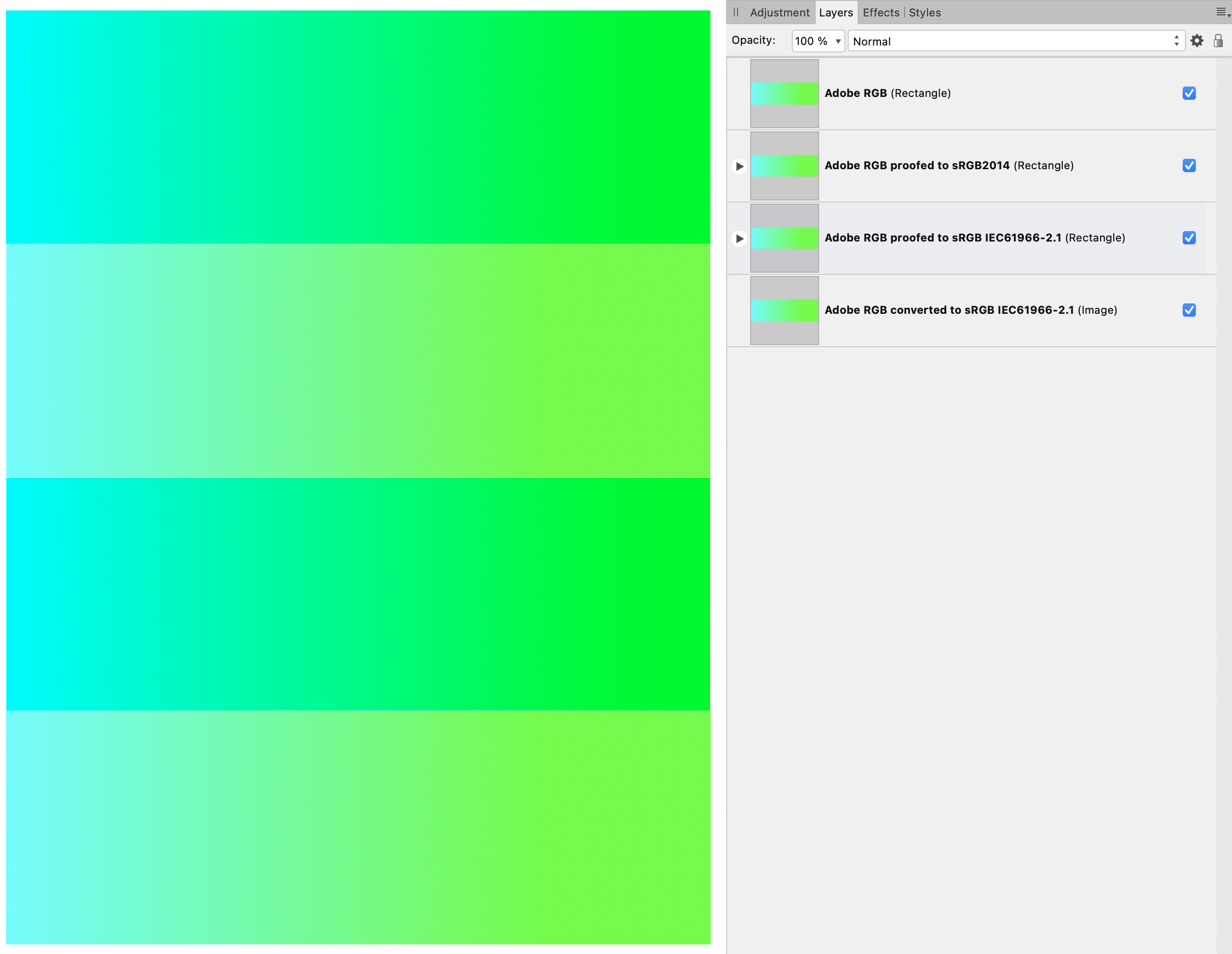
In my experimentation, I have found that the problem with Soft Proofing to sRGB is very specific to the sRBG IEC61966-2.1 profile. I found that if I use a different sRGB profile, the soft proofing appears to work. The document shown below is in Adobe RGB. The rectangles are, from top to bottom (on the canvas and in the layer stack) (1) a rectangle filled with a colour gradient from RGB 0,255,255 to 0,255,0. No adjustments. (2) an identical rectangle with a Soft Proof adjustment using the sRGB2014 profile available from the ICC (https://www.color.org/srgbprofiles.xalter). (3) an identical rectangle with a Soft Proof adjustment using the sRGB IEC61966-2.1 profile. (4) the first rectangle, exported to TIFF using sRGB IEC61966-2.1 (profile embedded), placed within this document. Note that (I hope this comes out in the screenshot): (3) appears identical to (1), ie soft proofing to sRGB IEC61966-2.1 has no discernible effect, (2) is different from (1), ie soft proofing to sRGB2014 does have an effect, and (2) appears identical to (4), ie soft proofing to sRGB2014 seems to have the same effect as converting to sRGB IEC61966-2.1. For information, I use a 2019 iMac running macOS Monterey 12.5; I assume the sRGB IEC61966-2.1 profile derives from there. In fact, as a separate test (not shown), I have copied this profile and used the Mac's ColorSync utility to modify JUST the "desc" tag in the profile: soft proofing with this seemed to work identically to the sRGB2014 profile from the ICC. I hope all that is useful for those investigating the issue, and also hopefully provides a workaround for those who want to Softproof sRGB in the meanwhile: head over to the ICC and install one of their sRGB profiles (even if you only use it for Softproofing, not for conversion).
-
... which can be found in the menu as Layer --> Geometry --> Separate Curves.
-
I think the “table of contents” shown in your image is a list of the PDFs bookmarks. The PDF bookmarks are derived from Affinity Publisher’s Anchors. If you open the Anchors panel (View —> Studio —> Anchors), you will see the same list, complete with the brackets that you have carefully edited out of the Affinity ToC. I think what’s happened is this: when you create the ToC, with the option to include the ToC as PDF bookmarks, Affinity generates the ToC text, using the relevant Paragraph Styles to identify ToC entries, and also generates all the relevant Anchors. Because the ToC entries are based on Paragraph Styles, the full text of the paragraph is used - including the brackets. You have then edited the ToC text to remove the brackets, but the Anchors remain unchanged. You could edit each individual Anchor entry (click on the name in the Anchors panel to edit) to remove the brackets, but note that after changing the name the icon on the right (which indicates that the anchor will be exported as a PDF bookmark) becomes greyed out. Just click it to re-enable it for export. Note that if you refresh the ToC, the Anchors will revert (as does the ToC text). The other option would be to somehow ensure that the text used to create the ToC does not include the brackets (which isn’t easy - perhaps others can help with that). You would then have to regenerate the ToC (though that would mess up the formatting changes you’ve made to the ToC text!)
-
I think what you’re looking for is “clip to canvas”. From the View menu, select View Mode and then select Clip to Canvas. https://affinity.help/designer/English.lproj/pages/DesignAids/clipToCanvas.html
-
If you select an area, you can export just that selection, but I don't think it's possible to export multiple selections all in one go, each to a separate file. However, you could amend your page size to match the data merge layout area size. (If you need to keep the existing layout for other reasons, then use a separate copy of the afpub file). Then each record will fill a complete page, and if you export as PNG then each page will be a separate file.
-
Invisible Subheadings
pbasdf replied to BlueSailing's topic in Pre-V2 Archive of Desktop Questions (macOS and Windows)
Personally I would add a separate text frame for the subheading, with the appropriate text and text style, and then hide (untick) it in the layers panel. It will be included in the ToC whether it is hidden or visible. -
Fit frame to text
pbasdf replied to NunoF's topic in Pre-V2 Archive of Desktop Questions (macOS and Windows)
You can also double-click the middle handle on the text box to shrink it to fit the text: If you hold CMD (on Mac, I think Ctrl on Windows) then the text box will shrink to the correct size, but will remain centred (vertically or horizontally as the case may be).
-
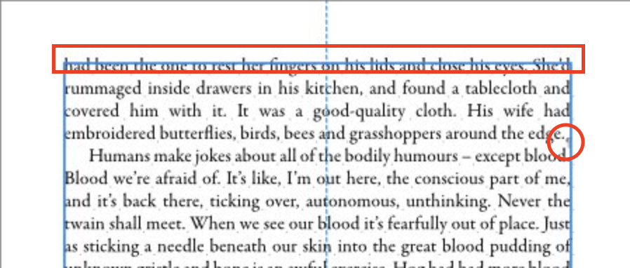
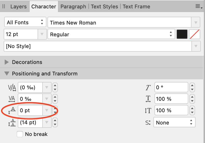
This might be unrelated, but looking at that text you seem to have quite a strong baseline adjustment - note the ascenders on the top line are above the frame box, and the text is out of line with the pilcrows. Unless you have adjusted the baseline for a reason, try setting it back to zero: it might be confusing the text flow options that @GarryP mentioned. (shown here in the Character panel, but if you are using styles check those as well).
-
Is it possible you have a hidden object which has text wrap applied?