kirkt
-
Posts
440 -
Joined
-
Last visited
Everything posted by kirkt
-
@d3d13 - What are you trying to accomplish specifically within AP? Toward the end of your original post you mention trying to save your AP work to ACES [ACES cg presumably] but then you mention that you are trying to export to JPEG or PNG. Are you trying to export a gamma-encoded version of the AP documented to an 8-bit JPEG or PNG in ACES or in sRGB? See this video - take deep breath and watch the entire thing before pointing me to the original post about not wanting to use Blender Filmic. Even though the video is about using Blender Filmic LUTs, the video spells out exactly how to generate correct output for a gamma-encoded format like JPEG or TIFF. Here is the TL/DR version: 1) When you open a 32bit file into AP and have an OCIO configuration enabled in AP, you need to select "ICC Display Transform" in the 32bit Preview panel. This is critical to getting your gamma-encoded, exported JPEG or TIFF to look correct. 2) Once that is sorted out, you can use your OCIO adjustment layers to do whatever it is you are trying to do - remember that you are now manually overriding color management to a certain extent. For example, transform your linear ACES data into sRGB to do texture work. 3) Make your edits. 4) Use an OCIO adjustment to bring the file from the transformed sRGB state back to linear. 5) Export to a JPEG, or whatever you need to do. The key to getting the "correct" low bit depth, gamma-encoded output is enabling the ICC Display Profile in the 32bit Preview panel, and keeping track of your OCIO transforms to make sure your data are transformed correctly for output. The attached screenshot depicts a 32bit EXR opened in AP with the above workflow, and the exported JPEG of the composite 32bit document. I used a Curves and a Levels adjustment AFTER the OCIO transform from linear ACES to sRGB (gamma-encoded data) and BEFORE the transform from sRGB back to linear ACES to manually tone map the bright, unbounded lighting of the celling lights back into the overall exposure range for the rest of the image. As Walt noted, there will be some differences between the two files and how they are displayed, because of the differences in bit depth and the preview accuracy (like the shadow tones in the 32bit file displayed on the left side of the screenshot). But that is minimal compared to the differences when ICC Display Transform is not used throughout the process. Have fun! Kirk

-
Interesting - I am not seeing an issue on my MacBook Pro running Catalina, but it is a newer 16" model, so whatever issues might occur may be overcome by the increased processing capability of the newer machine. To the OP - have you tried running the latest beta (1.9.0.205/206)? Kirk
-
I was speaking in a general sense, related to the ICC profiles. How AP handles conversion specifically, I do not know. This is a question to ask the Affinity folks, like @James Ritson. Kirk
-
That iMac is from 2013-2015, so it may be somewhat slow for AP's requirements and your specific use case for AP. Good luck, kirk
-
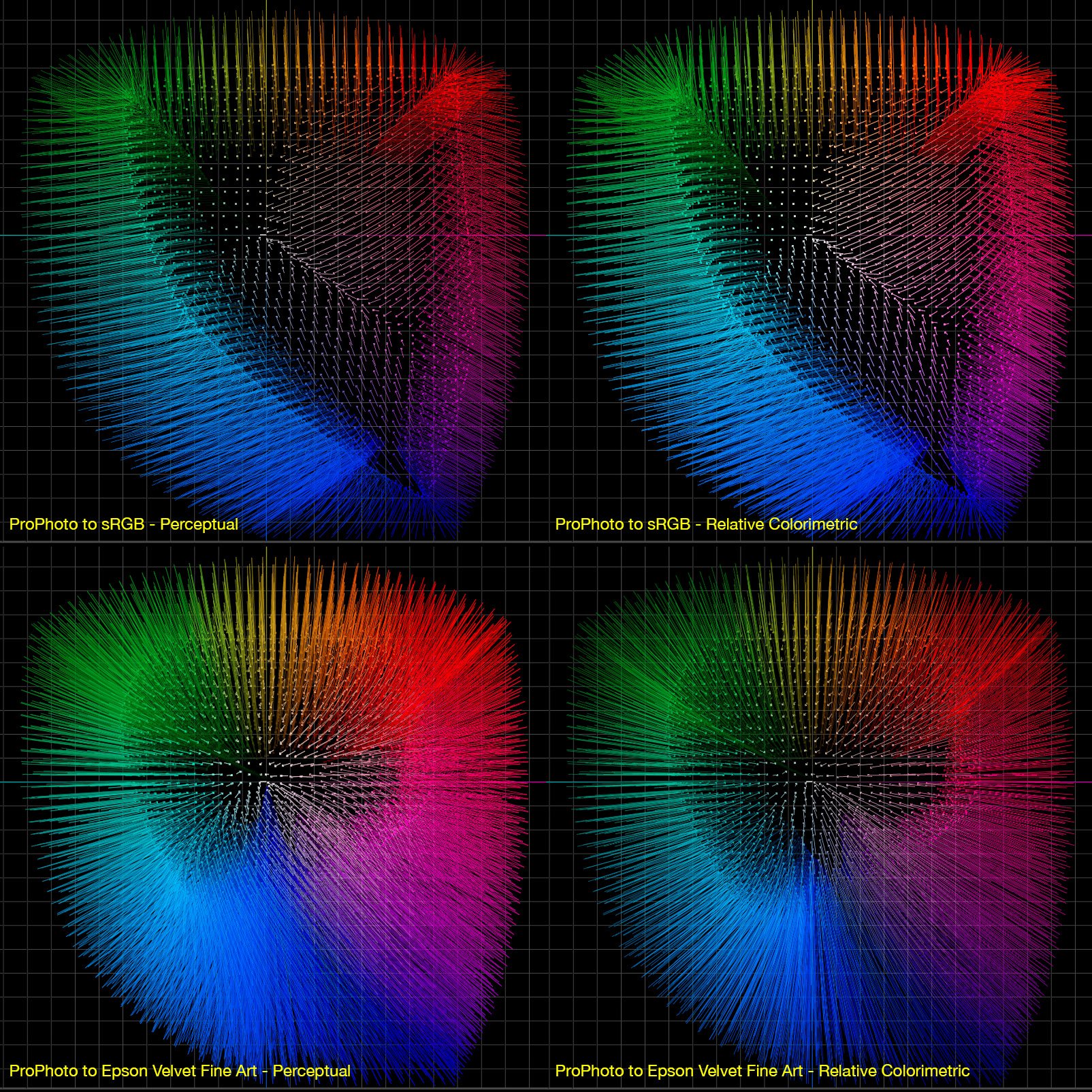
Working color spaces typically convert with only one intent, regardless of the choices presented to you during conversion. Seeing no difference amongst the different rendering intents is, therefore, expected. In contrast, conversion from a working color space to a printer color profile (or any profile configured with various rendering intent options) will provide different results for the various rendering intents, permitting you to control out of gamut color mapping and its relation to in gamut colors. The attached image is an example of a ProPhoto color image being converted to sRGB and to Epson Velvet Fine Art paper via their respective ICC color profiles. In each conversion, I used two rendering intents: Perceptual and Relative Colorimetric. As you know, Perceptual will map the out of gamut colors to the destination profile's gamut volume boundary, while also scaling the in gamut colors to maintain perceptual relationships amongst the colors in the image. Relative colorimetric will scale the out of gamut colors to the boundary of the destination profile, without scaling the in gamut colors. As you can see in the attached image, for the conversion to sRGB there is no difference between the two rendering intents; in contrast, the conversion to the Epson profile exhibits differences in the mapping - that is, you can see the scaling in the Perceptual intent, especially in the blue colors in the image. The images depict the color distribution in a test image I constructed in ProPhoto, and the lines depict the vectors of the displacement of the color from its original position in the ProPhoto gamut volume to its remapped location (onto or into the destination gamut volume) in the source profile's gamut volume. The images are shown as a 2D projection in the Lab color space. When you examine the mappings of ProPhoto to sRGB, there is no scaling taking place within the sRGB gamut volume, implying that the rendering intent for working space conversion is relative colorimetric (it is easier to visualize this with a 3D volume you can rotate and examine). kirk I made my own test image, but here is a test image you can use to try this out for yourself: link text "http://www.brucelindbloom.com/downloads/RGB16Million.png"
-
@Invictus - it looks like your machine is an older iMac (not a MacBook) - what OS are you currently running? What version of AP? AP takes advantage of your GPU to display and compute, and your video card may not be up to the task. In the Preferences > Display section, you may want to disable GPU (Metal) computing and see if that helps. Here are the minimum spec/system requirements: https://affinity.serif.com/en-gb/photo/full-feature-list/#system-requirements Kirk
-
Highlighting in RAW
kirkt replied to Nick Battersby's topic in Pre-V2 Archive of Desktop Questions (macOS and Windows)
Blue represents shadow clipping. Red - highlight clipping. Yellow - clipped saturation (tones). Click each control to enable, click again to disable. kirk -
Color Blind Photographer
kirkt replied to daveb2's topic in Pre-V2 Archive of Desktop Questions (macOS and Windows)
@daveb2 - Here is an example, with a diagram to help you get the gist. In this image, there are four color samplers, placed on various parts of the image and set to read Lab color in the Info panel in AP. The location of each sampler is represented by the red target (circle with a crosshair). I placed a screenshot if the sampler reading in the info panel next to each sampler so you can see what the AP info panel readout looks like for each sampler. The four samplers are: 1) the sky, reading L59 a(3) b(35) 2) a leaf on the green bush to the left of the van, reading L69 a(9) b18 3) a very red flower at the top of the bush, reading L56 a60 b37 4) the white siding on the house, in open shade, reading L48 a0 b(15). Recall here, that for negative values of a and b I use (parentheses) around the number instead of a "-" sign. Inset in the attached image is a schematic diagram of the a and b axes in the Lab color model, with a and b ranging from -128 to +127 (the 8bit representation of 256 total values). By the way, "L" (the lightness value) ranges from 0 to 100, with 0 equal to pure black and 100 equal to pure white). So, let's think about what these Lab values mean: 1) L59 a(3) b(35) - a little bit lighter than 50 percent lightness, slightly green (a(3)) and very blue (b35). This is a very slightly cyan-ish blue, which is pretty much a sky color. 2) L69 a(9) b18 - brighter than 50 lightness, greenish (a(9)) and yellowish (b18). This is a not very saturated (not very far from 0 in the a and b) yellowish green. This is a brightly lit leaf, and that makes sense. 3) L56 a60 b37 - just lighter than 50 lightness, VERY magenta and pretty decently yellow. This is an intense red, and makes sense for a saturated red flower. 4) L48 a0 b(15) - middle lightness, neutral in red-green, and sort of blu-ish. This is a neutral surface (white) that is in shade and being lit by open skylight (blue light), making the white surface appear blu-ish. This makes sense for a neutral surface in the shade in an image that is white balanced for sunshine lighting. So - does this make sense to you? It takes practice to get the hang of thinking in a and b - but, once you start to think about color this way, it becomes very intuitive. So, consider examining a bunch of images in AP, and pick a spot or an object in the image and try to guess what the a and b values will be (you can also try to guess the L value). Then use the Info panel to read the actual Lab values and see how good your guess was. This is fun and gets you into the swing of intuiting Lab color. Once you have a handle on how Lab works, then you can study how your perception of green can be augmented with reading and editing color "by the numbers" in Lab. You can read the Lab values for areas of an image that you think should be green and see if the numbers read as green, or the appropriate variation of green for the surface or object you are sampling. I hope this makes sense, this is a dense topic and I encourage you to read the work of Dan Margulis if you want to delve deeper into it. Kirk
-
Color Blind Photographer
kirkt replied to daveb2's topic in Pre-V2 Archive of Desktop Questions (macOS and Windows)
One thing to consider is learning how to interpret color "by the numbers" in the L*a*b* color model (also called "Lab"). There are several advantages to using Lab to assess and talk about color, even if you ultimately work in an RGB color space. You can set up the Info panel in AP to read Lab color values and use those values to get an idea of color throughout your image - the great thing about Lab is that it inherently separates lightness in the image from color. Color is modeled on two axes ("a" and "b") such that the "a" axis represents green-magenta and the "b" axis represents blue-yellow - this is very similar in some respects to how white balance adjustment tools characterize color temperature and tint. Each axis is centered around 0 - that is, if a or b has a value of zero, then than represents no color, or gray, in that channel. For the a channel, -a means more green and +a means more red. The further from 0, the more color. Similarly for the b channel, -b means more blue, +b means more yellow. For clarity, negative values in Lab are often noted in parentheses - for example, a-10 would read "a(10)" using this convention. Reading color in Lab is as simple as reading the a and b numbers and understanding what specific color that combination of numbers represents. For example, vegetation is usually "green" but that green typically contains a lot of yellow - a typical value of green leaves might be a(10) b40, where a(10) means greenish, or negative a, and b40 means yellowish, or positive b, with more yellow than green. If you sample an area that you know should be green and the a and b values do not make sense, it may require further investigation and adjustment. Green in vegetation is also characterized as a "memory" color and can be affected by various cultural and individual preferences of the person seeing green; however, you can probably find a bunch of reference images with various kinds of vegetation in them and sample the various greens with an Lab color sampler tool and make note of the relationship between a and b (usually negative a and positive b) and the absolute amount and ratio between a and b. The de facto reference for understanding Lab color is the written work of Dan Margulis. I know that some of his books contain specific discussions about color blindness in the context of evaluating color - for example: https://www.peachpit.com/articles/article.aspx?p=608635&seqNum=6 Instead of seeking a special tool, you can use standard tools included in all image processing applications if you familiarize yourself with "by the numbers" assessment of color, and specifically in Lab. You will find that when you examine an image and find that several different areas of the image appear to be off, and off by the same kind of error, there is a color cast that you can isolate and correct. Once this cast is removed, you can examine color in the vegetation, for example, and see if it falls within your range of values for a and b. Good luck! kirk -
Image banding in Affinity Photo
kirkt replied to Gaz's topic in Pre-V2 Archive of Desktop Questions (macOS and Windows)
For composting work, it is probably better to export linear image files from Cinema4D in full 32bit and then work linearly in AP for the compositing, using OCIO to display the composite as gamma-encoded, for reference. Kirk -
Poor resolution for DNG files
kirkt replied to Brolf's topic in Pre-V2 Archive of Desktop Questions (macOS and Windows)
No problem - thanks for updating them, I will take a look. Kirk -
Support lenses?
kirkt replied to Jansen's topic in Pre-V2 Archive of Desktop Questions (macOS and Windows)
@Jansen It looks like it is not in the lensfun database: https://github.com/lensfun/lensfun/tree/master/data/db and here: https://wilson.bronger.org/lensfun_coverage.html so you might want to contact the lensfun project and ask them how you can help profile your lens: https://lensfun.github.io/calibration/ kirk -
Poor resolution for DNG files
kirkt replied to Brolf's topic in Pre-V2 Archive of Desktop Questions (macOS and Windows)
The links take me to "page not found" Anyway - I use a Mac, so as far as the codec for your PC, I am sorry that I can't help you. kirk -
Poor resolution for DNG files
kirkt replied to Brolf's topic in Pre-V2 Archive of Desktop Questions (macOS and Windows)
@Brolf - The DNG is the raw file from which the JPEG was created, so the quality of the DNG cannot be less than the corresponding JPEG. To "see" the raw data in the DNG file, it has to be rendered, and that rendering will depend upon the specific application in which you are viewing the DNG result and the settings that you apply in that application. If the JPEG has been captured and saved at the time of image acquisition along with the DNG file (that is, a simultaneous DNG+JPEG capture in the camera), the JPEG has been created from the raw data by the internal processing of the camera, and likely has sharpening and other enhancements applied to it by the camera. The raw data contained in the corresponding DNG file requires you to process the raw data to your liking, including adding sharpening, tonal adjustment, etc. The default processing in your raw converter is just a starting point, and may only apply very basic adjustments to give you a general rendering of the raw file - it is up to you to make it look the way you want it to look. If you prefer the in-camera JPEG, then it may be that you do not need to shoot DNG+JPEG, but you can just shoot JPEG and work with those files. Post a link to the DNG and JPEG file combination here for download and I can provide you a comparison of the DNG renderings from several raw converters, with settings configured to match the JPEG. Kirk -
Brush Tool Opacity is not 100%
kirkt replied to LV1's topic in Pre-V2 Archive of Desktop Questions (macOS and Windows)
Yay! Kirk -
Work in Affinity Photo with ACES
kirkt replied to Dmi3ryd's topic in Pre-V2 Archive of Desktop Questions (macOS and Windows)
@Dmi3ryd The video to which you linked is about using Blender's Filmic OCIO config group and the LUTs contained in the group. An ACES transform is included in that OCIO config, so you can render your 32bit EXR to ACES linear and then use OCIO to transform the ACES linear to log and then apply the filmic LUTs, as the video shows. But it sounds like that is not what you want to do. BTW, "Filmic" is not a color space, it is a transform from log to filmic highlight rolloff rendering for unbounded files - i.e., it is a way to tone map 32bit files with filmic highlight rendering. In AP, you can set the ACES CG Linear AP1 profile, for example, as the working color space for 32bit files (see "1" in the screenshot below). You can also download an ACES OCIO config and associated LUTs from OpenColorIO: https://opencolorio.readthedocs.io/en/latest/quick_start/downloads.html and use this config as your OCIO within AP (see "2" in the screenshot). You can load a 32bit EXR file encoded in ACES and use an ACES working color space and OCIO adjustment layers to transform your data to whatever you choose, as long as those transforms are contained in your OCIO configuration. The method is the same as in the video, you are just using a different set of OCIO LUTs specified in your config file. If you describe what you are trying to accomplish it might be easier to get a more detailed answer. Kirk
-
It is advisable to remove the uneven illumination (the large areas of luminance variation) across the source image before you tile the source. One way is to create a copy of the source and perform a Gaussian blur to remove the high-frequency detail and leave the low-frequency blobs of illumination variation - make sure to enable "preserve alpha" so the blur is retained to the edges. Invert the blurred result and set the blend mode of the inverted, blurred result layer to something like Vivid Light (try the various contrast blend modes to see which works best for your source art). This will neutralize the luminance variation. To remove the tiling borders, use the Affine transform (Filters > Distort > Affine) and dial in an Offset in X and Y of 50%. The edges of the source will be moved to the center of the image, in a cross-like arrangement where you can inspect and deal with the discontinuity of the source tile at the edges. You can Inpaint or clone the seam away at the center cross. Then reverse the Affine transform by repeating it. Make sure that when you perform the Affine transform, you have the "Wrap" option selected. Now the edges of the source tile are continuous across the boundaries of the source. Now your source tile has the uneven illumination neutralized and the tiled edge discontinuities removed and is ready for repeating seamlessly. Kirk
-
Work in Affinity Photo with ACES
kirkt replied to Dmi3ryd's topic in Pre-V2 Archive of Desktop Questions (macOS and Windows)
Also - did you download James' macros to help automate the Filmic workflow? They are very helpful. kirk -
Work in Affinity Photo with ACES
kirkt replied to Dmi3ryd's topic in Pre-V2 Archive of Desktop Questions (macOS and Windows)
@Dmi3ryd - What specifically are you trying to accomplish in ACES within AP? Is your source EXR in ACES? Are you simply trying to use the Blender Filmic OCIO with an ACES source file, or are you trying to use ACES as a working space, etc.? Kirk -
Histogram differences
kirkt replied to Amosjl's topic in Pre-V2 Archive of Desktop Questions (macOS and Windows)
@Amosjl - In general, the camera histogram is based on the processed JPEG that the camera is generating from the raw capture, regardless of whether you are saving the JPEG or just the raw file. If your camera has a JPEG setting that is black and white, you can set the camera to this mode and the histogram will display the same curve in all three color channels (the black and white image), even thought the raw file will preserve all of the color info. This is one reason why it can sometimes be hard to judge exposure for a raw file based on the in-camera histogram, which is based on the processed JPEG. The AP histogram is displaying the rendered raw file made with AP's conversion settings, not the camera's conversion settings - the two histograms are, and typically should be, different because the resulting rendered image file in AP is not based on the same processing or settings as the in-camera JPEG. kirk -
DELETED - erroneous post. Sorry about that! Kirk
-
It appears that AP's raw conversion engine is not applying the metadata in the RAF that tells it to apply the appropriate tone curve for the DR400 shot. The raw file gets underexposed during capture (to preserve the highlight data) and then boosted during conversion for a system like in-camera JPEG processing, or a raw converter that is aware of the DR metadata. What are your Develop assistant's settings? Is Tone Curve set to "Take no action" or "Apply tone curve"? kirk
-
Need lens profil
kirkt replied to Equalizer's topic in Pre-V2 Archive of Desktop Questions (macOS and Windows)
I tried running the script as well - there was an issue with the script containing the greek letter "alpha" that threw an error. Even after changing the occurrences of that variable, the script will run but does not produce the merged xml database that it is supposed to produce. I am running it locally, with a local-to-the-directory database folder (version 2) that I explicitly name in the argument to the script, as well as explicitly naming the output file as an argument and nothing is output (the output file is created, but is simply has a line of text that echoes the database version 2). Same thing occurs when running the distributed lcp conversion utility that was built as part of lensfun via homebrew. There is a lensfun entry for the 15-30, but it appears that the LCP file you are wanting to convert might be a variation of the one that is already in the lensfun database (A012 versus A014). -
HDRI Neutralization method
kirkt replied to cgiout's topic in Pre-V2 Archive of Desktop Questions (macOS and Windows)
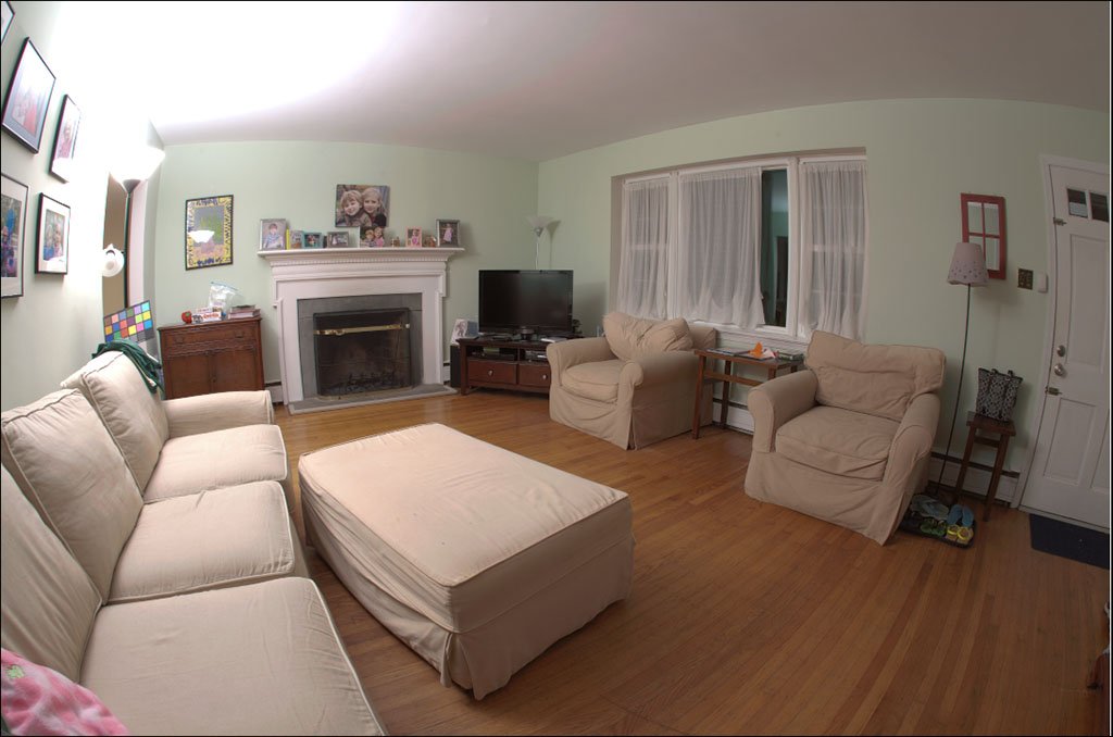
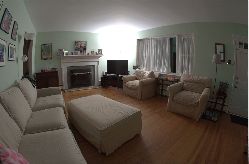
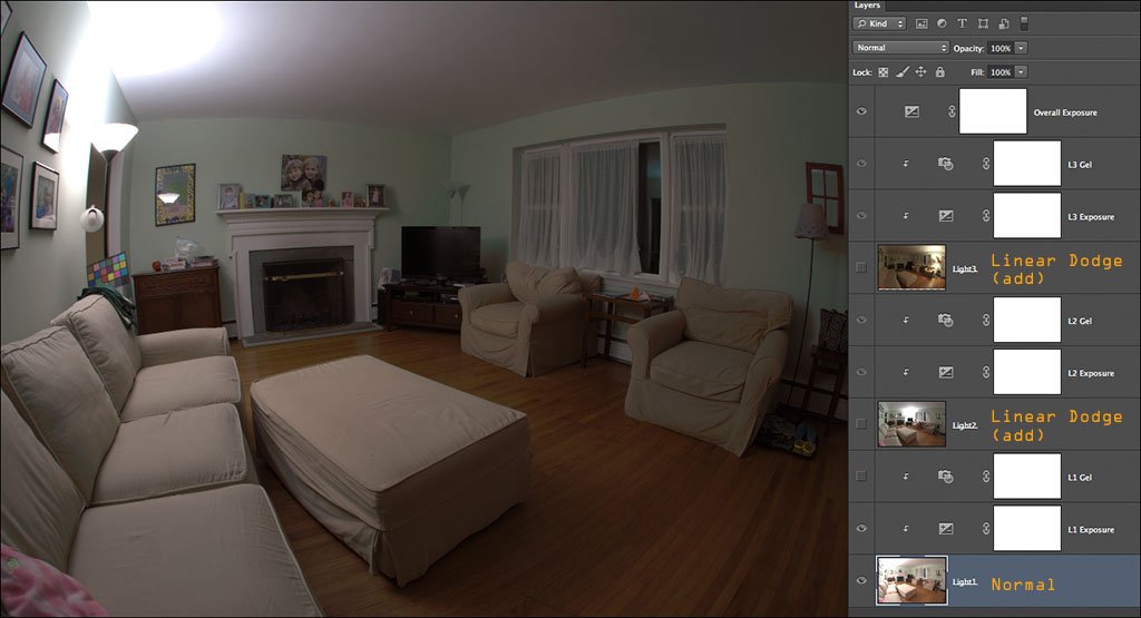
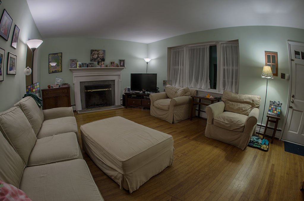
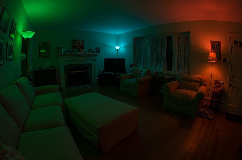
@cgiout - How much control do you have over the scene you are photographing and how long do you have to acquire all of the source images that you ultimately use to make your HDR composite? The reason I ask is because, when you use a full 32bit per channel workflow, you maintain the physical integrity of the lighting in your scene, making it easy to manipulate that lighting after capture. However, to give you the most flexibility, you want to sample the scene one light at a time and then add all of the lighting together in post. That is, let's say your scene has 3 lights in it. Ideally, you would want to shoot the entire scene with each light illuminated individually, with all of the other lights off. In post, you can combine your HDR exposure sequence for each light into its own HDR file (32bit per channel) and then bring each HDR file into a working document and add the light sources together in your 32 bit per channel working environment. In this scenario, you can add an exposure adjustment layer and a color filter adjustment layer clipped to each light layer and use these controls to change the intensity and color of the contribution of that light to the scene. This gives you the power to recolor each light and adjust is contribution to the scene as you see fit. Not only can you neutralize the color temperature of each light, if that is what you want to accomplish, but you can add any color filter, completely relighting the scene with some look or mood. Essentially, you stack the light layers and set the blend mode of each one that is above the background layer to "Add" - because you are working in a 32 bit per channel document, the light will add linearly, just as it does in "real life." Attached are a few images of the process based on an example I wrote up several years ago, but it is no different now (the example is in Photoshop, but it is the same in AP). The first three images show the three light sources in the scene, each one illuminating the scene without the other two. An HDR sequence was shot for each light. A color checker card is included near the light source that is being imaged. The color checker can also be cloned out or the image sequence can be shot again without the color checker. Next, the layer stack that is constructed to mix the lighting - note that each image of a light has a color filter ("Gel") and an Exposure control to modulate the properties of the light. It is like having a graphic equalizer for the scene! Also note the Master Exposurecontrol at the top of the stack, giving you control over the overall intensity of the scene (you could add a master color filter layer too). The next image demonstrates how a local white balance for one of the lamps is accomplished to bring its CCT (correlated color temperature) into line with the other lamps in the scene. In this scene, two of the lamps were LEDs with a daylight CCT, and one lamp was a tungsten filament light bulb with a much warmer CCT. I balanced the warmer lamp to bring its color into line with the other LED lamps by adjusting the warmer lamp's color filter layer. Finally, the rendered results for a "literal" tone mapping of the scene, and then a moody, funky relighting of the scene using the exposure and color filter layers for each image. Note that the scene is rendered "correctly" when you make large and extreme changes to the lighting because you spent the time to capture each light's contribution to the scene (for example, the mixing of colors and reflections within the scene). You can also add ambient lighting to the scene by acquiring a separate HDR sequence taken in that ambient lighting condition (daylight from outside, for example) and mix that into the scene as well. You just need to keep your tripod set up locked down within the scene and wait for the ambient lighting conditions you want. For example, set up your tripod and camera and shoot the ambient scene during the time of day you want (or several different times of day) and then shoot the individual lamps in the scene at night, where there is no ambient light in the scene. This process take a lot of time to sort out and acquire the image sequences, but it gives you an incredible amount of data to work with when compiling your HDR image. It sounds like you also are acquiring spherical panoramic HDRs for image-based lighting - the process is no different, but it will take time and diligent management of the workflow. You can mix your scene in 32 bits per channel and then export a 32 bit per channel flattened EXR to use for your CGI rendering. Have fun! Kirk
-
Colour caste in Affinity Photo
kirkt replied to Mike 1940's topic in Pre-V2 Archive of Desktop Questions (macOS and Windows)
You can also identify a patch of tone in your image that you know is neutral, and has been forced to be rendered neutral in the image, and measure the RGB or Lab values of the patch with the Sampler tool in AP's Info Panel to see if the patch is, indeed, neutral (ie, R=G=B or a=0, b=0). This way you will know that the patch is neutral and that it is that patch on your display in your particular application that does not APPEAR to be neutral. Accounting for differences in the appearance of an image and its tones and colors is a tricky thing to nail down because your perception of its appearance can be influenced by a lot of different factors, including color management, the way you and your brain perceive color, the tone and color of the workspace area surrounding the image on your display, the lighting in the room where your computer is set up, etc. Kirk