lmarcos
-
Posts
59 -
Joined
-
Last visited
Everything posted by lmarcos
-
epub/dox/docx/rtf export?
lmarcos replied to PeeGeeBee's topic in Desktop Questions (macOS and Windows)
If you're on Windows, Sigil does a nice work converting directly from pdf to epub if it's just text. It may have some more issues with images. My flow, though, doing all text editing in LibreOffice and exporting that to epub with writer2html extension and importing/copying, depending, into Publisher. -
VAT invoicing for V2
lmarcos replied to lmarcos's topic in Customer Service, Accounts and Purchasing
Just wanted to thank the Affinity Team. This time I was able to proceed to the purchase directly from the purchase page. -
Dear Serif, I would suggest you train your customer support properly to answer queries. After purchasing V1 as a business through reverse charge (registered in the EU VAT VIES), I tried to purchase V2 back in January, while the 50% discount was still available. I'm copying here the reply I received. After answering the folling to that email, I have received no reply so far and it's almost two months now. I'm currently experiencing problems with V1 (a file wouldn't allow me to save changes and another one isn't exporting italics), but right now I'm frustrated and wanted to get your previous level of support back.
-
I am exporting a file and though the italics are correctly shown on the program, they're not exported in the pdf. The font used is Amiri, renderization of incompatible properties is selected. I amnot sure what the problem is given it's the first time I've had this problem.

-
I believe the subject says it all. Right now, if I try to move or resize sections in Photo 1 I have to recreate them. This has only happened since I've installed Publisher 2. The files haven't been modified with Publisher 2, but I believe that's the only difference with before.
-
A Picasa Successor from Affinity
lmarcos replied to huedrant's topic in Feedback for the V1 Affinity Suite of Products
Another option would be Nikon NX Studio. if you're a Nikon user. Otherwise is jpeg and tiff. -
Colour Fonts - OpenType-SVG
lmarcos replied to LyricsGirl's topic in Pre-V2 Archive of Desktop Questions (macOS and Windows)
Now I have some use cases for color fonts and I can't use them with Affinity. Is there any guesstimation it will be considered in a future release? -
It would be fine if the photos app would be available on iphone, both for use as Osvaldo mentiones and to shoot raw pictures.
-
Shouldn't the CSS part be relatively easy? I mean, LO extensions like Writer2html from the Latex2html do it by adding the applied text styles to the css. The output problem of that css would be exactly the same as with anyother epub, limited support of certain css specs on many readers. Having a clean html would be much more difficult.
-
Have you considered removing the background directly on Photo? You can either do it with the delete background or by selecting the silhouette and duplicating it in a new layer or something similar.
-
Just a tip for you, LibreOffice can export directly to epub. If the output from the default export filter doesn't suit you, you can install the writer2html extension. You'll still need to tweak the css for some styles, but its output is rather clean
-
The photo editor is Affinity Photo, and I wasn't able to find a way in the development persona to isolate an area and develop that with differente values than the main picture to recover the details on the white areas. I have to check the support forum, but wanted just to share the picture. Btw, looking at the picture now, I might be reframing it (tip for myself (; ). Which is fair, as far as opinions go. But even then, you don't learn how to use a program by only watching tutorials. For hands on learning any photo will do. And since I like the result, I share it here.
-
Playing with the development persona and the RAW pictures taken directly with the app on the iPad, I came with this. I still have to explore how to apply a different development to a given area of the picture, but other than that, I'm pretty happy with the result. Anyways, if someone has tips to improve, they'll be quite welcomed.
-
I have been playing yesterday with taking directly pictures from the Ipad on the AP and find the RAWs were mostly over exposed under direct sun conditions and quite different from what was shown on the preview. I don't take my entry level reflex to most sites, but I do take my ipad to some and take pictures for fun. Can you please consider adding ISO, exposure, shutter speed and WB controls for manual control? Thank you very much.
-
Pali is copyrighted but free. It's the only one so far I have found with accented petite capitals. http://www.softerviews.org/Fonts.html Cardo is another nice one https://fonts.google.com/specimen/Cardo And Linux Libertine.
-
CSS has come far too complex lately for people like me who only use it now and then. And without the inspector on the web browser I would have had a hard time tracking the setting I had to override, so even if Apub is limited compared to css, it's more friendly for people like me... and I'm glad it is 😋
-
There's at least one point in which this is not true, though it currently has glitches. It is a paragraph style with drop cap and initial words. The first letter gets the drop cap character style first and the initial words character second. And you can have underline and bold without creating a new character style as well.
-
Try Libre Office before purchasing a Word licence. That's how it works. Regarding the comment on character styles, you can set your own ones by clicking on the +a in the menu, either the one in the picture or a different one. You can set the font, font color, font style... After fiddling around with Apub, my take is that those three are the ones that will map the default bold, italic and bold italic from any default bold, italic or bold italic you copy from other programs/documents, and only if you have the three styles for the given font. Regarding paragraph styles, there is a no style (which is using arial font and I don't know how to change), a base style build over that and then body /body text build on top and equivalent to body text in word/Libre Office. Normal would be equivalent to Default Style. If you want body text to modify when normal is modified you need to manually link it to normal, because both are based on base style by default.
-
Yes, character styles from Libre Office are copied to clipboard and correctly pasted, except for small cap. Bold and italics are also correctly pasted when applied directly by clicking on the b or i buttons, provided you have a font including a bold and italic set. Small caps are not copied either way and have to be manually reapplied. Which font? Liberation and EB Garamond work fine EB Garamond. EB Garamond 12 pt regular is pasted as 08 pt regular when that font style is installed. The Google font doesn't have the complete set of styles, so that may be the reason you're not able to replicate. The author recommends the font on Google for use on the web, so I did not installed the google font until aftwerwards I run into this issue. https://bitbucket.org/georgd/eb-garamond/downloads/ PS I'm wondering whether the Liberation Serif to Arial mapping might actually be default in LO to default in APub? 🤔
-
Static version.
-
Glad you like it, there are not that many free for commercial use fonts with ornamentals and petite capitals, so I'm always on the look to see if I can find one than can replace the whole bunch I use now.
-
Versales style is applied correctly to initial words in my document, @Wosven, so I'm not sure what you're referring to there. Regarding drop capitals, if you switch that character style to bold or italic, then bolds or italics are correctly applied regardless. Same happens with color: the color from the initial words style is applied. But when I open your file it doesn't keep line height. If you switch to no changes or any language, it's ok; if you switch to no language, then it changes. So at least character alternative and line height are not correctly applied. And the line height issue isn't something that appeared in the document originally created with 1.7.2. (back then it wasn't even possible to use initial words and drop cap at the same time, so this is an advance) and saved in 1.8.2. In a new document with 1.8.3 the line height problem appears when you apply at the same time inital words with small caps and no language. Let's see if the following steps to reproduce issues work for you on a vanilla document, @Gabe and @Wosven Open a new document. Create a character style with small caps. Create a paragraph style with initial words using the small caps style you created before and use drop cap as well. Add some text, apply paragraph style and see if the drop cap changes it's height when you switch language -> correction from default to none on character menu in the paragraph style. Create a character style with tipography alternate set to 1 (i.e. Pali ) Create a paragraph style with drop cap using the previous style. Add some text, apply paragraph style and see if the drop cap changes its appearance when you switch language -> correction from default to none on character menu in the paragraph style. I know most people won't work with no language correction in their life, but there are instances in which you want to keep the original text as is. I.e. old texts or dialects with lots of localisms in which you don't want to create an additional dictionary.
-
If you take a look at the afphoto file, the drop cap is different (I'm copying it below). You might need to reproduce with a font with salt applied, or download the pali font. I'm sorry it was not clear in the first email. This is the picture in jpg. This is majorcan, with all it's local difference and even the old wording, so I would get a lot of warnings in preflight with the modern catalan. ie, they use aumud instead of almud, ses illes instead of les illes and so on. I would say there's a missing space after the number. I might end copying the text as plain text and reapplying formatting because I'm having a lot of problems by pasting the tales one by one after I revise the Spanish version of the text. Regarding the apostrophe, that's how they sent it to me, I didn't thought about changing it until you mentioned. Only thing I did regarding the original version was asking some other friends of mine whether in catalan they write dialogues and interrogations marks and such the same as in Spanish or as in French. For dialogues the answer was it's the same as in Spanish, but for interrogation marks is not that clear, one said only at the end, the other said it can be both ways.
-
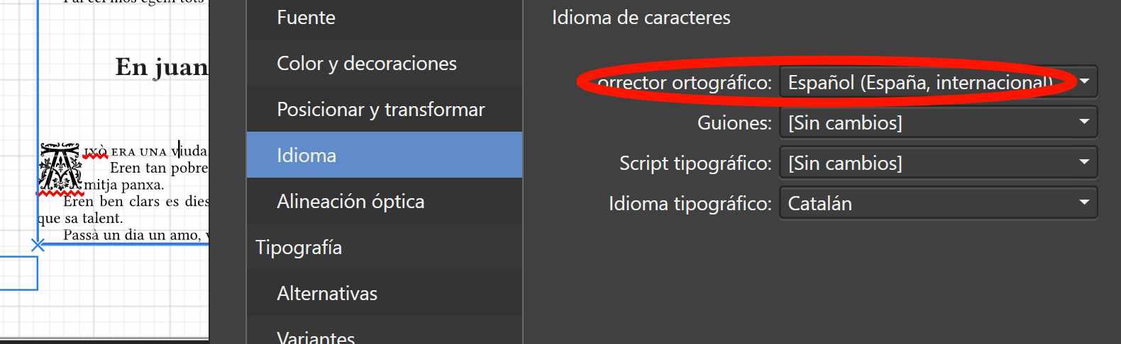
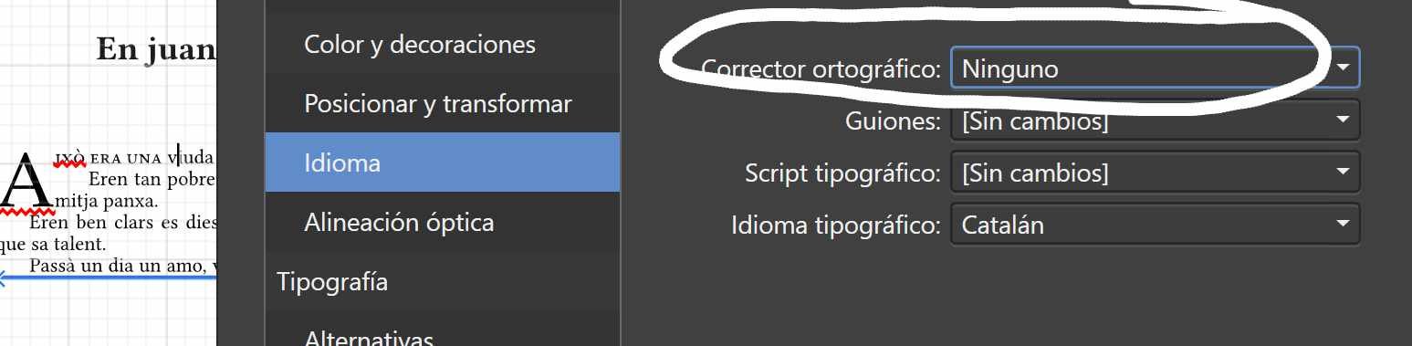
Yes, the styles are different since the languages are different and yes I'm talking about drop caps. I'm attaching pictures of the setting that makes the correct drop cap disappear. The only change in the paragrapg style is the one I highlighted.language.afphoto
-
The other one is EB Garamond. The standard set I downloaded from Google Font and the set with the other points from the designer site.