CPC
-
Posts
46 -
Joined
-
Last visited
Everything posted by CPC
-
 Another option is to 'break in' the binding. [Old enough to have received good books for Christmas or birthdays -- and being taught how to treat them!] cpc
-
Silvery100, Two suggestions for your 6x6 pattern: Un-group the rows -- then individual square can be selected by clickiing on them. Name the squares so you can easily find one in the layers panel if needed eg A1, A2, A3... B2, B2 B3 etc. Regards, Carl
-
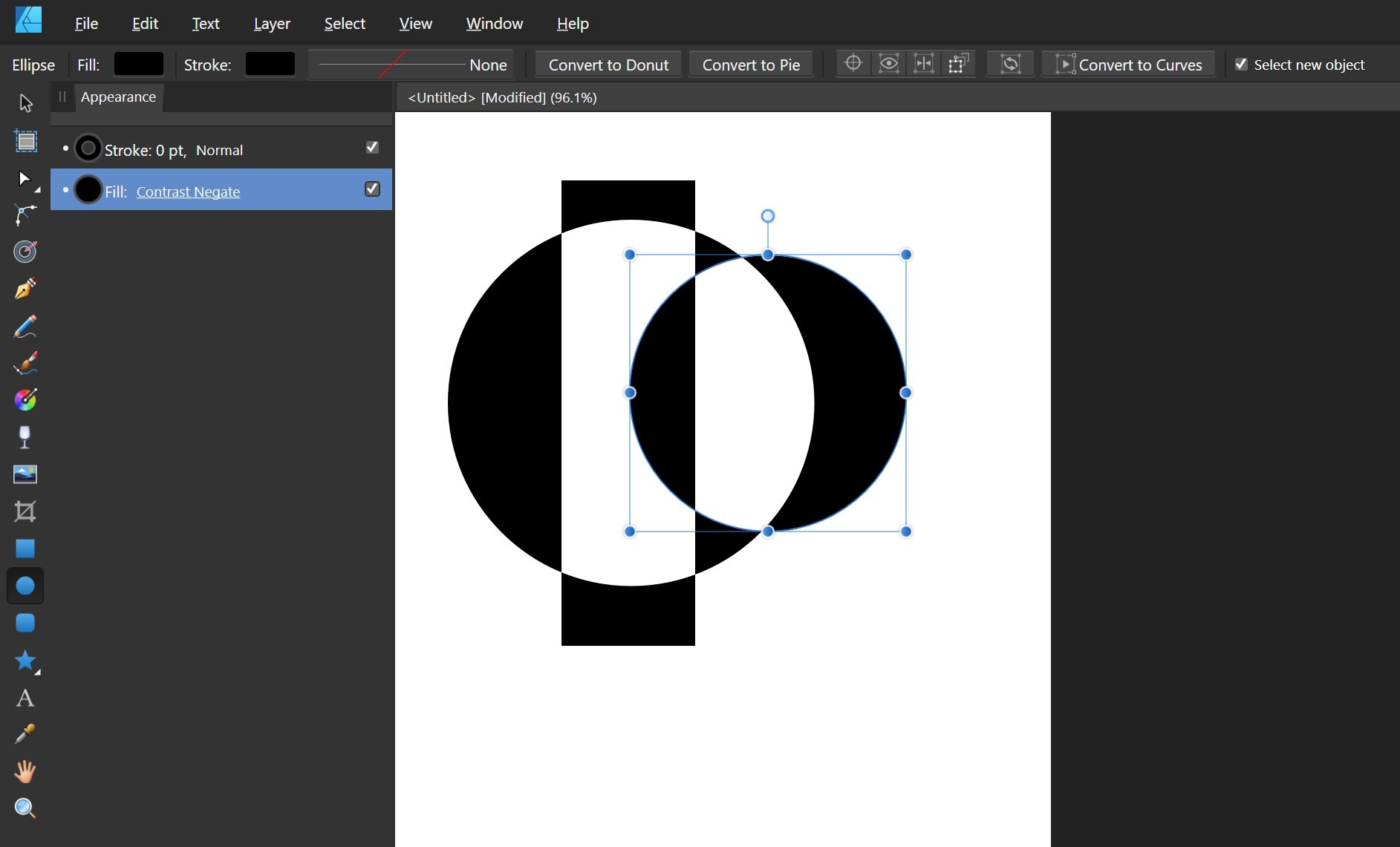
Might fill mode 'Contrast Negate' be an option?
-
Alfred & G13RL, Thanks for your contributions -- will make my future work easier than 'playing' till it works! 🙂
-
lascivious1, Two things to play with... The little triangular arrows slide around to set text start and end limits -- I regularly go back to the Help file to remember all the options for text direction and positioning inside or outside the curve! At the top , use the Baseline adjustment to position the text higher (inside) or lower (outside). Regards, Carl
-
I had a quick try... Added some text, which appeared with the unwanted background. Chose the text layer and added a style. Didn't matter which -- the text's background disappeared! Went to the effects tab and un-ticked everything which left only a fill color which could be changed to whatever I wanted. No doubt there is a more direct way?
-
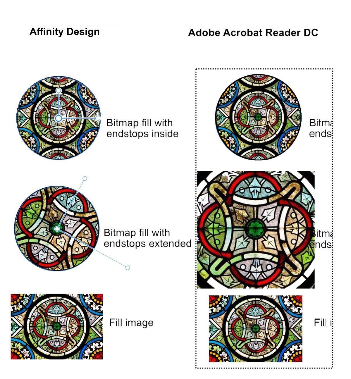
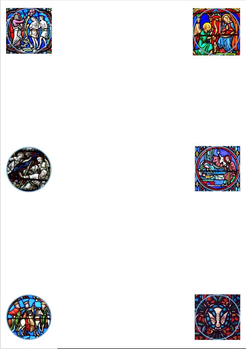
Callum Happy to oblige, though sending a simplified design. As I've been testing (and testing and testing!) the issue seems to be the extent of the end stops used to adjust the scale of the bitmap fill. If they (or sometimes only one) go beyond the edge of the object being filled the result in the print to PDF file is a square or rectangle rather than the filled shape. Note: the problem has nothing to do with the 4UP format I was using -- single sheet A4 PDF print has the same issue. The odd partial rectangles visible in the top right two images (nativity & annunciation) of my original poster design are due to partial covering by the 'Tidings of..." text group which is PDF printed as a single image rather than an individual curve per letter for the 'plain' text. When it is moved to the bottom layer then PDF print gives the four square / two round stained glass images like the lower picture in my original post. And yes, the two circles (shepherds and kings) have end stops within their perimeters. The 'forum.jpg' image included here was prepared for a possible bug report. How to see the end stops on two images simultaneously is an exercise left for the viewer! : -) Regards, Carl forum_test_design.afdesign
-
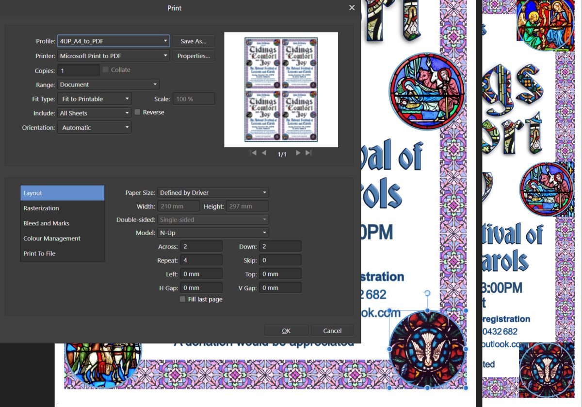
I've designed an A4 poster which needs to be also printed 4UP to give four smaller handbills. I've had no problems in the past but am getting peculiar results now using Affinity Design 1.8.5.703. The left section of the print error screenshot included shows a portion of my design and the print dialog which look fine as does an export as a jpg. On the right side is a screen shot from a preview of the pdf file in Adobe Acrobat Reader DC. Here the circular images, ellipses with a narrow stroke and bitmap fills, are peculiarly wrong with different parts of the bitmap fills showing outside of the clipping ellipses. As an additional test I deleted everything from my design except the six bitmap filled ellipses. Two printed to PDF correctly (shepherds and wise men) but the others again show bitmap beyond the ellipse -- but curiously not all exactly as they were in the original poster design. A simple 4UP workaround is to place four A4 jpg exports on a new A2 design, but I'd like to know if there is something I should have done to avoid the problem in the first place. Thanks, Carl
-
Stroke conversion
CPC replied to Imzan Hussein's topic in Pre-V2 Archive of Affinity on Desktop Questions (macOS and Windows)
Big thanks to carl123 & h_d for some new tips... Typing in alternate units and change of decimal places for display. -
Stroke conversion
CPC replied to Imzan Hussein's topic in Pre-V2 Archive of Affinity on Desktop Questions (macOS and Windows)
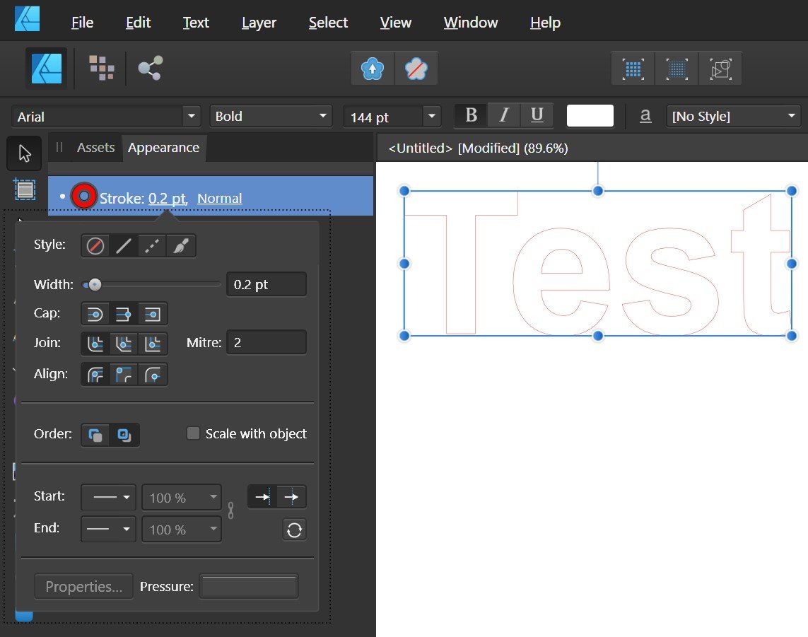
Imzan, Google says 1.0 mm = 2.83465 points, so your 0.072 mm = 0.20409 points. Might not 0.2 points (0.0705556 mm) be close enough? I don't think you can get closer than that as AF Designer seems limited to entering tenths of units. Regards, Carl
-
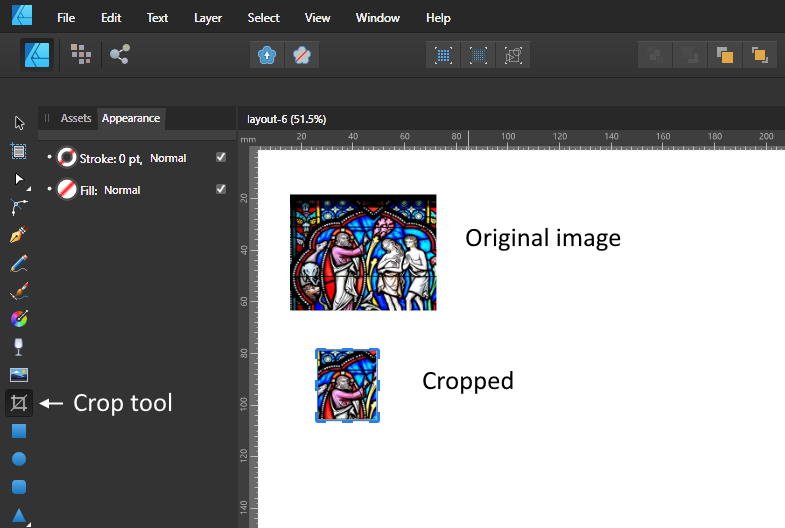
You can crop in Affinity Designer as well.
-
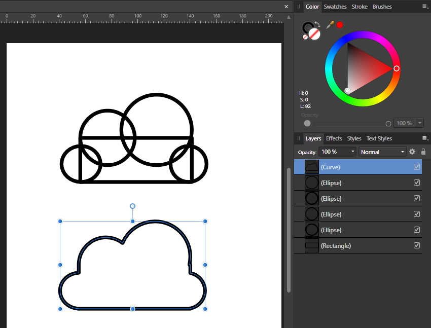
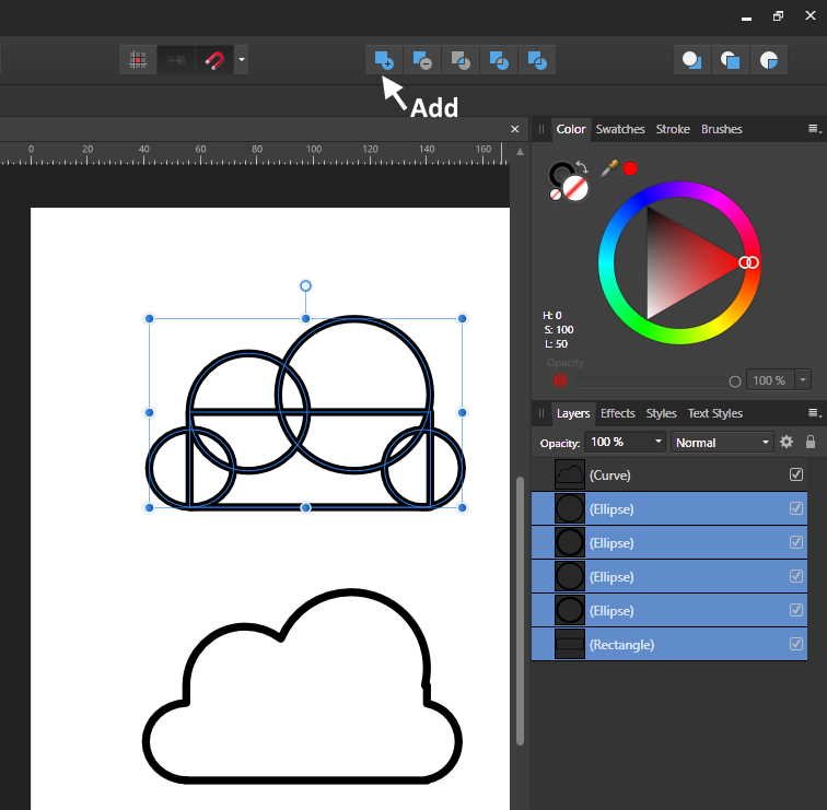
Maybe I'm missing something about the problem, but I seem to get the desired effect in two steps... [1] Select all the component shapes and [2] click on 'Add'! No need to select the parts one at a time. Added: How is a 'shape builder' tool different? You still have to select all the parts.
-
Related: I'm beginning to use the colour wheel most of the time and wonder if there is a way to have it the default. I realise I only have to choose it once for a particular editing session but whenever I open a design to resume work I have to choose it again.
-
Text Types
CPC replied to AHARRIS22's topic in Pre-V2 Archive of Affinity on Desktop Questions (macOS and Windows)
Well, learn something every day! Thanks for that; and for alerting me to 'Symbols'. I suppose much more is made clear if one carefully watches all the tutorial videos but my mind best absorbs what fits with current projects. -
Text Types
CPC replied to AHARRIS22's topic in Pre-V2 Archive of Affinity on Desktop Questions (macOS and Windows)
I checked on https://www.myfonts.com/WhatTheFont/ and found vaguely similar but nothing exact. Another option might be to stack copies of your text. Choose font and write, convert to curves and make the fill white and the outline black. Attached is a quick Publisher project including the (sorry so sloppy!) history. CIRCULAR FONT.afpub
-
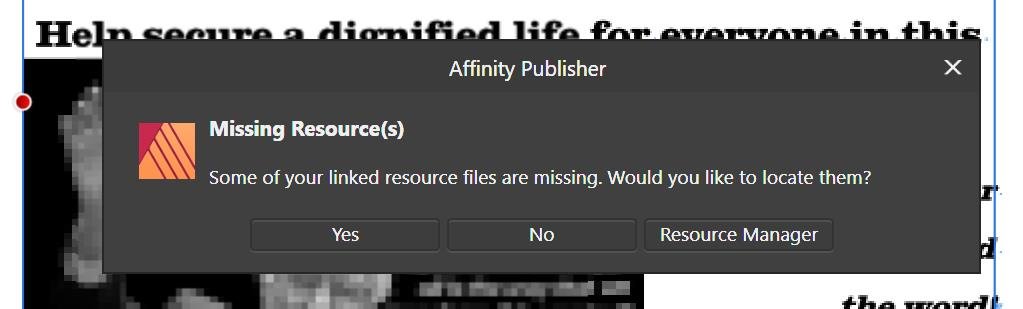
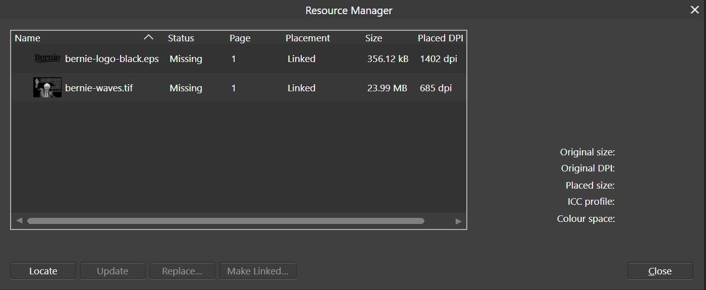
misergarth, Trying to open you project gave this missing resource error. I said I'd try and find it and the problem file was identified as 'bernie-logo-black.eps'. I did a jpg export as a full A4 sheet but the photo of Bernie appeared a a nearly complete blur. Edit: I clicked 'Yes' before; going to 'Resource Manager' gave more information. Regards, Carl
-
JohnG, Here a clip is what I see... I may be confused (missing something) by your description. To me 'original image' is the jpg/bmp used for the art text bitmap fill. Any changes being made in the adjustment layers are non destructive -- the original image remains unchanged. The effect of the adjustments are displayed in a rendering of the image in the project window. I'd reserve 'final output' for a bitmap export or for a print-to-file PDF. Notes: My earlier example was done in Publisher but I switched to Photo here to be sure I was doing the same thing. Again it's not bling, but as simple an example as possible to show WYSIWYG dynamic changes. Could you (and perhaps GaryP and firstdefence's distressed look as well) please post your project file? Regards, Carl BC_adjust.mp4 BC_adjust.afphoto
-
Is this what you want? With my bit-mapped filled text layer selected I went to the top menu and chose Layer >> New Adjustment >> Colour Balance. My sister's Bloomsbury fabric pattern certainly isn't 'bling' but I can easily make whatever adjustments I want while it's there filling the text. No need to '...go back to the original'.
-
Advice Using Text Styles
CPC replied to Macek's topic in Pre-V2 Archive of Affinity on Desktop Questions (macOS and Windows)
Greetings, and a comment, from Australia. Macek said "...I have found the solution..." but doesn't say what he did. A person searching the forum for help on 'text styles' will no doubt find these posts. but no useful information. Not asking for a thesis but a few words would be useful thanks. -
GaryP, Could you please post your project file? SO far I've only used bitmap fill text with bevelled stroke. Thanks, Carl
-
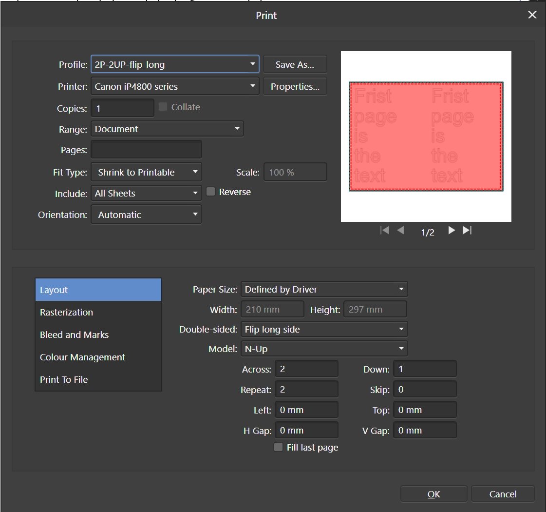
Josef, I've just tried this using N-Up printing and think the method will work for you. I designed each page on a full A4 sheet and then did the printing as shown in the attached image of the Print dialog. Some of the setting may be, as suggested by V-kyr, printer dependent. The setting for 'Double-sided:' was a guess and resulted in the image being upside down. I'd assume the 'Flip short side' would be OK or I could flip the design. As my designs did not extend to the very edges there was no problem with the printer's required narrow margins. I didn't worry about printing any cut mark as it's exactly half the sheet. n.b. So far I'd only used N-Up single sided for jar labels for jams and pickles using 9 repeats, 3 across and 3 down. Regards, Carl
-
Align rotation
CPC replied to Zbigg's topic in Pre-V2 Archive of Affinity on Desktop Questions (macOS and Windows)
Zbigg, Maybe I'm misunderstanding, but doesn't the 'Transform' studio provide the functions? Just set the rotation value to zero in the little text entry box. To align you would have to read the rotation value for the first object and then set it for the second. I use copy / paste! Regards, Carl
-
lettergothic, The values you seek are displayed in the 'Character Studio' panel. Place the text cursor between two characters for 'Kerning'. If a group of character are highlighted you get 'Tracking' value in the next window down -- all the spaces are adjusted. Regards, Carl
-
dmont76, It depends on what you want to do to your single letter but if you convert to curves (to change the shape say) your text will no longer be editable. My suggestion is: 1. Using one of the text tools (Frame or Artistic) do a click + drag to select the single letter. 2. Go the the Character Studio. 3. Do what you want! I've changed the font size of the 't' from 30 pt to 60 pt as a simple example. Hope this helps. Regards, CPC
-
Robert, I'd suggest your trying printing 'N-Up'. I've been using it for labels for my jars of jams and pickles. You may have to experiment a bit... My designs (Affinity Publisher) are created at full A4 and then printed with multiples retaining the A4 proportions. Quick check... Create a new document with the page proportions of your coupons and then print N-Up 3 across / 1 down. Note you need to choose to appropriate 'Fit Type' to scale. Regards, Carl