F_Kal
-
Posts
224 -
Joined
-
Last visited
Everything posted by F_Kal
-

[AP trial] Brush hardness counter-intuitive
F_Kal replied to F_Kal's topic in [ARCHIVE] Photo beta on macOS threads
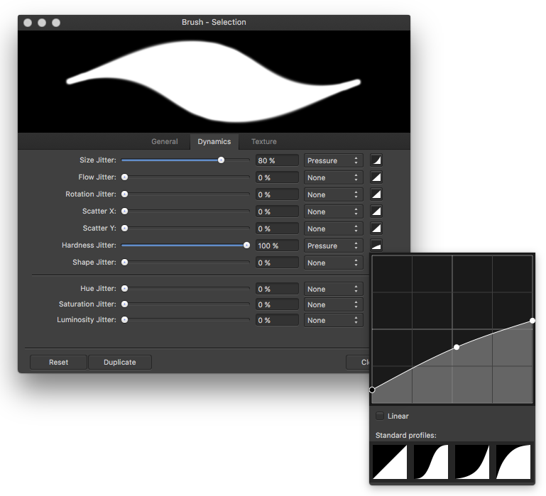
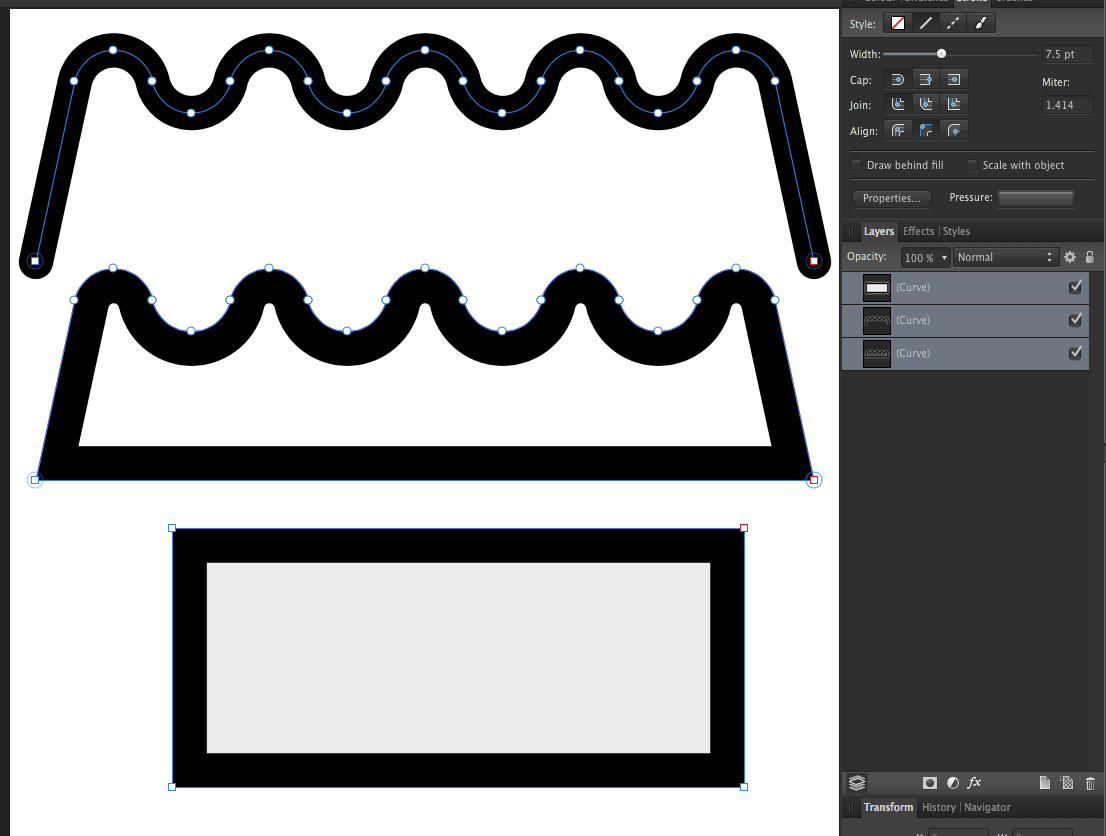
Hi @paolo.limoncelli thanks for the comment! The airbrush tip, is very useful, thank you! While writing my reply to you though, I realized that I was subconsciously trying to compensate for a bug. I do penciling and the reason I wanted to smoothen the AP brush all over by a constant measure was because the stroke was somehow too harsh in AP. In manga studio/clip paint, artrage, Affinity Designer or photoshop it was always smoother so I never had to change the hardness for that purpose. But in AP It appears as what I would describe aliased. I won't go into details here since since I opened a thread in the bug section (found here) but for the sake of friendly exchange of knowledge, if you still feel inclined to explore the topic, I would very appreciate if you elaborated a bit on your last reply: I was indeed trying to recreate a brush with a constant initial hardness: A brush feathering of n pixels that won't scale with brush size as appears on the second stroke on the image below. How would you go about doing it? Omitting to set the a hardness-pressure controller would result in the first stroke of the image; sharp at the edges, smooth in the center am I missing something here? Please don't feel pressured to reply - My initial problem is no longer standing. Thanks again, -Fotis
-
Hi! I've been trying AP, and I'm very puzzled by the behavior of the brush hardness parameter: It's expressed in percentage(%) and thus scales with size. I work with a stylus and while this proprtional scaling feels acceptable for an airbrush, it feels strange for a brush/digital brush: The feathering of the brush IMO should remain constant regardless of the brush size. So far the only way of maintaining a constant hardness regardless of size that I have found is via trail and error adjusting the hardness jitter with a curve to compensate for the loss of detail as seen in the image below . Am I missing something? Would be nice if you could specify hardness in pt/px instead of percentage (and probably default in px) -Fotis
-
what a coincidence! I've been perplexed by this exact issue all day long - I too have been trying to create symmetrical shapes; I recorded dozens of videos while trying to find the reasons as to why sometimes it will merge the two zero-distance (overlapping) points into ones perfectly fine, other times will distort the handles warping the shape, while other times will retain both point and connect them by creating a zero length straight line between the two points, even though they are perfectly overlapping!
-
Ah, that explains a few things! I too had this misunderstanding even though I have no illustrator background. I think the reason that this causes confusion is that the join curves option appears with the node (selection) tool, not the move tool (that I consider as the equivalent to a curve/path/shape selection tool) - and this is giving (to me) the impression that joining curves is an action that can be performed on specific nodes! The behavior gets more puzzling since the tool will choose "randomly" a candidate-pair when there are more than one equal distance pairs. eg. zero-distance pairs like in the following video (I couldn't upload the video in mp4 or webm format so I had to upload it on youtube) It took me a couple of hours of trial and error, plus reading this whole thread on the forum to get this straight in my head, and while now I don't think I'll even do the same mistake - It's probably something that at least some new users might have issues dealing with; probably something that needs to be clarified/reworked a bit? -Fotis
-
I've been setting my eyes on Hype 3.5 for animating my AD creations and read someplace that between Sketch and Hype you can transfer SVG code simply with cmd+c and cmd+v since they can exchange clipboard data in SVG. (hmm, was it sketch, or AI with some plugin? I'm no longer sure) regardless, wouldn't it be great if AD would generate SVG code when copying to the clipboard so that other vector programs (hype, inkscape etc) could get this information instead of the rasterized bitmap?
-
(Ps. Just found the answer regarding the stroke - there is a setting in the strokes panel that says "scale with object")
-
Hi! I've been trying out version 1.5 on Sierra and I'm so impressed! I've come across something that confuses me though: I've created a shape and gave it some round corners with the corner tool (radius 5mm - without baking them) Now if I try to resize to object, say down to 10% of the original size, neither the corner radius doesn't change proportionately but stays the same (5mm) thus distorting the original shape How could one make it so that the radius scales along with the image? I'd rather not bake it if it is possible thank you! -Fotis PS. Same happens with the stroke - how would one treat that?
-
Adjust how trial period is calculated
F_Kal replied to alexgoldstone's topic in Older Feedback & Suggestion Posts
Thank you @MEB for clarifying! -
Adjust how trial period is calculated
F_Kal replied to alexgoldstone's topic in Older Feedback & Suggestion Posts
I must agree with @Alexgoldstone, it's a better way of doing the trial. If the trial counts only the days that you've launched the program (as @alexgoldstone suggest), it doesn't have to be 30 days trial - IMO 15 days would suffice! Btw @Alexgoldstone, if I'm not mistaken, whenever a new version comes on the app store you trial gets an extension -even if it had expired already. @DavidMalcolm: Affinity products are awfully cheap for what they are, but that doesn't mean that they are what somebody needs; and if it's not something you need/want, then even 1€ is money wasted... -
wow @Herbert123 I learned something today! I've been using Manga Studio for inking precisely because of the brush smoothing and how fast it is compared to PS, but never knew you could do most of the crazy stuff that you demonstrated in the gifs!!! Thank you!
-
Thank you @crabtrem! It was indeed what I was looking for!
-
Hi! This must be quite basic, but I didn't know how to go about it: - I have a top level curve (parent), that has a few other curves as children in its hierarchy. - How can I move/scale/rotate the parent without affecting the position/scale/rotation of the children? I guess I could always break the hierarchy and re-instate it after the transformation; but I was hoping for some other way Thank you, -Fotis
-
I've used flux, but using it is very misleading when working with color, so eventually I've stopped using it ;-) But it was good. I use the built-in color inversion in OSX non-stop. I've found that if I alternate between black-on-white and white-on-black whenever I feel the mildest strain (some days every every few minutes), it is very soothing. I tend to press the Cmd+Shift+8 shortcut rather subconsciously nowadays... Similar with the brightness - I reset it trying to maintain a screen brightness that is just a pinch above the global lighting that is reflected the environment. As for the forum, it's one of the most functional forums I've used. I wouldn't call it dated, only a bit on the generic side, which is fine by me. The team has proved on more fronts than one, that they are not generic! I also prefer the white theme; apple computers nowadays have only(?) glossy screens, and the white background hides the reflections much better than the black ;p
-
Default location for Save As (and Export)
F_Kal replied to p10n's topic in Feedback for the Affinity V2 Suite of Products
+1 from me aswell! I felt there was something fishy with the saving location, but I wanted to make sure it is the case before I make a report about it! What you suggest, is indeed the intuitive-expected behavior so you totally nailed it! -
@pxls2prnt is so right about the logo having to be discernible from distance - Very insightful comment!
-
hi @BHIP, you may wish to send a png/jpg of your logo aswell; On my system the font "Kleymissky" wasn't found so probably the text didn't render as intended. I liked the ornament+star design a lot though! well done! -Fotis btw. an idea for the affinity team (if it hasn't been requested before): For the cases where a font is missing, it would be nice if there was an auto-generated curve substitute of the text. Llike on PS: If you choose to edit it, it should warn you and then have it replaced with an existing system font!
-
It is fixed indeed! Thank you!! -Fotis
-
affinity designer Fox Illustration Affinity Designer #Concept
F_Kal replied to airtonmaia's topic in Share your work
+1 from me too! it's very beautiful! -
@thank you MEB! Glad to know about Layer>Geometry>Divide; very useful! -Fotis
-
Here's another question regarding Affinity Designer: When in the Node tool (A), one can shift+click to select multiple nodes. Is it possible, to copy such a selection (of sequential nodes), and paste it as a new curve? A simple usage example would be the following: You have a compound curve (destructively created) consisting of two closed curves, one is enclosed inside the other and you wish to extract the inner one into a new object (see image at the end). Even though I could select the nodes of the inner curve, I couldn't find a way to copy/cut them. The only way I could find was: 1.duplicate the compound object 2. select all the nodes that I don't want and 3. have them deleted... Am I missing something? Thanks, -Fotis PS. btw I realized that I couldn't find a way to invert the selection of nodes - what if I had a complex object with 100s of nodes, and wanted to copy a strip of 5-6 nodes? would it be possible?
-
Hey @MEB, I've been getting the same "this upload failed" error message this afternoon while trying to upload a 50kB .png screenshot... I logged out, logged in, tried the "basic uploader" tried other files but it won't work - maybe it's some glitch?
-
Thank you @A_B_C, that is a very good idea indeed! -Fotis
-
I just realized that in Affinity Designer it's not possible to align the stroke of an open curve in any setting other than align stroke to center. Logically, it does make sense: How would you define the inside and outside of an open curve? Still, it's sometimes a desirable effect if you substitute the inside/outside with one-side/other-side. Anybody having any idea on how to achieve this? I can only think of 1.closing the curve, 2.applying the desired curve alignment, 3.expanding the stroke, 4.deleting the excess points - but this looks rather cumbersome and irreversible(destructive) as a method; any better ideas?
-
Consistant Transform Constraint UX
F_Kal replied to Tim Gummer's topic in Older Feedback & Suggestion Posts
@MEB, you just rock! wow, that was some feature! thank you!!!! -Fotis PS. I think next time before posting an essay, I'll start by asking a short question ;P -
Consistant Transform Constraint UX
F_Kal replied to Tim Gummer's topic in Older Feedback & Suggestion Posts
+1 for consistency! I agree with Tim on this; that's why I'm here making a post on this (plus that I have too much free time, and enjoy AD too much ;) projecting my ideas of the perfect piece of software on it) What's to be noted is that until today I couldn't tell where shift was needed and where not; I just had this constant feeling that shift doesn't work properly. Until coming here, I thought that consistency was broken in more places beyond the type tool, and that I'd never be able to understand when it works (or not). But what's more, is that the unease of this non-predictable behavior was lurking in the subconscious for 2-3 months, before finally reaching the surface and causing a conscious thought "ok, something is broken, I need to report that". As soon as it became conscious, I searched the forum, and found that the issue pertains only to the type tool, and that there is some reasoning behind this decision. Still, for a few months it was a cause of unconscious stress. Of course, I'm not saying that I couldn't sleep at night :P I'm merely making a friendly remark based on the little UX design experience I have: Consistency is important, it makes the user feel the program behaves as expected; when this feeling of predictability is not there it causes stress and frustration and detracts from the user experience. In retrospection, after all this discussion, I doubt any of us participating in this discussion will have issues with it again: It's become a rather conscious thing now :P The team's decision certainly makes sense, but I still think the team should consider a more consistent approach. How I would go about it: Personally I'd make constraint aspect the default across all tools: You'd need to press shift to transform freely (unlock the constraint). I'm stating three reasons that IMO support that: 1) While in theory curves have no inherent "aspect ratio" as @Dave Harris states, in practice they often do: it's the aspect ratio that you decided for the shape the moment you put it on canvas. In other words, if I interactively drew a rectangle as a square using the WYSIWYG rectange tool, it's more probable that I wanted it to be a square than not; The same applies to a freehand curve - eg. a spiral. If I make it prolonged, maybe it's because I wanted to emulate perspective. If I make it circular, it's probably because I wanted it circular. If instead of a WYSIWYG, I was creating a shape by entering numeric parameters or by pasting template basic shapes on the canvas, it would be safe to assume that free transformation would probably be the next step. But in our case, I think it's not. 2) If I want to quickly transform something without adhering to the aspect ratio, I can already use the top/bottom and left/right handles of the bounding box, without resorting to pressing the shift key. Why not have the corner handles default behavior a bit different? 3) Personally (though I suppose other people have different work styles), I don't think I ever "freely" transform something on both axes. I either want it wider/narrower, or taller/shorter so I go directly to the respective handles (top/bottom,left/right) for added control. And now that I dumped my thoughts for the day, I'll get back to work ;-) -Fotis PS. I wouldn't want to give the impression that I don't like what the team does for AD: Far from that, they are just amazing and they certainly know best! Even the fact that the forum has space for us to express our ideas and be in direct contact with the team, is a beautiful privilege that I am very happy for! If I get too passionate, is because I feel like I'm becoming an Affinity fanboy! :rolleyes: Thank you guys!