Search the Community
Showing results for tags 'monochrome'.
Found 12 results
-
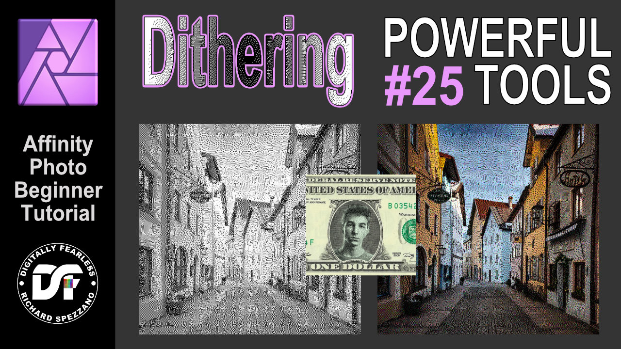
 Dithering filter. Affinity Photo beginner tutorial Power Tools #25 You can create some interesting effects by combining the Dithering filters and blend modes. This is an Affinity Photo beginner tutorial and number 25 of my Digitally Fearless Power tools of Affinity Photo playlist. https://youtu.be/x5aqafgKbyo
-
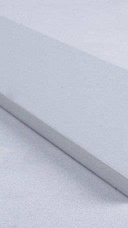
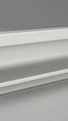
 I am creating a catalogue promoting a range of aluminium components. All of the photos I have been given by the client have a similar tint/hue/cast to Picture A. Now the customer wants me to include Picture B as well derived from a different source/studio. I have been experimenting with different options to achieve equalisation of the general appearance using Affinity Photo 1.8.3 but I have limited experience in this type of photo manipulation. I can make changes but I cannot get to where I need to be. I am sure it must be possible. Is there somebody out there who can give me some advice?
-
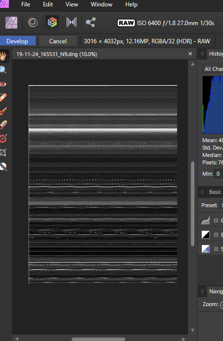
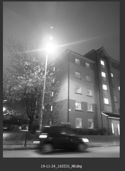
I'm unable to edit a monochrome raw dng file as Affinity Photo decodes it incorrectly. Sample raw file and two png files attached, one showing how the image should decode, the other how Affinity decodes it. Thanks, Rich. 19-11-24_165531_N9.dng
-
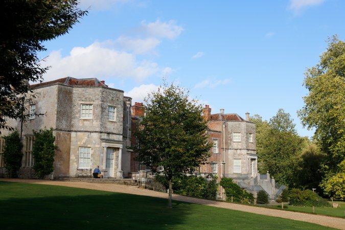
We dropped in at Mottisfont Abbey, Hampshire, last Thursday to see an exhibition of photographs by Lichfiled, Donovan and Duffy. (It's on til 4 November this year if you want to see it: well worth the trouble!) I darkened the sky separately to simulate a yellow or orange filter, and used a Black & White and Brightness/Contrast adjustments to get the selective contrast I wanted, after getting the verticals parallel with the Perspective tool. The original:-- (The chap on the bench is a scarecrow effigy of the artist Rex Whstler, who did some fantastic trompe l'oeuil painting here.)
-
- 5
-

-
- stately home
- mottisfont
- (and 3 more)
-
 Windows Home 1903, Designer 1.7.2.471. When I have Monochromatic Iconography set to ON in Preferences, and then go to Customise Tools, the Toolbar icons get temporarily set back to non-monochromatic until I close the customisation panel. Not a problem particularly but I thought I’d mention it. I don’t know if this is a bug or just the way it’s supposed to work. Also, on a related note, when Monochromatic Iconography is set to ON, the icons in the Colour, Swatches, and Stroke panels (along with the context toolbar, in places) are not monochromatic. Again, not a big problem but worth pointing out.
 -
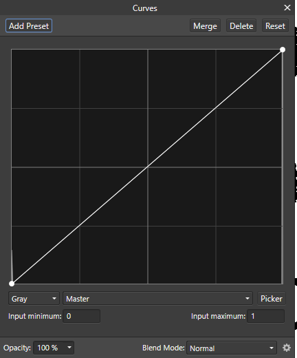
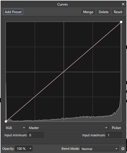
One feature missing from Affinity Photo is the ability to handle One-bit, or black-and-white images. I do a fair amount of scanning black-and-white documents, making small edits (typically cleaning up) and then saving them. I typically use Vuescan which will scan my documents and save them as 1-bit black-and-white tiff documents. I can open these in PS CS5 or in Paintshop Pro, and they open as 1-bit documents. If I open these tiffs in AP, they open as 8-bit RGB! Not even as Greyscale. I would expect that the histogram should show just black and white pixels, such as in this histogram (from Curves): However, what it shows is a histogram like this (also from Curves): Affinity has clearly found a range of pixels (in a 1-bit image) with intermediate values. I can apply a threshold in the Curves Adjustment at 127, which does indeed give me the histogram as seen in my first image. Can anyone explain this phenomenon? John
-
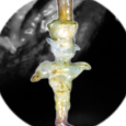
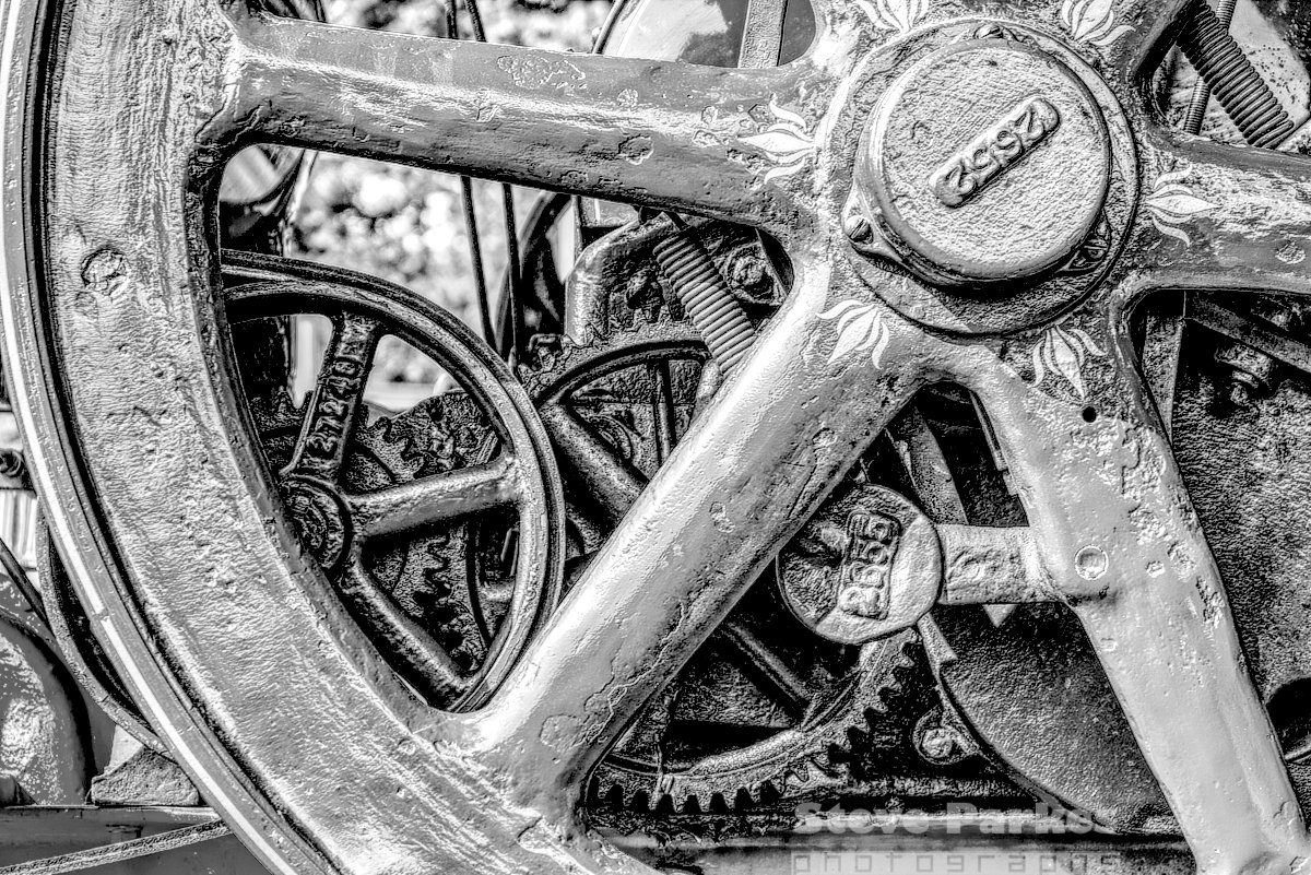
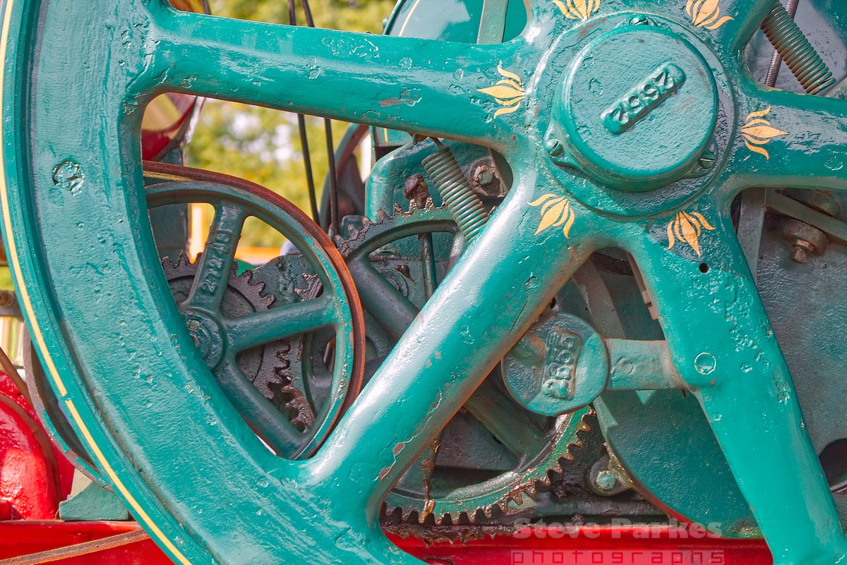
Every couple of years or so I visit the Bedfordshire (UK) Steam Fair and take tons of photos. This time I kept it down to just over two hundred; amazing self-restraint! I concentrated on unusual angles, detailed close-ups, and the like. This is part of the works of a paraffin (kerosene) fuelled vintage tractor. I cranked up the saturation a little in the first image, and later I thought I'd try it in mono. For that, I desaturated it and put it through the HDR persona to increase the local contrast, as well as the overall contrast. (Sometimes I find a better B&W result can be got by turning down one or more of the colours in the Black and White adjustment, but I didn't need to in this instance.) And if you're wondering where this lot fits on a tractor, here's the whole thing ... (If you want to see the other 217 photos, let me know!)
-
Affinity Photo - monochrome documents
Subclavius posted a topic in Older Feedback & Suggestion Posts
I apologise if this is covered elsewhere but I haven't been able to find an existing thread. I edit monochrome documents i.e. B+W a lot. When working with a document in colour then Affinity Photo has no problems displaying the usual colours for masks, selections etc even when a B+W conversion has been done. However, when a document is set to monochrome from the beginning, then all masking, selections etc is displayed as a shade of grey. Sometimes, depending on the background this can be difficult to see on screen and I find it it especially difficult with clipping warnings (a group with special blend modes I have set up to replace the inexplicable absence of the buttons in the Photo persona). I was wondering if it is possible to continue displaying masking, selections, clipping warnings etc in colour for monochrome documents? -
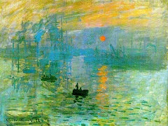
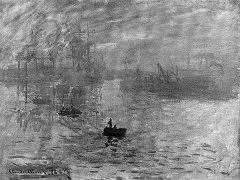
 What is the technical difference between desaturating with HSL adjustment and using the Black and White adjustment? An example: Take Monet's 'Sunset in Venice': Now turn down the saturation to zero. This demonstrates a neat trick where the sun and background are the same luminosity, so desaturating colours makes the sun disappear. Now make it monochrome with the Black and White adjustment. The sun is now clearly still visible. So what is happening here that is different?
-
 Hi I am a Leica user and use the monochrome a great deal is there any tutorial or can you do one for working with a grayscale raw file and developed image? Thanks.
 -
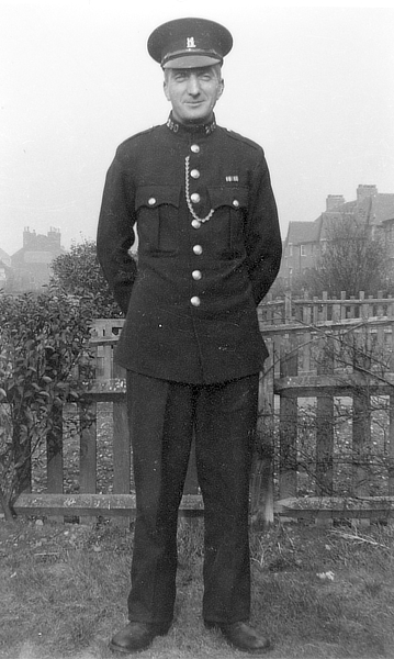
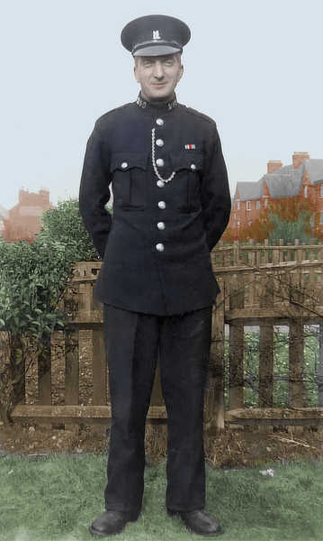
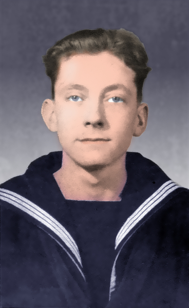
I've done some mono to colour in the past, but I've only recently begun to try it in AP. I scanned some old family photos a few years ago, and these two are of my grandfather and father (he's the younger one!) taken about 1949 or 1950, when Dad got his call-up. Granddad was a Special Police Constable, and they must have been showing off their uniforms. I'm pretty sure they were taken on Dad's camera. Anyway, to business -- I've reduced the images after recolouring, which cuts down the noise somewhat. The left-hand photo didn't look natural enough, so I tried Filters>Colors>Auto... (all four) and got the result on the right, which looks a bit more natural. Didn't work on Granddad though! I used a separate pixel layer for each colour, trying different combinations of blend mode and transparency till I was satisfied. Dad's eyes are a little stark, and there are some hard edges which need softening up ... but I'm still on the learning curve, and any constructive criticism will be welcome.
-
There is an opportunity to design not only next evolution of visual design software, which you guys are clearly doing AMAZINGLY, but also to design the next step in the evolution of software UI. Affinity can be the app that changes the UI game for good. But in order to do so, it must leave behind the iconography that has defined what modern UIs are since the 90s. I found a Yosemite version of the AD UI on one of the forums here when I first started hearing about AD, and I dug it up the other day to play around with some ideas I had. I can't remember whom or where I got it from, so my apologies to the artist who posted it for not giving him or her credit... As far as the UI: We've seen a move towards simpler and more iconographic interfaces, and less towards photorealistic, or skeumorphic UIs. I welcome this trend, and think it can continue to its logical conclusion of an ultra simplified, unobtrusive, monochromatic, high detail, user definable UI, almost like the UI of the computers in the control center in Zion in the film The Matrix 3: super clean, retina-sharp, monochromatic overlay over the content. A monochromatic UI is critical for a professional app. But that doesn't mean only gray. I think the proper balance between the unobtrusiveness of a gray background and the color of a monochromatic UI can be achieved, specially with some of the simple effects like glows and inversions to highlight the UI where necessary. There could be a setting in the Preferences to Activate Monochromatic UI. Another setting allows the user to determine her or his main UI color, glow level, as well as the pre-existing UI gamma controls for the background gray, which I think was a wise decision NOT to make it a user defined color. I would encourage the development team to allow the UI font size and perhaps a few san serif font variants with different widths, to be user selectable as well... If you really wanna blow everyone else away: allow access to an AD file that contains the entire UI in vector format, neatly arranged and organized, which users could then customize and share to our heart's content. We can dream, can't we?!? Anyway, here are a few basic variations of the UI, you get the idea where this could go: Cyan: Magenta: Yellow: White: