Search the Community
Showing results for tags 'alignment'.
-
 Hey there, I'm a bit late to the game – only today updated Designer (and only Designer) to the latest app version on my Mac because I was wary of another bug on Win and iPad and wanted to sit it out. Now, I'm facing a new issue that's got me scratching my head. What I expected: I hoped the update would refine how alignment options work, especially in scenarios where a key object is involved. Ideally, I wanted the ability to set a specific distance between objects while using a key object as the anchor – distributing other objects evenly around it based on their relative positions. What actually happens: It seems like this feature has been scrapped or is malfunctioning. If I set a key object, the distribution for Space Horizontally/Vertically are fixed to Auto Distribute, which doesn't help at all when I want precise control the distance between each object on the fly and see live how it would look. It’s making it really frustrating to work with. I’ve compared the behaviour between the previous version, though in Photo. I’d rather get back that behaviour back and see what distance looks best on the fly instead of having to control the distance before even using the alignment function with the new way. Now it’s super intuitive in my opinion. 😮💨 Distribution_Missing_Feature.mp4 Am I the only one who’s missing the previous functionality dearly? Greetings, Dennis
 -
 In Publisher 2.3.1, when I create a Picture Frame and a Text Frame for a caption and snap and group them together, usually there will be a space between the picture and the caption text as in image A but occasionally there won't as in Image B. Both text Frames are Top Aligned and the image is the same size as the Picture Frame in both cases. I can create space between the Picture Frame and Text Frame to look right, but there should be a way to do it automatically. How can I fix this?
-
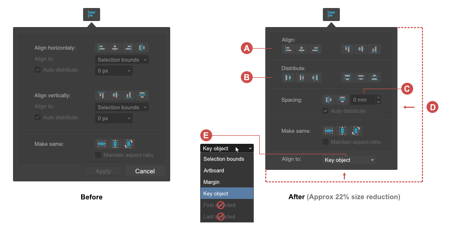
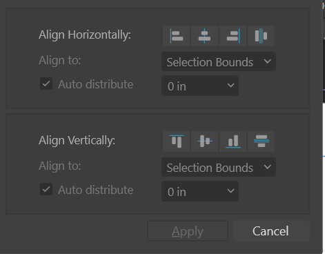
 I did a quick redesign of the "Alignment" drop-down panel because I'm disappointed with the current implementation. Perhaps one of you (devs) will come across this post and think that it is an interesting proposition worth considering. Current Alignment panel UI/UX shortcomings: • Dialog box to big for its content (space not used effectively) • Not all distribute options are included • Lack of "Key object" option in the "Align to" dropdown list • Alignment operations require to many moves / clicks from the user • Unnecessary command buttons (Apply, Cancel) • Poor combination of text field + drop-down list with slider is used as input field for numeric data: – an additional click is required to display the slider – problems with the precision of value changes caused by rapid mouse movements • User is not alowed to choose the "Align to:" option before performing an alignment operation This casues a negative effect, that objects are leaping before the user can go and chose the right "Align to" option Changes in the UI/UX and UX propositions: • Horizontal and vertical alignment controls combined into one section labeled as "Align" (A) • Included the missing distibute options (B) • For more precission, usability, less space a combination of text field + increment / decrement controls for numeric data input is used • Reduced the dialog box to make it more compact (D) • Option "Key object" should be added in the "Align to" dropdown list (E) • After implementing "Key object" alignment,"First selected" and "Last Selected" completely lose their reason for existence and could be removed without compromising usability. • Amount of dropdowns is limited to the only necessary dropdown for "Align to" option to avoid unnecessary clicks ⚠ The user should have the ability to set the "Align to:" preference before performing the alignment action. • Removed command buttons (Apply, Cancel) The alignment is a live on canvas operation so the "Apply" button is not mandatory. Every operation should be registered in history panel immediately after it is succesfully performed on the canvas. Edit → Undo command from the "Edit" menu can with succes replace the "Cancel" command button. To toggle the panel user should use the "Alignment" button in the toolbar or simply click outside the panel. Here also a PDF version (cheat sheet) for download↓ Aligment_panel_UI_redesign_cheat_sheet.pdf
-
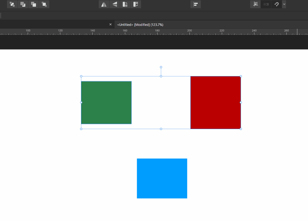
 I observed strange behavior when it comes to align objects to other objects that are clipped or masked. I prepared three cases, please watch my little demo video. - Case 1: When I try to align the blue rectangle to the masked group, the object aligns to the most left edge of all the items in the group. I would have expected the object to align to the most left visible edge, but I guess the thought process here is that the objects in the group didn't really change their size. By selecting the mask, I can easily change the visible area. - Case 2: The blue box aligns to the visible edge of the clipping rectangle, makes kind of sense, since clipping to my understanding means that nothing can be "outside" of the "carrier object". However I now can't easily resize the visible part without stretching everything else. - Case 3: This is probably the most weird one....If I mask the objects, just like I did in case 1, but this time I mask the objects themselves, not the group, the alignment is just like in case 2 (blue box aligns to the most left visible point). In my mind this is inconsistent: In case 1, the mask of the group was ignored when it came to alignment, however here, the mask matters for the alignment. Can anybody clear me up on this? Is this all intended behavior and I just don't get it right? 2020_02.12-00_31.mp4
 -
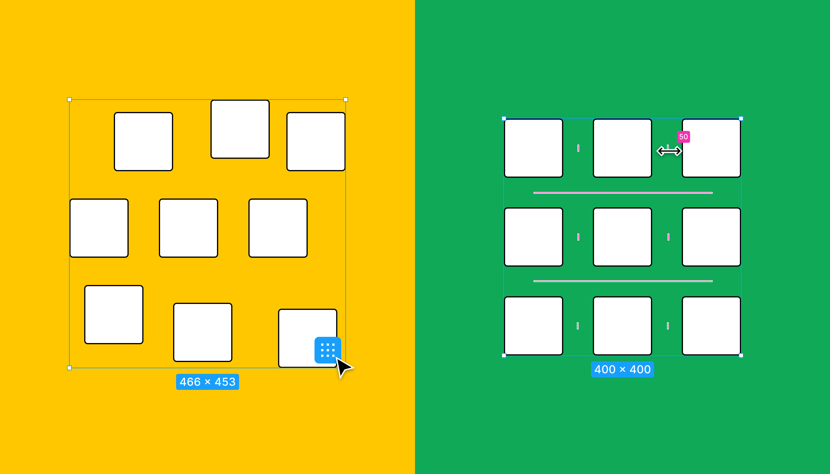
 I left a similar comment on a new feature addition of the 2.4 beta (Space Horizontal / Vertical now considers key object) in the excitement of the moment, unaware of its "suggestion nature". I'll elaborate more on this post. Affinity's "Tidy up" version What I was referring to is a "logical next step" of the new alignment behaviors in the 2.4 beta: an option that would equally or separately distribute the space between objects selected horizontally and vertically, in a similar fashion to the "Tidy up" option present in Figma. The result being a grid that may also let us set a specific space between each item in the two axes. Quick grids case The Affinity apps already promote the creation and management of grids with the "Quick grids" option: by pressing the right or down arrow key while creating a shape you'll see duplicates, which also let the user set a distance between them by long pressing the same keys. Promotional material showcasing product design uses cases I'm fully aware that the scope of an app like, for example, Affinity Designer is a bit different from the likes of Figma, Sketch, Adobe XD, etc. In the sense that it's not really trying to be a prototyping tool, but we are all aware that the promotional materials showcase product design use cases. And such uses cases would certainly benefit people like web designers, for example. So it's then to be expected that the Affinity Team would obviously be aware of such features, and I know they are . So that's why in my original comment I asked if something like this was already being thought on for a future update. Thanks!
-
Hey everyone, Update: Okay, apparently I completely missed the introduction of Key Objects somehow. Thanks for telling me it’s already there! 🤯 Firstly, however, part of my original subject was that key objects should work for any alignment – this includes the spacing operations »Space Vertical« and »Space Horizontal«. They currently work for the general alignment options such as top/bottom, left/right. From my logic it could/should work like this: If NO key object is selected, the last set »Align To:« option works as intended and expected. However, if a key object IS selected, the »Align To:« option should react and prioritise it by changing the »Align To: Key Object«. As soon as there’s no Key Object selected, it switches back to the previous item in the list, like »Last/First Selected«. Without checking, I think this is how it works in Illustrator as well. And I mean, it's just logical (at least to me): If a user actively selects a Key Object (and for Designer this can't be accidental, since you have to hold down an extra key on your keyboard), the user most likely wants to use it as such. So the Key Object should always have the highest priority in the list of alignment candidates/options. Secondly: They also only work from the Context toolbar – when I work with the toolbar popup and want to align (top/bottom, left/right, ...) it prioritises the selected »Align to:« option from the drop down. I think there's an item missing from this list for key objects to work in the toolbar popup as well, and I think that's the culprit. It's not at all obvious that »First Selected« equals »Key Object« in the »Align To:« dropdown in the Toolbar (not Context Toolbar). ––– I very dearly miss the ability to click on one of multiple selected shapes (especially in Designer and Publisher) in order to define it as some sort of »pivot« object, so to speak, around which all other alignments will happen since day one switching to Designer almost ten years ago. (Wow, Designer really turns 10 next year!) The »First/Last Selected« options in the »Align to:« dropdown come close to what I mean, but are not as intuitive, nor do they work for all alignment operations such as »Space Horizontal/Vertical«. Illustrator has solved this more elegantly and functionally by allowing you to mark one of the already selected objects as the »centre« by clicking on it, around which all further alignment operations will take place. They call it »Align to Key Object«. Here's a short clip of how it works. Here’s a video that explains its differences a little bit better compared to other alignment options present in Designer. Please please pleeease Affinity, I need this QOL back in my process and would love to see it and in the Affinity Suite. 🥲 Cheers Dennis
- 20 replies
-
- 2
-

-
- affinity designer
- alignment
- (and 6 more)
-
Hello! No matter what I have selected, the "Align to Option is greyed out. I just want to be able to align to my margins. I'm not seeing any other discourse on here about this problem so maybe it's just me? Thanks!
-
 Dear support, I have installed AfD 1.8.3 and found out that if I select two or more object and go to the alignment icon, the Align to option is grey and not accessible. I need to click to a align icon at first and then Align to is accessible. I have Win 10 and I don't know if it is some kind of a new feature but it's annoying. The picture after click to alignment icon is attached. Thank you in advance for your reply. Kind regards, Roman
-
 I prefer to use alignment shortcuts but I found that any alignment shortcut is fixed to "selection bounds" behaviour, and "spread" if you choose only one object. like if I go to alignment menu and change behaviour to "last selected", then use the shortcut, it doesn't see the change. I really think that this shouldn't happen. heres the clip; I'll use the "align to center" shortcut but "last selected" option is enabled: this is an issue for All Affinity products release 2.1.1 happening in windows 11 HW acc ON
-
 Hi everyone, I just spent half an hour to try and find a way to align text vertically in Publisher (V2.1). Then another half hour to find out about it in help and forums. I bought all of the V1 Progs as soon as they came out, then updated to V2 universal. I'm writing a textbook with many pictures right now and - of course - I use Publisher to "set it up" (is that the correct expression? - I'm German... ;-)) Anyway: I need vertical text on some pages - and I can't find it. That's really disappointing... Is it really true, that a Version 2+ of a Desktop Publishing Software can not do this??? I can't believe it. Thanks for any help.
 -
 I need to lay out a book of poetry. Sometimes the left aligned lines (paragraphs in fact) are too long to fit the page and the customer wants the 'overflow' line to be right aligned. I've been looking to set a style for this. The option of Justify Last Line Right works if there is a first line (although it can look messy with big gaps) but if all the text fits on the line it is also the last line and so becomes right justified. Is there some way out of this? I.e. left aligned for the first line but right aligned for the second?
 -
 Hello, When deleting a page, the picture and text frames on other pages veer off the columns they were originally placed in. This was a blank page I'm removing, and adding it back, locks the frames in position within the columns but breaks the text, I believe this has to do with the inner and outer margins that are different. Is there a way to lock all these frames within the columns rather than following the margins or spine when deleting or adding pages? Thanks a lot for your help.
 -
 I have been doing some testing in stacking pictures I took of the Orion nebula. The pictures are good and the stars are pinpoints. The problem is that I tried all alignment parameters and the result is never aligned. I had high hopes for this function but it doesn't seem to be very good. Stacking is one of the main reasons I bought Affinity Photo, the other being to replace Photoshop Elements. I could always use Deep Sky Stacker but I had great hopes for affinity. I could always try to align manually but that's a lot of work. Anyone has ideas?
 -
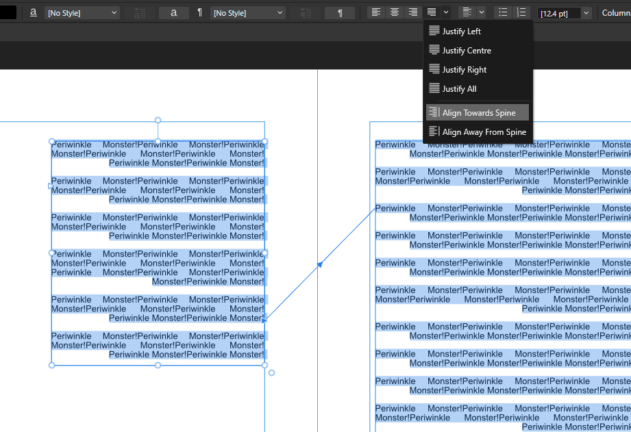
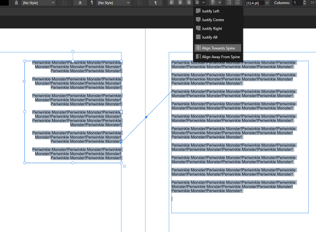
 Hi The spine awareness alignment tools are really useful, Align Away From Spine, Align Towards Spine. Unfortunately, for many text uses, Justify is the appropriate option, but the lack of a Towards and From Spine option limits this, or relies on manual hacks which can break things. Can we add a Justify Away From Spine and Justify Towards Spine option please? Thanks, Chris
-
 Hello! I'm working with a document using inches, and when I move objects using the transform window it defaults to move by full inches (1" > 2"). In Adobe when you hit the up or down arrow in the transform window it will increase by (.0625") making small alignment easy. I am not asking about the nudge preferences, as I find moving that way to be imprecise, but I still like the increments of (.01") for very small adjustment. Screenshots attached. I apologize if this question has already been asked before.
-
Shot on a super sturdy tripod, Nikon Z7, VR/IBIS = OFF, Z 24-70 2.8 S @ f/8, @ 24mm. NEF (0, -2, +2 stops) directly loaded into "New HDR merge", Auto align images set to Perspective, no noise reduction, Tone Map unchecked, Auto remove ghost: tried both, no difference, this is kinda not aligned:
-
Two rectangles: a gray one on Layer1 (locked), and a reddish one on Layer2 (unlocked). Select Layer2 then select Layer1. Click Align, Align Right. What happens is that the gray rectangle on the locked layer moves to align with the red rectangle on the unlocked layer, and that shouldn't happen. layer_lock_bug.afdesign
-
 This should be addressed to the Affinity Range. Dashed lines should not scale by length when adjusting the width, only the width should increase, as it stands, if you increase the width of a dashed line from say .5mm to 1mm the dashes increase in length knocking any phase adjusts you have made "out of whack" effectively destroying the phase setting. What should happen is the width of the dash should increase and the length of the dash should not, this means any phase adjustments you have applied will be retained. This leads me on to Alignment, there should be an alignment option to create a symmetrical dash, the corners would have a symmetrical L shaped dash and single lines would have a half dash at each end. See bottom image for an example. Affinity @ .5mm 12-6-0-0 Affinity @ 1mm 12-6-0-0 Dashes scale by length and go out of alignment. Adobe Illustrator @ .5mm 12-6-0-0 Adobe Illustrator @ 1mm 12-6-0-0 (No length scaling dash stays put) Adobe Illustrator with Alignment applied, makes a neat dashed line.
- 3 replies
-
- 9
-
-
- width
- dashed lines
- (and 3 more)
-
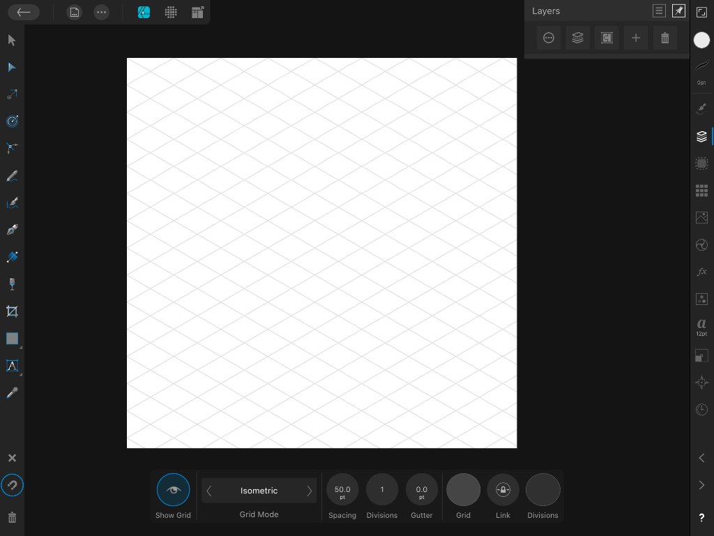
 Howdy, Affinity Designer for iPad pals! I'm a brand new user, and so far the app is perfect for what I'm looking to do. Love it. I’m hoping you can help me with a an issue, where my non-standard grids do not evenly align nicely with my document. To troubleshoot I set up documents with round numbers (10x10-inch canvas) and corresponding grid intervals (1/2 or 1-inch), but still no luck. In the attached screenshot you'll notice that the edges of the grid don't align evenly with the bounds of document/canvas. I'm running into this with all non-square grids: isometric, oblique, triangular—the lot of them. So is there a way to at least center the grid to one axis of the document/canvas? I'm hoping this is just a simple document size vs. grid spacing math problem that I'm too dense to figure out. My workaround is to manually place guides on a larger-than-needed canvas to get full, but it's a pain—so any help would be greatly appreciated. Many thanks in advance, friends!
-
 I know this has been discussed a lot in previous posts but I'm asking for advice here rather than complaining about the shortcomings of this "feature". I've drafted the basic shapes for a design and used strokes with thickness and varying alignments (inside, centre and outside). Several elements start life as an ellipse. In removing the strokes that I don't require in the final design I often have to break the curves at intersection points. Doing so reverts the alignment to centre. This changes the design and the alignment of the graphic elements. I realise that this isn't going to be fixed so I was wondering if anyone has any advice about a workflow that avoids this issue. Clearly not using the alignment option on any curves used in a design that might be broken seems to me to be the only option. Any thoughts?
 -
 Ok, this is my first post here, and I'm quite new to Affinity Photo, so be easy on me. 15+ years of mastering Photoshop certainly helped alot with getting around in Affinity Photo/Designer interface, and I'm already starting to love this software. However, there is this ultra-basic thing that's driving me nuts, as I can't seem to get it done (the way I did that in Ps). So, if I'm designing something, something made out of several layers (logo for example), and I want to position it in center of the frame/background, in Photoshop it's enough to select desired layers in panel, and align them to selection however you want. All selected layers wil stay in locked position in relation to each other and align themselves as a group to background. In Affinity Photo, if I select multiple layers and try to align them to center+middle of the frame, they all individually align themselves to center, making it a mess of layers stacked upon each other in center of the frame. What I mean is even as a selection all layers align themselves separately, and not act as a group. You can solve this by grouping the layers and then align them as a group, in which case they stay locked in relation to each other and acting as a single object. Is there any way to align multiple selected layers together, without additional step of creating group each time you need to do that.
 -
 Hello. My TOC has got into a bit of a mess. I want all the page numbers to be right-aligned, not just the level 1 headings. I think it might also be good to have dotted lines between the entries and their page numbers. How do I do this?
-
 Hey there! I use the tools in the Transform window and the tools in the Alignment window all the time, but I really dislike pressing the button that opens the Transform window in the hopes of it opening the right one upfront. This would be solved completely by having a seperate button for the alignment tools! Perhaps there is already a way to customize the buttons in the toolbar that I just haven't found yet? Adriaan
 -
 I have taken a set of shots from my window at different times of day. Mostly they are very similar - same distance settings etc., but I didn't use a tripod. Is it possible to trim the set slightly using Affinity Photo, so that I have a set of shots which are more or less accurately aligned? I think it might be possible to do this using a stack operation. I have used stacks for panoramas and HDR in the past, but this is a slightly different application. I want a series of individual shots, but all lined up within reasonably accurate tolerances.
 -
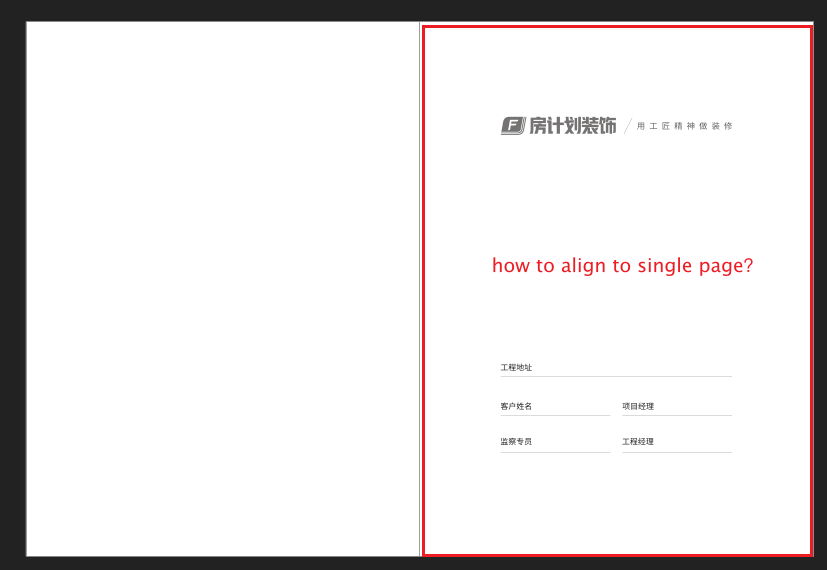
 When I want to align an object to the single page,But software is align to double spread! Looking forward to your reply, waiting online!