
Ballyshannon
-
Posts
69 -
Joined
-
Last visited
Posts posted by Ballyshannon
-
-
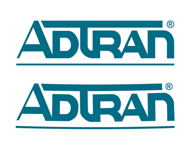
Glad you got it worked out for your purposes RM10. I've been able to push limits and do some interesting and unexpected things with Designer, but bending an image isn't one of them! For a text logo, I would approach it the same as you did, recreating the letters and rotating each letter to follow the curve. I've never had to do it, so gave it a try using the text logo of a large local company, placing the jpg logo image on a page in Designer and recreating it using the Pen tool to outline it with individually placed nodes and tweaking the nodes. This logo is a bit more difficult to 'bend' since the letters are connected (I love challenges), but with a bit of quick node manipulation, it's close. Not perfect and can use more tweaking to smooth the corners of some letters, but you get the idea.
Top image is original jpg. Bottom image was re-created in Designer. Took about 20 min. Thanks for posting this thread because it inspired me to push more limits in Designer.
")
-
-
To remove the background from objects like this, I use the Pen tool with a .2pt red stroke to outline the object via individually placed nodes, do fine tuning with the node tool for curves, etc, and remove the background by dragging the Image layer into the Curve layer. The Curve layer will be above the Image layer, so you drag the Image layer up into the Curve layer to join the two and you will see the background 'disappear'. At that point, I change the stroke size to zero. In the case of removing a white background, it's helpful to create a background layer with any color other than white so you can see the change. With this method, after the background is 'removed', you can still use the node tool for more fine tuning since this is basically a masking process and the complete image is still there with nothing being actually deleted or removed. Using the OP's image, I did this very quickly in Designer, so it's certainly not perfect but you get the idea in the image below where I added a blue background after 'removing' the white background. It took a little less than 15 min. Had this been a higher res image with more detail for an important project, even more precision is possible and would warrant investing more time to fine tune.
- Noam and firstdefence
-
 2
2
-
Thanks Walt. I did try that and discovered that selecting Unicode Text in Paste Special does work and basically does the same type of 'normal' non-bold formatting as the method I posted above, but without having to manually change the Style, etc. I've just been too busy to share. But now we know, and thanks for your input...and everyone's input!
-
1 hour ago, walt.farrell said:
Have you tried Edit > Paste Without Format?
Yes. The copied text is brought in as a group of images, not text, which won't work at all!
I just tried something that seems to work. When text is pasted, the paragraph style shows "[No Style]" and when changing that to "Body", the text changes to normal non-bold. I then change the character info to Arial Narrow 11pt with "No Style" selected, and it's good to go. I've tried it several times with text from different e-mails and websites and it's worked every time. Fingers crossed.
-
Well, after thinking all is well, it's doing it again. This time it was pasted text from an e-mail. I closed Designer, re-opened and still comes in as bold even when font characteristics are set to Arial Narrow regular (non-bold) 11pt. Have no idea what's going on. See screen capture below. Left is typed directly onto page, right is pasted text set to the exact font characteristics as the directly typed text.
-
I appreciate that, Callum. It seems to be doing fine now.
Bally
-
Sorry, I had posted a detailed description of the issue, but after closing and re-opening Designer, the problem disappeared.
-
Sorry, I was referring to an Image layer and adding a stroke since I do very little in Pixel Persona. As you say, in Pixel Persona an outline can be added.
-
It sure would be helpful if topic starters would specify Photo or Designer for those of us who are relatively new to Affinity and have one or the other, but not both. Even better, dedicated forums for each. I don't use AP and can't count the times I've seen interesting topics, only to discover it doesn't involve Designer after spending time reading through a few posts. For instance, the topic of this thread is "Creating a white border around the image?" which can apply to both AD and AP. BTW, adding borders in AD is super easy.
@jmwellborn, what program are you using for the book layout?
-
When drawing lines, boxes, etc by eye using the pen tool in Designer, when I end up with a line or edge of a box that's not exactly perpendicular or horizontal to the grid (eg: 90°), is there a way I can quickly correct it without having to drag a guide next to the line onto the layout, zoom in and eyeball it and guess that it's 90°? When creating an arbitrary line at an angle, there's nowhere I can find in the info that gives me the angle of that line or the ability to type in a different angle.
-
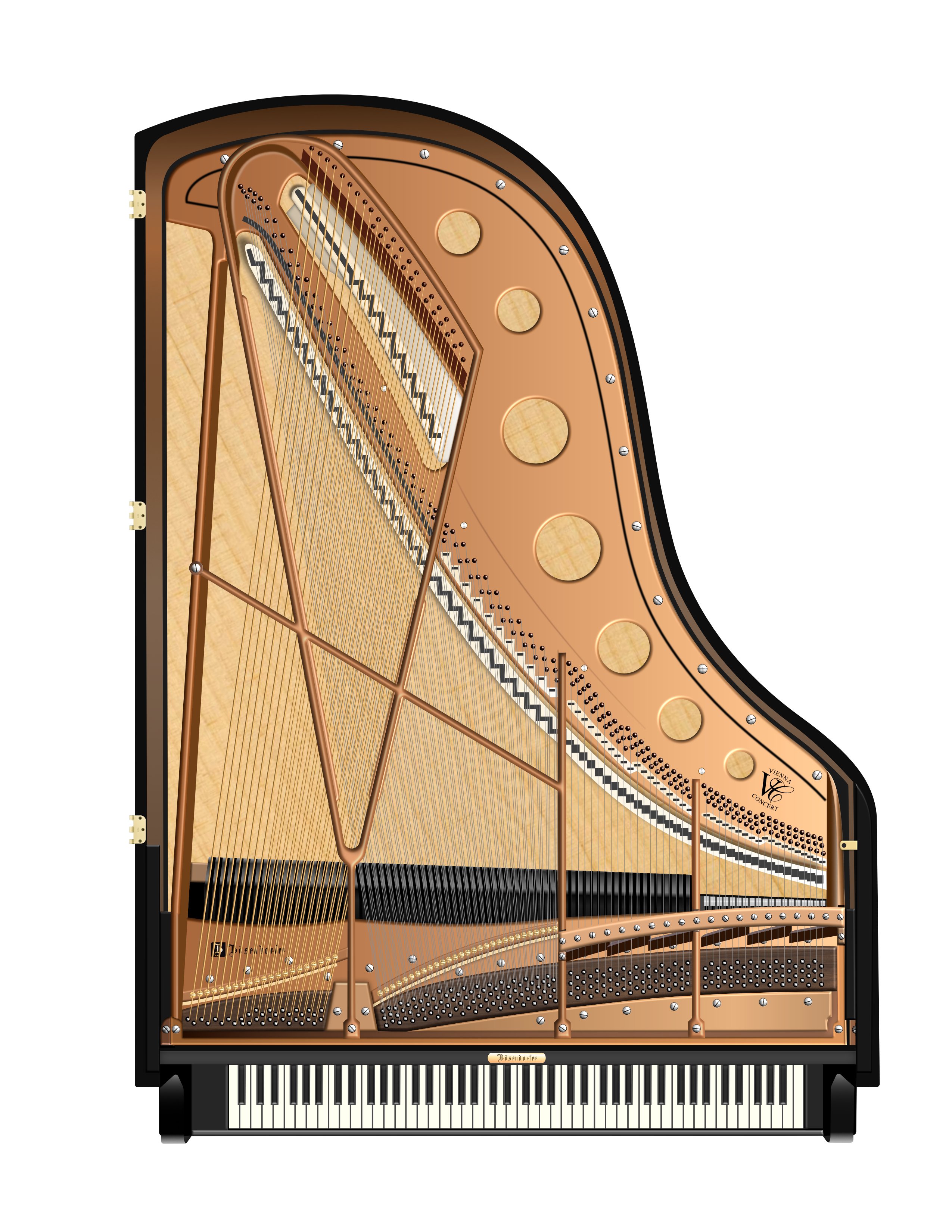
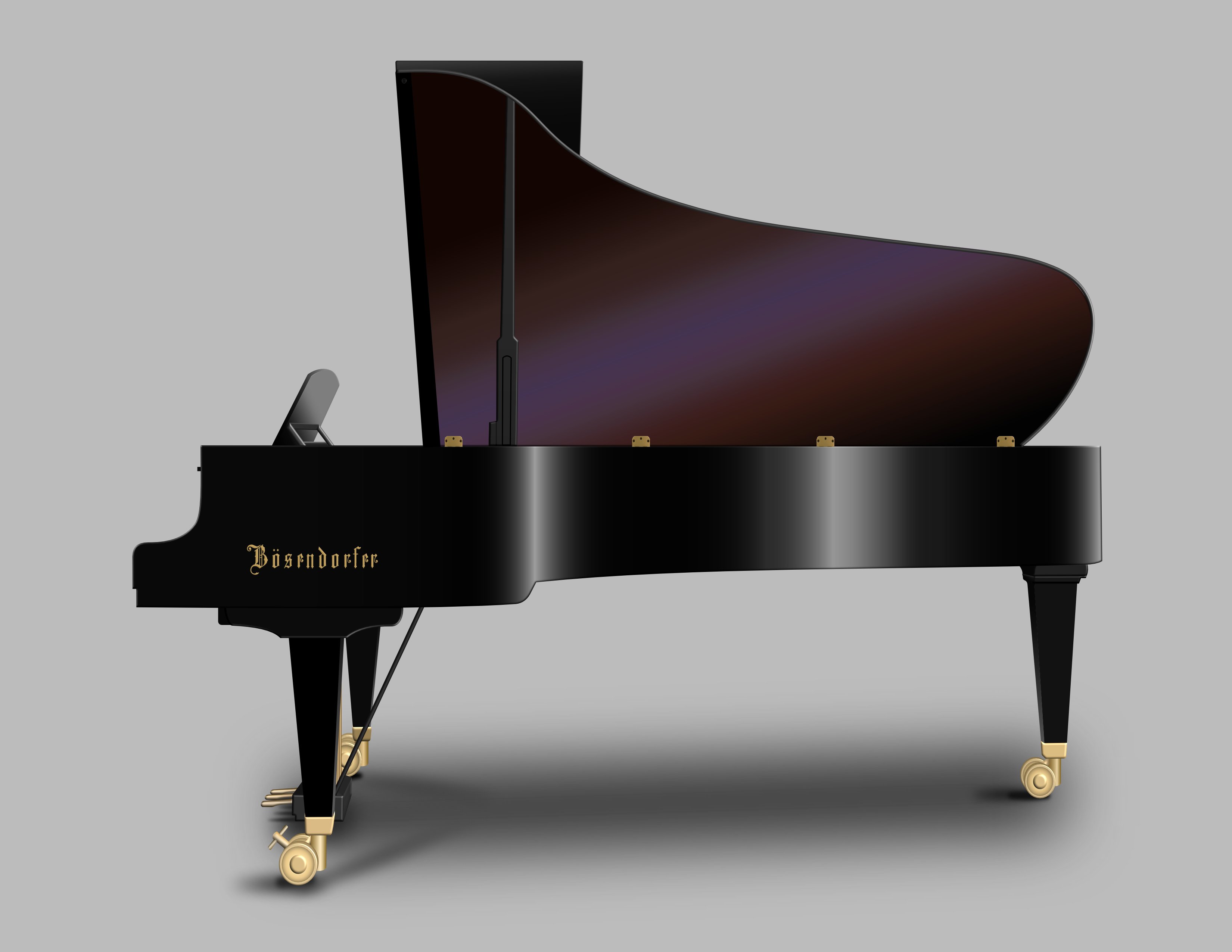
R C-R, thanks for that link. Although it's not the same piano (it's the 9' Imperial Grand while the one I'm emulating is the 6' grand) and some things are different, it's a big help. I've already corrected the key spacing and dampers on my project, so it's looking better. I know I said I was going to take a break, but I wanted to get some of those things taken care of. Still a few tweaks to be made.
-
I appreciate all the input regarding detail and some things obviously not being 'perfect' but please keep in mind this is still a work in progress, and the fact that I've never used Illustrator and have only been using Designer for a couple months. I'm still in the learning phase and the key spacing will be sorted out, as will other details such as the dampers. With SO much detail to consider, I can only do one thing at a time, figure it out and make tweaks as I go.
The only overhead template I could find online isn't high res, so I'm having to find various views of this particular piano online to put it together, and there aren't many. But I appreciate the input. The final version won't be perfect since I don't have a real Bosendorfer Vienna Concert grand sitting in front of me (wish I did!), but I'm learning a lot. I'm actually going to take a break from this project for a while and return to it after Christmas.
Merry Christmas everyone!
-
R C-R, here's the project so far. It's been quite the task and still some detail work to do on a 'wound' effect on the bass strings, and getting the upper two sections of treble strings lined up with the pinblock pins and pegs. Right now I only have one string per pin on those upper two treble sections just to have something there. Also have to do some lining up of the middle section of triple strings with the pinblock pegs. Certainly not perfect, but it's looking better each day. So far, a week-long project. It was a nightmare to get the upper harp section designed so the strings are beneath both the main and upper harp, yet over the top of the upper harp bass string securing pin section. I had to actually create an optical illusion using shadows to make it work and look close to correct. Still work to do! I've also included a side view of the Bosendorfer Vienna Concert Grand, on which I'll probably do a little more tweaking. Been working with Designer for about two months now, learning a lot, and enjoying it.
- R C-R, Gear maker and Alfred
-
3
-
-
That's a great idea! I had worked a little with Symbols when first starting with Designer a couple months ago, but forgot about this feature. When I'm finished with this project, I will look further into the Symbols feature and how it can relate to this type of project.
-
When I select the grouping of pins (whether the group layer itself or shift-select all the pins from within the main grouping), as expected, it places a selection box around all the pins and the Transform box only shows the dimensions of that selection box. Each pin is in a specific place, so I can't simply change the overall size of the selection box to achieve the smaller pin size, which will move the pins out of position and cause a real mess. I've already gone ahead and resized each pin individually, but for future reference it would be good to know if this can be done in one operation without altering the positions of the objects.
-
I'm taking on the daunting task of creating an overhead view of a Bosendorfer concert grand piano and have finished placing 200+ tuning pins onto the pin block. Each pin is a grouping of two elements... the base and top of pin, and all pins are grouped as a whole. I've decided I want to make the pins a bit smaller and can type the new dimensions for each individual pin grouping into the Transform area and locking the aspect ratio, but would prefer not to do each individually since it would take quite a while. Is there a way to change the dimensions all at once?
Forgot to specify I'm doing this in Designer.
-
Sorry it took so long to respond but have been out of town. That was the problem and appreciate the input. Grey border gone.
-
Today I noticed a thin grey line around the border of my pages that just started and definitely wasn't there yesterday. I've included a screen capture. The line is at the page edge with background layer extending beyond, and this line is on all four edges. I've not noticed this until today and wonder if it's possibly an unintended option accidentally selected? Any ideas?
-
The size/length of dashes isn't the problem. It's an issue with how the dashes interact with corner joining and look of the corners or lack thereof.
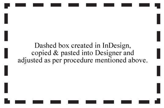
I found a quasi workaround by creating a dashed coupon box in InDesign using the Dashed 2/3 setting, copying and pasting into Designer, grouping the five elements (lines and 4 corners are pasted as individual layers), select the stroke option with dash line style, butt cap, miter join with miter set to 2 in order to maintain square corners, align stroke to center, and adjust stroke/dash size as needed. Dash settings are 1/1/0/0/0. As it's resized, the dashes still move around, but the corners remain constant and it just takes some adjusting to get the dashes to look evenly spaced. I don't like the look of the small snub-looking corners, but it's the best workaround I've come up with. Doing it this way, the dashed box can be changed to any color and respond to fx after re-grouping all layers within the original grouping.
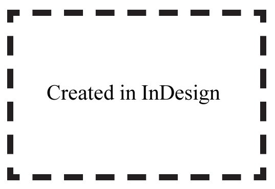
The first box below uses the settings mentioned above with a 7.8 stroke. Acceptable but still don't like the small snub-looking corners and can find no way to make the horiz/vert extenders a bit longer on each corner so they look like Illustrator or InDesign corners. For smaller coupon boxes, I can barely tell they're 'corners' when printed. For comparison, dashed box created in InDesign at bottom with 2/3 setting. InDesign provides three dashed line options... '2 and 3' (normal spacing), '4 and 4' (wider spacing), and 'Dashed Line'. I found it interesting that when selecting the basic Dashed Line option, the corners look exactly like the pasted-into-Designer version.
I found that I can achieve more consistent results when eyeballing the spacing by resizing vertically and horizontally and not dragging diagonally.
My file is included at the bottom if you want to check it out.
-
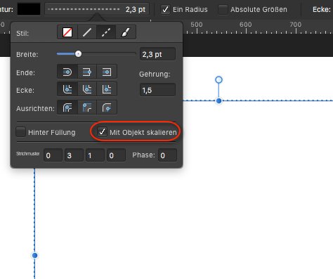
6 hours ago, v_kyr said:
Did you tried with the "scale with object" setting checked here for the line style?
Yes, and it has no effect. The results are still terrible. It's obvious the dash line feature in Designer was designed for single lines and not coupon boxes, which is a shame since many designers like myself have clients requesting ads with coupons. I'm pretty much resigned to creating anything with coupons in InDesign which isn't a bad thing since it's a great program. I was just hoping Designer could handle it.
-
I'm relatively new to Designer and can find no way to create symmetrical dashed line coupon boxes for clients as can easily be done in InDesign with symmetrical looking corners. When resizing in Designer, the dashes move around the box like worms not knowing where they'll end up and I need a consistent looking box with symmetrical corners when resizing. Any way of doing this in Designer? I can't find any tutorials regarding dashed line boxes for coupons.
-
In Affinity Designer, I've not found an arrowhead/dot end line feature, so have learned how to create a custom arrowhead and dot-end line brush and it works okay as long as the line length isn't changed, which changes the arrow and dot shape, making it impossible to maintain a consistent look. When doing projects that require arrowhead and dot line ends of different lengths, how do you maintain the geometry/size of the arrowhead/dot when changing line length without having to do each line individually separated from the dot? I just created an eye anatomy design with dot-end lines indicating the various named parts and had to create every one using individual line and dot for each item in order to maintain a consistent dot size with different line lengths, which is a bit tedious. Is there an easier way?


How to bend a logo? Help needed
in Pre-V2 Archive of Affinity on Desktop Questions (macOS and Windows)
Posted
@RM10, thank you for the positive words. No program is perfect and I agree with @Mithferion that Designer is a very capable vector program, albeit...as you said... requiring some imagination to utilize the program's strengths to work around some of its weaknesses. But then, in the 30+ years I've been in graphic design, I've found that to be true of literally every program I've used. The more time I spend with Designer, the more I like it and have been able to create some very rewarding projects despite its lack of some key features.