Alfred
-
Posts
25,450 -
Joined
Everything posted by Alfred
-

Licencing
Alfred replied to KarlVanSnail's topic in Pre-V2 Archive of Desktop Questions (macOS and Windows)
Welcome to the Serif Affinity Forums, KarlVanSnail. :) According to the Affinity License Agreement, "if you are a private individual, [you are permitted] to download, install, use and run for personal use, one (1) copy of the Serif Software directly on each computer running Microsoft Windows (“Windows Computer”) that you personally own or control. Commercial use is permitted but only use by you and not by any other users of any Windows Computers that you own or control." It seems clear from the above that commercial use on multiple devices is covered by one licence, as long as you are the only user. -
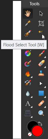
Magic Wand [German "Zauberstab"] missing in Affinity
Alfred replied to FFWD's topic in Older Feedback & Suggestion Posts
Its official name is 'Flood Select Tool', but (as you can see) the icon is a magic wand. ^_^
-
I'm afraid there's nothing really mysterious or seriously impressive about it! There was a thread some time ago where someone was complaining about SVG exports showing different dimensions when opened in Inkscape, and the 90 DPI thing was mentioned at the time. When I went to download Inkscape 0.92 three or four months ago, one of the changes mentioned prominently on the Inkscape site was the switch to 96 DPI. I'm not sure offhand whether Affinity consistently uses 96 DPI or 72 DPI, or whether it varies according to the document type. Try it and see!
-
Serif (the company behind the Affinity suite) have tried to provide a level playing field for Mac and Windows customers by using Mac App Store prices for the Windows versions of Affinity Photo and Affinity Designer. Because of Apple's current pricing matrix, customers in some countries pay considerably more than you would expect from applying a simple exchange rate to the US dollar price: in the UK, the Eurozone countries and Australia, the undiscounted price of $49.99 becomes more than $60, and in Norway it's an eye-watering $65. Suppliers have been required to charge VAT to EU residents ever since the rules were changed in January 2015.
-
Affinity Photo for ipad - feedback
Alfred replied to RHiNO's topic in Feedback for Affinity Photo V1 on iPad
No, not the App Store but the iTunes Store. ;) -
I think one of us may have misread the other's post! All I was saying is that 'Free hand Selection Tool' seems a strange name for what is commonly called 'Lasso Tool' elsewhere.
-
Affinity Designer has a Lasso Tool (called the 'Free hand Selection Tool', for some strange reason) in the Pixel Persona.
-
Those guidelines are out of date. They refer to Inkscape using the old SVG standard of 90 DPI, but when Inkscape version 0.91 was replaced by version 0.92 at the beginning of this year they changed it to 96 DPI to match the current CSS standard.
-
Very nice. I've long ago lost count of the number of those that I've made over the years, although the folds at the base of the wing in the version I learned look a little different from yours.
-
The Light UI option, the stabilizer for the Pencil and Brush tools, and the Glyph Browser panel are all new in version 1.6.
-
It's free for home users, but commercial use requires the payment of a licence fee (US$34.95 for a lifetime licence).
-
How are you selecting the rectangle? It sounds as though you are marquee-selecting it on the canvas instead of simply clicking on it. Alternatively, if you have a layer in the Layers panel which contains the rectangle and the continent shapes, you may be selecting the parent layer instead of the rectangle.
-
Text on path, please?
Alfred replied to Instigator's topic in Feedback for Affinity Photo V1 on iPad
Please see TonyB's reply in this similar thread. -
Upgrade Pricing Policy
Alfred replied to Fenster's topic in Pre-V2 Archive of Desktop Questions (macOS and Windows)
In all the years I've been a Serif customer, I've only ever had to pay for upgrades (i.e. new major versions like 2.0). Updates (i.e. point releases like 1.6) have always been free. :) It will be interesting to see whether Serif decides to follow the example of The Omni Group so that they can offer upgrade pricing to existing customers. :unsure: -
Affinity Photo for ipad - feedback
Alfred replied to RHiNO's topic in Feedback for Affinity Photo V1 on iPad
Welcome to the Serif Affinity Forums, jemity. :) If you own the computer version, I presume you also own a Mac or a Windows PC! Log into the iTunes Store from there, purchase the app and then either transfer it or re-download it once your shiny new iPad Pro appears on the scene. -
Lack of optimisation on iPad Pro 10.5
Alfred replied to defn's topic in Pre-V2 Archive of iPad Questions
Please consider providing an option for this. I can think of few things worse than having to resort to measures like turning the volume all the way down or plugging something into the audio jack just because I can't mute the sound with a control provided for the purpose. -
My original wording was something like "It seems highly unlikely that an Android version will come out soon, if ever," but when I searched for your post I found that you had written "Android doesn’t currently offer an equivalent technology that we can use." When I saw the word "currently" it occurred to me that if Android changes sufficiently then Serif's attitude to Android might change, too. :)
-
Lack of optimisation on iPad Pro 10.5
Alfred replied to defn's topic in Pre-V2 Archive of iPad Questions
Please see this thread. -
It seems highly unlikely that an Android version will come out in the near future.
-
Would it be possible to add an option so that only the rotation centre is moved?
-
When I choose the Arrow Tool in the latest release version of AD on Windows (build 1.5.3.69) the Context toolbar shows the ends with a white outline and a black fill. In beta build 1.6.0.72 the 'Ends' dropdown lists have no visible icons in either the Dark UI or the Light UI mode.
-
Affinity Designer
Alfred replied to CoryT87's topic in Pre-V2 Archive of Desktop Questions (macOS and Windows)
Welcome to the Serif Affinity Forums, Skilover. :) Vector curves and text remain editable in any Affinity app regardless of which one was used to create them, so you don't need to wait for Designer on iPad before you can edit your vector art. If you have the Mac or Windows version of AD, you can edit your files there and then pass them back to APh on iPad for further tweaking. -
Affinity Designer
Alfred replied to CoryT87's topic in Pre-V2 Archive of Desktop Questions (macOS and Windows)
It's ready! Well, almost. BTW, if you want to change the thread title to reflect the fact that this thread is about AD for iPad in particular rather than just AD in general, you can do so by editing your OP and pressing the 'Use Full Editor' button for access to the topic title and tags. -
Everything? Including, in this day and age, keyframe animation with export to SWF format?? I'd like to see mesh fills, mesh warping and a blend tool, among other things, but I understand that Affinity Designer was always intended to be an entirely new product rather than a direct successor to DrawPlus. Publishing to PDF or exporting to SVG is, in effect, that conversion tool (but built in to DrawPlus instead of being separate).