RHiNO
-
Posts
13 -
Joined
-
Last visited
Recent Profile Visitors

-
 misc33 reacted to a post in a topic:
Affinity Photo for Digital Painting
misc33 reacted to a post in a topic:
Affinity Photo for Digital Painting
-
RHiNO reacted to a post in a topic:
Apple Pencil
-
RHiNO reacted to a post in a topic:
Affinity Photo - iPad Two-Finger Canvas Rotation Gesture
-
RHiNO reacted to a post in a topic:
Apple Pencil
-
RHiNO reacted to a post in a topic:
undo gesture or undo button move
-
RHiNO reacted to a post in a topic:
Toggle for finger pan mode while using pen
-
RHiNO reacted to a post in a topic:
Toggle for finger pan mode while using pen
-
Affinity Photo for Digital Painting
RHiNO replied to chadmakes's topic in Pre-V2 Archive of iPad Questions
Other users and myself have put some dozens of requests in this thread :) https://forum.affinity.serif.com/index.php?/topic/41089-affinity-photo-for-ipad-feedback/ Should I consolidate my requests and repost them in the requests forum if the specific request is not there already? :) -
RHiNO reacted to a post in a topic:
Painting persona
-
Affinity Photo for Digital Painting
RHiNO replied to chadmakes's topic in Pre-V2 Archive of iPad Questions
Even better than to mimic another app gestures, I wish Serif gives is a way to fully customize the gestures, so we can choose the behaviour of a two finger tap, three finger tap, four finger tap, three finger swipe (up, down, left, right), one finger swipe (up, down, left, right) etc. That will be awesomeness ;) -
Out of curiosity: What's the size of the actual app itself and the size of the help in the 1.2GB app size? I understand a online help is problematic, but why not having a separate ios app just for the help? It will help (ops) people who need to constant look into the help (because the embedded help always start at the beginning) and also will alleviate the update size of the app itself (if the help and the videos are a considerable chunk of those 1.2GB) ;) Not a big problem, just technically intrigued by this really big app size, that's even bigger than the desktop version :)
-
RHiNO reacted to a post in a topic:
Affinity Photo for Digital Painting
-
RHiNO reacted to a post in a topic:
Affinity Photo for ipad - feedback
-
RHiNO reacted to a post in a topic:
Affinity Photo iPad: Undo/Redo gestures
-
Affinity Photo for ipad - feedback
RHiNO replied to RHiNO's topic in Feedback for Affinity Photo V1 on iPad
Super excited about ios11 + Affinity Photo. The ipad pro is gaining traction as a pro tool :) -
Affinity Photo for ipad - feedback
RHiNO replied to RHiNO's topic in Feedback for Affinity Photo V1 on iPad
That's cool too. I wish the UI is movable/dockable so we can put these panels (or buttons) everywhere, so everyone will have his own UI to fit specific workflows :) Even if the user wish to put *all* the panels (even the studio ones) on the left, why not? Someone may find it more useful this way. The only way for a pro UI to become perfect is to allow the user to adjust it to his own needs. No two professionals work exactly the same way, specially not artists, each own have a particular style or need This kind of flexible UI, of course, is not easy to do, but if someone can do it properly on the ipad, I bet on Serif ;) -
Affinity Photo for ipad - feedback
RHiNO replied to RHiNO's topic in Feedback for Affinity Photo V1 on iPad
Thats why i put everything on the left on that mockup I sent earlier in this thread. For drawing, the left border is the optimal place (if you draw with your right hand) to put the most used buttons for the reasons you describe. I understand the design logic behind the context bar beeing at the bottom of the screen - to clearly separates visually it's function - but I guess affinity apps will be used by people who can handle a more "dense" (information wise) unified toolbar - we are trying to ditch the desktop ;) As always, I am asking for an *option*. For those who want the context bar at the bottom, thats cool - if one want to compact it at the left, allow him to do so, give the users flexibility in the UI please :) -
Affinity Photo for ipad - feedback
RHiNO replied to RHiNO's topic in Feedback for Affinity Photo V1 on iPad
But the Affinity Photo sliders *already are* nonlinear and sensitive to velocity, move away very slowly and move away with a quick swipe to see it for yourself :) ...the UI is uber cool, I agree, but have room to small quality of life touches regarding drawing and painting, I believe the app will evolve to be even more awesome :) -
Affinity Photo for ipad - feedback
RHiNO replied to RHiNO's topic in Feedback for Affinity Photo V1 on iPad
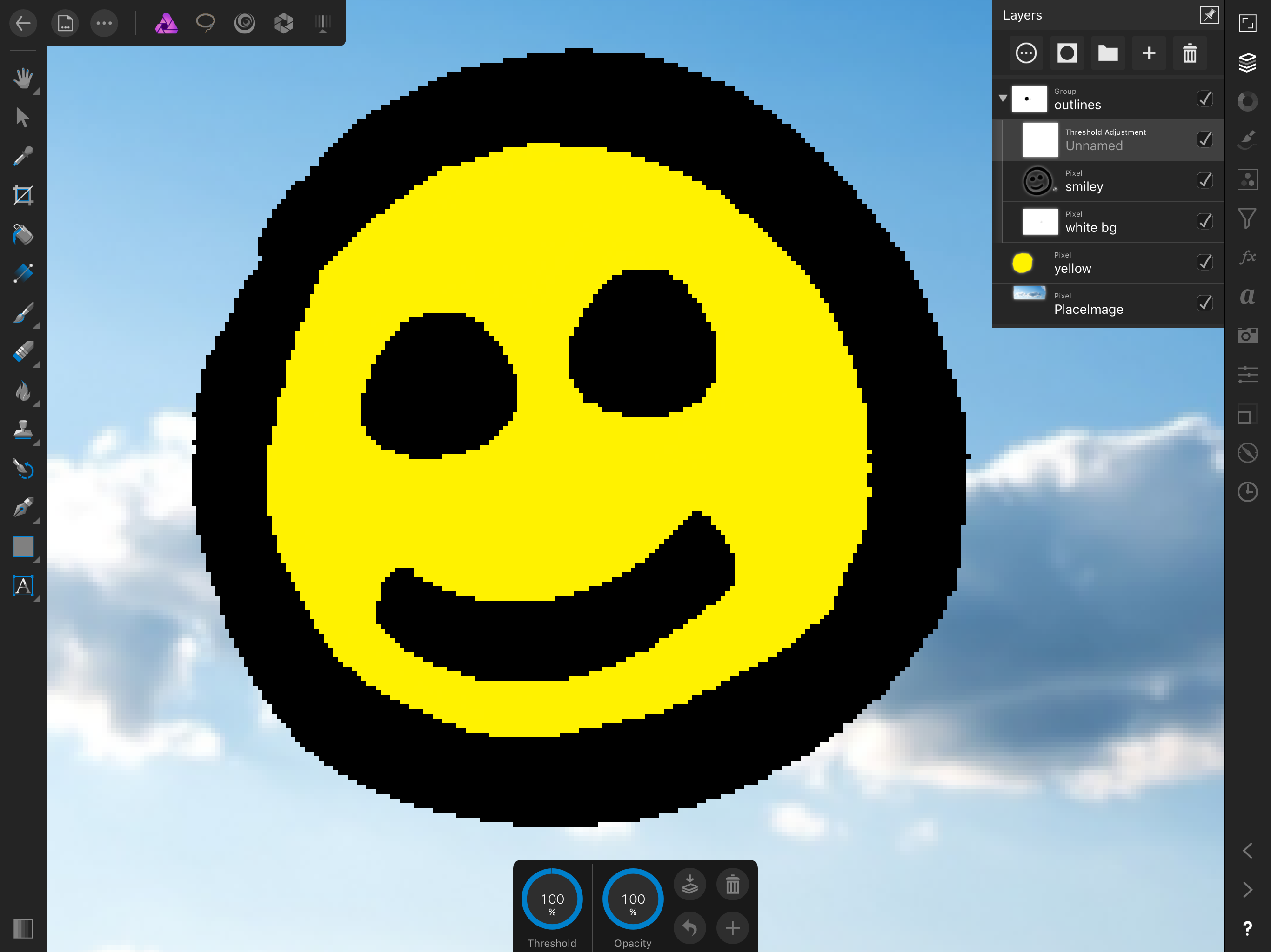
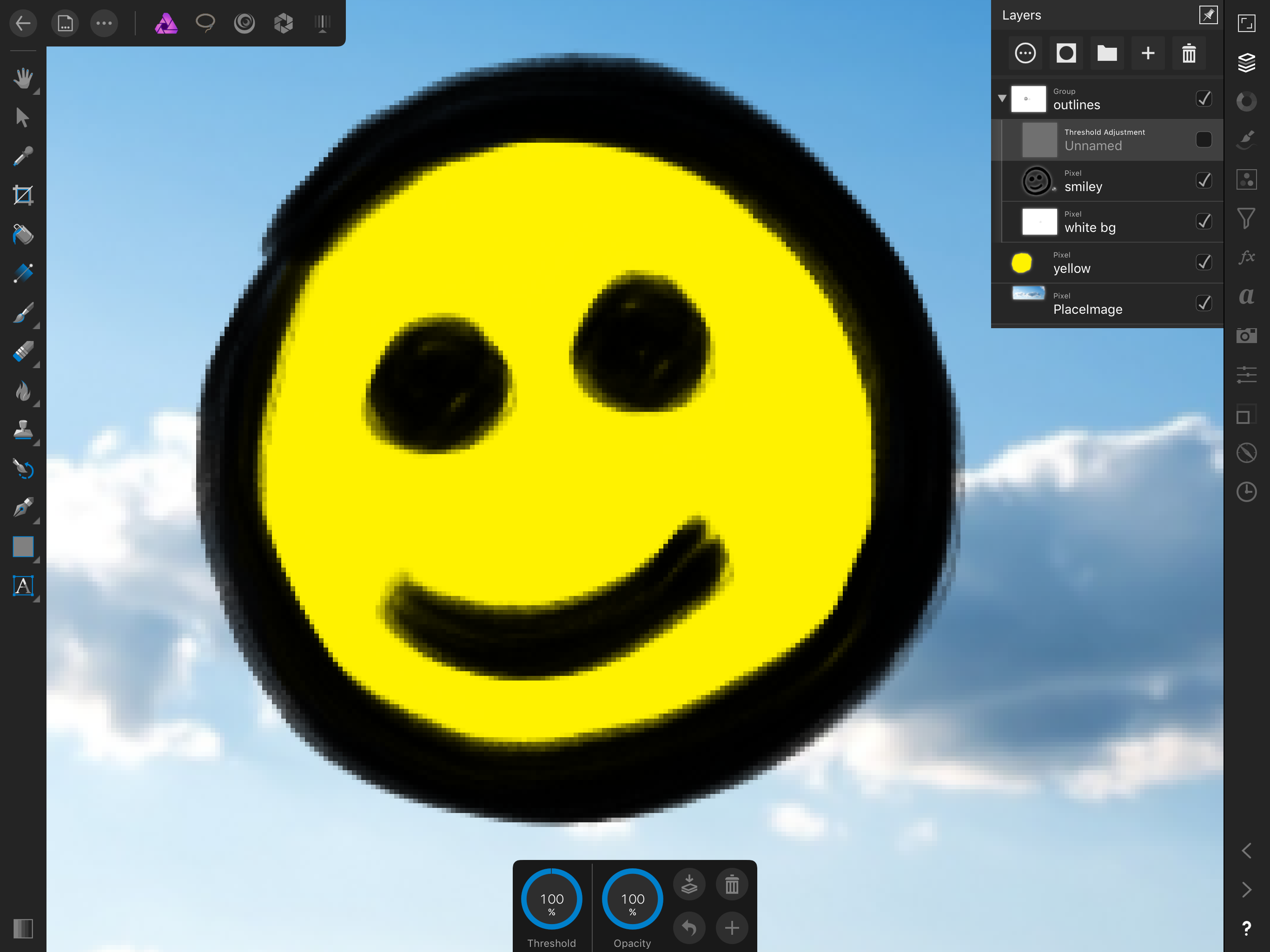
Cool, I just used the threshold + group layer to (somehow) simulate "1bit layers" while we don't have a proper 1bit layer effect in the adjustments studio ;) Check it out my 1bit simulator setup at the screenshots (One with the threshold on and another one with the threshold off). I drew the face with a normal brush, not a pixel brush, and I can use the regular eraser to erase with "pixel crispness" without antialiasing artifacts if I enable the threshold :) The "group" is set to multiply (so the white bg become transparent), everything else is set to normal. The white bg is a layer filled with the color white (necessary for the threshold to work) BTW, you can gives us an option to show the name of the blending mode selected of each layer using that nice tiny font used to write "pixel", "group" etc, it can be very useful to track more easily the blending modes we are using if we see something like "Pixel - Normal", "Pixel - Darken", "Group - Multiply" etc I hope you guys implement a 1bit layer like we have in clipstudio. if we have an option to change the color from black to any other color - like a threshold+color overlay with just one step - it will be awesome too. In clipstudio this is under layer property - expression color - monochrome, and we can change the color of the layer in the "layer color" option above it. Good to make black crisp outlines become brown crisp outlines easily, for example Now this is something apparently I cannot achieve here: Using the setup from the screenshot, how do I change the pure black, pixel crisp outlines generated by the threshold to another color, like brown? If I apply a gradient map to the outlines group, it will affect the blue clouds because of the "white bg" layer... If we disable the "white bg" layer, the gradient map works, but we lost the crispness from the threshold... Trying to solve this without using masks or flattening the layers of course. Interesting puzzle PS: you can see in the screenshot the threshold value looks like is set to 100% but it is not! Notice the tiny bit gap at the context bar (if we put *real* 100% at threshold we will have a all black image). Looks like we can set fractional values with the finger (like 99.99%) but not with the number panel, we don't have a decimal point in the number panel for threshold - and the value showed at the context bar is simply rounded to the nearest integer. Am I guessing right?
-
Affinity Photo for ipad - feedback
RHiNO replied to RHiNO's topic in Feedback for Affinity Photo V1 on iPad
The help is really vast with animations and all that stuff. Out of curiosity, How much megabytes are occupied by the embedded manual and how much megabytes are occupied by the app itself? I am guessing the manual is very large :) If that is the case, why not make the manual a separate app? It will become easier for new users to check the manual and go back to the program too. Every time we enter the manual we are back to the "introduction" - a separate app will stay there, opened at a specific topic. Also, the updates of the app itself can become lighter? ...and the user can update the manual later to be in sync with the app version, of course ;) -
Affinity Photo for ipad - feedback
RHiNO replied to RHiNO's topic in Feedback for Affinity Photo V1 on iPad
Not exactly game breaking, so much apps use this "up and down" behaviour. Besides, One smart way to do it is the "non linear way", meaning, you do not use the full widht or height to represent the full range, instead, you can use the velocity of the swipe to increase the steps and/or the distance from the initial click to define the step ;) ...Also, for real precision, you just click and input the value, affinity implemented this beautifully with a nice number keyboard popup -
MattP reacted to a post in a topic:
Affinity Photo for ipad - feedback
-
A_B_C reacted to a post in a topic:
Affinity Photo for ipad - feedback
-
Affinity Photo for ipad - feedback
RHiNO replied to RHiNO's topic in Feedback for Affinity Photo V1 on iPad
I believe the "node tool" have the greatest context panel, and it can fits also. Notice the context panel on the quick mockup have gigantic space between the tools now, it can become way more compact, but I am not sure, it's just a small suggestion ;) About the block, one option is to set the interface in "left handed mode" I guess? -
Affinity Photo for ipad - feedback
RHiNO replied to RHiNO's topic in Feedback for Affinity Photo V1 on iPad
Hi Matt, thanks for the swift reply :) about the canvas rotation, sure we can rotate the device, but you know, we are already addicted to do it with 2 fingers without clicking anywhere before, it's really just second nature on the ipad across many apps. Also, we don't want to scratch the precious :) A cool, permanent rotation like the one we have in comic draw or procreate, where the angle "snaps" if it is very close to 0 or 90 degrees with a smooth small and fast animation will be awesome, I guess the "annoyance" is related to canvas rotated by very small values and not "aligned" with the ipad screen? I am pretty sure is even more annoying to click one tool to rotate, do the rotate, click back on the brush tool, do the brushstroke, click the rotate again, etc etc. Some fluid strokes are tricky to do at certain angles ;) ...You can see my main usage is for drawing and painting, for photo manipulation I guess this is not so much of a problem Not sure that I understand what you say: "Pixel eraser is also sensible". I am asking for a eraser that behave like the "pixel brush" that do not create transparent pixels at all (Right now I circunvent this by using a threshold adjustment above the pixel layer and a fully white layer below the pixel layer because the threshold doesn't work if the layer below is transparent) BTW, there is a way to apply the threshold adjustment *only* to a group of layers? Looks like the threshold is applied for *all* the layers below it. Also, the threshold adjustment doesn't work if I put it *inside* a group of layers? About the daub brushes, they work 100% if we import them one by one? We only don't have a bulk import, that's it? About the scale of the context bar, I understand it's a complex problem, just asking because is really big now (200% of the normal toolbar), but I also understand some users may like it so big, so, to each his own :) About the position at the bottom, I guess some users my find useful if we could position it on the top because the context bar is, very often, obscured by our hand and arm... Or maybe the context toolbar can be compacted below the main toolbar.? Maybe you can call it "compact interface" in settings? :D Easier to show than tell. Sent you a rough mockup below to show what I mean. Just for the kicks I pasted one small interface element from clipstudio where we can swap primary and secondary colors and - of utmost importance - the transparent color. The ability to draw with transparent color is super useful for "sculpt" the drawing without changing tools, we can left the eraser for big chunks of erase and use the transparent color to correct small mistakes using the exact same brush we use for drawing. We will also be enabled to use the pixel brush to "erase" with pixel crispness, without the need to use the actual erase brush tool. I hope you guys implement the transparent color in the future About the navigator, I agree the pencil will shine there, the finger, not so much You are right about fonts, I was expecting the app to offer me an option to install them (silly me), I forgot about the whole "profiles" thing in ios, just installed some fonts using the free "Founteer" app - The text studio is really good o/ And the app is amazing, I am loving it, can't wait for ios 11 to see all that drag an drop in action with the app too
-
anon1 reacted to a post in a topic:
Affinity Photo for ipad - feedback
-
Hello, thank you for releasing the Affinity Photo for the ipad, just bought it and it's awesome. I hope you guys launch Designer for ipad soon - it will be another instabuy ;) Some small questions and feedbacks: Any technical reason to not allow "free rotation" of the canvas? Having to select the "canvas rotate tool" to do something as trivial as rotating the canvas seems counter intuitive. For drawing and painting, we need to rotate very often Please include a setting to enable the "apple pencil only" to draw or paint, meaning, please give us a setting to disable the ability to "stamp the brush on the canvas" with the finger I love the pixel brush, really perfect for crisp lines, but I guess we need a "pixel eraser" too? When we use the eraser tool, it creates antialiased pixels, defeating the purpose or the crispness. You guys have plans to implement a crisp eraser too? The Daub brushes for the desktop version of Affinity Photo <https://www.daub-brushes.com/affinity/#gallery> are fully compatible with the Affinity Photo for the ipad? Any plans for customizable gestures (like one finger swipe up for brushes, one finger swipe down for eraser, one finger swipe right for flip canvas vertically, one finger swipe left for undo, etc) ? I wish the bottom toolbar can optionally be placed at the top of the screen (or somehow "docked" vertically at the left, below the main toolbar. Also, it is a little big on the ipad 12.9, we will have an option to "scale down" this toolbar to something like 75% or 50%? We will have the ability to click or drag at the navigator to show another area of the canvas? We will have the ability to import fonts? When we reopen a document, the app remember the last brush, but when we open the brushes studio, the panel doesnt open in the correct category, it always open in the default (painting) category Any chance for a setting to allow the app to "remember" the icons from the left toolbar? Everytime we open a document, the app "reset" the toolbar to the default tools and we need to choose again the "rotate canvas" and "pixel brush" for example BTW, thank you for the pinnable color wheel, so few apps understand how this is important o/ And again, congrats for this amazing app, you guys really raised the bar on the ipad pro