AlanPickup
Members-
Posts
407 -
Joined
-
Last visited
Profile Information
-
Location
United Kingdom
Recent Profile Visitors
3,277 profile views
-
 AlanPickup reacted to a post in a topic:
Deep See
-
 bah is life reacted to a post in a topic:
Deep See
-
liked the artwork, but the ascender on the h needs to be extended, I read it as Bon is life i.e. good is life
- 4 replies
-
- affinity publisher
- affinity photo
-
(and 2 more)
Tagged with:
-
 AlanPickup reacted to a post in a topic:
Mandala, designed in Affinity Designer 2.5 beta
-
 AlanPickup reacted to a post in a topic:
Problem with Designer update to 2.4
-
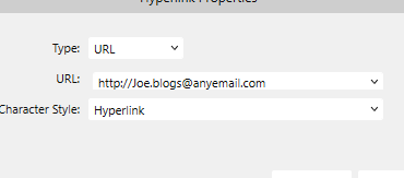
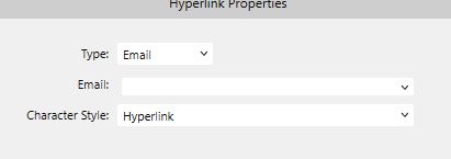
I am sure this was posted a long time ago, but is still the same. If you highlight an email address and right click, select insert hyperlink in the popup it does not insert the email address. Sometimes it defaults to url and adds the http etc, but changing it to email deletes the email address. Any update?
-
 AlanPickup reacted to a post in a topic:
Indiana Jones and the Dial of Destiny
-
 AlanPickup reacted to a post in a topic:
Control Your Selections with the Refine Tool : Affinity Photo Tutorial
-
Fill colour on Picture Frames
AlanPickup replied to AlanPickup's topic in Affinity on Desktop Questions (macOS and Windows)
thanks Walt, did not even know that existed, should spend more learning time instead of just getting on with jobs🤭 -
 AlanPickup reacted to a post in a topic:
Fill colour on Picture Frames
-
I had a picture to go in a round picture frame in publisher. The picture was oblong so there were going to be gaps at the side. I thought the best way to deal with this was to add a fill using colour picker tool and picking up the background of the photo to fill the frame. But this does not work. There does not seem to be a way of having a fill colour in the picture frame and an image unless I am missing something. Tried with both jpg & png. If I am not missing something what is the point of having fill on a picture frame, it may as well be a shape? I tried this with a shape converted to a picture frame and same result. Only way seems to edit the photo to increase the canvas and fill the background, which seems a lot of work. Not a big user of photo so any advise welcomed
-
I agree with MmmMaren, if you highlight an email address and then click create hyperlink it adds the https:// element to the text If you then change the url to email it then blanks the address box and you have to close the box and go back and copy the email address, then start again. I come across this a lot and try to remember to opy before inserting the hyper link. Previous versions left the email text insitu when you change the type
-
AlanPickup started following Autosave required
-
 AlanPickup reacted to a post in a topic:
Slice, Dice, & Design: Knife Tool Tutorial for Affinity Designer
-
Copying and pasting from Master Page crashes Publisher
AlanPickup replied to AlanPickup's topic in V2 Bugs found on Windows
Hi Walt Tried replicating this and I think it relates to my other post re large Asset file, must have had that open when I was doing the cutting and pasting. Tried now with same content and performs as expected -
 walt.farrell reacted to a post in a topic:
Publisher crashing when a large asset file is open
-
Publisher crashing when a large asset file is open
AlanPickup replied to AlanPickup's topic in V2 Bugs found on Windows
This was related to the same asset pack and slowed down the loading, did not try any actions before I detected what was the problem and closed that asset pack -
Copying and pasting from Master Page crashes Publisher
AlanPickup replied to AlanPickup's topic in V2 Bugs found on Windows
No the crash report file is empty -
I opened an A3 template to design a poster and did not note I was working on the master page until I needed to edit an EPS clip art file I had obtained and placed on the master and nothing happened when trying to select so it would open in an editing window on a page I then cleared the master from the pages that had been created at the start, went to the master and copied everything, went to one of the pages and did C+V and Publisher crashed. This happened a number of times and also when I cut and pasted. Just copying the text and omitting the eps worked
-
I have the icon_pack.assets installed, which I downloaded from the resource forum. If I perform actions or as previously documented in a prior post Publisher crashes. I do not know whether this is the size of the asset file or something in the designs, but is easily replicated as it has happened previously with a different design. Good news is the recovery file had most of the work I had done intact.
-
 itsRachel reacted to a post in a topic:
Printing 6in x 4in greetings card
-
It would appear that this is printer related as you exported the pdf and the margins appeared correct, but when printed the pdf the same shift to the right was experienced. This makes me think that the setting of the notch on the rear printer guide is the culprit. Glad the rotating the document cured the problem which again confirms that 6inch wide is a setting the printer guides align to.


