
kenmcd
-
Posts
2,229 -
Joined
-
Last visited
Posts posted by kenmcd
-
-
10 hours ago, Marathon1908 said:
If it will help I can upload the file.
Yes. That will help.
-
Set a fixed leading/line height.
If a font has Use Typo Metrics set to Off, then the Mac vs. Windows default line height can be different - which can cause reflow.
Always set a fixed line height, specially when working cross-platform.
-
Seems like this has come up before...how Affinity handles the embedding licenses.
Hoefler has different licenses for Desktop (Print & Preview) vs. Electronic documents (embed in PDF).
Have to check the actual PDF to see if the fonts are installed.
If the fonts are not embedded, you need to have them installed to see the doc.
On iOS the fonts are not installed.
If you have the font installed locally, and the PDF does not have the fonts embedded,
you will see the document correctly (because you have the fonts installed).
So we have to see the actual PDF.And see the fonts too.
There are a lot of older versions out in the ether with various embedding settings.
Sounds like you have a mixed set.
So post (or PM) a link to the files.
I can take a look at what is in there.Below is a PDF created in APub with the 12 Whitney normal width fonts (v2.200 Pro, OTF).
These have the Print & Preview (only) setting, which I think is their Desktop license.
The fonts are embedded in the PDF.
I tested the PDF in every PDF reader/editor I have on my Android phone (10 apps).
All appear correctly.
So could some of you with access to an iOS device please test this PDF?
Whitney-Test1-Originals.pdfIf this PDF does not work on iOS, I can remove the restrictions on the fonts,
and make another test to see if it then does work on iOS to confirm that was the issue.If this does work on iOS, then we definitely need to see the PDF and the fonts to figure-out what is going on.
-
14 hours ago, Gnobelix said:
I want a defined spacing (distance) between the letters.
The default distance between the letter glyphs is the sum of the two side-bearings.
If all the characters side-bearings were all set to the equivalent of 1mm the spacing would be 2mm - automatically.
What font is it?
Why pick a monospace font?
What point size will it be at with that spacing.?
How is it going to be used?
Note: proportional fonts are already optically adjusted to appear to have the same character spacing (thru the initial spacing via side-bearings and then additional kerning). So if you add tracking the characters still appear to have the same spacing - just more of it.
Monospace fonts are not going to appear to have the same spacing between the glyphs because they are crammed into a fixed-width box. Even if you set the side-bearings equal you would still have to manually adjust via kerning to make it appear the same.
Starting with a proportional font is easier.
So why monospaced?
-
5 hours ago, lacerto said:
Yes, but much is "editable" text (rather than curves), so as far as appearance is close to match, it may be worth an effort (to make some minor changes).
Which is exactly what I said above.
He has not said exactly what type of changes he would like to make.
If the changes are just some simple text changes, then a PDF editor would work.
And then you do not have Affinity making it into a mess first.They could even make simple music changes (like correcting a note).
Do not even need the fonts if the PDF editor can use the embedded font.
But again, most of this is shape objects - which you could carefully copy and place.
It's possible, but not in Affinity. -
5 hours ago, AdrianusvdPol said:
Can someone advise what fonts i need to load so publisher can interpret these correctly.
Not going to work even with the Opus fonts.
I have the Opus fonts and the document is still a mess.
The majority of what is on that page is shapes, not text.
Those shapes are created by the music software.
Given that the fonts are Opus I assume that is Sibelius.In Opus the "characters" - such as that black note - are vertically centered on the baseline inside the font.
The music application then shifts that single note shape vertically as needed.
This also depends on the .jason file supplied with the font which contains a lot of measurments or metrics used by the music software to align things.
Affinity will never use those .jason files.
It would be extremely hard to manually replicate what the music notation software is doing.Some of the text on that page is actually text objects.
So you could edit that in an editor which does not try to convert it all to text.
I can edit the text in a PDF editor.The only way to type music like text is to use a "text" font like BravuraText.
In BravuraText all the shapes are pre-composed, and most have Unicode code points.
Then you type code points and specific character sequences to build the music.
The character sequences do things like shift the note characters vertically.
The documentation is really bad.
And the font has long un-fixed bugs.
They really don't want you to not be forced to use their music notation software.
But I have seen people actually learn it, and use it to write music.IIRC there is at least one other music "text" font out there.
Generally Affinity Publisher is not the tool to use to write or edit music.
Some of it also depends on the music notation software used to create it.
Some of them build it with more code points and less shapes.But for your document above, not going to work very well.
-
Ran across this thread looking for an old bug post...
I am guessing this is an issue because Affinity is trying to actually use the real style-linking,
and less of the iStupid way of guessing the linking by the font weights, and style names (and mac flags).
Which kinda works with these old broken fonts (probably only tested/working in ID on macOS).Many of the older FF font families have totally wacko name structures.
Some had all font styles in a separate Typographic Family (Preferred Family).
And all style groups were also in a separate family.
So any normal style-linking did not exist at all.
IIRC an older Milo was like this.Some had all styles in separate Regular/Italic style groups.
So the R&I linked, but no link to Bold because it was in a separate style group.
IIRC Abasra was like this.These FF fonts were originally Type-1, and they started converting them to OpenType.
And focused only on Adopey/macOS. so proper style-linking was ignored.Now that they are on MyFonts (where they do have some standards) the fonts actually have to be fixed to work properly.
Current versions on MyFonts work properly in applications which work properly. -
50 minutes ago, Hangman said:
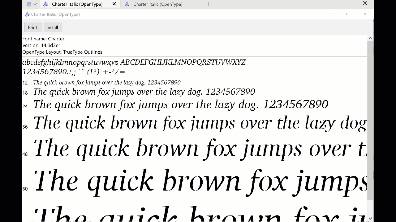
Charter is a default font on Mac (Version 14.0d2e1), though the Roman, Italic, Bold, and Bold Italic versions on Mac are OpenType and the version I'm using when viewing the PDF uploaded by @carolinsart. Zooming to any level, I see zero issues...
I think macOS ignores the hinting (IIRC).
So you will not see the issue in a preview.Oddly enough, I have been looking at the Charter-Italic from macOS 15.4.0 (v14.0d2e1)... in the Windows Font Viewer.
Windows Font Viewer does use the TrueType hinting - and that Charter-Italic looks really bad.
So I made a copy of the font file and removed the hinting.
And that fixed it.
The dehinted font looks fine.Below is the original hinted font in the left tab, and the dehinted font in the right tab.

Also, the PDF viewer must support hinting to see the issue.Appears that the printer's rasterizer does support hinting, and the broken hinting is the issue.
Work-arounds:
- use an OTF version of the font which will not have that hinting.
- use another free OFL version of the typeface - XCharter, Charis, etc.
- use another commercial version typefaceEven the old Bitstream Charter OSF conversion looks good - and it has oldstyle figures which look better in running text like this. Ugh, those tabular lining figures are painful. Not even proportional lining - tabular! Bleah. Hurts my eyes.
.
-
On 6/22/2025 at 10:46 AM, Hangman said:
yet the PDF itself appears absolutely fine...
When I initially opened the PDF in PDF-XChange Editor Pro, it looked fine.
But as I started zooming in and out to look more closely, I started seeing character distortions.
Like this (and worse):
And it changes at different zoom levels.
Which again kinda points to a hinting issue.
@Oufti Those issues look like they could be the same problem.
The PDF shows it is using TTF version of the font.
To test, we can remove the hinting from the font (by just deleting the gasp table).
And we could also test with an OTF version of the font.
And we could also test with different versions from different designers.
@carolinsart
What operating system are you on?
What exact version of the font?
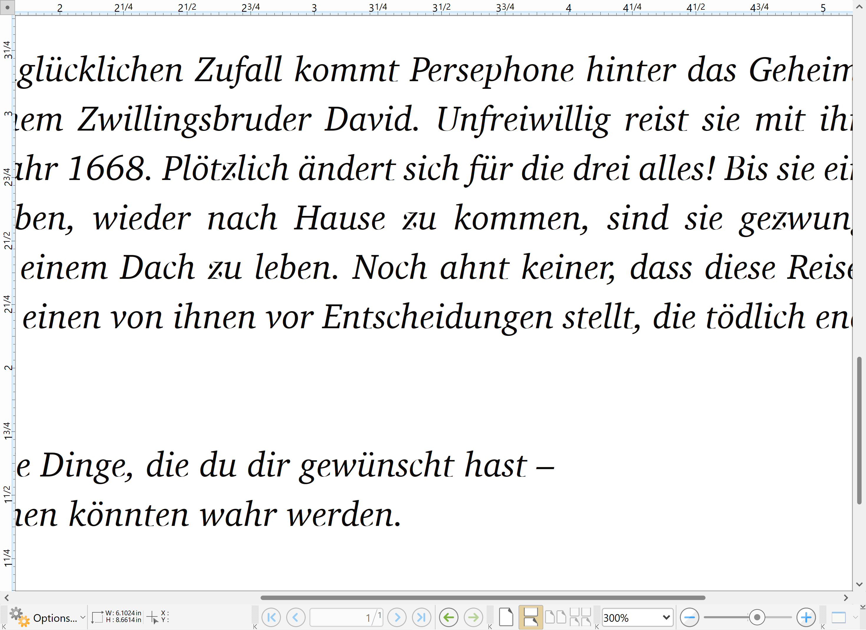
Name, version number, where you got it?An APub doc of at least that one page would be helpful.
We could confirm there is or is not a stoke applied.
And we can test different versions of that typeface.
UPDATE: changed the fonts in the PDF to XCharter OTF (which is also based on the Charter BT Type 1 fonts),
and all the visible character artifacts dissappeared. -
41 minutes ago, Old Bruce said:
I have to say that the problem (as illustrated by the photo in the third post) seems like it could be caused by a stroke on the text. At least that is what it looks like to me.
That was my thought also.
Can see distortions in the text when simply viewing the PDF as you zoom-in and out.
Given all the issues with v2 strokes that seems to be a good guess.Been printing the PDF directly to an image rasterizer at different DPIs (300, 600, 1200)
At different DPIs the artifacts on the characters are different.
300 and 600 both have artifacts.
1200 looks OK.So I was guessing it was either a stoke or some weird hinting issue.
But I think you are right about the stroke.Also the increased weight on some parts of the characters points to a stroke applied.
-
PixFile appears to be a competitor for Callas pdfToolbox.
Similar features - at less than half the cost.
https://pixfile.com/pdf-editor/ -
2 hours ago, Efvee said:
Scenario, I have 4 consecutive paragraphs each with a separate paragraph style.
Use Next Styles.
See discussion here:
-
There are quite a few free comic book fonts, grafitti fonts, and brush fonts with letter styles like those.
https://duckduckgo.com/?q=comic+font
https://duckduckgo.com/?q=graffiti+font
https://duckduckgo.com/?q=brush+fonts
That brush style is quite common.
And many you could fill them like the example above.Comicraft makes a lot of comic sound effects fonts.
https://www.comicbookfonts.com/Sound-Effect-SFX-Fonts-s/1514.htmBlambot makes a lot of comic sound effects fonts, and also has some sound effects brushes.
https://blambot.com/collections/sound-effect-fonts
https://blambot.com/collections/sound-effects-brushesCreative Market has a lot of comic and grafitti fonts.
https://creativemarket.com/fonts/style/comic-book
https://creativemarket.com/fonts/graffitiGoogle Fonts has some comic style and grafitti style fonts. And some brush styles.
Which are free and OFL licensed which you can use as you wish.
With some help from the knowledgable people here to apply effects, that may be all you need.Those should give you some ideas.
Note: The color fonts are almost always Color-SVG - which Affinity does not support.
Some of the SVG fonts (with vectors only, no gradients) can be converted to COLRv0 - which Affinity does support.
I have converted a few of the Color-SVG fonts to COLRv0 (using nanoemoji, which is free, open source). -
If anyone wants to play with it - these should work properly:
NitWhit.Sans.AF.v1.010.(fixed.names).zip
And the family name is different so you can install them at the same time.Not much to see.
They removed a bunch of the Source Sans 3 OpenType features, characters, glyphs, etc.
The only claim to fame is the metrics are similar to Whitney, but most people won't care about that.
PR stunt.
-
Love it when someone raves about how great open source fonts are,
and takes an open source OFL licensed font and makes their own font,
and then blathers about how much time and effort (and money) this has saved them,
and then in this wonderful spirit of sharing they release their modified fonts to the world,
without the source.I think forum rules allow me to say things like - scumbags, sleezeballs, braindead, etc.
Definitely cannot say ####### ######.
I guess all their philosophical blather does not include basic ethics.Regarding the fonts...
They screwed-up the style-linking, badly.
In each of the six weights, the Italic is marked as the Regular, and
in each of the six weights, the Regular is marked as the Bold.
And there is no style link between the Book (400) and the Bold (700).
Applications using the typographic family & sub-family should list the fonts correctly,
but the Bold and Italic buttons are not going to work properly, and the order may be odd.
Applications using the style groups (Word, LibreOffice, etc.) are going to have lots of issues.
No telling what is going to end up embedded in a PDF from any application.They do get the prize for Best ####-up Never Seen Before.
Maybe I should convert it to variable and call it NitWhit Sans.
And of course release the source with it.- Mithferion and joe_l
-
 2
2
-
-
Are you using an older version of APub on the older Mac?
Because in older versions of APub, Affinity did not support the old legacy kern table.
At some point they started supporting the kern table.
That font does not have any OpenType kerning.
The legacy kerning in the font is rather minimal.
TNR was created when Word did not support kerning at all.
So they put a lot of "kerning" in the letter spacing (which results in some weirdness).The font is an Apple AAT font, and APub does not support AAT font features.
The font does have a morx table, where Apple may possibly have added some kerning.
(none of my tools support AAT so I cannot look; you need Glyphs on a Mac)
But that would only have an effect if APub has started supporting AAT.
AFAIK that has not changed.So my final wild guess is the document was created in an older version of APub, with no kerning,
and the newer version of APub applied some legacy kerning.
(may have needed to be triggered by something for it to update)
Which is also why your new documents have kerning. -
Bitcount is not even released yet - for a reason.
There are still unresolved issues.
That is why it is not on Google Fonts (GF) for download yet.
Affinity 1 apps do not support variable fonts (so you only see the default master).
One of the current issues with Bitcount is with the default master.
Probably best to only use a font after it is done.Not a good idea to pull fonts out of the google/fonts repo.
May not be the same fonts as released on GF (they are trying to resolve this).
Not all the fonts on GF are in the google/fonts repo.
There are often missing statics for example.Nothing wrong with Noto Sans.
It gets more developer attention then the vast majority of the other GF fonts.
And it is used by millions.
Highly unlikely there is an issue which would cause a crash.I have no problems with Workbench.
My wild guess is you have multiple cases of having both the variable and static fonts installed at the same time for multiple GF families, and that the font cache is completely scrambled - resulting in unexplained errors.
GF uses the same family and style names in the VF and the statics.
So they are interchangable in web browsers when delivered via web fonts.
But this causes name conflicts in applications when both are installed locally.Depending on how you installed the fonts, you could also have duplicate font files in the Fonts directories.
Which causes similar name conflicts and font cache issues.
Windows just adds a number suffix to the new file when the existing font is in use (locked).
Affinity then scans the two Fonts directories and tries to cache the duplicate font files.
Which leads to name conflicts. -
22 minutes ago, DEWLine said:
Wishing that I knew where to look for the relevant stuff re: the province of Ontario...but I should be okay.
Thank you kindly.Ahhh... I was not paying attention that you are in Ontario.
There is some agreement or association where they agree to use the same or similar road markings.
There are links to other similar agencies on WP.
Here is the info on the Canada agencies with links which should get you to the info..
https://en.wikipedia.org/wiki/Manual_on_Uniform_Traffic_Control_Devices#CanadaIncludes the Ministry of Transportation of Ontario.
I think they all have some sort of standard sign drawings.
They want all cities and towns to be able to easily comply with the standards. -
-
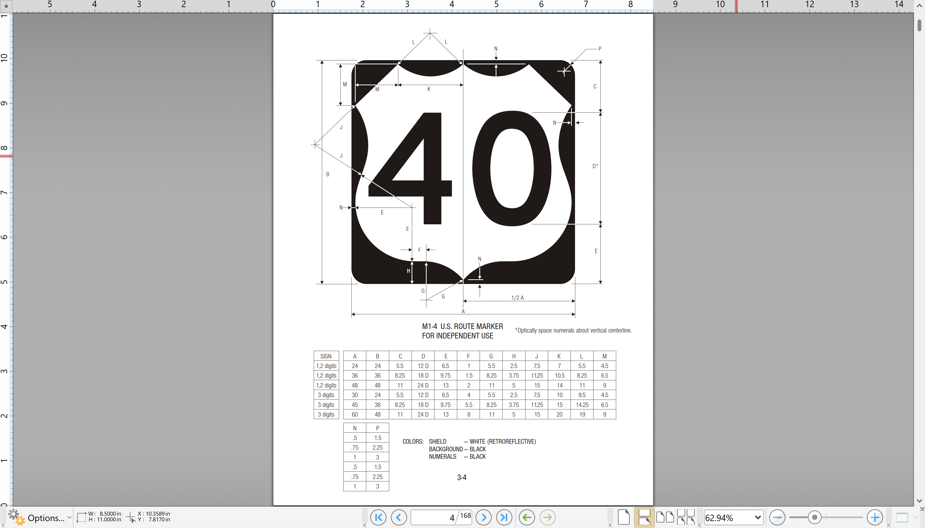
Ahhh... forgot what I came for...
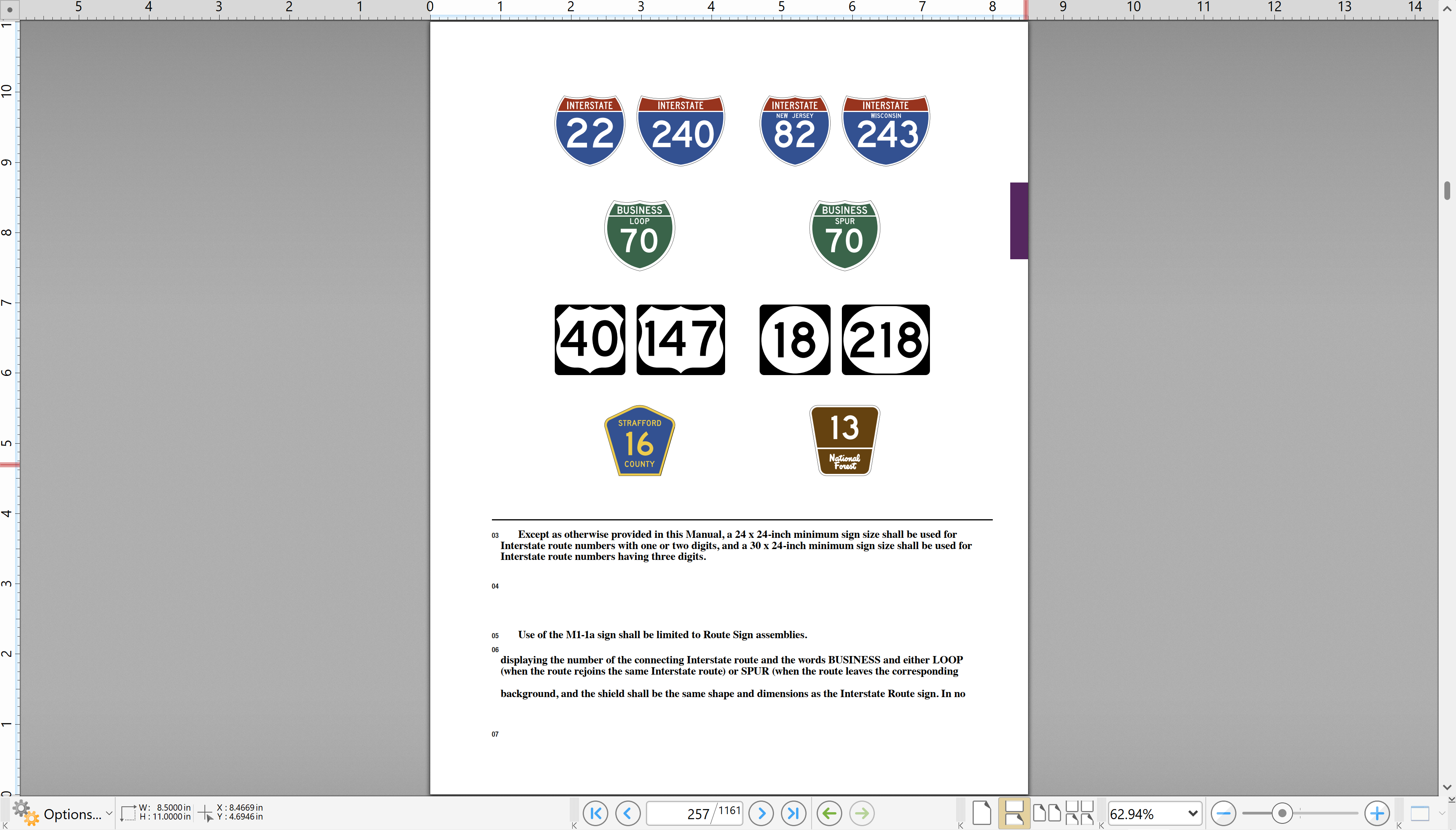
The Federal Highway Administration (FHWA) supplies standard highway signs in vector format.
The website is a confusing mess.
So start here: https://mutcd.fhwa.dot.gov/kno-shs_2024.htmThere are PDFs with all the specifications, and sample images.
And the vectors are in ZIP files.
Have to dig a bit to find what you need.
As they update stuff they just add pieces, which is a bit confusing.
So there are parts from 2024, 2012, and 2004.The highway route number shields are in the Guides section.
Some examples from the PDFs:
I once downloaded all this stuff - which took quite awhile.
And now I do not know where it is. Typical.Anyway, if you want realistic looking route signs, these are the real deal.
Hmmm... I have the fonts too... somewhere.
-
Attended the 1986 Worlds Fair in New Orleans.
Wife called me at work.
Said her sister's boyfriend has gotten four really cheap plane tickets to New Orleans.
And they want us to go with them.
I asked "How much?"
She said "$186."
I asked "Is that one-way or round-trip?"
She said "Round-trip."
I asked "Is that for each of us?"
She said "No, for both of us."
I said "I guess we are going to New Orleans."$186 for two people round-trip from LAX to New Orleans.
Even back then that was insanely cheap.Also did the usual New Orleans tourist stuff in addition to the fair.
It was fun. -
It amazes me how Adopey apps can use broken fonts.
How does one create a TTF font with fractional coordinates?
TTF only allows integer coordinates.Windows font viewer does not show any of the instances.
Normally you can click thru all of them.
That shows a problem.FontCreator will not even open the font.
Exits with an error message which indicates an error in the axis settings or file corruption.FontLab will open the font, but shows no axis range settings for the Bevel axis.
(dumb name for an axis that affects the terminal roundness - not a bevel)
So I added the axis range setting.
The fvar table shows some settings, but there must be something broken to not appear.Name fields are kinda wacko.
FL appears to have fixed those by applying some best practices.
Style groups are still wacko.Exported the modified font and now it appears in APub. Did not test it at all.
The version info inside the font says it is a Beta - go tell them to fix it.
Here is the modified font (notice I did not say "fixed"):
AlimamaFangYuanTiVF-Thin-VF.modified.zip -
11 hours ago, linkedc said:
I hope the Affinity suite can correctly parse and render text with fake-bold features like other software
"Correctly" render horrible distorted fake bold. "Correctly" - that's funny.
Fake Bold is really bad.
Fake Italic is even worse.
Fake BoldItalic is an assault on the viewer's eyeballs.The PDF library also has to support this bad idea.
LibreOffice users have been confused when no Bold appears in the PDF.
When the actual Regular font is embedded.Hope this "feature" never happens here.

File created in Mac opens significantly differently on PC
in Desktop Questions (macOS and Windows)
Posted
This is why I wanted to see the document.
To be sure that a fixed leading was actually being used everywhere.
And to see what fonts were being used.
Use Typo Metrics is Off in Calibri.
So even if you used the exact same font file on both systems,
the vertical metrics would be different on Windows vs. Mac.
Which results in reflow like your image.
And different versions of Calibri have different vertical metrics.
The Windows version has one set of metrics.
The Office on Mac version had a different set of metrics.
And now Office 365 on Mac and Windows has another set of metrics.
Which could lead to bizarre results in non-Office Mac apps (perhaps on purpose).
For years Apple has been sabotaging their fonts to not work properly on Windows.
Maybe Microsoft is returning the favor.
InDesign avoids a lot of this by always using the Typo metrics, if available,
no matter what the Use Typo Metrics flag setting says.
Which avoids a lot of reflow issues.
I think Affinity should do the same (as stated again now for the Nth time).
Never use default metrics.
Always set fixed/exact leading.
Then most of this does not matter.