Max Basok
-
Posts
33 -
Joined
-
Last visited
Everything posted by Max Basok
-
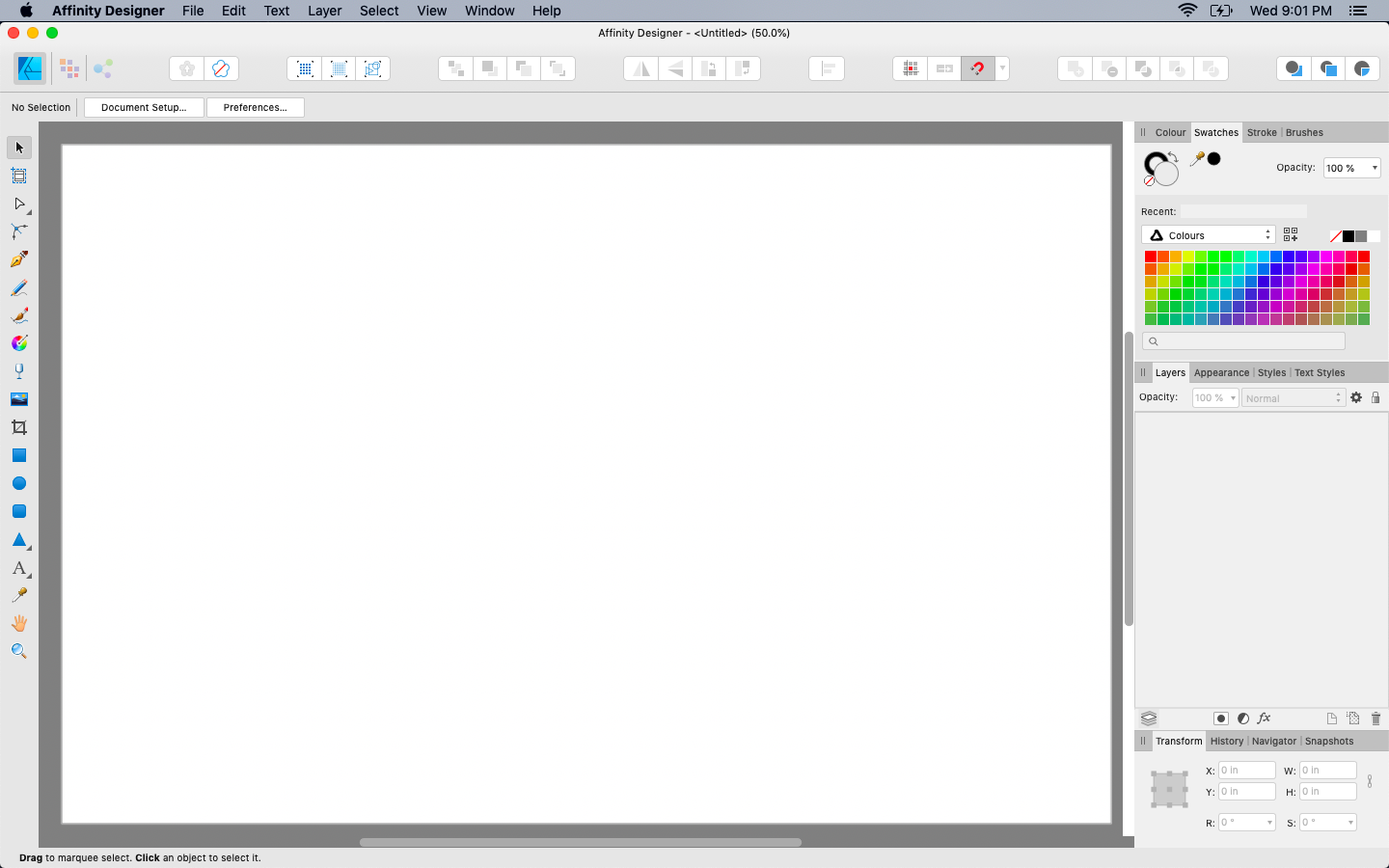
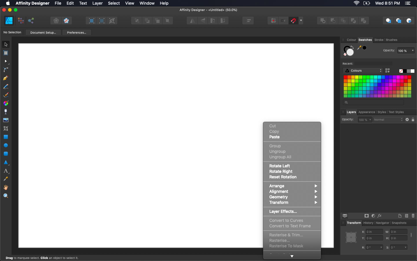
it's not crucial but some weird stuff going on with scrollbars. I personally keep scrollbar hidden by default but there are issues both ways. when scrollbars is hidden by default it has glitch in lower right conner, ugly thick scrollbar in swatches panel and swatches itself shifted. when scrollbar is visible by default it's reduces workspace, makes border around the canvas asymmetrical and distinguish workspace from panels in Light UI witch is look a bit disappointing to me. I don't have any particular ideas but it would be nice if you'll made your wonderful apps even better. actually, it concerns all three of them — I just don't want to make tree separate topics and spam. thanks

-
here's the tricky one… I like Designer Dark UI and I do not like System Dark UI. but there also a contextual menu witch controls by Designer. it causes some strange combinations. could you please do an appearance of contextual menu dependent on System UI not Designer's (like it was until 1.7)? actually, it concerns all Affinity products — I just don't want to make three separate topics and spam. thanks
-

Affinity Designer Customer Beta (1.7.0.8)
Max Basok replied to MattP's topic in [ARCHIVE] Designer beta on macOS threads
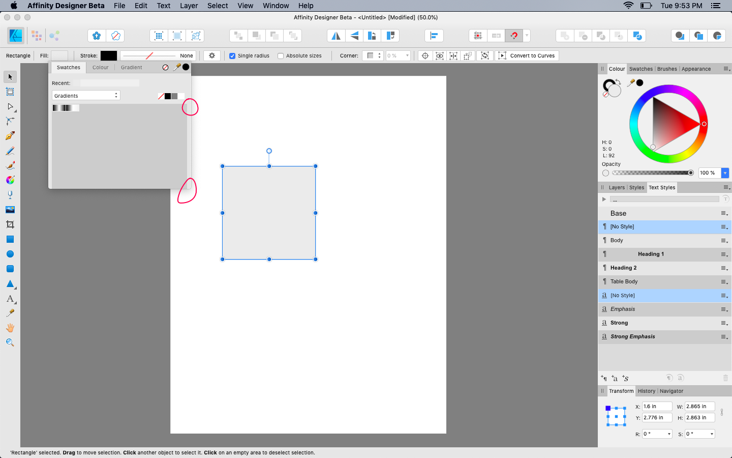
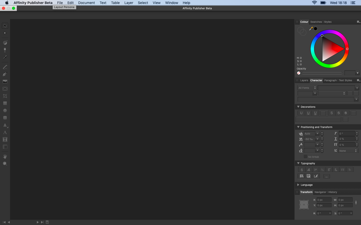
swatches panel have open border at bottom. is that voluntary?
-
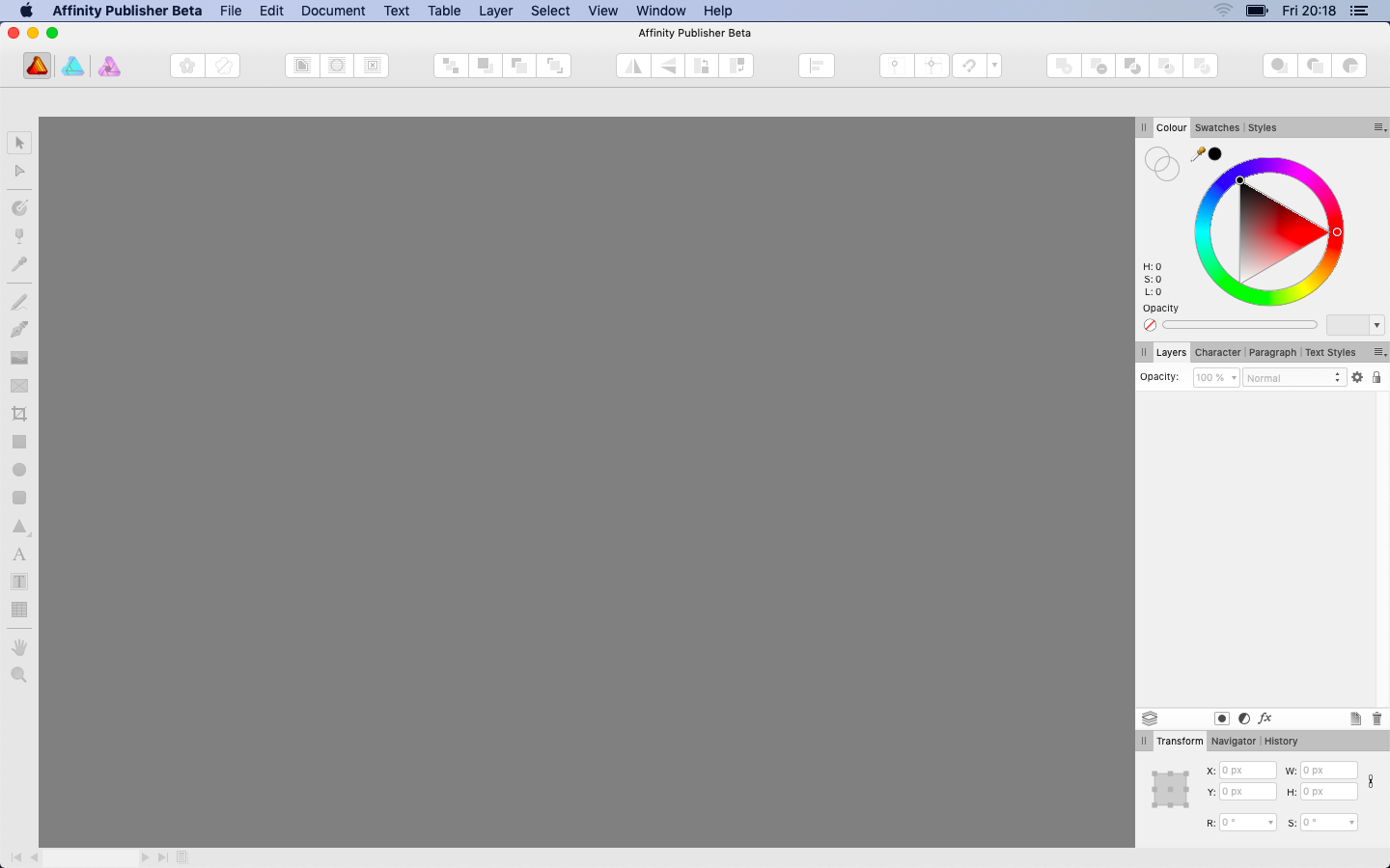
problem with Color Wheel
-
still problems with Color Wheel
-
color wheel is overpixelated in Publisher .145
-
1.7.0.145 nothing changed
-
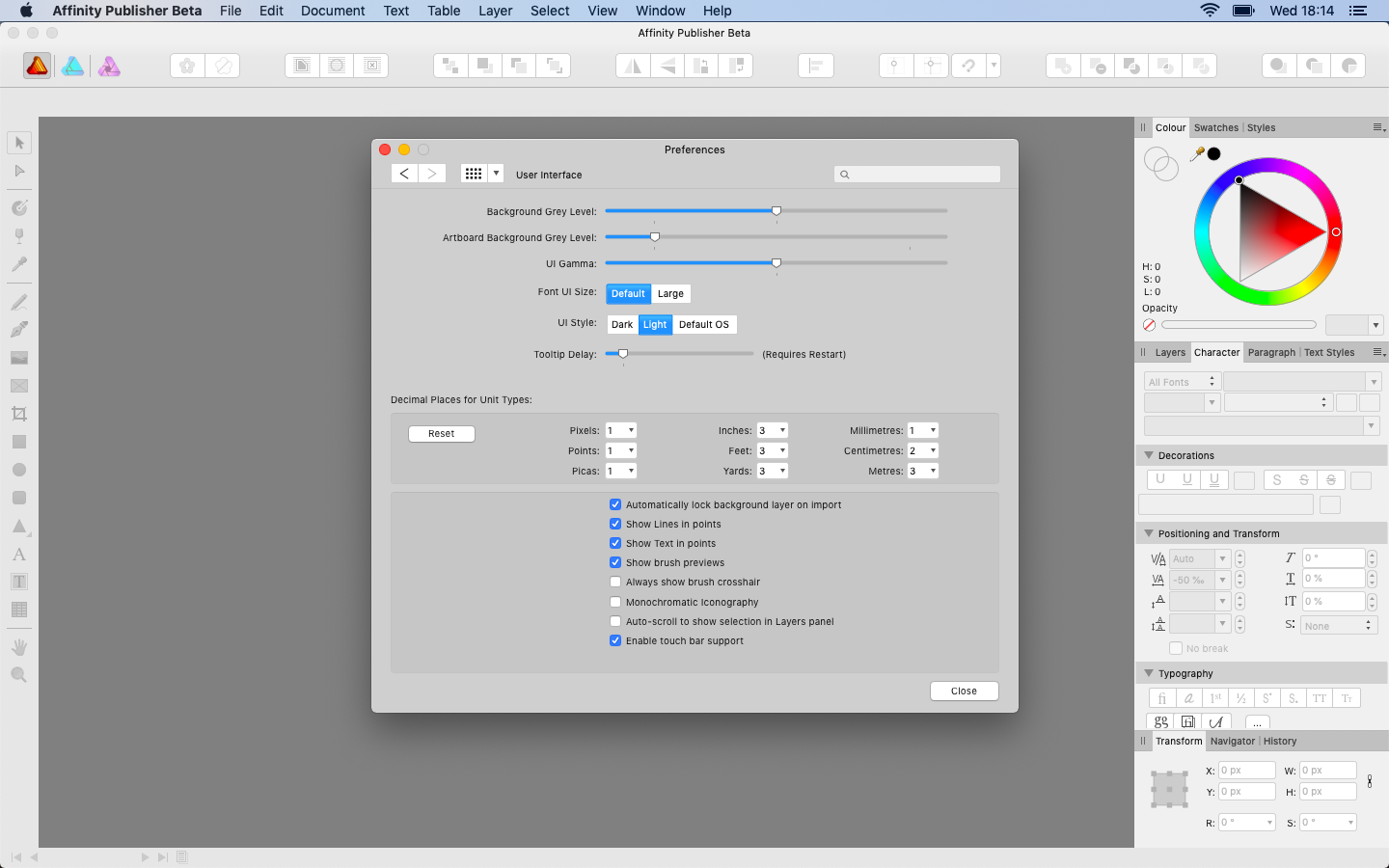
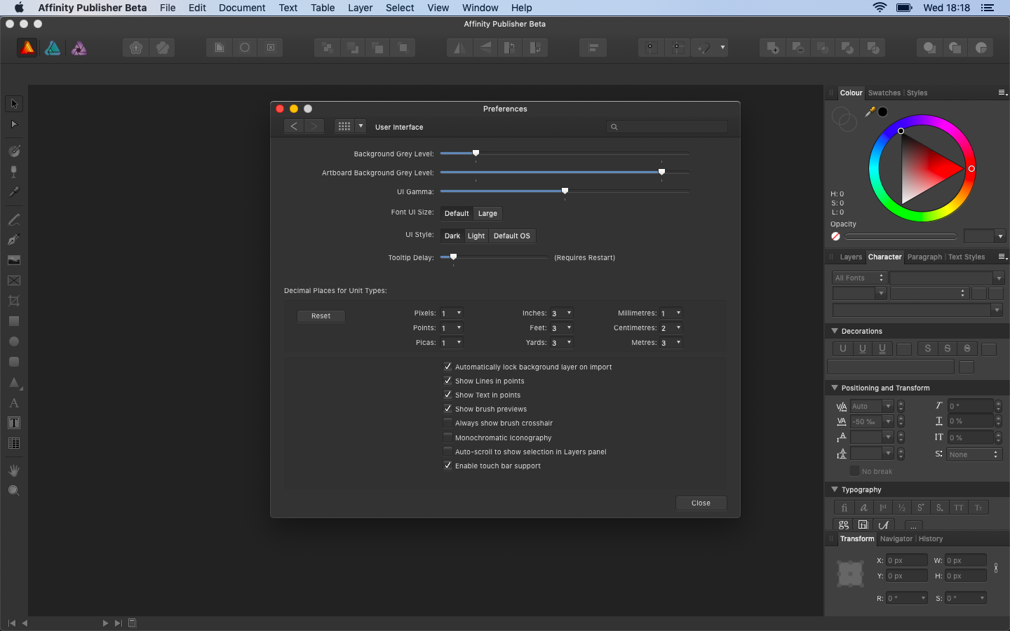
I've changed OS version to customer Mojave and there are still same interface problems (3/4)
-
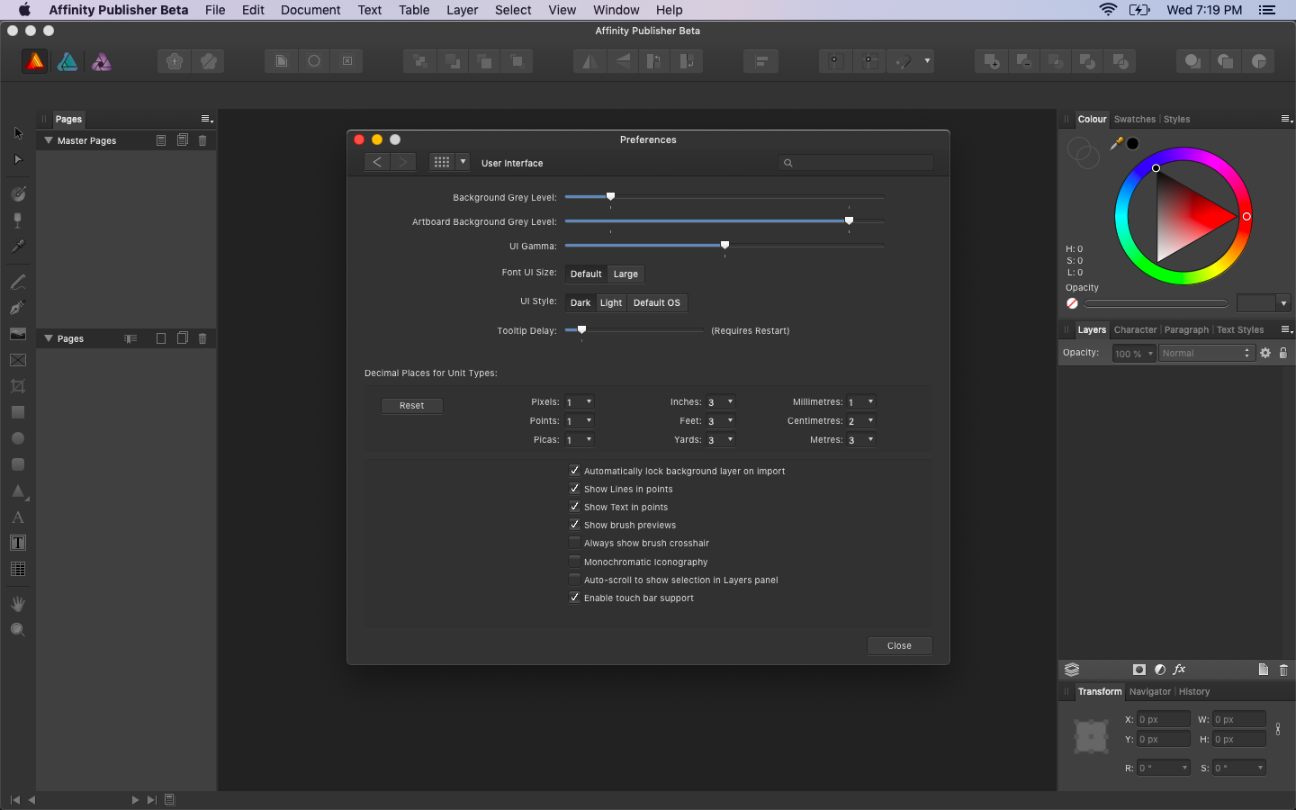
macOS Mojave 10.14.1 Developer Beta 2 (but I believe it’s already in public release). in Dark UI Publisher looks similar to Designer. in previous versions (before 1.7.0.128 I believe) Publisher wasn’t so flat. there was the same problem with Close/Minimaze/Zoom buttons not only at Preferece window but all over the program
-
I believe Preference looks different in Light UI
-
by the way, can add sort of Preview Mode from InDesign, so you can hide all guides, grids, baseline, left&right studio at one click and look at your layout?
-
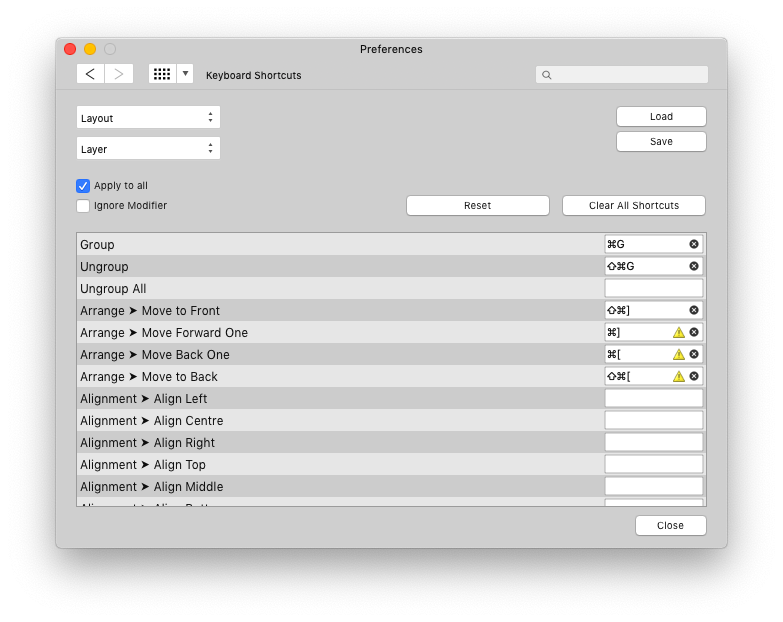
Publisher have some contradictory schortcuts by default
-
another thing, Beta release doesn’t really need such things right from the box…
-
my guess, they’re preparing promotional material (like artwork examples available on the start screen) in these last days
-
nothing… just nothing
-
so, it's almost summer. have any ideas in wich mounth (supposedly) Publisher will be available?
-
Sneak peeks for 1.7
Max Basok replied to Ben's topic in Feedback for the V1 Affinity Suite of Products
definetly, uniform. at least, for me it's hard to imagine non-uniform scale when it takes complex shapes -
Sneak peeks for 1.7
Max Basok replied to Ben's topic in Feedback for the V1 Affinity Suite of Products
well, suppose you want a rectangle with an area of exactly 12 square inches — this is easy to achieve, because the area of the rectangle = width × length. but more complex shapes are difficult to make a certain area. some Illustrator plug-ins (like hotdoor.com) allow to change area of the shape numerically. so you can make uneven shapes the same size not by changing their width or length, but by changing their area -
Sneak peeks for 1.7
Max Basok replied to Ben's topic in Feedback for the V1 Affinity Suite of Products
can you add an abbility to change area of an object numerically? it would be very handy for optical compensation of uneven shapes -
hey Affinity, how about typographic grid in Publisher (similar to InDesign)?
-
hey, Affinity can you please make the tutorial about typesetting in Designer? of cause it will be lots of them when Publisher will release, but now Designer is my primary tool for everything, uncluding typesetting. I've mastered most Designers features with your tutorials, build-in manual and just by experimenting, but there is two topics I can't handle with… 1. type styles. I don't understand the practical difference between text and paragraph styles (considering the fact that there is check box “show in both panels”) and I'm totally confused with group styles. how it works? is that something like nested styles in InDesign? 2. tab stops. I partially understand how it works, but I still can't do antything practical with it (table with complex assymetrical allignment for example) thank you))
-
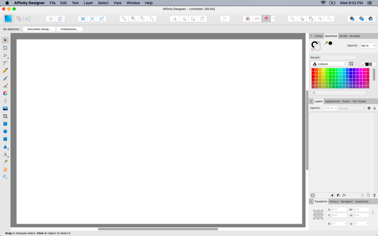
I have an idea for both Designer&Photo. Can you please fix scroll bars in swatches on a macOS: when it off (in the system preferences) it knocks out the order of swaches hue (the pannel itself can't be thinner — it's minimum possible width) + the one in the swatches panel is thick and ugly; when it's on… it ruins my perfect workspace alignment (17 by 11 fits perfectly on my MacBook Air with 50% zoom) and just eats free space. it's not really big deal but it would be nice if you will handle this))
-
Ideas for Designer 1.7
Max Basok replied to Bri-Toon's topic in Feedback for Affinity Designer V1 on Desktop
I have an idea for both Designer&Photo. Can you please fix scroll bars in swatches on a macOS: when it off (in the system preferences) it knocks out the order of swaches hue (the pannel itself can't be thinner — it's minimum possible width) + the one in the swatches panel is thick and ugly; when it's on… it ruins my perfect workspace alignment (17 by 11 fits perfectly on my MacBook Air with 50% zoom) and just eats free space. it's not really big deal but it would be nice if you will handle this))
-
how about Apple Motion?
-
it's the feature in InDesign that works just like it's heard — change number of words in line to balance the rag