GarryP
-
Posts
14,682 -
Joined
-
Last visited
Everything posted by GarryP
-

Quality Loss on Size Reduction
GarryP replied to jagtar's topic in Pre-V2 Archive of Desktop Questions (macOS and Windows)
Welcome to the forums. Designer, when you are in the Vector View Mode (the default view mode), will show everything as sharp as it can. Photo, on the other hand, shows you everything at the DPI of the document. Depending on the DPI of your document, this could be why your document in Photo looks pixelated where it is not in Designer. Check the DPI of your document in Photo (menu “Document → Resize Document”) and see what the setting is. -
Welcome to the forums. Early on in the video you seem to ‘cancel’ the Crop Tool in some way. Can you say how you did this? (It might or might not be important.) Also, can you give us a screenshot showing the extra bits of your Context Toolbar that we can’t see? (You will need to press the second ‘right-pointing double chevron’ – the “»” icon – down from the top-right of the screen before taking the snapshot.)
-
One common reason why the official video tutorials – you don’t say if those are the ones you are watching – do not display is when your browser security (possibly due to a plugin) is stopping content from vimeo (and related sites) from being displayed. Check your browser and plugins to make sure that vimeo.com and vimeocdn.com are ‘allowed’.
-
As far as I understand the process you are following, the Node Tool should work pretty much the same as it did in previous versions (at least as far back as 1.6.5). Can you give us some visual idea of the problem, either screenshots or a video? It’s difficult to diagnose a problem like this without being able to see it. Show us what you have, tell us what you want to get, tell us exactly what you are doing, and show us what you get which is different to that which you expected.
-
export to png
GarryP replied to OdieZ's topic in Pre-V2 Archive of Desktop Questions (macOS and Windows)
If you have either Photo or Designer you can use the Export Persona. -
If you click on the Date at the top-left of the post which contains the video (see attached image) you can then use your browser to create a bookmark which you can use to get back to the video quickly.

-
Is there a specific reason why you want to replicate this, or are you just practising/experimenting with the software? I only ask as there may be easier ways to do what you want depending on what you are trying to do.
-
You can also rotate a layer by moving the mouse pointer near to (not directly over) one of the selected layer’s corner handles, until the pointer looks like a curved-double-headed-arrow, and dragging from there. You can also hold the right-hand mouse button down while you do that to rotate the layer from the opposite corner to the handle which is being dragged. gumbo23: How were you expecting to be able to rotate a layer “more easily”?
-
Sorry, but without access to the original image and more information about what you were doing with it, it’s difficult to say what happened. If this happens again then please post again with the necessary details.
-
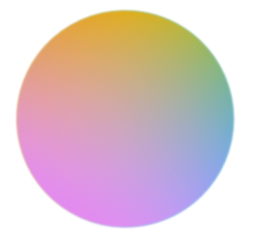
So which part of the coloured circle do you need help in producing? I don’t think anyone will take the time to show/tell you how to reproduce the whole thing in Affinity so if you tell us how far you have got with it and what you are stuck on we can probably advise better.
-
That video is nearly twenty minutes long. Is there a specific thing within it that you would like some help with recreating in the Affinity software? P.S. The audio is not in English so I cannot follow what is being said.
-
Welcome to the forums. Since Publisher has only been around for about a year and Templates have only been a feature for a few months (or so) you might find it difficult to find a template for what you want, especially since each template will be set-up for a certain page size and so might not match your needs. Plus, your list of requirements is quite vague, e.g. only “book” and “non-fiction”. If you can give us some ideas of the sorts of things you want to use in the book then we could give you some information about how to do it yourself.
-
Welcome to the forums. The attached short video should give you a reasonable idea of what you can do. There will probably be other ways but I think this might be the simplest way. If this is not what you want then just say so and give more details. 2020-06-21_09-31-57.mp4
-
Unless you can Undo the action immediately, I don’t think you can get the software to do it automatically. Once the Group has been resized, the layers within it will also take on their new sizes and they ‘forget’ how they used to be. I think the software knows the original sizes (not what they were before the group resize but the original drawn size) but I don’t think there’s a way for us ‘reset’ the layer sizes (either group size of child layer sizes) back to what they were before the latest resize without doing some manual calculations. I would be interested to know if I was wrong about this as I have come up against the same issue myself from time to time and have resorted to recreating the originals.
-
Font color issue?
GarryP replied to sdm1177's topic in Pre-V2 Archive of Desktop Questions (macOS and Windows)
You’re welcome. I agree; that colour chooser should not affect an image layer, even if one is selected, as it doesn’t make sense given what the user expects that control to affect. You can post a bug report in the relevant section of this site if you want the developers to fix this. -
You're welcome.
-
Font color issue?
GarryP replied to sdm1177's topic in Pre-V2 Archive of Desktop Questions (macOS and Windows)
Welcome to the forums. When you select the Frame Text Tool you probably still have the Pixel or Image layer selected. Because of that, when you select a colour from the Context Toolbar you are saying “apply this colour to the selected layer” rather than “start new text with this colour”. You need to create the Frame Text first then, with the Frame Text selected, choose a colour. I think the UI may need some tweaking to stop a colour being selected from the Frame Text Context Toolbar when a Frame Text is not selected. P.S. To remove the colour ‘overlay’ from an image, when you have applied one accidentally (or on purpose), you can select the pixel/image layer, then go to the Colour Panel or Swatches Panel and set the Fill Colour to None. -
Templates
GarryP replied to gabisan's topic in Pre-V2 Archive of Desktop Questions (macOS and Windows)
Welcome to the forums. One of the best places to start is by looking at the Samples supplied with the application (on the Welcome screen). For instance, in Publisher, the "Gemini Brochure" sample looks quite a bit like the templates in your link. You cannot save the samples but you can look at how the document is set-up and formatted and use similar formatting in your own documents. Templates are normally set-up for one specific page/paper size so even if you get a template which is close to what you need you may find that you have to do a lot of modifications to get it looking right on the page/paper size you want to use. Note: There won’t be many Templates, rather than documents that someone has called templates, for the Affinity applications as Templates were only added as a feature recently. -
context menu by mouse
GarryP replied to Jackanger's topic in Pre-V2 Archive of Desktop Questions (macOS and Windows)
I think the right-click functionality isn’t there as it wouldn’t work on iPads, and the Photo functionality has to work as similar as it can on iPads as well as desktop. I don’t know how Adobe get round this for Photoshop, if they indeed do. -
Welcome to the forums. You can set the various Snapping options ON to get something close to what you want, see attached video. 2020-06-19 13-14-49.mp4
-
Welcome to the forums. There are probably lots of ways to do what you want but you could try inverting your pixel line art layer and putting a coloured rectangle behind it, see attached video. 2020-06-19 12-58-51.mp4
-
Move object on a tilted line
GarryP replied to caiqejr's topic in Pre-V2 Archive of Desktop Questions (macOS and Windows)
[For Designer Only] In this particular case you can use the Point Transform Tool, see attached video. I’m not sure how well it would work for more-generalised shapes but it’s worth a try. 2020-06-19 12-47-24.mp4 -
context menu by mouse
GarryP replied to Jackanger's topic in Pre-V2 Archive of Desktop Questions (macOS and Windows)
It looks like Serif has simply decided not to implement a right-click context menu for the Clone Tool. However, you can change the Hardness via the Context Toolbar (using the scroll wheel of your mouse, if you have one, if that’s easier than typing or using the slider) and you can change the Width (Size) in a similar way or use the “[“ and “]” keys. Just a different way of doing things. If you would like Serif to make changes to how things work then you can add a Feature Request in the relevant section of this forum. -
You’re welcome. As I said above, there will probably be better ways of doing it so keep checking back to see if anyone else has posted other techniques.
-
The coloured circle in the linked example looks like it has three colours – blue, orange and pink, or thereabouts – so this might be closer to what they would like to replicate. In my crude example (image and file) I have used three circles, each with a gradient and a Gaussian Blur applied. There will probably be better ways to do it. (I think I remember this coming up a while ago in the forums and someone gave a very good example but I don’t know where it is, or maybe I’m just imagining it.) tri-colour_fill.afdesign