

przemoc
-
Posts
32 -
Joined
-
Last visited
Posts posted by przemoc
-
-
Hopefully additional picture explanation will help if my words are not understood properly.

-
10 hours ago, Chris B said:
If you go to Preferences > General and toggle the Limit initial zoom to 100% does it make a difference?
No. AFAICT behavior is still the same as I wrote earlier (assuming 60Hz screen):
There are like 1-2 frames showing wrong position and zoom (centered and shown fully, but it's a bit bigger than zoom to fit) of the document before it is shown properly (i.e. like it was left before switching to other document).
I hope the behavior is clearly visible on videos that I uploaded before. I used various document zoom levels among apps to make it more prominent.
-
When you switch between more than one document opened in the same window, there are often issues with displaying them properly. For a split second document is often placed differently than it should, i.e. different than how it was zoomed&panned last time. (It seems to be even more prevalent when rulers are shown, but I'm not sure I can write it definitely.)
It happens in all Affinity programs. Observed on Windows 7 and Windows 11 (not tested on others).
Bug is present in current latest v1 (1.10.6.1665) and v2 (2.0.4.1701). Was present in previous versions too, possibly all of them.
It is extremely irritating. I would love to get it fixed.
I attached videos from all apps showing this problem. There are like 1-2 frames showing wrong position and zoom (centered and shown fully, but it's a bit bigger than zoom to fit) of the document before it is shown properly (i.e. like it was left before switching to other document).
Carried over from v1 feedback:
-
I tend to have many documents opened, reorder them depending on what I focus on, and switch between them, e.g. 3 out of N.
Next Window and Previous Window actions (Ctrl+Tab, Ctrl+Shift+Tab by default, can be set in Preferences > Keyboard Shortcuts > Miscellaneous) do not follow tab order I have. It looks like they follow order in which files were opened.
It would be great to have Next Tab and Previous Tab action for navigating tabs in display order. I would assign them to Ctrl+PageDown, Ctrl+PageUp by default.
Carried over from v1:
-
If you open non-Affinity file, e.g. JPEG, the default layer name is "Background", which is inconvenient if you want to keep track of what you work with. It would be great if filename would be used as the layer name, by default or as an option. It would be also more consistent with existing behavior of drag and drop on the document, as then new layer name is the filename.
Carried over from v1:
- Granddaddy and bures
-
 2
2
-
There are seemingly 2 issues.
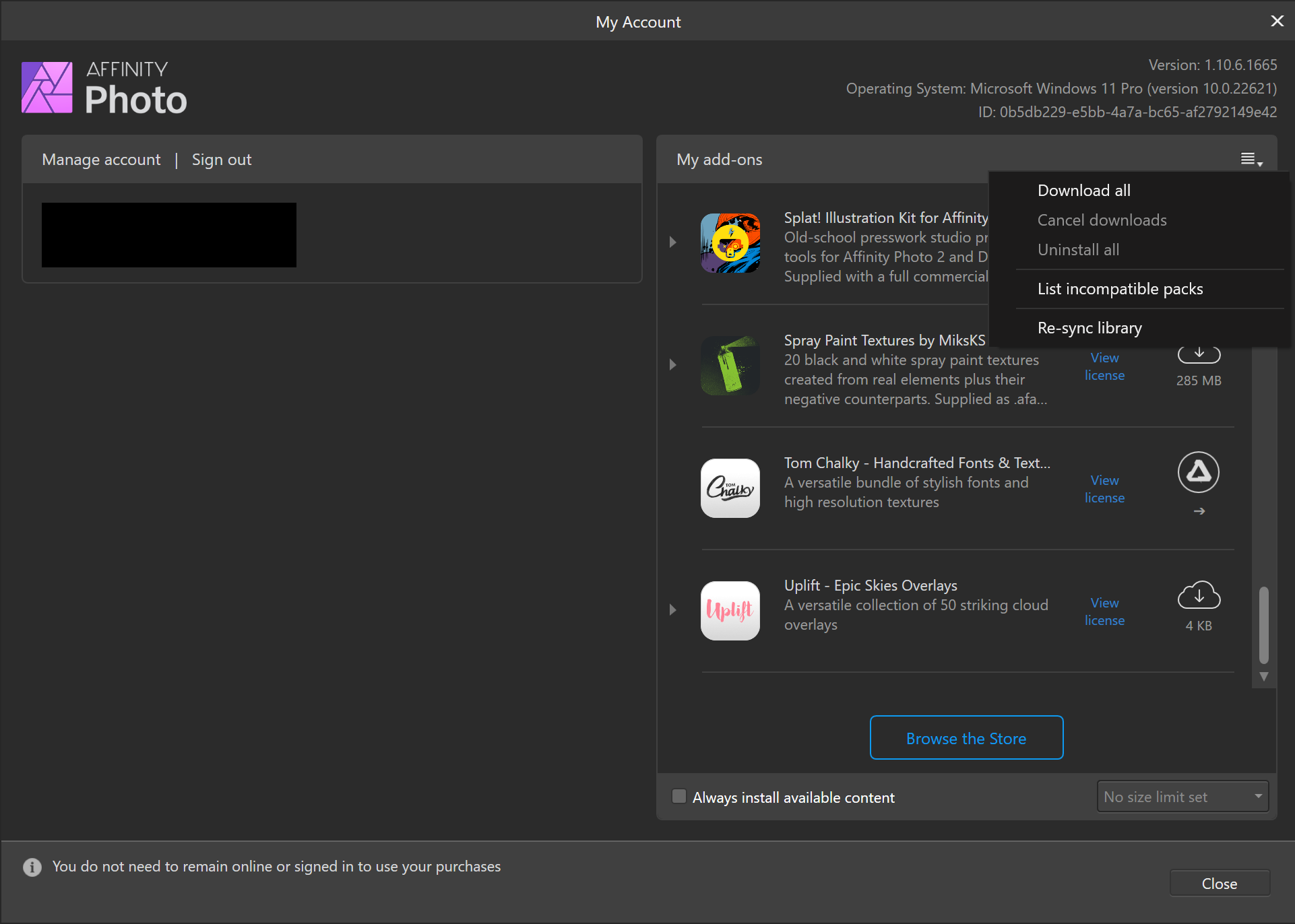
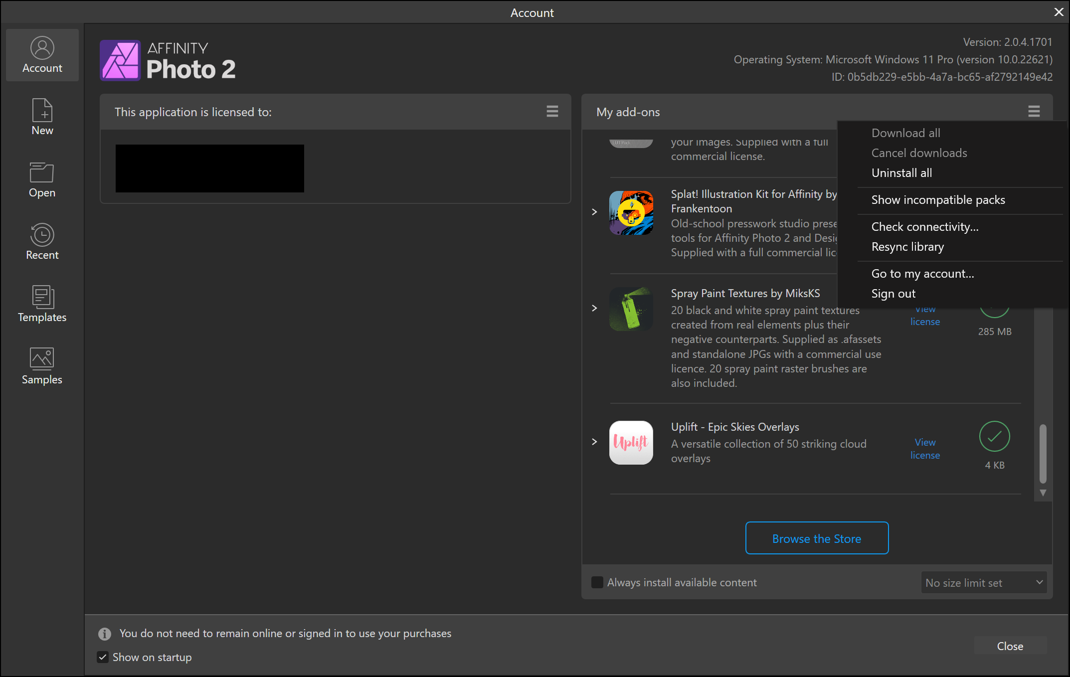
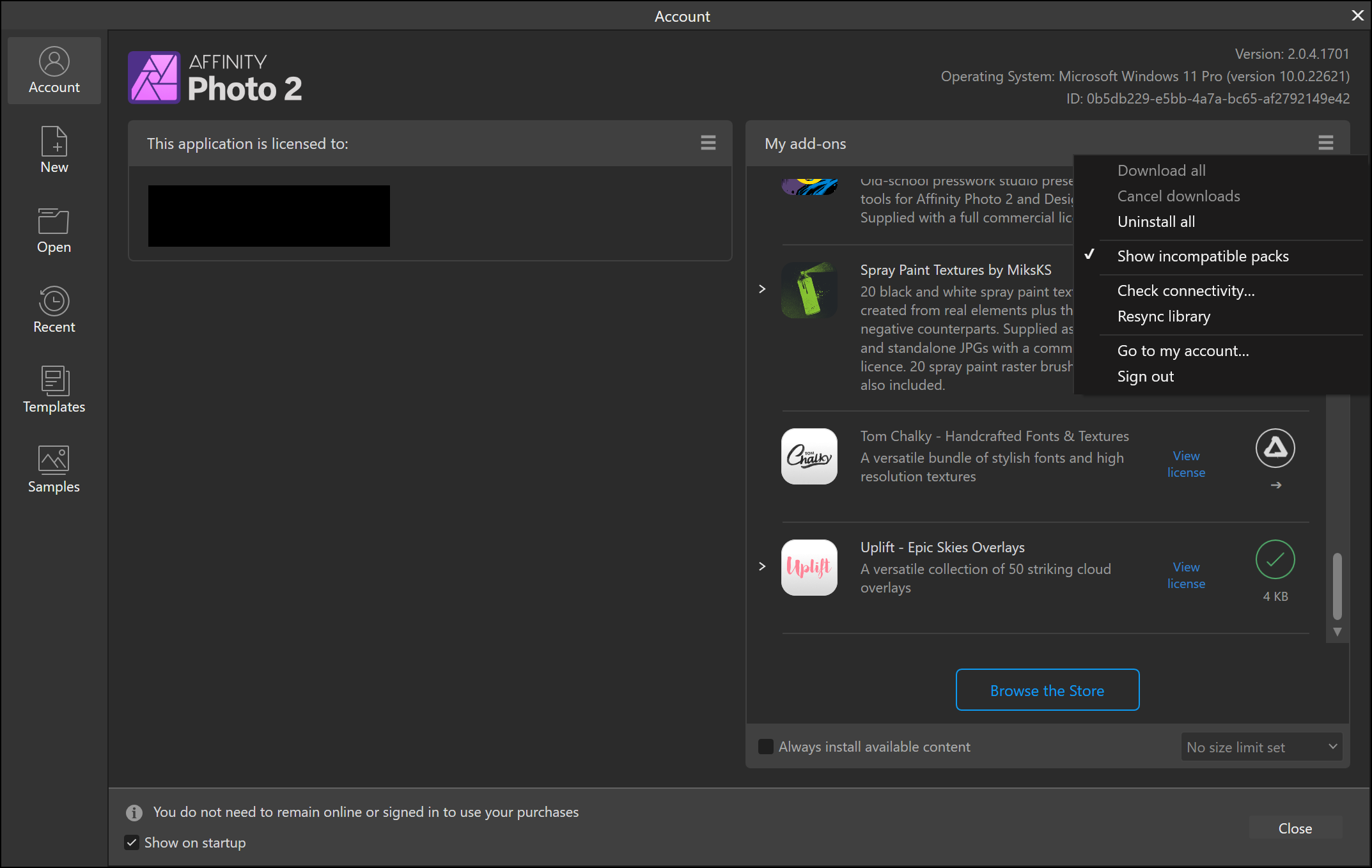
1. Add-ons that require downloading through browser are not shown unless "Show incompatible packs" are selected. This is a regression since v1, where one didn't have to select this option to see them.
2. Some add-ons are not shown at all, e.g:
- Publication Typefaces Collection
- Wallington Pro – Typeface
It seems it's the case also for v1.I uploaded screenshots from Photo v1 and v2 showing 1st issue. It's impossible to show 2nd one.
Issue applies to all Affinity apps, not only Photo.

- Tom Lachecki and Chris B
-
 2
2
-
Wrong zoom and placement of the document for a split second when switching between documents happens in all Affinity programs.
Observed on Windows 7 and Windows 11 (not tested on others).
Bug is present in current latest v1 (1.10.6.1665) and v2 (2.0.4.1701).
I attached videos from all apps showing this problem.
Carried over to v2 bugs:
-
When you switch between more than one document opened in the same window, there are often issues with displaying them properly. For a split second document is often placed differently than it should, i.e. different than how it was zoomed&panned last time. (It seems to be even more prevalent when rulers are shown, but I'm not sure I can write it definitely.) It happens roughly 5 of 10 or more times when switching tabs.
It is extremely irritating. I would love to get it fixed.
-
I tend to have many documents opened, reorder them depending on what I focus on, and switch between them, e.g. 3 out of N.
Next Window and Previous Window actions (Ctrl+Tab, Ctrl+Shift+Tab by default, can be set in Preferences > Keyboard Shortcuts > Miscellaneous) do not follow tab order I have. It looks like they follow order in which files were opened.
It would be great to have Next Tab and Previous Tab action for navigating tabs in display order. I would assign them to Ctrl+PageDown, Ctrl+PageUp by default.
-
If you open non-Affinity file, e.g. JPEG, the default layer name is "Background", which is inconvenient if you want to keep track of what you work with. It would be great if filename would be used as the layer name, by default or as an option. It would be also more consistent with existing behavior of drag and drop on the document, as then new layer name is the filename.
-
It would be great if Affinity products started supporting perceptual color spaces for image processing, like Björn Ottosson's Oklab.
Let me quote two sections from Björn's post:
QuoteMotivation and derivation of Oklab
What properties does a perceptual color space need to satisfy to be useful for image processing? The answer to this is always going to be a bit subjective, but based on my experience, these are a good set of requirements:
- Should be an opponent color space, similar to for example CIELAB.
- Should predict lightness, chroma and hue well. LLL, CCC and hhh should be perceived as orthogonal, so one can be altered without affecting the other two. This is useful for things like turning an image black and white and increasing colorfulness without introducing hue shifts etc.
- Blending two colors should result in even transitions. The transition colors should appear to be in between the blended colors (e.g. passing through a warmer color than either original color is not good).
- Should assume a D65 whitepoint. This is what common color spaces like sRGB, rec2020 and Display P3 uses.
- Should behave well numerically. The model should be easy to compute, numerically stable and differentiable.
- Should assume normal well lit viewing conditions. The complexity of supporting different viewing conditions is not practical in most applications. Information about absolute luminance and background luminance adaptation does not normally exist and the viewing conditions can vary.
- If the scale/exposure of colors are changed, the perceptual coordinates should just be scaled by a factor. To handle a large dynamic range without requiring knowledge of viewing conditions all colors should be modelled as if viewed under normal viewing conditions and as if the eye is adapted to roughly the luminance of the color. This avoids a dependence on scaling.
What about existing models?
Let’s look at existing models and how they stack up against these requirements. Further down there are graphs that illustrate some of these issues.
- CIELAB and CIELUV – Largest issue is their inability to predict hue. In particular blue hues are predicted badly. Other smaller issues exist as well
- CIECAM02-UCS and the newer CAM16-UCS – Does a good job at being perceptually uniform overall, but doesn’t meet other requirements: Bad numerical behavior, it is not scale invariant and blending does not behave well because of its compression of chroma. Hue uniformity is decent, but other models predict it more accurately.
- OSA-UCS – Overall does a good job. The transformation to OSA-UCS lacks an analytical inverse unfortunately which makes it impractical.
- IPT – Does a great job modelling hue uniformity. Doesn’t predict lightness and chroma well unfortunately, but meets all other requirements. Is simple computationally and does not depend on the scale/exposure.
- JzAzBz – Overall does a fairly good job. Designed to have uniform scaling of lightness for HDR data. While useful in some cases this introduces a dependence on the scale/exposure that makes it hard to use in general cases.
- HSV representation of sRGB – Only on this list because it is widely used. Does not meet any of the requirements except having a D65 whitepoint.
So, all in all, all these existing models have drawbacks.
Out of all of these, two models stand out: CAM16-UCS, for being the model with best properties of perceptual uniformity overall, and IPT for having a simple computational structure that meets all the requirements besides predicting lightness and chroma well.
For this reason it is reasonable to try to make a new color space, with the same computational structure as IPT, but that performs closer to CAM16-UCS in terms of predicting lightness and chroma. This exploration resulted in Oklab.
References:
https://bottosson.github.io/posts/oklab/
https://news.ycombinator.com/item?id=25525726https://raphlinus.github.io/color/2021/01/18/oklab-critique.html
https://news.ycombinator.com/item?id=25830327 -
On 6/21/2019 at 3:09 PM, carl123 said:
What Alfred wrote to create the .reg file should have worked but does not.
I was getting really weird and confusing results
So I had to create it another way
@carl123 There is a difference between "REGEDIT4" and "Windows Registry Editor Version 5.00" .reg files. The first use single-byte Windows character encoding (typically Windows-1252), the latter use UTF-16 (characters represented using code points taking 16 bits or more). In notepad the first one is called ANSI (which is a terrible name, as it has nothing to do with ANSI), the second one - Unicode (which is not as precise as it could be, but well, Microsoft...). So I suspect that during saving you did not set Unicode, that's why it wasn't working properly for you, so you did the change yourself in regedit, exported and shared it afterwards in the thread.
-
On 6/21/2019 at 11:37 AM, Mark Ingram said:
@przemoc, thanks once again for your insight. I agree modifying the Registry is not great, but as we use .NET, we follow the recommended advise which is to let the OS decide the relevant TLS version:
https://docs.microsoft.com/en-us/dotnet/framework/network-programming/tls
Unfortunately my recommended suggestion here is to upgrade from Windows 7. After all, after January 2020, it will be out of support from Microsoft.
On the mentioned "Transport Layer Security (TLS) best practices with the .NET Framework" we can also read:
QuoteIf you want your app to be able to negotiate a TLS 1.2 connection, explicitly setting to a lower TLS version prevents a TLS 1.2 connection.
If you can't avoid hardcoding a protocol version, we strongly recommend that you specify TLS 1.2.
So I think AP should simply set TLS 1.2 if it detects it runs on Windows 7. I believe it's a pragmatic solution.
- Mark Ingram and Tom Lachecki
-
2
-
Thanks, Mark.
I also confirm that editing registry as suggested in link provided by carl123 workarounds the issue. Thanks!
There is a useful tidbit there that I wasn't aware, which is worth quoting explicitly here.
QuoteWindows 7 supports TLS 1.1 and TLS 1.2. However, these protocol versions are not enabled on Windows 7 by default. On Windows 8 and higher, these protocols are enabled by default.
Basically adding following stuff in registry is sufficient to make Unsplash work in AP:
[HKEY_LOCAL_MACHINE\SYSTEM\CurrentControlSet\Control\SecurityProviders\SCHANNEL\Protocols\TLS 1.2\Client]
"DisabledByDefault"=dword:00000000
I call it a workaround, because I think it should be fixed in AP without need for changing user's registry. Even if TLS 1.2 is disabled by default in Secure Channel (schannel) as configured in Windows 7 out-of-the-box, it remains supported, so it should be possible to enable it in programmatic way from any application that needs it.
-
I gave a quick look with Wireshark into this issue and it seems it may be old TLS version used to setup secure connection.
AP sends:
TLSv1 Record Layer: Handshake Protocol: Client Hello
Content Type: Handshake (22)
Version: TLS 1.0 (0x0301)
Length: 119
Handshake Protocol: Client HelloAP receives:
TLSv1 Record Layer: Alert (Level: Fatal, Description: Protocol Version)
Content Type: Alert (21)
Version: TLS 1.0 (0x0301)
Length: 2
Alert Message
Level: Fatal (2)
Description: Protocol Version (70)I suspect there is some difference in how you setup secure connections in Win 7 and Win 10.
There are no reports of Win 10 users having this issue, right?In practice you shouldn't use any TLS < 1.2.
-
I'm also always getting "Connection failed" for Unsplash in Stock tab in latest Photo 1.7.1.404, just like I was getting it in previous Photo 1.7.0.367.
(BTW this stock thing is a really nice addition among other features added in 1.7!)
EDIT: Forgot to mention that in the web browser searching using https://unsplash.com/ works fine.
-
I wasn't checking betas for some time, but I'm fixing my behaviour right now:
P1. The bug mentioned half year ago in topic 100% zoom clips off edge pixel is still here.
WYSIWYG aspect of image editors is quite important, so it would be great if someone finally tackled the problem.
P2. I'm baffled that simply zooming in and/or out the image a few or several times (most conveniently using Ctrl + mouse wheel) leads to freeze of AP, i.e. it's become unresponsive for about 5 seconds. (The used image is a simple one as in my post from above mentioned topic.)
I'm using AP beta version on other machine now (Athlon 64 X2 4600+, 4 GB RAM, GTX 460) than the one I used to work with release version (details in the footer), so it's not your top rig, but it's still ok for a lot of things, definitely including 200x200 images.
Anyway, thanks for working on AP to make it even better. It's all really appreciated. Those pesky bugs are simply extremely annoying.
-
Blending-related wish list:
-
Adding "Use beneath layers as initial Destination" button in Apply Image filter.
Such button would allow for typical use case when you want to perform custom blending.
Nowadays you have to:
- temporarily hide the layer "S" you want to blend,
- Merge Visible,
- unhide the layer "S" and move it below new merged layer "D",
- switch to layer "D",
- Apply Image and drag layer "S" onto its dialog window to use it as Source.
-
Supporting presets for equations in Apply Image.
It's obvious enhancement for better automation.
-
Defining custom blend mode via Adjustment Layer (possibly called Blend Adjustment).
It would work for such layer only when it is a child layer. Presets here are also crucial.
-
Defining custom global (accessible in all documents) or local (accessible in current document) blend modes.
The most robust solution for users performing repeatedly their own custom blending.
In Blend Mode Manager there should be a way to see (in a read-only manner) already existing blend modes with equations (for blend modes expressable in plain equations).
S (Source) = current layer [aka Active or A]
D (Destination) = beneath layers [aka Background or B]
In case of Blend Adjustment source would be the parent layer.
Example of custom blend mode:
Remove
DR=(DR-SR*SA)/(1-SA)
DG=(DG-SG*SA)/(1-SA)
DB=(DB-SB*SA)/(1-SA)
DA=DA
(It doesn't make sense for truly opaque layer, of course.) -
Adding "Use beneath layers as initial Destination" button in Apply Image filter.
-
Indeed, unchecking it helped! Thanks a lot, rubs.This is a known "feature" of Adobe Reader. Unchecking the "enhance thin lines" option in Preferences > Page Display generally solves this problem.
-
These cheat sheets are really nice!
I've downloaded them (recent version, using the link given in the blog: https://affin.co/affinityshortcuts), but there is one issue.
Any PDF in the archive has bold l and I (lowercase L and uppercase I) letters, that clearly stand out. Is it a known issue?
I'm using Adobe Reader X (10.1.16) in Windows 7 Pro 64-bit.
EDIT:
It seems that it's not present in all PDF readers. I tested SumatraPDF and there is no such problem there.
Well, Adobe is the company behind PDF, so Adobe Reader rendering them wrongly is kind of suspicious.
-
Hi!
My first post here, so sorry for being possibly more verbose than I should be in this forum. I am quite excited about finally getting more than decent photo editing software for affordable price and running in Windows (Linux would be fine too!). I am mostly Linux guy, but I still keep Windows for laptops (better power management) and some multimedia matters like running Reaper DAW (it's supposed to run mostly fine in Linux via wine, but I prefer native and therefore more stable application's environment).
I love the idea of Open Source, but GIMP is simply not there. In the past, ten-odd years ago as a teenager, I was "cursed" by playing with Paint Shop Pro shareware and later trial versions of many Adobe products, mostly Photoshop of course. I heard a lot that Photoshop is not a beginner-friendly application, but I always felt quite comfortable playing with it. It had its awkward limitations here and there (usually removed with new versions), but it almost always looked and felt quite thought-out. I cannot say the same about GIMP. And I cannot imagine having different thoughts even if GIMP was my first graphics program I ever used.
Whenever I'm doing something in GIMP, it feels extremely clunky. Engine in the backend may be even decent, but UI is awful and usually getting in the way of getting things done (there are some exceptions like selections that became more handy than they were in Photoshop, at least in the past, not sure how they are now in PS).
In the past i hoped that there will be some affordable graphics program with decent UI - it was called Pixel Image Editor. Pixel was developed by one man (Pavel Kanzelsberger) and there were some promising demo versions available. In December, 2007 I bought it in Christmas sale for $29, even though there wasn't any final version available - it gave me access to unlocked version. Application was buggy and not ready for serious use, but I treated my paypal donation as kind of preorder, encouragement to the developer. Year later it was told that there will be final version, but it never got out. I believe that pixel-1.0.740 was the last available version.
In 2007 Pixelmator for Mac came out. I read it was PS-like and good. I hoped there will be Win version, because I don't have any Mac (or even any Apple device at all) nor I was planning to get such. I still don't have any Mac and there is no Pixelmator for Windows.
Well, there is Corel Photo-Paint. I had a few occasion to play with it, but every time it felt barely better than GIMP, tiring, unpolished and upside down.
But... Some time ago I read about Affinity products, sadly again targeting only Mac, but apparently very good. I hoped (again) for Windows version of it. Later I heard it was in the works and very recently I came upon Affinity Designer, which beta is already publicly available for Windows and Affinity Photo was going to be next soon. I registered on November 6 and four days later I got notified: "Affinity Photo for Windows is here!". What a great timing! :)
So today I finally played with AP a bit and I very like what I got. I would like to preorder it already! AP didn't crash even once during a few hours I had it opened and used in various ways (I managed to crash AD somehow quite fast, even though it is much more advanced in terms of releasing stage, being RC9). There are many rough edges in terms of user experience (I hope to write about them in separate post(s) in AP for Windows forum later, hopefully tomorrow), but overall application seems mature, polished, snappy, and well-thought-out.
I don't have any serious work to share with community here, I guess I just wanted to express how I am happy with AP available on Windows.
Anyway, here are some of my stages of using basic tools and functions available in AP on image I found on internet.
They were exported as High Quality (85%) JPEGs.
Album: https://imgur.com/a/LPiZv
Direct links for better viewing:
<1> Original
http://i.imgur.com/J2rbjoU.jpg
<2> Corrections
http://i.imgur.com/5kbCvx3.jpg
<3> Colors = {Corrections} Auto Contrast + {Corrections} Auto Colours via Colour
http://i.imgur.com/Fbn2RBQ.jpg
<4> {Corrections} + {Colours} [Tone Mapping: Natural] via Soft Light
http://i.imgur.com/pIMuYbJ.jpg
<5> Previous + {Colours} [Tone Mapping: Summer Glow] 50%
http://i.imgur.com/kyOvyCa.jpg
<6> Previous Auto White Balance
http://i.imgur.com/c4xlXGA.jpg
<6> Previous [iCC Profile: sRGB IEC61966-2.1]http://i.imgur.com/z5H9UNx.jpg
The aim was to get much more lively, almost picture-ish, look. With the help of Tone Mapping persona and good predefined presets I got there quite easily, I think.
Warning! Apparently Google Chrome (unlike Internet Explorer [at least v11 I am using]) doesn't handle ICC properly (Adobe RGB (1998) is used here), so you may want to download images and view them locally in some better viewer (like XnViewMP with ICC turned on, or HoneyView), otherwise only last image may look good for you.
(I have to add that I am not a photographer, illustrator or graphic designer, I simply like to play with images sometimes.)

")

OKlab - OKlch color space
in Feedback for the Affinity V2 Suite of Products
Posted
For reference mentioning archived v1 thread.