RaymondDO
-
Posts
11 -
Joined
-
Last visited
Recent Profile Visitors
1,217 profile views

-
 RaymondDO reacted to a post in a topic:
Retro Vespa Vintage travel art
RaymondDO reacted to a post in a topic:
Retro Vespa Vintage travel art
-
retrograde reacted to a post in a topic:
Retro Vespa Vintage travel art
-

affinity designer Retro Vespa Vintage travel art
RaymondDO replied to retrograde's topic in Share your work
Awesome work! Really, really like the style, composition and palette. Certainly rating this as some of the finest work I've seen here.... -
Zoltan Korcsok reacted to a post in a topic:
Old Wheels - digital painting
-
RaymondDO reacted to a post in a topic:
Aztec Bar & Restaurant
-
RaymondDO reacted to a post in a topic:
Book Cover Design (Entwurf)
-
bodobe reacted to a post in a topic:
Old Wheels - digital painting
-
bodobe reacted to a post in a topic:
Aztec Bar & Restaurant
-
dmstraker reacted to a post in a topic:
Blend modes notes (52 A4 pages)
-
Not something I'd show my 8-year young daughter -- which is a compliment to you! I like how you balanced the implied gruesomeness of the scene with the design's overall softness, sensing this makes the visual all the more confronting. Great angle; the head-first approach transforms us in a third-party bystander, arriving seemingly too late to witness the butchery, and to prevent it from happening. With that, your design actually introduces a sense of time; a sense of inevitability. Will dismount my philosophical high-horse now; all meant as compliments!
-
affinity photo Old Wheels - digital painting
RaymondDO replied to Zoltan Korcsok's topic in Share your work
Yep, adding my like deservingly to the already long list. Nice feel; great composition, lovely palette. Bikes are certainly moving. Real nice work!- 19 replies
-
- 2
-
-
- digital painting
- illustration
- (and 1 more)
-
RaymondDO reacted to a post in a topic:
Old Wheels - digital painting
-
Well done Eduardo! Liking it. Radiates a Happy Disposition, with those leaping steps. Liked!
-
RaymondDO reacted to a post in a topic:
Aztec Bar & Restaurant
-
Yeah, you're right pxls2prnt. Was dicking around with kerning for a while already; left off here at 23:10 when I couldn't see anymore. I'll take your advise; will have another play with that. Cheers for that feedback!
-
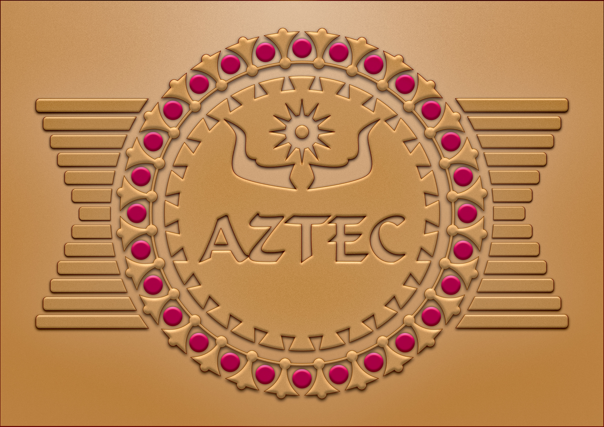
Hi GarryP - thanks heaps for your response. Always good to receive someone else's perspective, especially when coming from our Affinity community! Use: It's a concept for a wall decoration; printed on an approximately 190 mm wide medium, with one concept placed in the restaurant itself [where it will say "Restaurant" under Aztec]. A second one may be placed in the bar area where, of course, it will say "Bar" instead. Maximal viewing distance will probably not exceed 20 meters, or there about. Perhaps best to consider it a poster concept. The design replaces the original idea for a fixed, Fresco-like adornment, which proved too costly and may be too sensitive to regular wall washing/repainting. As it will be printed professionally, the concept can include shadows and fine details.
-
Freid reacted to a post in a topic:
Aztec Bar & Restaurant
-
Blend modes notes (52 A4 pages)
RaymondDO replied to dmstraker's topic in Tutorials (Staff and Customer Created Tutorials)
Brilliant dmstraker! One [or more] step ahead of me; was planning to do something similar to get my head around blend modes as well. Much respect for sharing this with us openly; very grateful! -
Hi all - One of my first draft versions for a wall decoration concept for Aztec, a potential start-up bar restaurant. Although the client likes it, I am sensing a few opportunities for improvement. The space under the name Aztec needs to be filled by another text block - either 'Bar' or 'Restaurant' - depending on where the image will be placed, or how it will be used. I am also contemplating whether the design needs more color, although the client feels that the overall sandy-color reminds him of his homeland Mexico. We are still playing with the ruby-red 'gemstones' which could potentially be recolored in blue to become more complimentary to the design's yellow/orange overtones. Happy with all else so far; looking forward to receiving your feedback, critiques and ideas. Cheers!

-
Nice work Dominik - Herzlich Dank! [My German is most definitely rusty - to say the least. Originally from Holland but that was many years ago. Your response was perfect...] I'll give that a go. The artwork I am making is for a client and fairly boring but this text alignment thing is a reoccurring challenge in this piece. Thanks for adding the images; made your response much clearer. Appreciate the effort; going to give all this a go mate. Cheers.
-
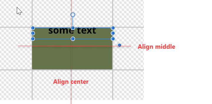
Hi all - This may appear as a complete 'nob head' question but I am hiding behind the excuse of being new to Affinity... Question: How to center text both center and middle in a shape? I have a number of squares, each generated with the corresponding shape tool, and want to put a block of text in each, each possibly of a different lenght. Irrespective their character number, each text block should become positioned exactly in their square's center. I've run past the text tutorials - each of which are excellent - but couldn't find the answer I am looking for. Could anyone help me out here?
-
Just feeding back that I haven't had one single issue with the first Beta install. None of the ones mentioned previously. Must have been either a Divine Version or mean that I haven't pushed the install enough. Happy with the upgrade through! Keep going & don't stop...