loukash
-
Posts
6,949 -
Joined
Everything posted by loukash
-
There are still other ways to make stuff look right until a bugfix comes: paragraph child styles for full paragraphs Character panel for lines – and character styles Text > Insert > Spaces And Tabs for lines
-

ICC profiles embedded in native Affinity documents
loukash replied to loukash's topic in V1 Bugs found on macOS
For illustration, here two blank A4 RGB (!) documents, one created while the ECI CMYK profile was set in preferences, the other one while SWOP CMYK profile was set in preferences: RGBdoc_ECI_profile_in_preferences.afpub RGBdoc_SWOP_profile_in_preferences.afpub -
Crashes when rearranging System Palette
loukash replied to Joakim Svensson's topic in V1 Bugs found on macOS
(Unrelated to your issue, but yeah, I've noticed that it's nowhere to be found for download on Bjango's website. Luckily I always keep at least one latest version of any software I've downloaded backed up. Other than that, I'm an iStat Menus user since many years. Can't work on a Mac without them. iStat Menus and Little Snitch being always the first two things to install on an untouched MacOS.) -
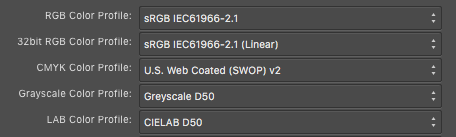
Ever since the beginning of using Affinity in 2014, I wondered why my document file sizes are so huge – usually over 1 MB – even though the document is completely blank. It affects all three apps, not just Publisher. Finally I have figured it out: As long as you use the default ICC profiles in Preferences > Color, the document file size will remain "slim", usually under 10 KB for completely blank documents from default presets. These are: But I have no use for "U.S. Web Coated (SWOP) v2" in Europe, hence I'd change the default CMYK to ISO Coated v2 300% (ECI) (from eci.org) globally in Preferences > Color because print houses usually want me to avoid more than 300% color anyway, especially with photos. Then, however, when I create an unrelated RGB document with a standard sRGB profile, the blank saved *.afpub/afdesign/afphoto file size immediately grows to about 1.4 MB, even though an sRGB profile is usually just a few KB! That's the same file size if I had the default SWOP profile in preferences but assigned the ECI profile to a CMYK document manually. (The actual ECI profile file size is 1.8 MB uncompressed and – wait for it – 1.4 MB zipped.) Summed up, Affinity apparently embeds the ISO Coated v2 300% (ECI) – or any other non-standard CMYK profile that is set as the new default in Preferences – to any native Affinity document, regardless of color space, even though it's of no use e.g. in RGB space. An already embeded redundant CMYK profile remains in an RGB document even if I change the app preferences back to CMYK: SWOP and resave the RGB document. It just lives there as junk data. So, the workarounds for new documents seems to be: Keeping the default CMYK preference at SWOP, and either assign my favorite CMYK profiles to CMYK documents manually, or setting up custom document presets/templates with the respective CMYK profile assigned. Like that, new RGB documents will embed only the RGB profile they need. Tested on APu 1.8.4, El Capitan, MacBook Pro 9,1

-
Crashes when rearranging System Palette
loukash replied to Joakim Svensson's topic in V1 Bugs found on macOS
Still can't replicate: crashpalette19.afpub Crashes–really?.clr Crashes?.clr Moved swatches around, added swatches, renamed swatches, renamed palette, both in APu and in Apple Picker. Renaming palette in APu while having it open in Color Picker and vice versa resulted in palette duplication upon relaunching APu, but still no crash. That's on High Sierra. It must be something else on your MacOS installation. There's so many variables… Possibly a specific Big Sur issue? -
For illustration:
-
Definitely not! Meanwhile, posted a bug report:
-
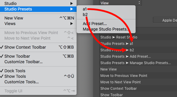
Custom Studio Presets sometimes appear in the Preferences > Keyboard Shortcuts > View list. It is possible to add shortcuts, but they will not stick. Then the presets may eventually disappear from the View menu shortcuts list altogether, for instance if resetting shortcuts. While it would be a nice feature, it behaves more like a bug. Very inconsistent. Same in Designer and Publisher. More on it here: APh/APu/ADe 1.9, High Sierra, MacBook Pro 9,1
-
Hmm… If you're using the default keyboard shortcuts, the presets won't appear in the list. If you've loaded your custom shortcuts from an *.affshortcuts backup, under some circumstances the presets will appear in the list. But sometimes not. This is weird and totally inconsistent.
-
Voilà: BUT: (Yes, it's a very big but…) It appears to be a bug rather than a feature. As noted, they will appear there immediately after creating them. However, while you can sort of add a shortcut there, it will not stick or do anything. Sometimes you'll even get a spinning beach ball of death if you try to add a shortcut. Tested on APh 1.9, High Sierra So the global MacOS Shortcuts way is currently the better approach for sure.
-
Crashes when rearranging System Palette
loukash replied to Joakim Svensson's topic in V1 Bugs found on macOS
That's where the color palettes actually should be, regardless which app creates them. What if you create a custom palette via Apple's Color Picker first? -
Hm, I thought I’ve seen that while testing v1.9 on another partition the other day. I’ll have to check again then…
-
Yes you can: As soon as you've named your presets, they should also become available in Affinity's own Preferences > Keyboard Shortcuts > View.
-
Interesting to learn how the correct conversion actually works and what the "neutral" numbers are. But… Upon playing a bit more with the various adjustment tools, I found that you can achieve the same basic correct conversion e.g. by adding Levels or Channel Mixer and only change its mode from RGB to Gray. Or adding Effects > Color Overlay > Blend mode: Color > Color: Black. The result will be exactly the same as Black & White > 30/89/59/70/11/41, so it's not as if Serif have forgotten to compensate for this phenomenon. But the advantage of Black & White > 30/89/59/70/11/41 is that you can then fine adjust the value of each channel. So that's definitely a useful custom preset to be saved for later.
-
No, it's not just you. I was just about to post a "rant" today, too. My theory is that they have been designed to "look good" on retina displays. But I can't tell because I don't have any retina displays.
-
Crashes when rearranging System Palette
loukash replied to Joakim Svensson's topic in V1 Bugs found on macOS
Perhaps an incompatible 3rd party color picker plugin? I've got a few nice ones that still work, like the ~/Library/ColorPickers/SkalaColor.colorPicker (bjango.com/help/skalacolor/gettingstarted). But I vaguely recall that some old ones may have caused troubles. -
IMPORT/EXPORT Studio Presets
loukash replied to bogarguz's topic in Feedback for the V1 Affinity Suite of Products
Serif Store version: ~/Library/Application Support/Affinity Publisher/presets/com.seriflabs.Studio.Preset.Data2Layout-tab.YOUR_PRESET_NAME.preset App Store version: ~/Library/Containers/com.seriflabs.affinitypublisher/Data/Library/Application Support/presets/com.seriflabs.Studio.Preset.Data2Layout-tab.YOUR_PRESET_NAME.preset … and correspondingly similar paths to Designer and Photo app support folders. Copy these presets to the other Mac and place them into the corresponding folder. I haven't tested it yet – my v1.9 is installed on a different partition so I'd have to reboot the Mac right now – but it should work. -
DAM Feature Wishlist
loukash replied to pheller's topic in Feedback for the V1 Affinity Suite of Products
Everything that iView Media Pro could do. With the addition to catalog any file type. -
If you don't place any solid color rectangle at the bottom, yes. ? That's the expected behavior. The paper you would print a PDF onto is not transparent either. The white PDF background is the virtual paper. If you then open the PDF in ADe or APh and set the document background to transparent (ADe: File > Document Setup > Color, APh: Document > Transparent Background), you will see the Affinity checkerboard, meaning the document is actually transparent for applications like ADe/APh that can make use of it.
-
Siehe affinity.help/photo/de.lproj/pages/Panels/layersPanel.html > "Anpassungen: Einfügen einer zerstörungsfreien Anpassungsebene für die Tonwert- und Farbkorrektur." Dort kannst du deine Anpassungen auswählen. Die "Anpassung"-Palette ist lediglich eine lausig konzipierte Schnittstelle um Voreinstellungen der Korrektureffekte abzurufen.
-
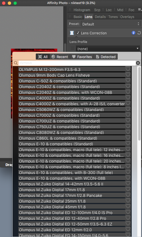
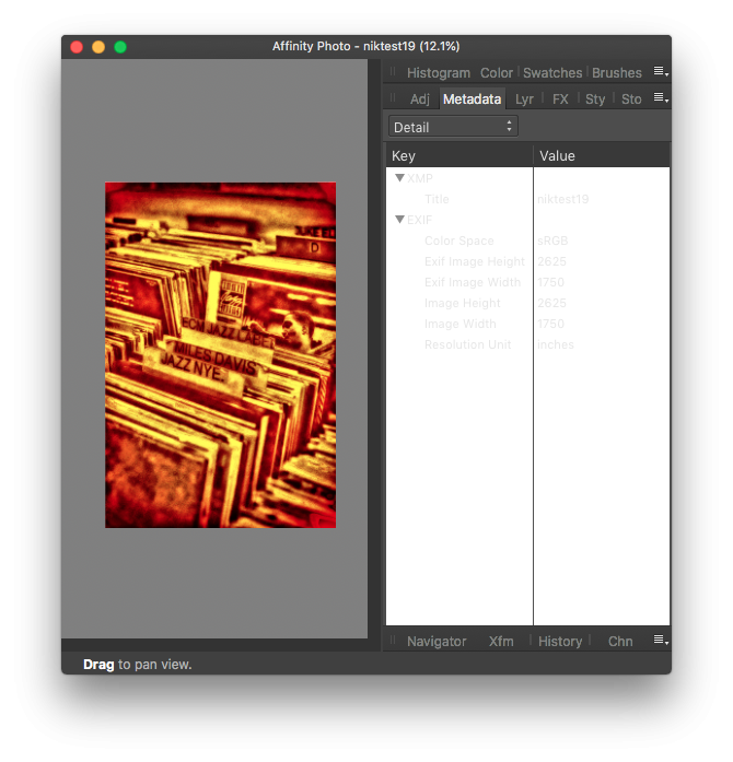
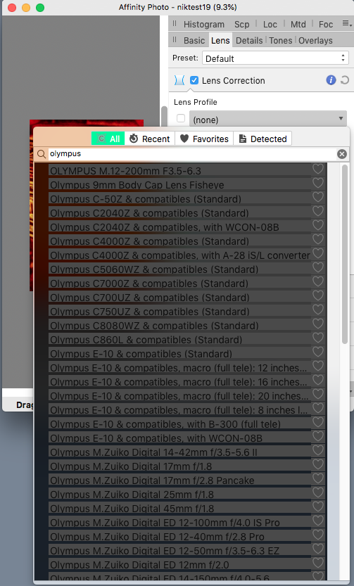
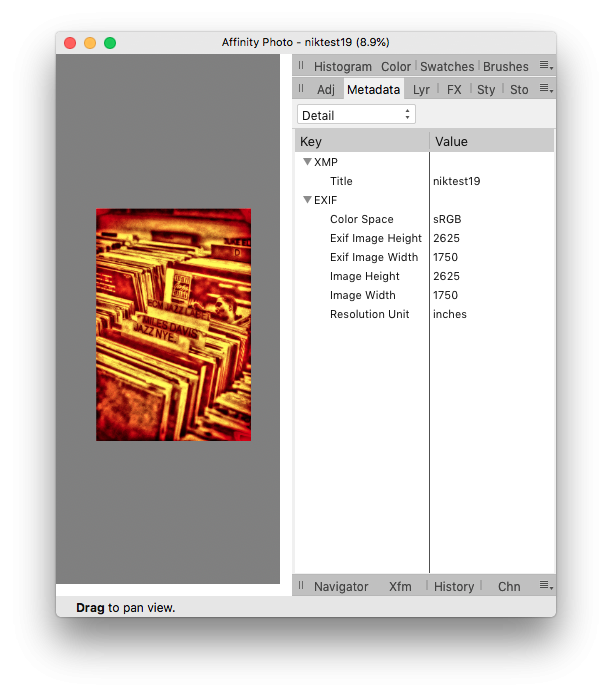
APhoto 1.8.4 ad 1.9.0, tested on El Capitan & High Sierra MacBook Pro 9,1 Unreadable text in Metadata panel, Dark UI: OK in Light UI: Unreadable search field in Dark UI Develop Persona > Lens Correction panel: Lens list glitches in both UI modes:
-
Just to be sure, I have now freshly reinstalled the original nikcollection-full-1.2.11.dmg from my archives, reset APh and checked again: no more "demo" splash screen no crashes whatsoever
-
We've spent too much time with Adobe workflows and can't get rid of that mindset. You know it's hard to learn old dogs new tricks; and don't let me even start about us cats! Oh, so was the switch from my beloved Freehand 9 to Ill-frustrator 10 as part of the OS X compatible "Adobe Design Collection" that I acquired in 2001. I've never fully recovered!
-
1 bit TIFF/Bitmap support please
loukash replied to Chris L's topic in Feedback for Affinity Photo V1 on Desktop
Definitely. As long as Serif doesn't add any vector tracing tools. Doesn't need to be Ill-frustrator though. I've seen threads here with links to many affordable alternatives. Hm. Lemme think. Could it be that InDesign is obviously the best tool for what you're doing? And since you do it professionally, its subscription fee would be actually part of what you're charging for your work? Don't get me wrong. I'd like to get rid of Adobe apps as much as the next guy. CS5.5 doesn't work on Catalina and beyond. I never jumped onto their CC subscription ripoff because for the amount of work and turnover that I have with graphic design, the subscription fee simply doesn't add up. So, e.g. in Designer I'd love being able to accomplish anything I can do in Illustrator (I'm looking at you, vector roughen effect which I can apply on live typography!). Etc. etc. But Affinity is just not there yet. So we're keeping on asking for features. And bugfixes. Sometimes we get some. (Features AND bugs, haha.) Sometimes not, and so we have to resort to workarounds. Or we have to resort to the software that will do the job now without crashing or tedious workarounds, etc. It's really that simple.™ Er… not the point here whatsoever. That's something between you and the artist. Definitely! As I said: That's inevitable. Much like Illustrator or Photoshop CS5 were "just not feasible in many cases", so that I've completed a task in Designer or Photo instead. (Sadly, can't say that about InDesign vs. Publisher yet.) That's why we – being professionals – are using specialized tools. Right? Cheers! -
Yeah, it appears they have changed the package structure, and the splash screen – along with the tool icons etc. – is now buried somewhere in a monolithic dynamic library file inside Frameworks…