User_783649
-
Posts
228 -
Joined
Everything posted by User_783649
-
@coque.regis Another and well known reason for Affinity apps which causes refresh rate drops is your mouse polling rate. If you have it set to 500Hz or 1000Hz, try lowering it to 250Hz or 125Hz. It will greatly improve your canvas redrawing performance. At least it did for my Logitech G102. It won't let you completely get rid of these tearing artifacts as they are integral part of how Affinity apps render the canvas. But it can greatly improve an overall visual feedback and performance.
-
Unfortunately, all Affinity apps have awful tearing issues. This is one of my main complaints about Affinity suite. In these apps canvas is being redrawn in smaller square tiles without any synchronization. We've been told multiple times here on forums that it is a performance optimization. Unfortunately, there is currently no way or setting of fixing or improving this. Nothing in Preferences helps. What we see — simply unacceptable. Serif needs to make some global changes in canvas rendering pipeline.
-
What stops you guys from toggling an option in User Interface preferences? It will make all icons turn to monochrome.
-
View Quality preference is not respected when zoomed in
User_783649 replied to Sobakasu's topic in V1 Bugs found on Windows
The thing is: between 100% and 200% AP simply uses cached mipmap of canvas at 100% upscaled with Nearest Neighbor to the current zoom level. Same thing happens for anything between 200% and 300%, 300% and 400% and so on. That fully explains why we only see things correctly at these "strict" zoom points and never — in between. I believe it's solely aimed for performance optimization for weaker machines and allows to cover broader range of various hardware of all sorts and ages, as it requires almost no extra job when comparing to adding any extra filtering steps in the rendering pipeline. It heavily distorts the end result and in no way can be considered as a true or honest representation of pixels. It's a computationally cheap and visually false approximation. I believe that there's a room for improvement in this direction for Affinity Photo. Adding an option in Performance Settings (something like Precise Clipping but for zoom — Use Precise Zooming) would greatly benefit AP and those users who have more powerful systems or simply want better image quality from their favorite photo editing app! -
Page border visible in preview mode
User_783649 replied to Jowday's topic in [ARCHIVE] Publisher beta on Windows threads
Hopefully we'll finally see this fixed at some point. I find this border very distracting and absolutely unnecessary, especially when we can freely adjust background color. I understand that in some cases it may be useful to have another element that helps to visually separate working content from background. But please, let us switch it off as well, at least in Preview mode — just like any other guides/bleeds/margins/rulers and etc. -
@DarkClown I fully agree with you — it would be nice to have a kind of output sharpening parameters section somewhere in export options. Having to go through multiple rounds of exports seems very inefficient. Btw, I found your thread from 2017 with the same question: Unfortunately, it seems like nothing has changed in this regard. Hopefully we'll see some improvements in next versions.
-
View Quality preference is not respected when zoomed in
User_783649 replied to Sobakasu's topic in V1 Bugs found on Windows
@Sobakasu Fully agree with you, thanks for pointing this problem one more time. View Quality setting isn't respected when zooming in. Image quality is bad as it always uses nearest neighbor. I mentioned the same issue here recently (see the thread below), however it seems like the problem exists for almost five years without any fixes or improvements. -
@Pšenda Honestly, I don't have problems with zooming out. Because in this case View Quality setting works as it should. But when we start to zoom in >100%, only Nearest Neighbor is being used even if I have Bilinear selected in View Quality. I can understand that it might be another performance optimization to squeeze all the juices from weak hardware but some of us have pretty powerful systems and it shouldn't be a problem at all to allow us to use at least proper Bilinear filtering on all zoom levels. Personally, I'm ready to trade in some performance in favor of better on-screen image quality.
-
Five years later and this is still an issue, unfortunately. The reason why image quality is bad is that all three apps (AP and non-vector modes in AD and APub) completely disrespect global View Quality setting and simply fallback to Nearest Neighbor once you zoom in more than 100% and it's not exactly 200% or 400% or 800%. I believe it's a bug. Chosen View Quality algorithm should probably be used all the time, be it zooming in or zooming out.
-
Seems like a known issue — see the thread below: And possible solution from that thread:
-
Lag when using Logitech G305 on macOS
User_783649 replied to Customer Feedback's topic in V1 Bugs found on macOS
About a half year ago I faced the same problem and the solution I found was very simple — just decrease your mouse polling rate to 125-250 Hz. It will significantly improve your dragging/moving performance. DPI doesn't really matter here as much as polling rate does. Initially I used 1000 Hz or 500 Hz on my Logitech G102 and performance was awful. Once I set it to 125-250 Hz all problems gone. Also recent performance fixes in 1.10.5 significantly improved canvas performance for me, especially working with large text layers and groups of objects. -
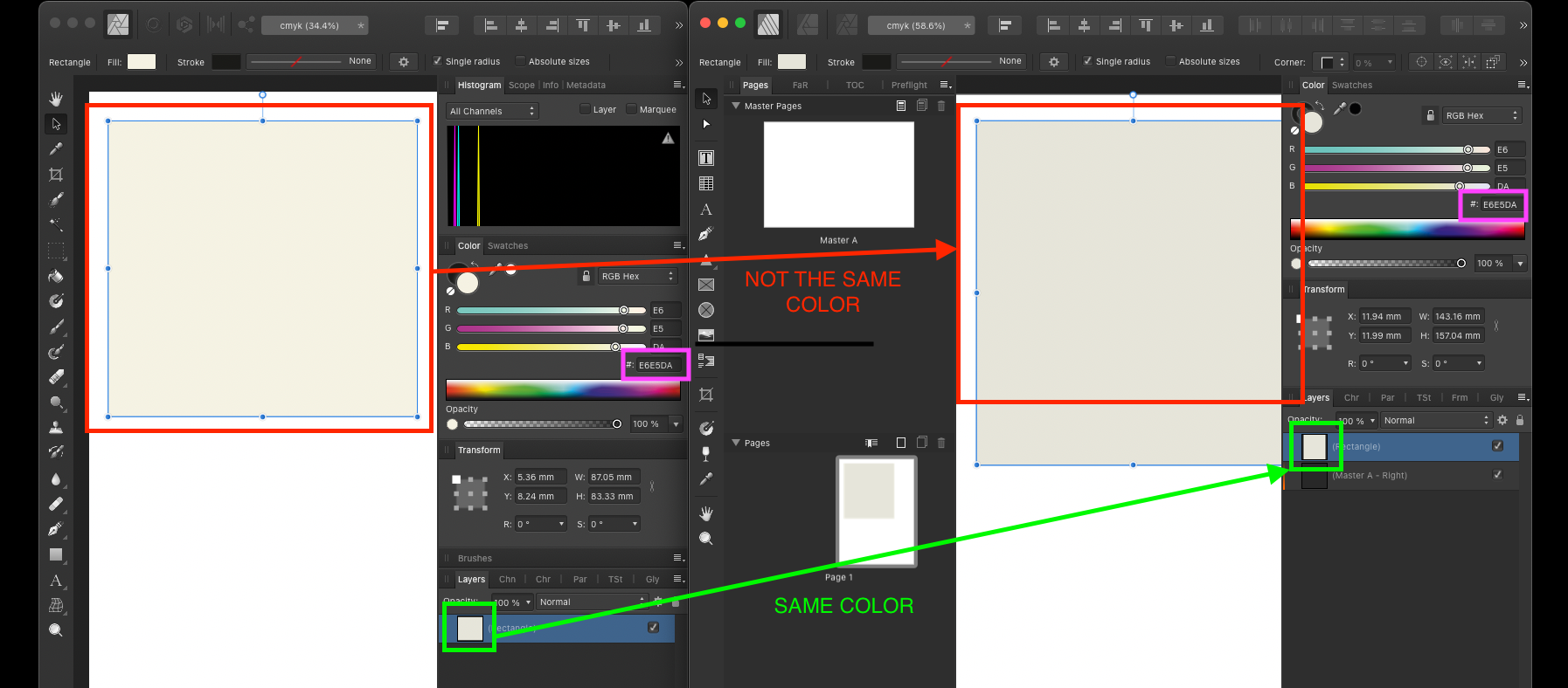
The most interesting part of this is that those little layer previews in Layer panel are of the same color for each app. When layers itself on canvas have different color but indicate they have the same RGB Hex value. @cgidesign I just created a new AP document in CMYK/8 mode and manually entered that #E6E5DA for rectangle color. It showed me the same color on canvas as in your Apub doc (correct one, not that bright and saturated like in your AP doc). Could you please tell us how exactly are you setting the color — by providing CMYK values or by entering RGB Hex values? If I simply copy your layer into a new CMYK/8 document I also get correct color. Screen Recording 2022-05-01 at 21.16.42.mov

-
Bicubic resampling by default
User_783649 replied to User_783649's topic in Feedback for the V1 Affinity Suite of Products
It has been pointed out multiple times here by some of Affinity developers, that Bilinear method was chosen by design as a quality/performance compromise. It provides fairly acceptable image quality at a lower performance cost. As we know, Bicubic uses 16 pixels (4x4) and Bilinear uses just 4 (2x2) so it definitely allows to process and draw things faster. But the quality... While I may accept that this might be totally okay for most people, I personally find it strange to not being able to see what exactly is going on the canvas I work with. I need more precision and having that level of precision even when "it's only for viewing in the program" — crucial for any kind of professional workflow. At least for me. Even for downscaling, which I agree we use most of the time (because who the hell upscales images? it's a crime!), Bilinear is not the best option, be it Affinity or Adobe. Everyone can take a screenshot of this forum post or some other piece of text and place it as an image layer on their canvas. When we downscale this layer we can see how bad everything became. Some letters loose their proportions, some became very blurry and other became too blocky and crisp. While with Bicubic everything looks way better and more uniform, obviously. Tonal gradations are smoother and whole image has fewer interpolation artifacts. Hopefully Affinity introduces Bicubic as an option in View Quality settings. After all, it's not a battle of which algorithm is ultimately better. I should agree that in some cases some algorithms may work better than others. But having more options for canvas view quality would be beneficial.- 9 replies
-
- 2
-

-
- resampling
- canvas
- (and 6 more)
-
Bicubic resampling by default
User_783649 replied to User_783649's topic in Feedback for the V1 Affinity Suite of Products
Can we get an update on this, please? If there's a chance we'll see a proper canvas view quality option (not bilinear, sorry) in all Affinity apps? Be it an overall zoom level different from 100% or any kind of image layer being scaled down — observable image quality is mediocre at its best. Rough and fast approximation by using computationally cheap and visually imprecise algorithm is not a suitable way for professional apps which Affinity certainly claims to be. I'm personally willing to sacrifice some performance for better canvas fidelity. I have a good and powerful system and just want better image quality. I personally already accepted the way you (re)render the canvas with those blocky tiles all around. Sad you can't do better, but I think I'm already used to it. But I can't accept the way you resample everything on the canvas with bilinear. At the very least, make Bicubic a third option in settings. Please.- 9 replies
-
- 1
-
-
- resampling
- canvas
- (and 6 more)
-
Photo Benchmark 11021 Results
User_783649 replied to MikeTO's topic in [ARCHIVE] Photo beta on Windows threads
Yep. It would be really great to see all numbers for that beast. In this AppleInsider article I found the following information: -
It could also be one of those rare cases of 72dpi from/to 96dpi problems I've seen before. Try checking and compare Document properties when receiving edited copy of the document from your colleague with Windows machine.
-
Photo CPU hogging
User_783649 replied to Dieselelkins's topic in Pre-V2 Archive of Desktop Questions (macOS and Windows)
@Dieselelkins In your screenshots I noticed that you're using file from your NAS and another one — from OneDrive folder. I've seen so many problems with apps (not just Affinity) when working with project files over network or from folders that might be in constant sync (Dropbox, OneDrive, etc.). Just as a rule of thumb: never ever work with files from such locations. It is always better to copy file to a more safe place (local one, which is not modified by other apps) and then put it back once you've finished your work. Things can go really weird sometimes if you not following this more safe workflow. -
@ryder That's actually one of the biggest problems of all Affinity apps — enormous and absolutely inexplicable resources usage even for the most basic operations. I'm using macOS and I can tell you: once I start moving an artboard in Designer with some text and image layers on it, CPU load instantly goes up from 0 to 1200% of 1600% available. That's happening on a quite powerful Intel Core i9-9900k with 8 cores and 16 threads. For just moving an artboard with text layer and image layer — that's too much. No other graphic design apps behave this way. Same happening in Publisher and Photo. Insane CPU load on the very basic operations. CPU temperature instantly goes from 35º to 65º. And I have a very good cooling system. And while I understand that having the potential of being able to fully utilize machine's hardware capabilities is good for really heavy project files (it will speed up things, sure), using it all the time even for the most basic operations is very wrong and potentially harmful. That leads me to conclusion that there are very little load-balancing optimizations at all. Never understood why it "eats" so much...
-
No smooth contour.
User_783649 replied to Designer1's topic in Pre-V2 Archive of Desktop Questions (macOS and Windows)
Fully agree. For the price and licensing method Serif is giving us (it’s almost charity) we should have literally zero complains especially about such minor differences. I would also like to add that it’s not only Affinity who seems to be showing things slightly worse. Honestly, macOS itself and any software built on top of it’s graphic framework (think about apps like Preview, Safari, Font Book, Pages, Numbers, Keynote, Sketch etc.) — they all show things same or even worse than Affinity. Or just different. So, no one is perfect! No one. And probably I’d prefer having slightly less polished output (on macOS difference is not that bad actually, OP has more notable problems on his Windows system) but I’d know that it comes more in line with any other software I use on a daily basis to work and deliver my documents to clients. So overall predictability — more important for me. Honestly, I absolutely don’t mind seeing render quality being improved in some future. Everywhere, not just in Affinity. -
No smooth contour.
User_783649 replied to Designer1's topic in Pre-V2 Archive of Desktop Questions (macOS and Windows)
@Designer1 First one has obviously better quality. In the second sample there are various individual "leftovers" semi-opaque pixels that make it appear more harsh and fuzzy. While in the first sample their opacity appears to be more aligned with their geometrical placement and distance from the main curve. Therefore, an overall quality is better. I’d suggest you sending these directly to Serif support. Just to not waste your (probably valuable) own time. It will be better to receive qualified response from them or even get some kind of engineer feedback on this issue. By continue posting here you just trying to convince other regular users. I mean, everyone has different eyes, different screens and different expectations. For some people all these are just... letters, you know. Many people won’t even able to spot the difference between some typefaces, so what to say about subpixels and quality of antialiasing? -
That's actually quite interesting. As someone who've been struggling with the way text performs in Affinity apps for many months (I can really feel your pain) I am finally quite happy with recent improvements in 1.10.5. For me it became way faster and more responsive than before. Of course there are some visible blocks and artefacts showing up during things being moved or updated on the canvas. But that's just how their tile based rendering system works. I think I'm slowly getting used to it. In every other aspect — 1.10.5 is a big performance improvement and finally makes me able to work on large complex projects without these annoying text object lags. I'm also on Catalina 10.15.7. Intel Core i9-9900k, AMD RX 580 8GB.
-
No smooth contour.
User_783649 replied to Designer1's topic in Pre-V2 Archive of Desktop Questions (macOS and Windows)
@JimmyJack AD is #3 and probably #4 (with probably Blend Gamma value put more towards 3.0 which gives it more aggressive and rough antialiasing). However, I'm not sure how exactly you were able to get such bad looking text in this last sample. I was never able to do something close to that. And #1 and #2 seem to be Adobe. -
No smooth contour.
User_783649 replied to Designer1's topic in Pre-V2 Archive of Desktop Questions (macOS and Windows)
@JimmyJack Can you explain — why there are four samples? What apps you compared here? -
No smooth contour.
User_783649 replied to Designer1's topic in Pre-V2 Archive of Desktop Questions (macOS and Windows)
@walt.farrell It may look blurry if you're looking at the image preview in the forum's popup window. Try opening image in new tab so it appears at its real size. -
No smooth contour.
User_783649 replied to Designer1's topic in Pre-V2 Archive of Desktop Questions (macOS and Windows)
@JimmyJack My Friday’s bet will be is that first one is AD.