JimmyJack
-
Posts
1,350 -
Joined
Everything posted by JimmyJack
-
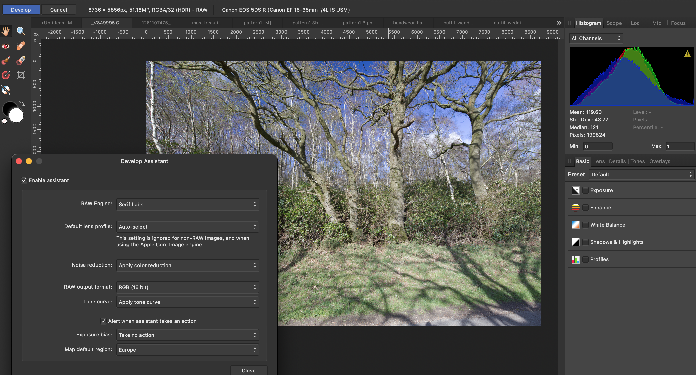
Hmmm. My AP screenshot with Apply Tone Curve (and nothing else) looks very very close to your LR screenshot. Maybe a hair more magenta... but nothing like your experience. And the Histogram looks similar to LR too. Still looking for another Monterey to chime in. Another thought, are you on an M1 chip by any chance? Duh, nvmd, Intel i9. Staring me right in the face 🧐 🥴. AP (obviously 🙃) - apply tone curve

-
Guess we just need someone else on Monterey to give it a try. Cuz' all good here on Big Sur.
-
Interesting. The problem is that the HSL Adjustment itself isn't really making a static selection. If you had someone wearing a blue shirt and targeted the HSL to "see" blues then the "shirt area" alone is affected. But if the layer under the very same HSL was all blue then the whole layer would be "selected". It's quite a bit different than masking the HSL. Do you have links to the vids making this work? (yes, I'm lazy.... not gonna google it myself 😇)
-
@Mr Lucky, resampling, up or down, can be a bit of a fickle creature. Results can bounce around with not much of a change. My advise is to try the list. This time, going even smaller down to 1200 (...even more demanding. That' basically an 80% reduction IN DIMENSION, which means you're left with less than 5% of the original information) the clear, pun intended, winner was Lanczos Non Sep. This is more of the result I originally expected. The bicubic result before was a bit of a surprise. But I guess that's why ya gotta try. My results from the big original: Oh, and.... Affinity. I got that from you.... So the reality is we're dealing with two things here simultaneously. The resampling AND the jpg compression. And the 1.5 px Unsharp was with the default .5 Factor and 0 Threshold. (maybe even that's too much like you said.... up to you)
-
The original looks fine (it just needs to be opened in it's own window. In-line in the thread it gets compressed). It's a little interesting that the photog would give you something in a lossy format (jpg) but whatever, we will work from this starting point. The main point here (imho) is.... why create a problem to then have to unwind that very problem? To be sure this is a significant reduction. Some loss of quality is inevitable... But the resample method is causing most of the problem. Another method will cause less of an issue and therefore less to clean up. That being said it looks pretty clear to me that you've used a bilinear resample. Here is a comparison between your second image above (bilinear I think) and Bicubic (I used jpg 80, because that's what you used). You be the judge. And, yes I tried all the other methods: Lan Non, Lan Sep etc. I even tried the mysterious SIXTH method.... the internal rasterization. BiC was the best in this downsize situation. Surprisingly Nearest Neighbor came in a close second. If you want to do further processing (sharpening or whatever) go right ahead. But by all means let's not create the very hole we need to climb out of. Let's start in the shallowest hole possible 😆. edit: ...... and with just a touch (1.5 px) of Unsharp.
-
Yes, I think this has less to do with compression artifacts (although there is some) and more to do with the resample method. Can we see the original?
-
So, on a PC, in a vector drawing program, there's no way to add a point while drawing? One literally has to switch tools?? That's hilarious!! 🤣😂
-
Ahhh. Ok yeah Ctrl+click on Mac is delete too. On MAC the tool tips say "CMD to use Node tool", but in reality (as you can see in the vid) you don't "really" leave the pen tool, you're just able to access the node tool's capabilities on the fly. It's not literally switching back and forth.
-
Right, so no key does this on PC?? CMD..... never leaving Pen tool. pen tool.mp4
-
Maybe I'm not getting it. You never have to leave the Pen tool to do all of the above. It's just a modifier key. Or is that the problem?
-
Fun little exercise with no real practical use (I think). Interactive Loupe: Couple of notes:• Requires filter(s) in Photo. It's not using actual zoom. It's using either a Spherical or Punch filter, and therefore is limited to their 100% values.• To set a custom center point for the chosen effect click on canvas when it's panel is active.• The three elements need to be selected as separate entities and moved together. Grouping them destroys the different "lock children" attributes needed.• I'm not sure how useful it is. It's not really a tool per se. And Affinity doesn't do animation, so... there are faster ways to get to the same end result (without limitations) for a static output. Although, the slight curve of the filters sells the effect nicely 🤔.• So it's really just kinda more of a fun trick. That's why I'm putting it here in Tutorials, rather than Resources. That being said.... have a play. loupe.mp4live loupe AP.afphoto live loupe AP.afphoto
- 1 reply
-
- 4
-

-
How about right here 😃. Couple of notes: • Requires filter(s) in Photo. It's not using actual zoom. It's using either a Spherical or Punch filter, and therefore is limited to their 100% values. • To set a custom center point for the chosen effect click on canvas when it's panel is active. • The three elements need to be selected as separate entities and moved together. Grouping them destroys the different "lock children" attributes needed. • I'm not sure how useful it is. It's not really a tool per se. And Affinity doesn't do animation, so... there are faster ways to get to the same end result, without limitations, for a static output (see my post above). Although, the slight curve of the filters sells the effect nicely 🤔. • So it's really just kinda more of a fun trick. That being said.... have a play. loupe.mp4 live loupe AP.afphoto
-
1) Position an un-blurred copy of the motor as a child of the circle. (don't think you need a donut here) 2) Enlarge. To enlarge the image from a specific spot (in this case I'm assuming the circle center), enable and move the transform origin to where you want it and hold CMD when resizing. (I also have a pretty cool INTERACTIVE version of this effect if interested.... like moving a loupe over the image in real time. But that's a different post I guess) This should do what you want:
-
You have to put the adjustment in the mask position of the mask. (the mask itself can be in the child or mask position) And.... if you do the mask first then the adjustment, the adjustment does not get "embedded/disappear" into the mask. It's fully clickable and editable in it's position.
-
Don't know what to tell ya. Works for me. 🙂
-
The adjustment goes right on the mask.
-
Yes. Set them to Alpha. 👍
-
An extra little tidbit if you haven't discovered it already: When using a mask the outer FXs will bleed over. (With a halo, that might be appropriate. Or not... I have very little halo experience 😅) When using a clip, they won't. 😇
-
I'm (fairly 😉) certain that palm fronds is not the natural background for that statue. That would suggest to me that you already have her with a transparent background..... or with a very detailed mask already done. A) If it's a mask, copy it and use just the part that interacts with the halo. B) if the statue has a transparent background, CMD click on it's layer thumbnail to get a marching ants selection of the head in order to make your mask. It should be perfect. But, the solutions above should work fine. Just adjust you brush size and hardness to get into the finer details. Alternatively, you could make a vector clip object (image ⬇️). (edit: I see you posted while I was typing. Love it when I'm right 😛)
-
1) Has to be applied to the individual objects (iow not on a group), BUT they can all be done at once. 2) In this case, don't think it matters.
-
You are lucky in this case, all of your pieces have only horizontal and vertical edges. You don't need to pay any attention to being pixel perfect. Adjust the Coverage Map in the Blend Options (accessed through the cog wheel in Layers panel) Move the left node up, or do something like this:
-
nope. Just quoting them. (edit: oh, I see what you're saying. I changed the x to %. 100 =1x) 🤣
-
I didn't forget!! The "answers" to my comparisons. Two circles: Left = AD Right = AI standard png export (better IMO, but very slight) Text: 1 (top) = AD text at 2.2 gamma 2 = AD at 1.4 gamma, it's default for text 3 = AI png supersample export setting (the best IMO) 4 = AI standard png export (the worst IMO) Bottom line: I do think there are marked differences. I think this is just one corner of the aliasing issues within Affinity that show up many places. I think, though, that it comes down to company philosophies. Affinity has picked the aliasing protocols it's picked. The results are by design. I personally disagree with it, but hey.... that's what makes horse racing. Thanks all who chimed in. On to the next. So few tests to do, so much time. Strike that, reverse it 😉.
-
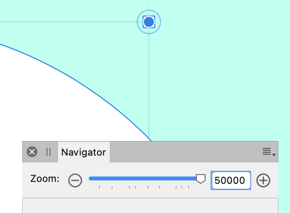
At 400 MILLION % zoom it's no wonder. At that scale I think we've entered the quantum realm! 🥴
-
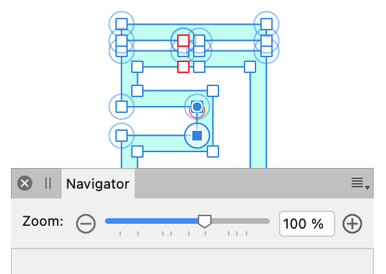
Zoom isn't the issue. Handles stay the same size on screen regardless of zoom. Here are grabs at 100%, 500% & 50,000% (with largest handles setting). The handles are the same. I think you're missing something? And with Default handles