HydroJLW
-
Posts
75 -
Joined
-
Last visited
1 Follower

-
 Andy05 reacted to a post in a topic:
FEATURE REQUEST - Proper vector brush support
Andy05 reacted to a post in a topic:
FEATURE REQUEST - Proper vector brush support
-
wesleyb reacted to a post in a topic:
Request: Auto Select All Child Layers
-
HydroJLW reacted to a post in a topic:
Please add a film strip to Photo's Develop persona
-
EricP reacted to a post in a topic:
Request: Auto Select All Child Layers
-
HydroJLW reacted to a post in a topic:
Highlight clipping indicator photo persona
-
HydroJLW reacted to a post in a topic:
Highlight clipping indicator photo persona
-
Taffe reacted to a post in a topic:
FEATURE REQUEST - Proper vector brush support
-
Taffe reacted to a post in a topic:
FEATURE REQUEST - Proper vector brush support
-
Taffe reacted to a post in a topic:
FEATURE REQUEST - Proper vector brush support
-
HydroJLW reacted to a post in a topic:
Can't create guides by dragging
-
 HydroJLW reacted to a post in a topic:
Is there a way to resize a rectangle without stretching the pattern?
HydroJLW reacted to a post in a topic:
Is there a way to resize a rectangle without stretching the pattern?
-
HydroJLW reacted to a post in a topic:
FEATURE REQUEST - Proper vector brush support
-
HydroJLW reacted to a post in a topic:
FEATURE REQUEST - Proper vector brush support
-
Raff reacted to a post in a topic:
FEATURE REQUEST - Proper vector brush support
-
jhgriggs reacted to a post in a topic:
Request: Auto Select All Child Layers
-
HydroJLW reacted to a post in a topic:
Is there a way to Taper Vector Lines?
-
HydroJLW reacted to a post in a topic:
Vertically center circular text
-
HydroJLW reacted to a post in a topic:
Highlighting Text in Affinity Publisher
-
Johannes reacted to a post in a topic:
FEATURE REQUEST - Proper vector brush support
-
Roland Ricaurte reacted to a post in a topic:
FEATURE REQUEST - Proper vector brush support
-
Yeah, I really hope they are actively developing this feature. Much needed!
- 21 replies
-
- 1
-
-
- feature request
- vector
- (and 1 more)
-
Also, proper vector eraser, please! (rather than masking over the vector layer in the pixel persona)
- 21 replies
-
- 3
-
-
- feature request
- vector
- (and 1 more)
-
Really hope this is actually the case, and not yet another cannibalisation of a great suite of software as we have seen so many times in the past. My personal design journey has been 100% with the Affinity apps, as I didn't want to go down the Adobe subscription route. As I am still in the relatively early days of this, it would be really sad to see the platform I have learned on thus far, go down. That said, I know that large corporations tend to swallow up competitors too, so if this means Affinity continues to exist in the world, then that is a good thing. But please never budge on the no-subscription model...that is why we are here!! Please safeguard the things that has made Affinity great so far. All the best.
-
Thank you, this was very helpful! - I have no idea what got overridden there, but setting to 'no style' and re-formatting the text has fixed this, and the spacing now responds as expected to 'leading'. Jack
-
Hi, I can't seem to figure this out...How can I reduce the spacing in the cells in this table? The usual 'Leading' setting doesn't do anything when I change it. Thank you, Jack

-
Text/Curves Transparent on Export - SVG
HydroJLW replied to HydroJLW's topic in Desktop Questions (macOS and Windows)
Hi Dan, Thank you for getting back to this - Yes, the issue seems to be with Vistaprint and that particular style of card...just sod's law that that was the first style I tried. I tried playing around with their own online designer and the elements I added were treated the same way, so it must just be the set style for that type of card. Glad all ok on the Affinity side of things! Thanks again, Jack -
Text/Curves Transparent on Export - SVG
HydroJLW replied to HydroJLW's topic in Desktop Questions (macOS and Windows)
I think it is that specific Vistaprint design - if I changed the background colour, the text remained in the same erase blend mode style....I tried in other products and the design behaved as I would have expected. I could change the background colours of the product, whilst the text at the bottom remained white on black. Sorry, I just couldn't understand what was happening, as it was the only product I had looked at and I didn't think the website would override my own file! So, I guess the style I wanted in that product isn't possible... Thank you for your help! @GarryP
-
Text/Curves Transparent on Export - SVG
HydroJLW replied to HydroJLW's topic in Desktop Questions (macOS and Windows)
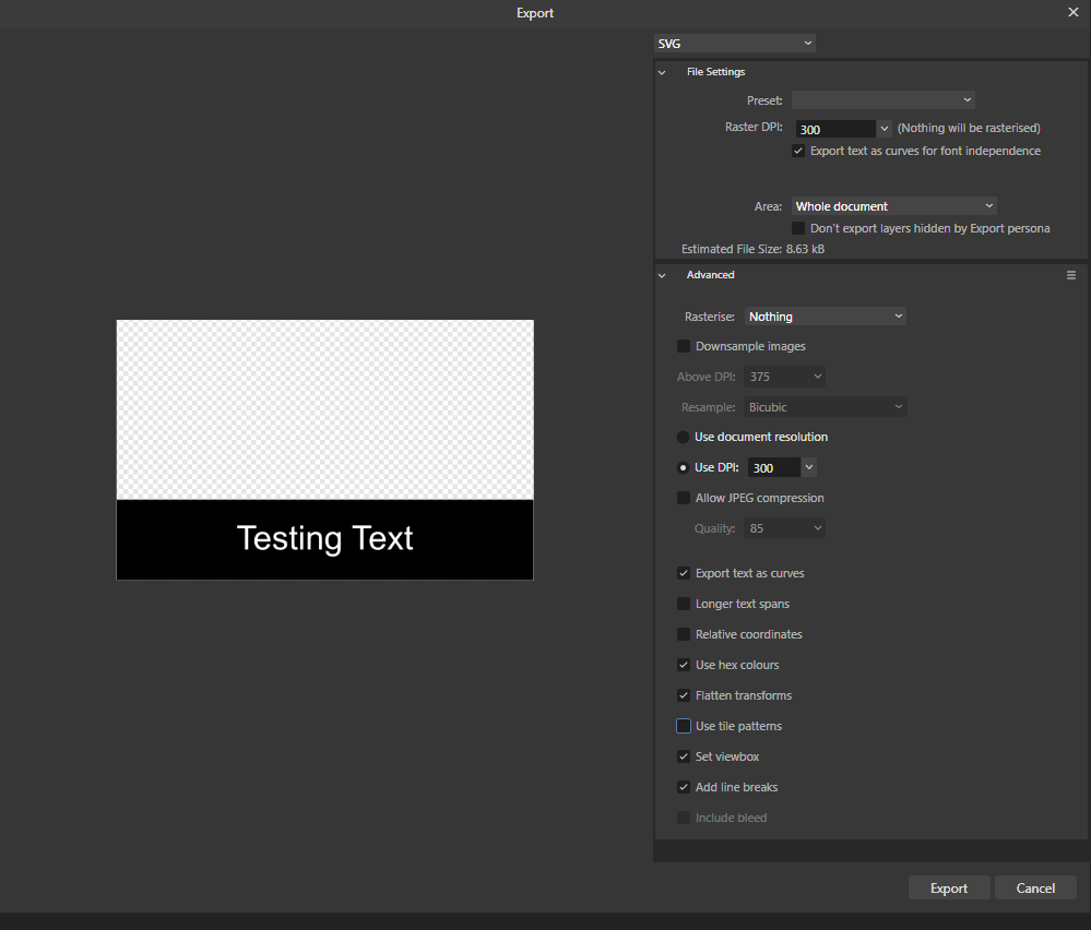
Thanks for checking that out! - Hmm, perhaps it is just Vistaprint then. I see the same results as you in Affinity, so is it possible that Vistaprint is doing something specific with the file for the specific product I am looking at? Could it be applying its own erase blend mode or something? Export settings below. Thanks,
-
Text/Curves Transparent on Export - SVG
HydroJLW replied to HydroJLW's topic in Desktop Questions (macOS and Windows)
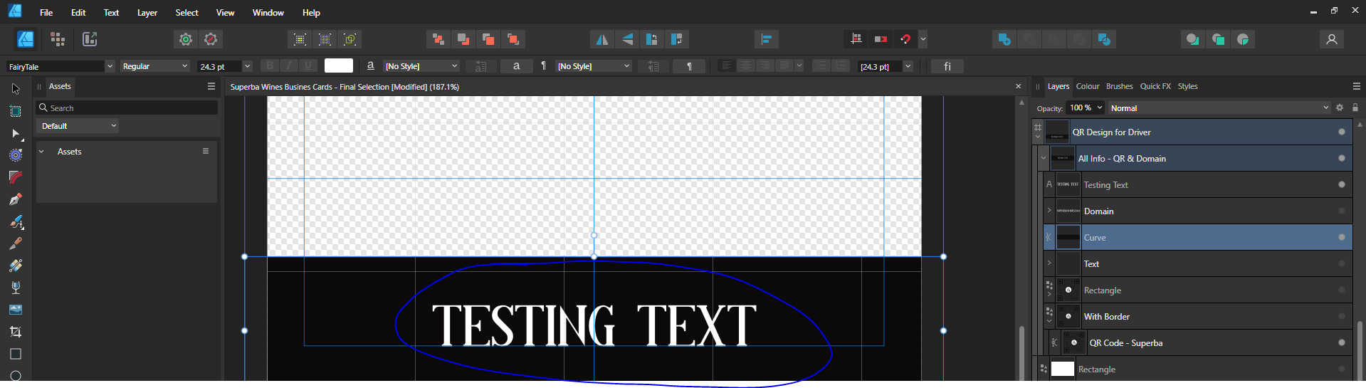
Thanks @GarryP - I tried those options but was still running into issues...very strange! I have attached an example file. Thank you, Jack Example Design.afdesign -
Text/Curves Transparent on Export - SVG
HydroJLW replied to HydroJLW's topic in Desktop Questions (macOS and Windows)
I would like this text to show up as white.
-
Hi, The text in the image below is exporting as if it is cutting out from the black rectangle below it (showing the background). Is there a way to export this text in an SVG so that it shows up as white on the black background? Not sure what I am doing wrong here. Thank you, Jack
-
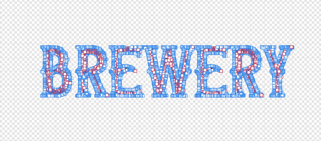
Hi @NathanC, Thank you for getting back to me - Ahh yeah, I tried this, but it didn't reduce the nodes all that much...there are so many haha. I was just playing around with this text and I wanted to try stretching parts of it, so I am assuming that the Warp Group functions will probably be the best way to do this at the moment. A simplify curve feature would be nice though! Thank you, Jack
-
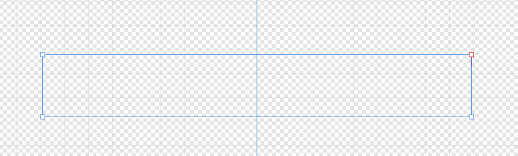
Hi, Is there an easy way to reset all of the nodes in the 1st photo so that this group of letters (curves) will collectively just have the basic corner nodes around the perimeter of the shape as a whole without rasterising? (as in 2nd photo). I would then like to be able to manipulate the group as a whole by adding in new nodes to the outside of the group. Or is the best way to do this using the Warp Group tools? Thank you, Jack
-
Hi, Apologies if this has already been requested - I did search around for a while for this, but there were a lot of varied results. I would like to request proper vector brush support. I feel like this is probably quite a fundamental feature for a lot of people and would be a highly valued addition to the Affinity suite (which I really like, by the way!) Thanks, Jack
- 21 replies
-
- 10
-
-
- feature request
- vector
- (and 1 more)
-
Export SVG with merged layers
HydroJLW replied to HydroJLW's topic in Desktop Questions (macOS and Windows)
This helped a little - so I am led to believe that the issue is probably being caused by the font itself. I thought a decent workaround would be to create a circle with no stroke/fill to go around the whole logo so that everything remains aligned and the outer circle can be aligned to the centre etc without messing things up. Jack