

lacerto
-
Posts
5,783 -
Joined
Posts posted by lacerto
-
-
8 hours ago, thomaso said:
Different to adjustment or filter layers a .LUT or .ICC is a separate file with one specific, fixed curve only … that's why you think of "try multiple" to achieve more flexibility.
I was referring to possibility to try multiple LUT or ICC based curves for different "standard" situations as kinds of presets, or possibility to combine them with e.g. Curves adjustment that shifts the basic "abstractor" curves to make them work in a bit different situation. Like below, but as far as AI is involved, programmatically (here the abstract ICC I attached above creates reasonably good results after having been adjusted with a Curves adjustment), in Photoshop:

You could have alternative abstract ICCs created for the same purpose and used in multiple (alternative) Soft Proof adjustments on top of each other to find the one that serves best for a specific purpose.
External "abstractors", as LUT .cube or abstract .ICC files can also be useful to deliver adjustments across different apps (and app versions) and between users. I do not understand why either of these assets should be avoided as too rigid, even if they do not have controls of their own (like Photoshop has, e.g. dithering), since they can be tuned by using other adjustments, as in the example above where an abstractor removing the chroma is adjusted with a single Curves layer. You could have any number of adjustments added but then the point of having one basic abstractor doing reasonably well the basics is kind of lost.
Abstract ICCs can be used in any of the three Affinity apps as a Soft Proof adjustment. I am not sure about the best possible use but as far as the document DPI is high enough, you could export or rasterize an abstract ICC along with other adjustments once satisfied (so you do not need to start by first converting to Lab color space and choosing a specific abstract ICC). In that respect they clearly differ from Output Device ICCs that are used e.g. in context of photo printing and where the Soft Proof adjustment needs to be turned off before production.
I do not see abstract ICCs as a one-click problem solver, but they, similarly as LUTs, can be a good starting point for a kind of a task OP wanted to have, and both can be created to suit anyone's custom needs and purposes (LUTs can be created from adjustment layers in Photo, and in all Affinity apps by inferring, comparing the source and adjusted export files, and abstract ICCs can be created by using e.g. the above mentioned low-cost tool). If Photoshop makes them easily available (I just had not realized that Abstract list in the Color Lookup referred to abstract ICCs), then why should the feature be obscured in Affinity apps?
-
7 hours ago, thomaso said:
In case of AI coded adjustments neither a profile.icc nor a LUT file would be required, right?
I know very little about AI so I use the term vaguely to refer to any kind of algorithmic based examination of source, and estimating the best possible means to get desired results, including some retrying within specific limits, and comparing results, and then offering the best possible as alternatives, and possibly saving feedback to be able to offer "most wanted" results as defaults. IMO that is basically what user-fed and controlled service has always done so not probably AI...
I would imagine that it is possible to programmatically apply adjustments (e.g. using Photoshop scripting) that could apply the kinds of curves that produce LUTs that aim at abstraction of "black(ish) text from "paperlike" (to some extent recognizable by the color/tones differing from the text) background, and then apply these to a sample scan and evaluate the results (with user feedback if necessary). So using this kind of approach it would be possible to use alternative, on-demand-created LUTs (or abstract ICCs) and try multiple to achieve the goal. This would be different from traditional quantization or thresholding, and ideally end up in the quality shown in posts by @NotMyFault and @David in Яuislip.
UPDATE: Just looking at the Lab curves of the LUT-based abstract ICC using Apple ColorSync utility, I wonder if it is possible to programmatically run tests just shifting the curves a bit, to have them work with "slightly" different papers and text contrast... Possibly not, so a different set of adjustments might be required, created from the scratch (though of course with similar parameters)...
-
On 2/17/2024 at 12:43 PM, NotMyFault said:
Here my workflow for this file:
- Noise reduction to get clearer image
- Levels adjustment to align color channel histogram
- Levels adjustment to blow-out shine-through
- Curves adjustment to boost readability of letters
- HSL adjustment to remove remaining color cast (optional, please deactivate)
- Black and white adjustment as better option to remove color cast and improve contrast for letters. The color cast is a by-product of sharpening and jpeg compression. We can use it to selectively brighten or darken certain colors which essentially works as sharpen filter for letters while retaining "organic" curvature. com in to 500% while tweaking the sliders.
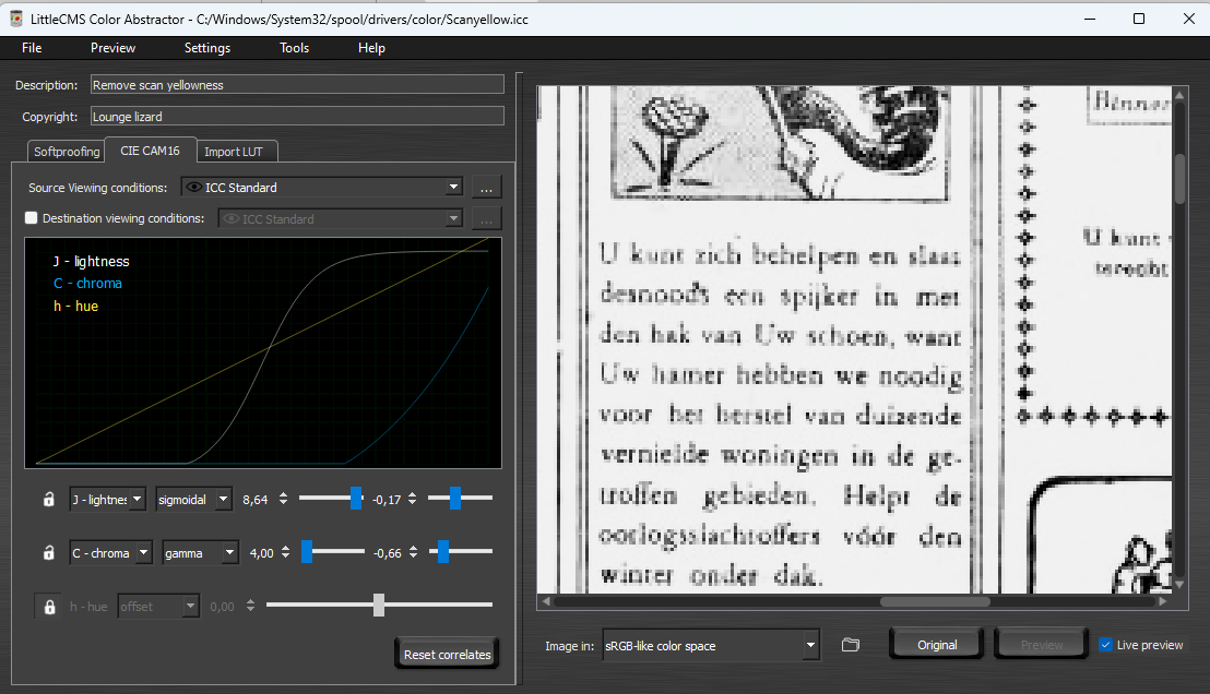
I had another look on abstract ICCs and exported a LUT of the series of adjustments created by @NotMyFault and described above (the original post also contains an attachment where the procedure is applied on one of OP's example scans). I then used the LUT in above mentioned LittleCMS Color Abstractor to create an abstract ICC and applied the created ICC to the same scan.
It was interesting to see that while the created abstract ICC (attached below along with the LUT) seems to work well in Affinity Photo 2 and does reproduce pretty well the results of the adjustments when applied to the same image, it works differently when applied on the same image as an abstract ICC in Photoshop (CC 2024 tested).
In addition, when applied in Photo 2, it seems that LUT based conversions / transformations, are too specific, so when applied on tasks where the goal is to quantize (reduce tones), the results may vary greatly just for relatively small changes in the source, so when applied e.g. on different scans of the same source, or different pages of the same book, results may vary too much from scan to scan and page to page. Using AI in tasks like these might significantly improve the results and probably AI is already used for this purpose.
Nevertheless, it was good to see that an abstract ICC can basically reproduce the effect of a series of adjustments saved as a LUT -- at least when the app creating the LUT and applying the abstract ICC created from it stays the same. As for Affinity apps, it would be easier to just share the LUT which, when applied in Photoshop, would give similar if not identical results when applied as an abstract
a LUTadjustment:
Perhaps someone with more experience with LUTs (or abstract ICCs) can tell why this difference between these apps (and possibly other apps supporting these features) exists, but the Photoshop Color Lookup functionality directly shows that abstract ICCs and LUTs are used for identical purposes.
-
1 hour ago, v_kyr said:
Little CMS was already mentioned earlier in one of my posts as the creator of Apple abstract ICCs, with the link to their web site, so i am not sure why there was need to notify me of the address being included also in your list of addresses? I wanted to pinpoint them just to give something concrete, and demonstrate how simple creation of abstract ICCs is 🙂
-
7 hours ago, R C-R said:
All I was suggesting is that some users might find them useful if the Affinity apps supported them automatically, without having to add them piecemeal to their respective user app support folders.
I agree. I did not know about abstract profiles earlier, and while it is true that there are far more well-known and more effective and especially shareable methods of achieving similar results, it does not harm to stay curious and learn something "new" -- in quotation marks because it seems that abstract ICCs are not anything new. Based on the fact that many if not all the abstract ICC samples distributed on macOS seem to be created by the same company doing business in the field of abstract ICCs, Little CMS, and that these profiles appear to have been created already in early 2000s, and that Photoshop appears to have supported abstract ICCs starting already from CS4, the technology has been there now for well over two decades.
I had not noticed existence of this feature because it is kind of "hidden" as a separate list in Photoshop, and probably very few have noticed its availability in context of Affinity apps because of poor accessibility of these profiles. But I think that they might have some use especially in context of non-destructive soft proof kind of UI with endless capability of combining whatever is primarily achieved with an abstract ICC with other, still more "experimental" adjustments. Personally I think it is good that Adobe implemented this feature separately from other kinds of ICCs (where results are exact and based on ISO standards), and also separately from color proofing, where reasonably predictable results can be achieved with specific manufacturer and production profiles even if adjustments are applied manually and based on perception.
The whole concept of having color profiles in context of Lab color mode (a "profileless" color space), is a bit confusing, so in this sense having these profiles listed amongst Soft Proof adjustment is likely to blur the underlying technology (and whatever is achieved by using accurate Lab to Lab calculations), and make the whole feature a kind of a hobbyist widget. But then again, has not the feature now reached a proper home having been exposed in the realm of Affinity apps 🙂
2 hours ago, R C-R said:It's only a suggestion based in part on what @lacerto mentioned about their potential uses.
...which was of course basically just a hunch, and as mentioned above, I am not personally into this kind of approach, either. But it might offer some basic means of achieving kinds of goals initially asked by OP and not entirely off topic. One often learns new things by trial and error, and taking a few side steps. My initial interest in the topic arose because of @David in Яuislip's post, however apparently "Luddite" but nevertheless based on experience and understanding of underlying (analogue) technology, and getting excellent results effectively and elegantly, rather than as a result of "experimenting" with multiple adjustments and controls. So in that sense, looking into something possibly simple, achievable e.g. with a self-made absolute ICC profile with a tool costing EUR 3,95, seemed worth an effort:
-
1 hour ago, R C-R said:
Edit: forgot to add, since only AP has a File > Import ICC Profile command, for the one(s) you added to AD 2 and/or APub 2 how specifically did you do that?
They are just symmetrically in
/Users/<user>/Library/Application Support/Affinity Publisher 2/profiles
/Users/<user>/Library/Application Support/Affinity Designer 2/profilesI suppose version 1 profiles are just in equivalent folders but probably without a version number in folder name.
Versions purchased from Apple Store might have profiles in different locations, or might be able to read from general system locations?
-
-
Here is a demo of usage of abstract profiles installed on macOS (Sonoma) with Affinity Photo and how they can be previewed in context of Softproof Adjustment (they can also be used for direct conversion, but would be more useful as adjustments so that they can be tuned before flattened and rasterized):
-
2 hours ago, R C-R said:
I guess I must be doing something wrong, but I have no idea what it might be.
It is probably that the profile is not available to your Photo app. Try to make it available by using File > Import ICC Profile command of Photo. I am not sure if the location the ICC profiles are placed differs depending on whether the app is from Affinity or Apple Store, but I have Affinity store versions, and then the profiles will at least be available at:
/Users/<user>/Library/Application Support/Affinity Photo 2/profiles
....and for other Affinity apps, equivalent app and version specific paths.
I renamed the two Black & White profiles as Black & White Gray and Black & White Lab using Color Sync Utility App, and can now use both Lab and Grayscale based profiles independently, so not having both accessible previously was just a name conflict. As for Adobe Photoshop, abstract profiles are available in context of profile conversions as a separate list, and all installed abstract profiles (like Blue Tone, Gray Tone and Sepia Tone) appear to be automatically available (as for Affinity apps, I think that at least Affinity Store versions need to have these profiles copied under the user Library, as described above). On Windows all these profiles are installed in one common place which makes their use much easier (but naming conflict can make e.g. Proof Setup inaccessible).
The concept of abstract profiles was new to me so I am not sure how they are typically used. The Lab based Black & White profile would appear to be useful also as a Softproof Adjustment to get a reasonably realistic preview of monochrome output, and when making an actual conversion, the result will be pure black and white image (even if of course not a true monochrome within Affinity ecosystem). But I am not sure if this is "intended" or "typical" use since Photoshop does not allow using abstract profiles in context of Proof Setup.
Anyway: this was one step forward in understanding different kinds of ICC profiles and how they are supported and accessible in different apps, and realising that naming conflicts can become an obstruction but be easily resolved with Apple Color Sync Utility was useful.
-
10 hours ago, R C-R said:
I can't be sure but I think they must not be the same profile.
They are not. The one I referred to is "Output Device Profile", while the Apple one that comes with the OS, is "Abstract Profile".
The latter are primarily useful in context of Softproof and miscellaneous image manipulations, and in RGB color space (more specifically in Lab color mode). They can be potentially pretty useful in tasks like in this thread, abstracting black and white content from a color image (e.g., below, a pretty good conversion can be achieved just by applying the Softproof adjustment and then increasing the Gamma):
The Apple Black & White profile becomes also available in context of definition of color profile when creating a document in Lab color mode, or when converting to Lab. Interestingly, when embedding this profile and viewing it in XnView MP, the displayed information shows that the profile creator is actually the same as that of the Output version: Little CMS.
It seems that I cannot use the Apple-specific abstract profile in Photoshop, at all -- it may of course be just a name conflict (as both profiles have an identical name even if different filenames). Both profiles, however, can be equally useful in the kinds of tasks presented in this thread.
-
25 minutes ago, R C-R said:
it is something related to Microsoft, not Apple
It is acsp, which appears to be an acronym for "Apple ColorSync Profile".
-
1 hour ago, R C-R said:
I'm not sure what you mean about if it the Apple one unless you are talking about the Little CMS color engine.
Ok, I see. The version I use on Windows and also on macOS in context of Affinity apps appears then to be different from the Apple one in /Library/ColorSync/Profiles, and which cannot be used with Photoshop. The profiles just have the same name. I am not sure if the four-letter profile file signature is somehow Apple-related, though. Also, I have no idea where I initially got the profile -- perhaps it was something that cane with some older Adobe software...
-
It is on my MacBook Air (original M1 that came with Big Sur, currently Sonoma 14.2.1). Affinity store based apps do not read if from /Library/ColorSync/Profiles so I need to place it in my user Library and separately for each Affinity app to have it available. But what is stranger is that Adobe Photoshop 2024 macOS version will not read this profile no matter where it is placed.
I think that this profile is basically intended to be used in context of Softproof, and in RGB color space, to create levels for monochrome printout. For some reason it does not work with Affinity Softproof Adjustment, possibly because of the monochrome reference (as this color mode is not supported in Affinity apps), even if it does show grouped with press / device gray profiles in other profile contexts (and can be used). In context of Windows Photoshop (2024 and earlier) it works and basically allows determining threshold for black and white using e.g. the Levels control, so I am not sure how useful the profile might be... It could basically allow the user to set levels of a color image and output it to a monochrome device without needing to convert the image color space...
You can try to get more information from the creator of the profile:
-
Check if this fixes it. The links were created using Adobe Acrobat Pro 2020, but I think they could be easily created also with PDF-XChange Editor (available only for Windows, but a perpetual license at about EUR80).
PS. I replaced the original as I forgot to add link on pages 2 and 4. I tested also PDF-XChange, and it was even easier with that tool as it could paste a link exactly on the same location on successive pages, so it needed to be placed only once.
-
2 hours ago, mopperle said:
This might be indeed what confuses me, because as you said when you create a new text style it is based on [No Style] which in fact seems to be a style, just with no settings.
Yes, but I can see your point.
E.g. as far as I can see No style does not determine OpenType features, and I have understood that this means that the style does not specify whether a specific feature is on or off, and accordingly, the attribute is indeterminate, and therefore has a dash:
However, if I have manually added e.g. a slash zero and then use "Apply Test to characters" (having the slash zero included in the selection), the slash zero is reverted to regular zero even it is not defined in the underlying paragraph style (it is not turned on or off, but left indeterminate). (E.g., in InDesign, OpenType features are explicitly on or off, when being part of paragraph style definitions.)
What is worse is that if I apply another paragraph style (which does not explicitly specify that slash zero should not be used, either), the slash zero will be removed just by applying the paragraph style without asking to remove overrides or apply styling to characters. This does not happen in InDesign (I am not sure about QXP), but this behavior of Affinity apps makes it basically an obligatory task to fix local formats with character styles, to avoid catastrophic formatting errors. EDIT: Correction, this actually does not happen in situation of "indeterminate" attributes, unless styling is explicitly applied on characters; but it happens with determinate attributes, so local "conflicting" attributes are lost by simple paragraph style attribution.
I am not saying that Affinity apps define styles "incorrectly" or "illogically", but it is good to understand that there are significant differences between different apps.
-
More generally: Affinity apps are far from being consistent in their use of UI to signal mixed state of attributes in selections.
Just compare this InDesign view expressing more or less consistently indeterminacy or mixed state in UI for a selection that contains multiple attributes:
a) InDesign:
Note especially how the Color panel indicates indeterminacy (even is also showing color values of a partial selection), and has the underline and superscript buttons in off state (which of course is not accurate, either but IMO better than having them in on state just because part of the selection has these attributes applied).
b) Affinity Publisher:
Note how the Bold and Underline buttons are on (while Italics is off), and how Super/Subscript box says "None" instead of being blank. No break box would not express indeterminacy, either, even if it is a check box, and OpenType features do not show indeterminacy, at all. It would be possible to use checkboxes instead of radio buttons whenever such functionality is needed, and have radio button behavior created programmatically (which is also Apple recommendation in XCode documentation, to be used instead of radio buttons even if indeterminate is available also with radio buttons). In general, use of indeterminacy / mixed state in UI is a thing that requires programmatic involvement, so whether an app shows this or not is much an indication of maturity and culture awareness of an app. I think that Apple (and any software company with some history and culture) still cares about these kinds of things, even if there is no longer quasi-scientific agenda behind to back up idiosyncratic choices like one-button mouse, bottom-right-corner only window resizing, etc.
-
43 minutes ago, mopperle said:
Then I start to create a style (text, paragraph or group), which is not based on any other style, but all those checkboxes show per default a mixed state, which makes no sense to me.
I think that the dash is also used to indicate indeterminate state. That means: it does not indicate actual presence of mixed states, but that there is no underlying rule that determines whether a certain attribute is on or off.
-
15 minutes ago, Alfred said:
Have we gone off topic yet?

Does the resulting grayscale TIFF look like off topic?
-
Note though, that if you actually opened the PDFs, as far as I recall, you mentioned that your scores are in RGB color mode. When you open a PDF for editing in Publisher, you can let Affinity estimate the document for correct color mode, or you can force a specific color mode. Disregarding of what you choose, the original color definitions of the opened document will stay, so they would be RGB 0, 0, 0, and only appear to be four color CMYK (something like shown above) when viewed e.g. in Color panel. You can see the true color value if you temporarily turn off the lock in the Color panel (you do wisely to normally keep the lock on, so that you do not inadvertently convert colors of selected objects).
This means, too, that you should look for RGB 0, 0, 0, instead of the equivalent CMYK conversion, to be able go through all your objects.
See below how this would work for this demo score:
-
In version 2, you can select all objects of the whole document by specific type (e.g., text, shapes, etc,), and then apply common attribute, like value of fill color to them:
Or, you can select one object, and by using its one attribute, like fill, to select all objects within the document that use the same value, like color, in that attribute, and then change the color to something else:
In version 1 of Publisher, the Select feature is available only via Designer Persona, but it does not select objects document-wide but just page-wide, so you would need to repeat the process for each page.
If I recall right, you ended up placing PDF documents (either to be passed through, or interpreted), rather than open them, in which case you could not do this. This would be possible only if you have opened the PDF(s) for editing.
If your printer is willing to do this for you, I would recommend leaving this to them, especially if this is a job where RGB 0, 0, 0 (which would appear as four-color CMYK if viewed as a CMYK simulation) needs to be converted to K0.
EDIT: Note that since your notation is practically "text" (as it is laid out using fonts), you could actually use Find Replace and use its Format feature to find all text that uses common Fill / Stroke Color, and then replace it with another Fill / Stroke Color, and you can do this document-wide even if you have "text" in separate frames, and you can do this also in version 1:
-
1 hour ago, thomaso said:
To me an unintentionally assigned Affinity character style seems to be triggered if it's selected when placing the docx.
It does not need to be a character style, it is enough if no break attribute is active in the position where text is placed within an existing frame, and if it is an attribute last applied on any frame, it will also become an attribute of a new text frame that is created when a Word document is placed on canvas. I am not sure if No break exists as a Word attribute: non-breaking space of course does (and is imported), and probably some other non-breaking glyphs, but they do not cause the same non-wrapping behavior as no break, but just forced word breaks at (probably) random points.
-
Odd. My only advise would then be to resize the document page size (trim box) to match the physical sheet on which the dot grid will be printed. E.g., in the attached file, the original page size of 7.5 x 9 in is changed in Adobe Acrobat Pro to US Letter (8.5 x 11in) without scaling the original art (that is, centering existing content by adding 0.5 in to horizontal margins and 1 in to vertical ones).
-
15 hours ago, TypeNerd said:
Thank you. Yes, the frustrating thing is that I have done the work already, all images are 8-bit grayscale tiffs, all my text is specified at 100%K with no other color. And then my pdf turns it all to color at the end with PDFX1a. But I did check with the printer, and the reason they specify that pdf setting is that USUALLY that is the only way to get true grayscale output (from Adobe InDesign). They are content with any pdf output that is grayscale, so I will go ahead without the PDFX1a setting. Thanks, everyone for sharing my pain and helping to work on the problem.
Thanks for the update. This was an instructive thread, because the job at hand appeared to be very simple, and what was confusing, was basically the very different way Adobe InDesign and Affinity apps handle "grayscale" (or basically, press-oriented black). InDesign does not basically offer "grayscale" color model at all, but uses instead Lab for specifically light intensity oriented color definitions, and for print intent documents always handles "gray" as K ink. So it is very straight forward. Whatever is defined in print intent document and using the factory default {Black] swatch (including tints) will end up on K plate when exporting to press, and stay "grayscale" in that sense. Similarly, imported grayscale images will aways stay on K plate, there is no need to explicitly tell that gray is not a composite RGB but needs to be treated as black ink.
What however was particularly confusing was bringing in PDF/X-1a and combining it with concept of grayscale, and specifically in context of InDesign, since when using this standard, conversion to grayscale proper is not available at all in InDesign (at least up to CS6), so to be able to produce specifically grayscale PDFs, anything else than PDF/X-1a needs to be chosen! PDF/X-1a is often asked for the purpose of guaranteeing that the job will be in CMYK-only color space and will not contain live transparencies, and is therefore a kind of fool-proof export method.
So, to wrap up, what seemed to have happened was that as you had a pure b/w press-oriented job, you initially chose the Gray/8 document color mode and assumed that text and native art is safest to specify in CMYK, using K ink only (as you would do in InDesign or Quark, where gray is not even available). Which in Affinity apps is wrong, since K would be handled as an RGB value in a grayscale document and would end up being either a four-color black or a diluted black (dark gray) depending on whether exporting to Grayscale or CMYK. So: in a Gray/8 color mode document, you need to define blacks (text and native art) that are intended to end up on K plate, as Grayscale or RGB color values, and make sure that you also export using Grayscale color mode (using CMYK at export time would convert grays to four-color black). Placed grayscale images would also be converted to rich black. Using PDF/X-1a in context of a grayscale document, would work if you had press-oriented grayscale profile available (which Generic Gray Profile or D50 are not), so in this sense the color preflight warning that you would get trying to export using PDF/X-1a in context of a grayscale document, is correct. You will end up having four-color blacks if you use PDF/X-1-a:2003.
The next step you tried was probably switching the document color mode to CMYK/8. You already had your text and possible native art defined in K100 so it would seem obvious that you will have correct output having K-only color definitions and placed 8-bit TIFF grayscales. But no, your placed TIFFs would now be exported using four-color-black, as they would be treated as RGB images within Affinity apps whenever placed in Gray/8 or RGB color mode document, but handled in CMYK context, and would be exported as rich black when exporting to CMYK. Using PDF/X-1a would not change anything here.
At this stage, at latest, you might have heard an instruction from the printer to produce in true "grayscale", in the meaning: everything on one/black plate. The trick, in Affinity apps, is to apply the "K-Only" button on all placed grayscale images. This would not be done when placing these images in other than CMYK document color mode, and it won't be done automatically if switching the document color mode to CMYK. The button is also visible on the context toolbar only when using CMYK document color mode, and unfortunately you cannot apply "K-Only" for all document images at once, but need to go through images one by one and make the change. Note that when you have a document color mode in CMYK, placed grayscale images do have K-Only button automatically applied (and the mode will be retained also if you subsequently switch document color mode even if the button itself is hidden, which would also change the way these images are treated in these alternative document color modes when exporting to different color spaces).
After this, you would finally get what you need: "a simple grayscale" job where what you have defined in K-ink only and with imported TIFF grayscales, will be delivered as expected on one (K-plate) only (whether exported using PDF/X-1a or not). You should additionally be careful not to change color profile at export time, since that would, again, convert K-only colors to four-color values. [ALSO: It is good to remember that letting Affinity apps embed ICC profile in the document (= default), will produce an ICC-dependent PDF where using wrong simulation profile will show incorrect CMYK values in Adobe Acrobat Pro so there is still this additional confusion related to complexity of defining black ink values within Affinity apps.]
Part of this is related to clash of different technologies and underlying color engines, and terminology (some say "cultures", but I personally disagree), and the fact that you are not likely to get proper instructions from printers / print shops. The Affinity apps are also under development, and there seem to be recent changes e.g. in the way placed CMYK images are treated when they contain embedded profiles (nowadays they are discarded similarly as by default in InDesign). How could anyone expect to get step-by-step instructions from a third-party when they are not provided even by the first-party, practically ever?
-
4 hours ago, Hangman said:
but it looks as though his source file may have included Blend Modes with Passthrough at some point in its life
It is possible, since I initially created this file in Illustrator and used a different blend mode in each rectangle, and additionally applied 50% opacity for all objects. There were no groups initially, but I saved this file as SVG 1.1 from AI CS6 just to see that Illustrator at this point did not export blend modes in any of the attribute encoding styles (I am not sure if CSS Level 3 and blend modes were even developed at that time (around 2011). Anyway, I think that I opened one of these SVG exports in Designer and then exported directly to SVG again to see the differences. I thought that I had checked from the code that there were no blend modes but just opacities. I, too, tried to manually reproduce the strange random rasterization using similar group and passthrough inherited opacity values, but could not, so perhaps this is somehow more or less a unique case.


Best PDF export settings for print-on-demand (KDP, IngramSpark, Lulu, Blurb...)
in Affinity on Desktop Questions (macOS and Windows)
Posted
Ok, good to know. The document referred did not specify any clear press-specific specs, nor did it accordingly give any instructions on how to meet such specs when producing with Affinity Publisher, so therefore I assumed that they do not have any strict requirements e.g. as for live transparency or color mode, color profile, or PDF production method.