Search the Community
Showing results for tags 'typography'.
-
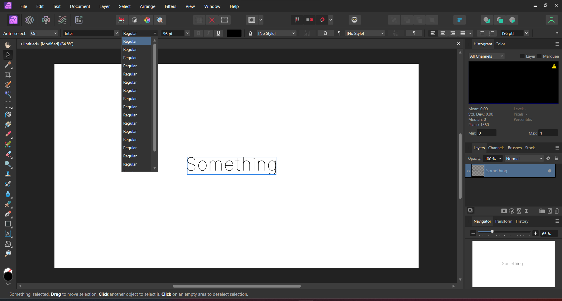
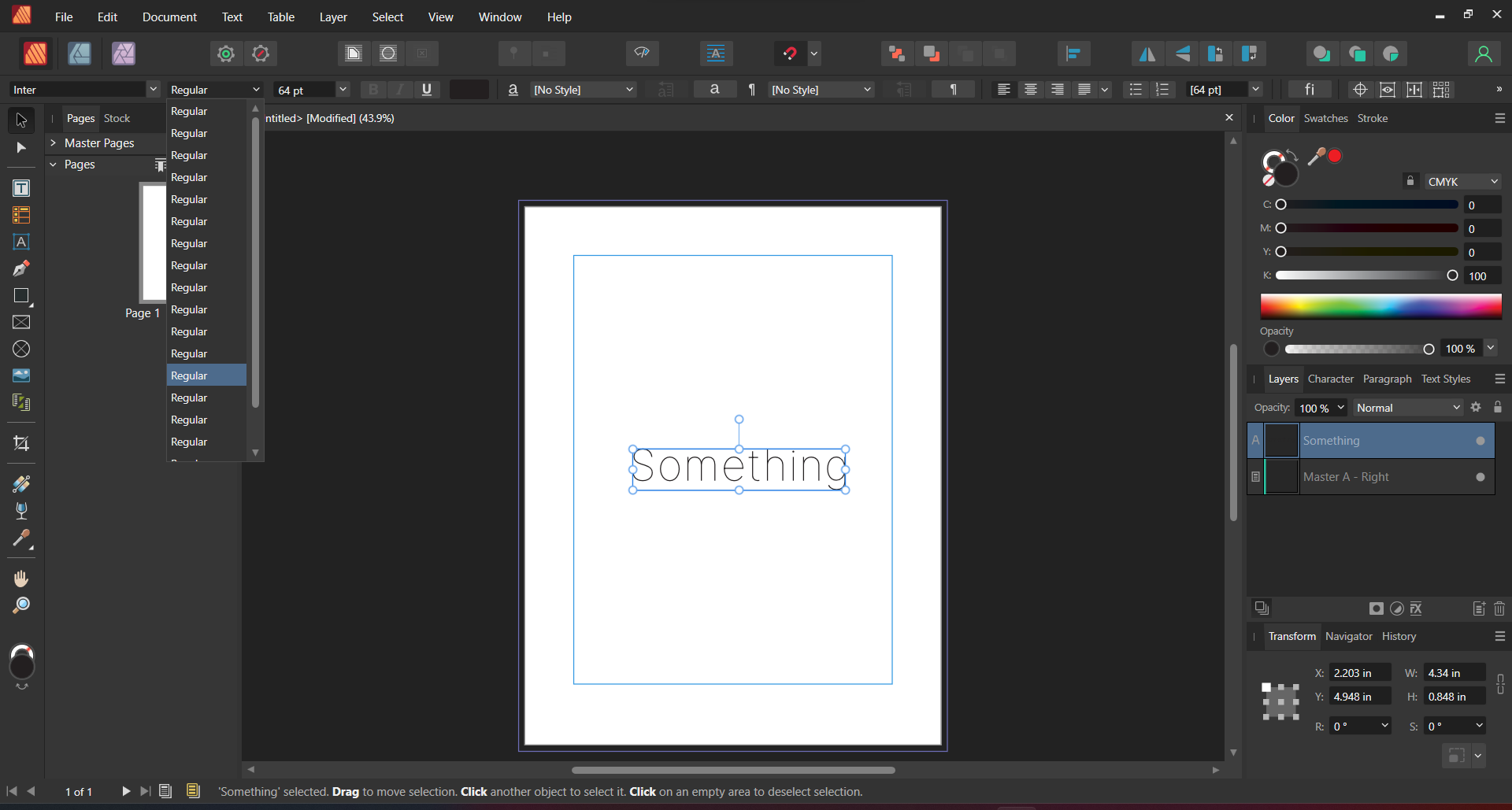
The problem is quite simple. I am not able to use variable fonts installed on my system. I have attached screenshots showing that my computer properly recognizes the font however, none of the programs, Photo 2, Designer 2, Publisher 2, correctly recognise my font. And yes, this is the case with other variable fonts as well, not just one. Fonts were downloaded from Google Fonts. Running Windows 11 22H2. Downloaded all programs from Microsoft Store. If you need any other info, I'll be happy to provide. P.S: Sucks to not be able to create something on the first day itself. But I guess launching a software has its share of challenges.

-
How does Affinity Publisher deal with variable fonts? Are there any plans to integrate related features?
-
Hello, We need and extra interface/panel for the variable fonts. All the 'visible' axes need to populate that, so we can fiddle around with these and get in realtime visible output on the pages. How these interfaces must look like? Maybe, for a start, just as Illustrator has now, with sliders? Later, more refined controls. Some axes are just on/off switches (checkboxes). Maybe a font with a two axes designspace should have a square view where the user can drag a location in and so control the two axes at once... (thinking out loud here) Thom
-
Hello, Are you planning on adding functionality for the new OpenType variable font technology in Designer, Photo and Publisher? Best, Bauke
- 42 replies
-
- 4
-

-
- variable fonts
- variable
- (and 3 more)
-
In addition to a Shetland pony, I would love have an information readout attached to the text box in Publisher that would show me the paragraph measure (number of words per line) of that text box. Spitballing here but something that would: For lines that have words in them 1. Count the number of words. 2. Average the number of words vs the lines that have words in them. 3. Display that number somewhere I can see it while I jiggle the handle, like the toolbar thingie. In a fairly lengthy meeting, you could have a heated discussion about whether the calculation should be performed before the auto-linebreaks and assign some sort of decimal weighting based on the overhang of the words that break the line or whether the calculation should be performed after the auto-linebreaks because that's what users see anyway. Either of these options would be fine with me, I would happily get the coffee and pastries from the kitchen to make sure no one dies of malnourishment during the meeting. This feature would help me make nice readable blocks of text. Or dense impenetrable text when I'm feeling mean.
-
 I've been trying to create something like this by... Making a letter with the artistic text tool Converting it to a curve Breaking up the nodes so the letter is made up of four separate vectors Making the fill a gradient Just curious, is there a better method to pulling something like this off? How would you approach this differently?
-
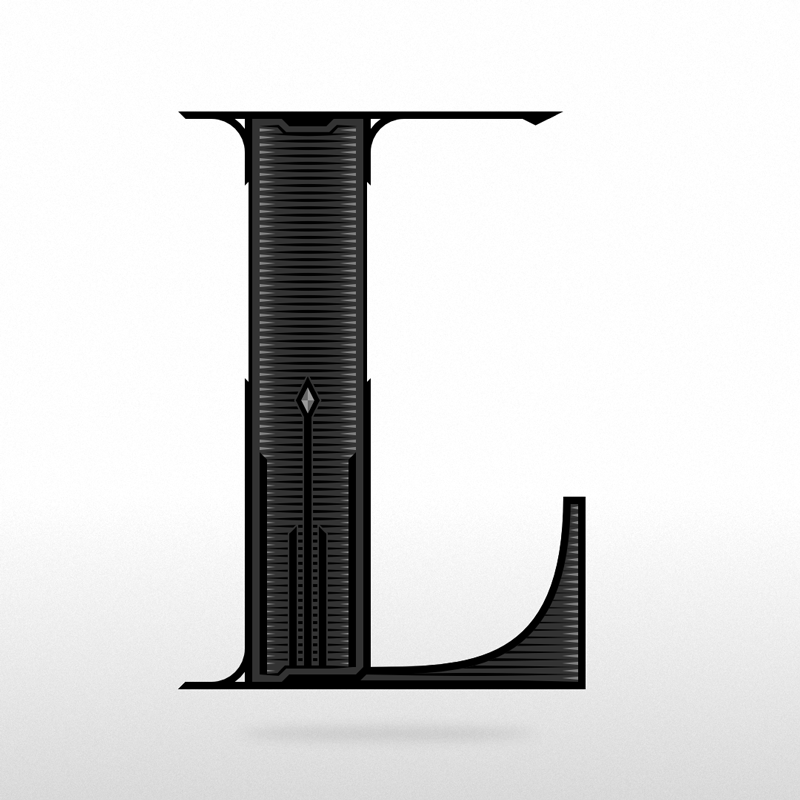
 Hi everybody 🙂 After recently buying all 3 of the Affinity programs, this was the 3rd thing I made with Affinity Designer. The other 2 were a Christmas post and a new years post for Instagram. My first impression of AD is that it has potential, but to me it still has a long way to go if it wants to compete with Adobe Illustrator. But of course, it's very difficult to get to the Adobe level, since they have so much experience and money 😅 I bought the Affinity programs to hopefully get less dependent on Adobe software, because I really don't like the 'subscription only' principle Adobe has adopted. I don't like to pay Adobe 'ransom money' to be able to have access to my own documents. And since using Adobe Creative Cloud I've had several bugs that have never been an issue back when I had Adobe software that I bought. So even Adobe isn't as good (anymore) as it should be for that price. Most of the things I design are T-shirt prints for my webshops and since I'm addicted to designing letters (typography) most of my designs contain custom made text. This 'L' was made for Instagram only. From time to time I design single alphabet letters, to have something more to post on Instagram. I post far less than the algorithm wants, but I don't want to be a slave to the algorithm, so I follow my own rithm 😋 Is anyone else into designing typography? ✌️ Luc
- 13 replies
-
- 8
-
-
- typography
- alphabet letter
- (and 1 more)
-
 It would be useful to introduce more advanced features, like Discretionary Ligatures that could be useful with fonts like Chartwell. https://www.fontfont.com/how-to-use-ff-chartwell
 -
If you would like to see more of my work go to my Youtube page where I linked my other socials. Let me know what you guys think and Thanks for any constructive criticism
- 1 reply
-
- 1
-
-
- youtube
- logodesign
- (and 2 more)
-
 Doesn't look like anyone has reported this issue.
 -
 Welcome to our channel! In this tutorial, we'll show you how to effortlessly achieve a mesmerizing glossy text effect in just a matter of seconds using the powerful 'Macro' feature in Affinity Photo. Whether you're a beginner or an experienced user, this step-by-step guide will take you through the process of creating a professional-looking glossy text effect that will add a touch of elegance to your designs. No need for complex editing - let the 'Macro' feature do the work for you! Join us as we explore the wonders of Affinity Photo and unlock the potential of this time-saving tool. Watch now and take your text designs to a whole new level! Don't forget to like, subscribe, and hit the bell icon to never miss an update. Let's get creative together!
- 4 replies
-
- 4
-
-
- affinity photo
- text effect
- (and 6 more)
-
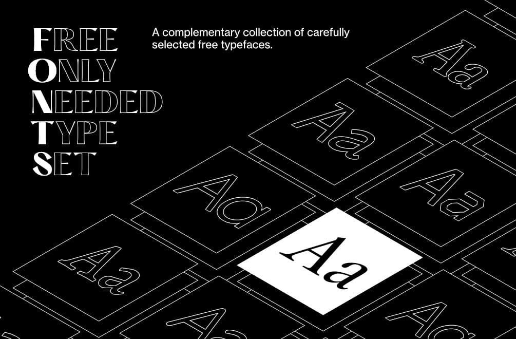
Typography is one of the most important(if not the most important) factor determining the quality of visual communication. I’ve always had trouble finding the right typeface. Wasting countless hours browsing various websites in search of "the one" that I currently want to use. I came up with an idea to create a list of free high-quality typefaces that you can use when the client’s budget doesn’t allow the use of paid ones. Typography is a tough nut to crack especially at the beginning of your journey, so I prepared a list with only good positions. ● Full version: https://fircyk.gumroad.com/l/fontslist Free version: (just put 0 in the price box) https://fircyk.gumroad.com/l/fontslistfree ● FONTS – Free Only Needed Type Set A complementary collection of carefully selected free typefaces that contain the best positions to fulfill every need in a graphic designer’s work. Your benefits: Graphic designers: Sometimes when the budget is too tight we need a free for commercial use but high quality typeface for our project—with this list you won’t waste your time searching the internet in order to find the right one. Content creators: Base your brand-building on proven typefaces to increase the quality of the materials you produce. Strengthen the power of your communication with your target audience. What is included: + LIST OF TYPEFACES A balanced list of free typefaces that combines the right level of versatility and personality. Created as an alternative to the original premium typefaces. Selection was based on: Glyph similarity Variety of weights Tone of voice Development state Language support Glyph count Opentype features + COMPARISION LIST Every free typeface on the list has its paid equivalent so it adds 40 positions and compares the free and paid classic that was the main inspiration. In addition, a comparison list has been prepared for printing. + FUNDAMENTAL RULES OF GOOD TYPOGRAPHY 10 timeless rules that will drastically increase your skills in the beautiful art of typography. + COMMON TYPOGRAPHIC MISTAKES 10 mistakes you can make in your career as a graphic designer. + MASSIMO VIGNELLI PICKS Original list of typefaces selected by one of the best graphic designers of our times. + LINKS TO SOURCE FILES Links to direct sources of selected free typefaces. + QUICK CARDS A preview prepared for quick comparison of the free typefaces included in the list. + QUICK–INSTALL FOLDER Latest versions of typefaces from the list in one folder for quick installation. Version 1.1 has already been implemented. In version 1.2 a typography checker will be added(as an Affinity Designer template file), where you will be able to check the quality of a selected typeface. —— Be effective. Stay creative. ——
- 3 replies
-
- 2
-
-
- typography
- font
- (and 2 more)
-

Serious issue with drop caps
FlatCat posted a topic in Feedback for Affinity Publisher V1 on Desktop
If one cares about the end typographic level, there is a serious issue, as far as I can see, with the drop caps feature in Publisher. The top of a drop cap should align with the tops of capital letters on the first line next to it. I haven’t tested every single font of mine, but most come in on various distances lower than that. Other than your standard Arial, only two fonts, Caslon and Bodoni are acceptable. I would not use the drop cap function until fixed. There is also a possibility to align the drop cap to the left, which works fine on some fonts/letters, however not at all on others… Other design software offer a possibility to fix this manually by adding a word space before the drop cap, then giving it a minus distance (as first line indent). But Affinity only offers the possibility to make the indent wider. This is one of the professionals’ trade tricks, but we need them -
 I have a large design file that I made using one font. Because it was a font I constructed I made an update to that font which included a name change. Now my design file is full of Helvetica and there appears so be no way to replace missing fonts or "select same font". Is there any way to do this? If not, please add it. This process is exhausting otherwise.
 -
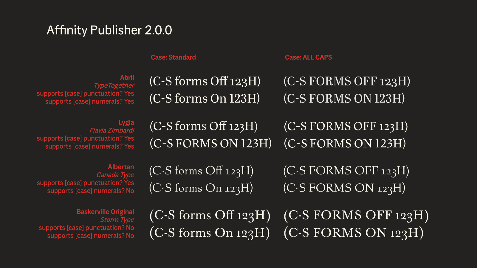
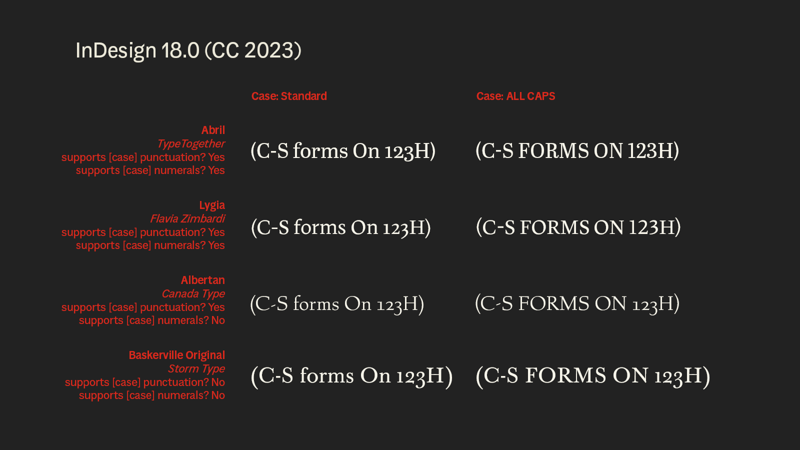
 Case-Sensitive Forms are an OpenType feature designed to replace some glyphs with alternates when All Caps is applied. (Official description here.) Activating Case-Sensitive Forms (a checkbox in the Capital section of the Typography window) should have no effect except when All Caps is applied, but currently Case-Sensitive Forms is replacing relevant glyphs whenever the feature is activated regardless of case. In the examples illustrated here, Case-Sensitive Forms include and upward shift of hyphens and parentheses for Abril, Lygia, and Albertan and a switch from oldstyle to lining numerals for Abril and Lygia. All of these behaviors are correct in the right column where All Caps has been applied but incorrect in the left column where case is unchanged. Additionally, activating Case-Sensitive Forms forces capital letters from Lygia. I suspect that there is something different and/or wrong with Lygia’s coding but note that it would likely not matter if Affinity’s handling of Case-Sensitive Forms were correct. Additional notes The same examples exported from Adobe InDesign 18.0 is included for comparison. As far as I know, it is not possible to turn off Case-Sensitives Forms in that program. This issue to be affecting Publisher v1 as well, but I think it might be a new issue. PDFs I have exported more than a few months ago do not show this unexpected behavior, but I’m having trouble finding definitive evidence that I had Case-Sensitive Forms turned on at that point. Minor nit: ‘Case-Sensitive’ should be hyphenated in the Typography window.
-
I am noticing I can't type a soft return using the shift + return keys when on a Bluetooth keyboard (Logitech Keys To Go). This is a generally used function in other apps. Would love to see it in designer as well. On an added note it is possible to do a soft return in other apps using this same combo with the software keyboard. That would be great if Affinity Designer could do it, so I don't have to open the special characters tray.
-
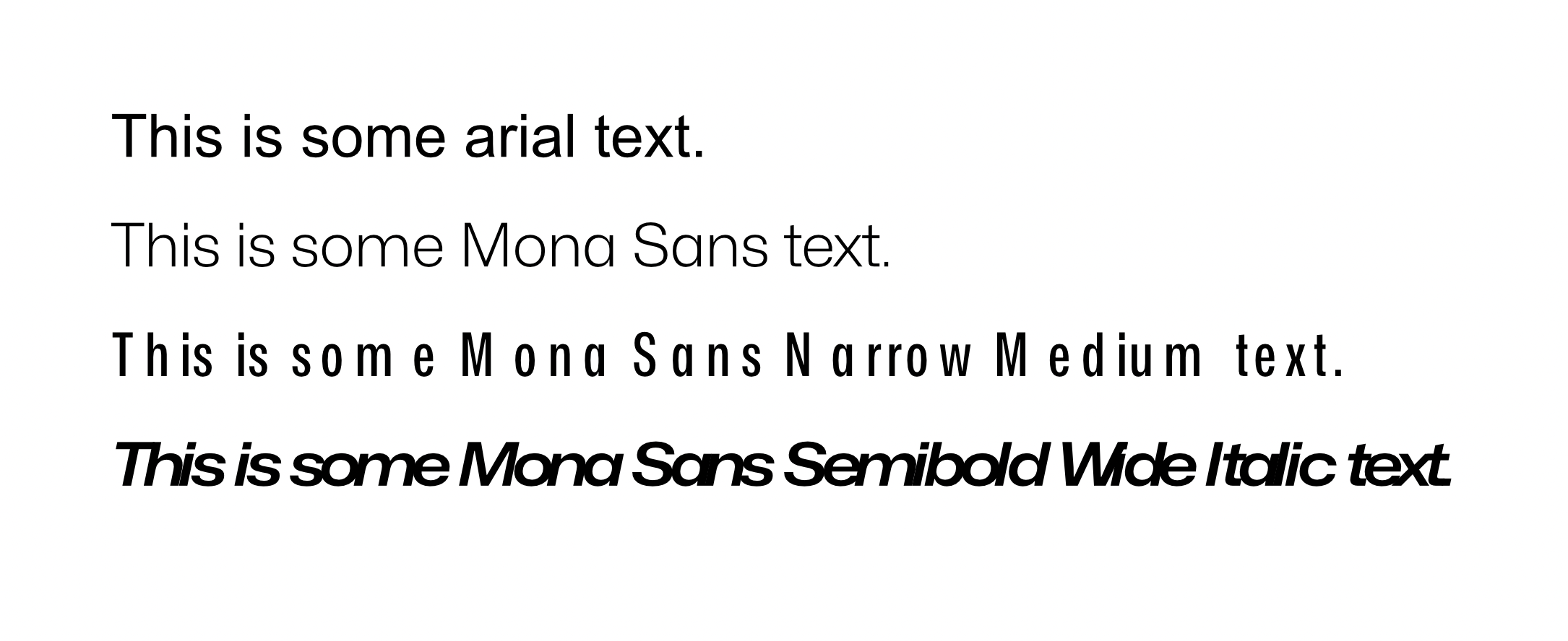
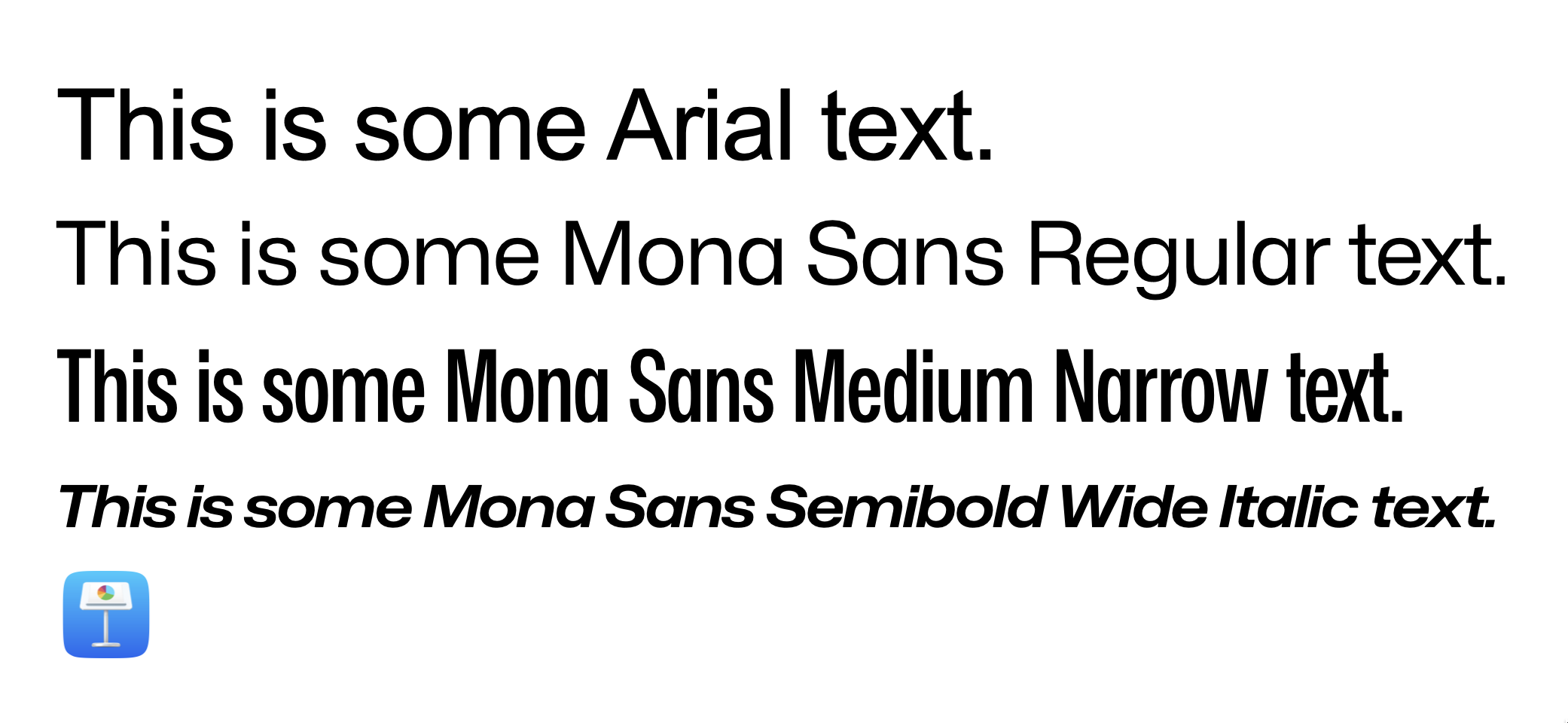
 Hi, everyone. Thanks beforehand for your time. So, basically my problem has to do with character spacing, no matter tracking, kerning, both or none. Affinity displays it completely wrong. Refer to the screenshots for more context. This first screenshot comes from a fresh new affinity document. I just wrote the text and set the font face. This is how Mona Sans looks against Arial, just to name an example. You can clearly see that the spacing for the Narrow Version and the Wide Italic version has been absolutely butchered. I can't tell if Arial and the Regular version for Mona have the same problem. To me, they look fine, but I don't really know what to expect after seeing how it reacts to very wide and narrow fonts. Second screenshot is how Keynote, just another app that deals with text, looks like. Font Book looks identically, as so does every other text app I have. Essentially, that's the spacing that the original designers had in mind. I am very aware of the ⌘ + opt + → command for setting this up manually. But, in this specific case, I am just writing a bunch of text. I expect the result to be like the second picture with no additional tweaking. Essentially, that's how the typeface was designed and I want to keep those proportions. For reference, I accessed the Character window and tweaked everything to be as default, or close to default as possible. That means, 0% everywhere. I went character by character, checking that the kerning for each pair was set to 0%. Question is: am I missing something? Am I doing something wrong? Or, on the other hand, is it a problem with Designer? Hope you can help me out. Lemme know if any other piece of info is needed. Specs: - OS: MacOS Ventura 13.0. This occurred in both an Intel machine and an Apple Silicon Machine. - Affinity Version is 1.10.6 Again, thanks much for your time beforehand.
-
 Hi everyone, I have looked in the forum for a trace of this, and couldn't find it in the functionalities in the App, but it is such a sadly missing function of Illustrator that it is, for me, entirely necessary to add it to Affinity Designer to make it THE Adobe killer. Some of you might have used Inkscape in the past, I discovered it very recently, being a mac user (and it is far from user friendly on a Mac...): The Spiro Spline, or automatic smooth curves, swirls and swooshes. For both typography and ornaments, 2 "hot topics" nowadays, this tool is just fantastic. There are 2 elements that are genius about it: - First, it calculates automatically the "smallest curve value" between two points or a specific node, transforming any rough angle into smooth curves to create spirographic-style designs so easily it made my jaw drop when I discovered it (it is a nightmare in Illustrator). - Second, and that's the most powerful, is the ability to edit "live and dynamically" the shape used as the fill of the stroke. Meaning you can easily conver a simple curve into a gorgeous "fat to slim" swirl and create highly editable ornaments on the go, using triangles and other shapes. For those who never heard of it, check those two links, you will just be... wowed. A simple tutorial to show your the "spiro magic" http://verysimpledesigns.com/vectors/inkscape-tutorial-spiro-swirls.html And this one to show you how powerful it is, especially for Typography design: Inkscape + Spiro (sorry it's in Spanish–which I'm not, and it goes fast, but it's quite straightforward). This, combined to the user-friendliness of Affinity Designer, would make me put the premium for it right away. Hope you enjoy it guys! Boris
 -
.thumb.jpg.cebca0cd223c277a07c986819a33011a.jpg)
Add a Built-In Font Creator
rawii22 posted a topic in Feedback for the Affinity V2 Suite of Products
I don't know if I'm just not familiar enough with the affinity suite and haven't found this feature, but there's a feature that I've been wanting for some time. I would like for there to be a tool in affinity designer that streamlines the creation of a new font and allows you to export to a font file format. I want to be able to easily do something like select a letter to work on, design it, and repeat for each letter. Maybe they can add an option to create a "New Font Project..." This would make the font creation process infinitely easier and much more accessible to someone like me who doesn't need to create fonts very often. Every time I want to create a font I'm met with a million steps, and a million potential websites, but never one easy software feature that integrates the design and the workflow into one place. Affinity seems like a prime contender for such a feature, and they already have an amazing base of existing features to work with. Let me know if anybody else feels something similar, or if you think I'm inept and have to get over it 😆. I just want to be able to keep falling back on affinity for my every design need! I just found this forum post and I'm hoping that the new release of V2 makes it possible for affinity to add this feature. -
Other than Capitals option are not shown. try major fonts such as Arial or Helvetica. Not sure since when this problem started. I confirmed this on Monterey.
-
It would be nice to be able to be able to rotate single letters/characters on a line or in a frame of text – PixelPest has posted a nice suggestion as a mock-up of this option here:
-
Feel Free to share your feedback. Other works done with affinity designer here : https://dribbble.com/hayavadhan
- 1 reply
-
- 1
-
-
- typography
- illustration
- (and 1 more)
-
 Hey everyone, i technically have a maths question but it is do with tracking/letter spacing. When im designing I usually want certain text to be certain width and height WITH tracking. For example, Original height of text: 20px Original width of text: 177.8px I need the text tracked so that its exactly 240px wide but keeping the 20px height/text size. I can do it manually by setting up a guide at the end of a box thats 240px wide and then incrementally increasing the tracking % of the text by 1% until it meets the centre of the line…. But is there a better way? Is there a formula where you take the original width compared to the finished width and try find the tracking %? Any help for a more efficient and accurate method would be greatly appreciated. Thanks
 -
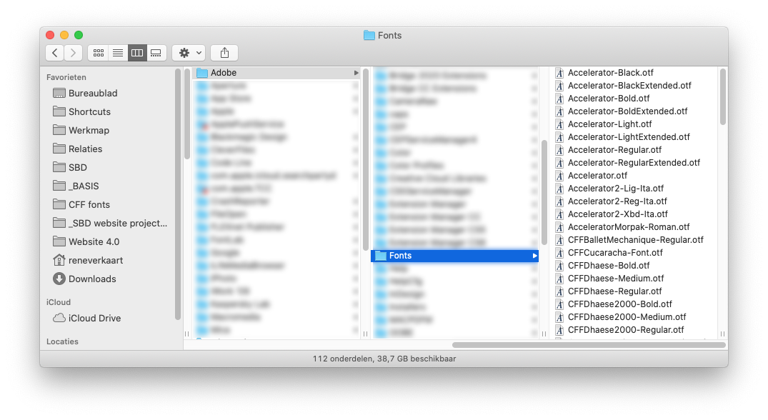
 Hi guys, I'm part of a type design community working with the Glyphs app (https://glyphsapp.com/) or Fontlab (https://www.fontlab.com). This is a huge community and type design is an important part of the design process. There are some real typography rockstars in this space wanting to work with Affinity. We'd love to have a system fonts folder, like Adobe has, to export and test fonts with Affinity apps. Adobe's fonts folder is usually located here: user > library > application support > adobe > fonts This folder allows us to export fonts to this location and prevent Apple font cache issues. Because Adobe directly reads typefaces from this folder there's never an issue and you can export and test fonts unlimited. Whereas if you'd use Apple Fontbook, you'd need to clear font cache all the time, because it's almost impossible to change the same font file a few times in a row without issues. Having a specific folder for the Affinity Suite would help a LOT of type designers out there. I know a lot of people who are switching from Adobe to Affinity, but this is kind of a dealbreaker, because font cache issues are horrible to work with. Would this be possible? @ Type Designers feel free to jump in!
-
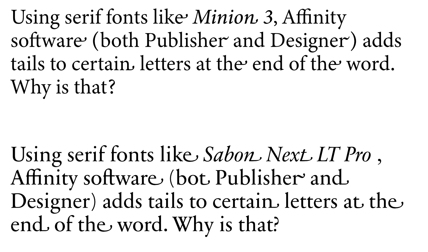
 Using some serif fonts like Sabon Next LT Pro or Minion, Affinity software (bot Publisher and Designer) adds tails to certain letters at the end of the word (see attached file). Why is that and how can I tackle this issue?