Search the Community
Showing results for tags 'dots'.
Found 10 results
-
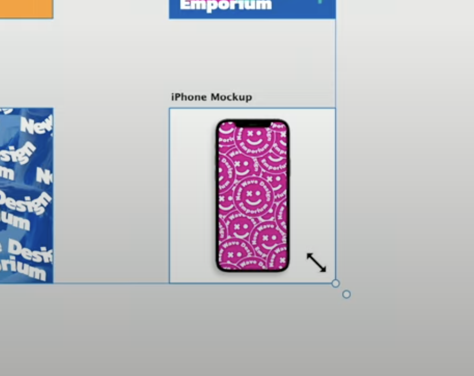
 At 3:59 in this Designer video from Affinity, there are 2 dots in the lower right corner when resizing multiple Artboards. I can't seem to replicate this. Is there any setting not mentioned in video that needs to be enabled? Still frame: Thanks.
-
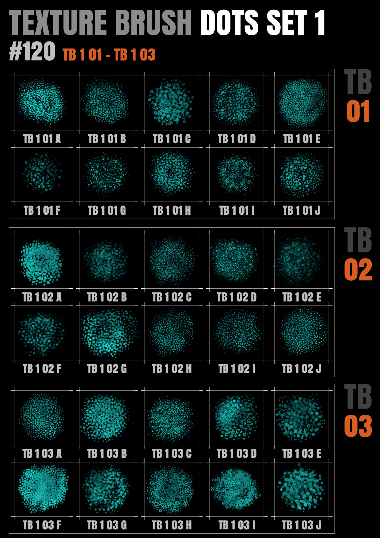
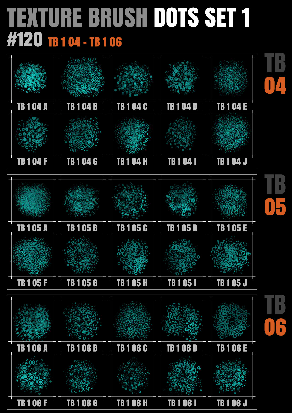
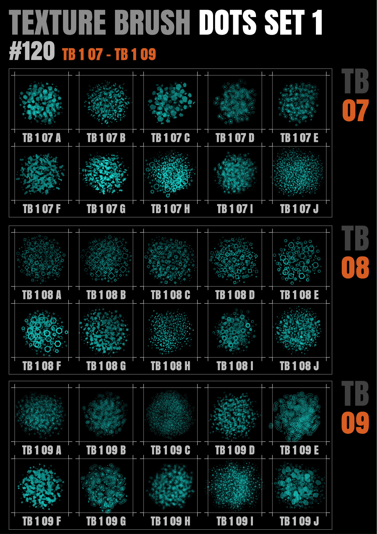
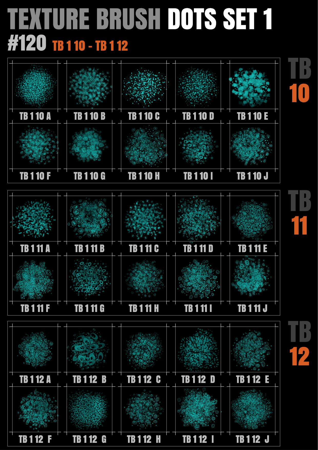
Texture Brush Dots Upload of 120 Texture brushes [Set 1] with sample sheets Changes 1. Modified Dynamics (Flow and Accumulation Jitter mostly...) 2. Assembled into single Zip file 3. Added new set of sample visuals 4. Added A4 sample sheet [PDF] 5. Brush Labels re-named in individual packs to comply with how sets have been organised 6. Removed old sample visuals New Format TB DOTS Sample120.pdf TB DOTS Set 1 P 01 - 12.zip Single Brush Packs (10 brushes per pack) Old versions of TB DOTS set 1 (above) Assembled in one place for convenience Texture Brush Pack 05.zip Texture Brush Pack 06.zip Texture Brush Pack 07.zip TB DOTS-Pack 29.zip TB DOTS-Pack 30.zip TB DOTS-Pack 31.zip TB DOTS-Pack 34.zip TB DOTS-Pack 35.zip TB DOTS-Pack 36.zip TB DOTS Packs 37-39.zip
-
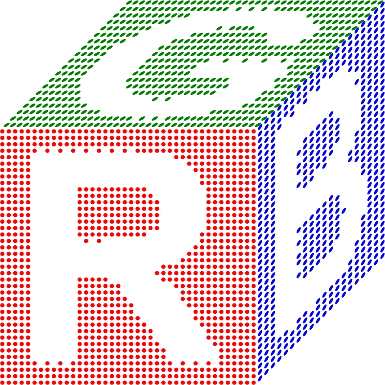
I have been playing with converting black & white images into dots. It is a seemingly complex process but I have managed to automate the hardest step. I start by creating a simple B&W image in Affinity Designer. For example, I then export it to PNG at a small resolution, such as 40x40 pixels. I actually need an ASCII .pbm image, but Designer does not export to those, so I get a PNG instead. Like this, (the forum seems scaling it up unfortunately, in reality this is much smaller). The .pbm image format allows only one of two values for every pixel, 0 if it is a background pixel (so white in our example) and 1 if it is an image pixel (so black in this example). And since it is an easy-to-parse text format, I wrote a simple C program that creates an SVG file with a circle (dot) for every 1, like this, or for every 0 instead, like this, And because the result is plain SVG, I can edit several of them together, distort them, change the colors, etc. Like this, I will probably post the C source code of my program converting .pbm to SVG. It, of course, would be nice if Affinity Designer could do it on its own, but it is still fun doing it this way.
- 7 replies
-
- 5
-

-

-
- dots
- affinity designer
- (and 3 more)
-
 Can anyone help me how to randomize a bunch of object's position and scale for instance i wanna do a starred background with various position rotation and scale. In AI there is transform each command and you can randomize transform applied on objects. Thank you.
 -
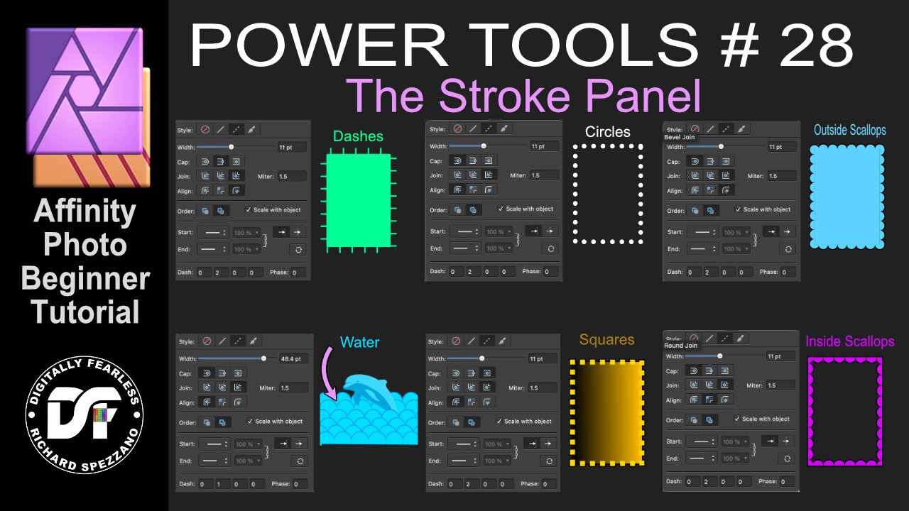
 Affinity Photo beginner tutorial Power Tools 28 Stroke settings panel Affinity Photo beginner tutorial Digitally Fearless Affinity Power Tools 28. You can create many different effects by just changing the settings in the main stroke panel. Combine this with other effects and let your creativity flow. https://youtu.be/GlHVGRMsOgI
-
- 1
-
-
- strokes
- stroke panel
- (and 3 more)
-
I am getting similar issue like but on my Windows PC with a Wacom Intuos Pro.
-
 The features can edit what we need with any size
 -
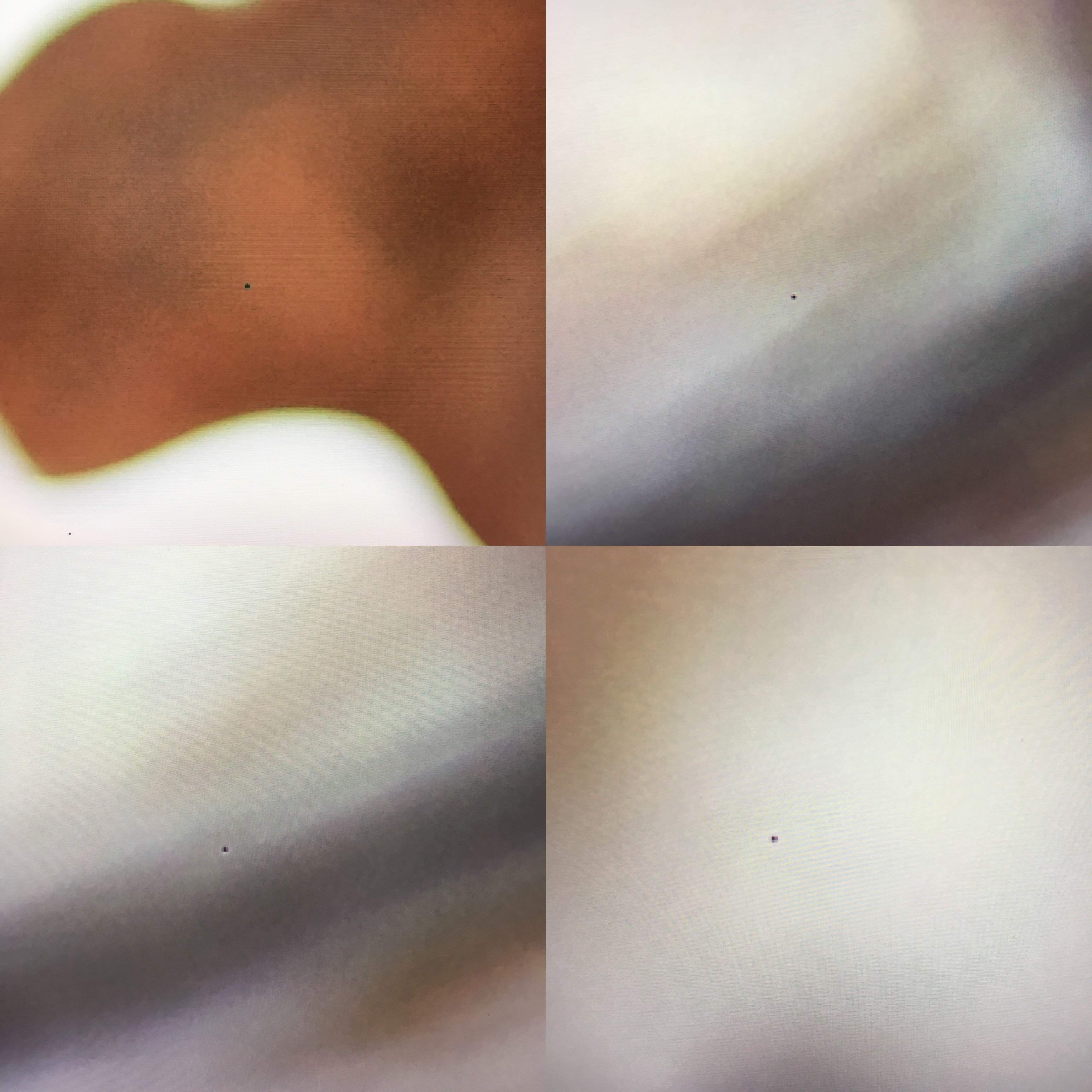
 Hello fellow Affinity iPad users! i just bought the Affinity Photo App for my iPad Pro 9.7“. I already love it! However I encountered one weird problem: There are random tiny dots visible on my imported RAW files (RW2, Panasonic Lumix G7). You can see what I mean in the photo I have uploaded below. Does anyone know where that could come from? As for now it isn‘t that much of a problem as I can remove the dots with the clone tool, however it is quite annoying if you have to edit multiple photos and have to go searching for the little dots first and remove them all first. if you need more information to help me with my problem, just tell me, I‘ll try to be as precise as possible. EDIT: The dots appear only in Affinity, when I import and export the RAWs with another software, there are no dots visible at all. EDIT 2: I have now found out that the dots are so called „Stuck Pixels“. I tried the Pixel Refresh option my camera provides that actually claims to solve stuck Pixel Problems but that didn‘t work - it actually made it worse I believe. I‘m a bit concerned - I have spent my money onAffinity and really want to use it but this makes it pretty much unusable for me... Thank you for every answer! Greets, Sarah (infinabey)
-
 I'm making my letter on Twitter and Facebook "open" because I'd really like to see this addressed. I believe the issue at hand is also more relevant to a "bug", since the correct term is PPI and not DPI. You've responded to this issue in the forums, but I'm considering this topic an error that I feel many users would like corrected. Please consider making this change. Thank you. "Respectfully, I believe ignoring the significant difference between PPI and DPI is a huge mistake, and an irresponsible choice for a company that does what yours does. I understand you feel this is addressed. However, if the vibe I'm getting is correct, then you feel that so many people misuse the term DPI, it's not worth the effort to address questions and concerns if you change it. I think that's lazy. It seems like a couple lines in an FAQ that you could link to would take care of it. As far as professional work and the factor these properties have on the final outcome of your project, I think these differences are way too significant to ignore. If I create a document at 300 PPI, and then print it at 300 DPI and 1200 DPI, the difference is immediately obvious. With the exact same pixel data, the document printed at 1200 DPI is significantly higher quality. If I create a document at 1200 PPI, with 4 times the pixel data, the quality difference between a 300 DPI and 1200 DPI print is also immediately apparent. Again, the 1200 DPI print is far higher in quality, contrast, clarity of detail, color accuracy, and intensity. However, if I look at two images printed at 1200 DPI, one from a 300 PPI file and one from a 1200 PPI file, then the difference is almost completely indiscernible. This is also true printed at 300 DPI. In spite of having 4 times the pixel data in the same amount of space, the difference between the two printed images is almost impossible to discern. However, two images printed at a different DPI from the exact same digital file are *easily* distinguishable from each other. I'm an artist and designer, and I don't personally deal with printing images very often. That said, after 8 years doing this stuff, the difference between DPI and PPI has always been simple and clear, and I don't think there's a legitimate reason to use them interchangeably. Especially given the impact they have on the final outcome is weighted so differently. I've waited a long time for you guys to come to Windows so I could be done with Adobe, and seeing DPI every day instead of PPI won't change that. I just think the responsible thing to do is set an example, use the correct term, and help clarify that there is a difference between the terms. From what I've seen in the forums, a lot of your users also understand the difference, and it also frustrates them. It's a small change, but it could have a big, positive impact. The users frustrated by it no longer have to be frustrated, and all the people that don't understand the difference can start to. Please consider this. Thank you for your time."
 -
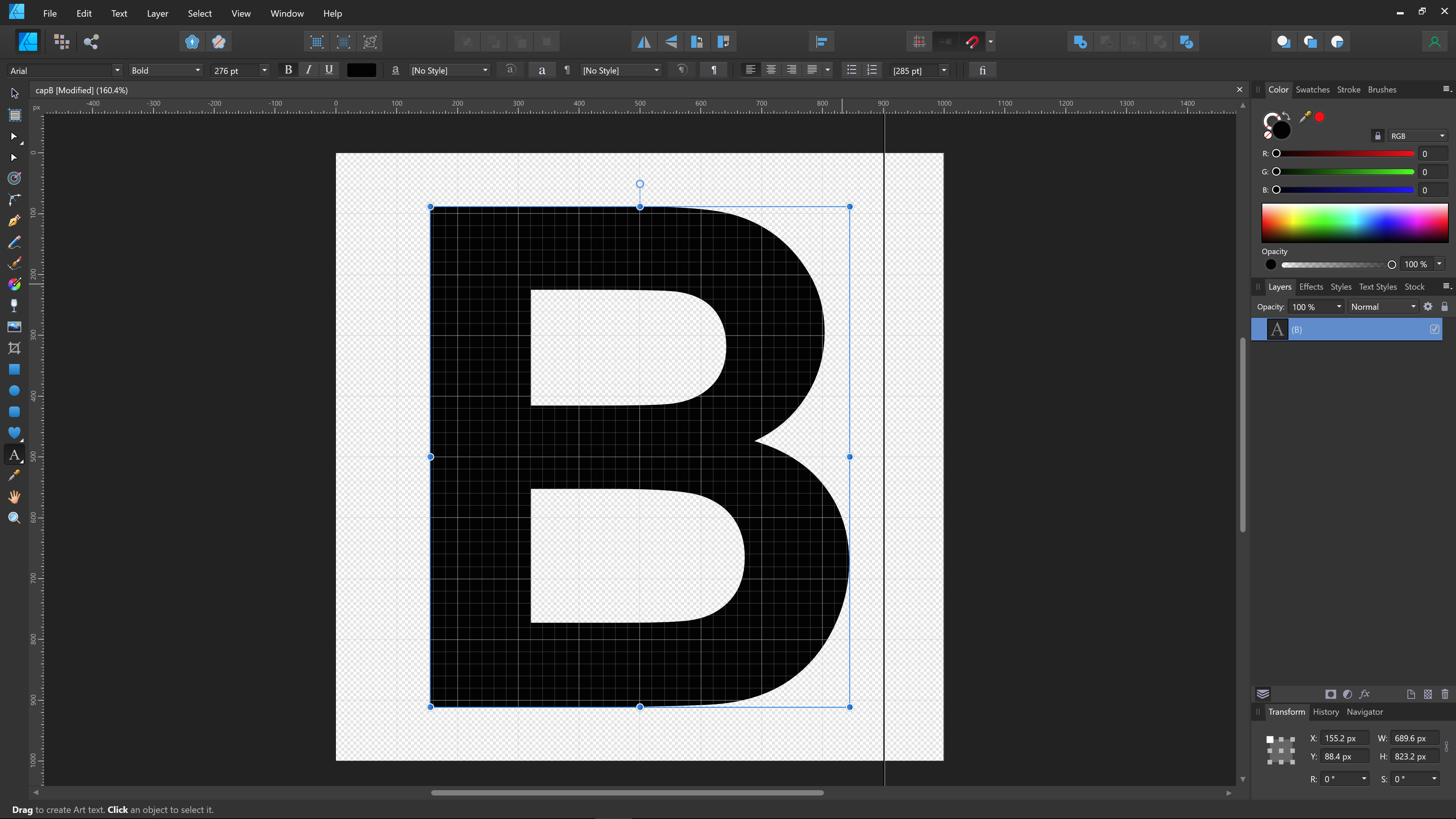
 Hi On attached image You can see some text typed with Arial font. On the left everything is as I want to but on right side, where You can see image exported to PDF, the "L" letters and "." (dot) symbol seems to be bolded somehow. No matter if I converted text to curves, after export to PDF it looks the same. With other fonts everything is OK. greetings Bartek