Mark Oehlschlager
-
Posts
634 -
Joined
-
Last visited
Everything posted by Mark Oehlschlager
-
Why is it that when one applies and adds a Pantone spot color to an object in one's document, that the swatch for the Pantone spot color in the Swatches panel is labeled generically "Global Color X" by default, rather than being labeled by the actual corresponding Pantone spot color number? (See attached screen grab.) If we're wanting to manage inks, including spot inks, within our documents, swatch collections, and files sent to offset print services, shouldn't the Affinity software correctly label color Pantone color swatches by default as they are added to the document Swatches panel?

-
@firstdefence Thank you. That's a very clean and efficient solution.
-
I know that Designer does not currently have a blend function like the one found in Adobe Illustrator, but is there some alternative way of achieving color and shape blends in Designer? See the attached image. How could one go about achieving the contoured color blend along the shadow of the "C" letter form? A linear gradient won't work.
-
I enjoy the new graphic presentation of document sizes in the latest New Document Setup window, however, the text in the feature panels to the right is blurry on my 2012 iMac running OS X High Sierra. See attached screenshot.
-
Currently, the ability to tab through fields in panels such as the Character and Paragraph panels remains broken.
-
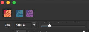
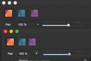
The issue of the unsynchronized Zoom UI in the contextual toolbar remains in this latest beta. See attached screenshot.
-
Perhaps I could purchase a $50 value Apple Store gift card at a Black Friday discount. That might work.
-
Serif Staff, I'm writing to inquire whether or not it is possible for me to purchase Affinity Suite licenses early via the Mac App Store as Xmas gifts for relatives and receive the Black Friday discounts. The obvious complicating factors are purchasing early but not presenting and installing the app gifts until Xmas, and of course associating the licenses with the relative's computer and Mac App Store account. Can I accomplish what I'm trying to achieve, and if so, how? Thank you.
-
@Jesse L You seem angry and emotionally invested in this. Certainly it would be nice to see an auto trace feature built in to Designer, but until it appears, the best course of action for you would be to dismiss Designer as an alternative to your existing tool set and move on.
-
Image Vectorizer from the Mac App Store is a good and inexpensive ($5) autotrace application for 1- or 2-color art.
-
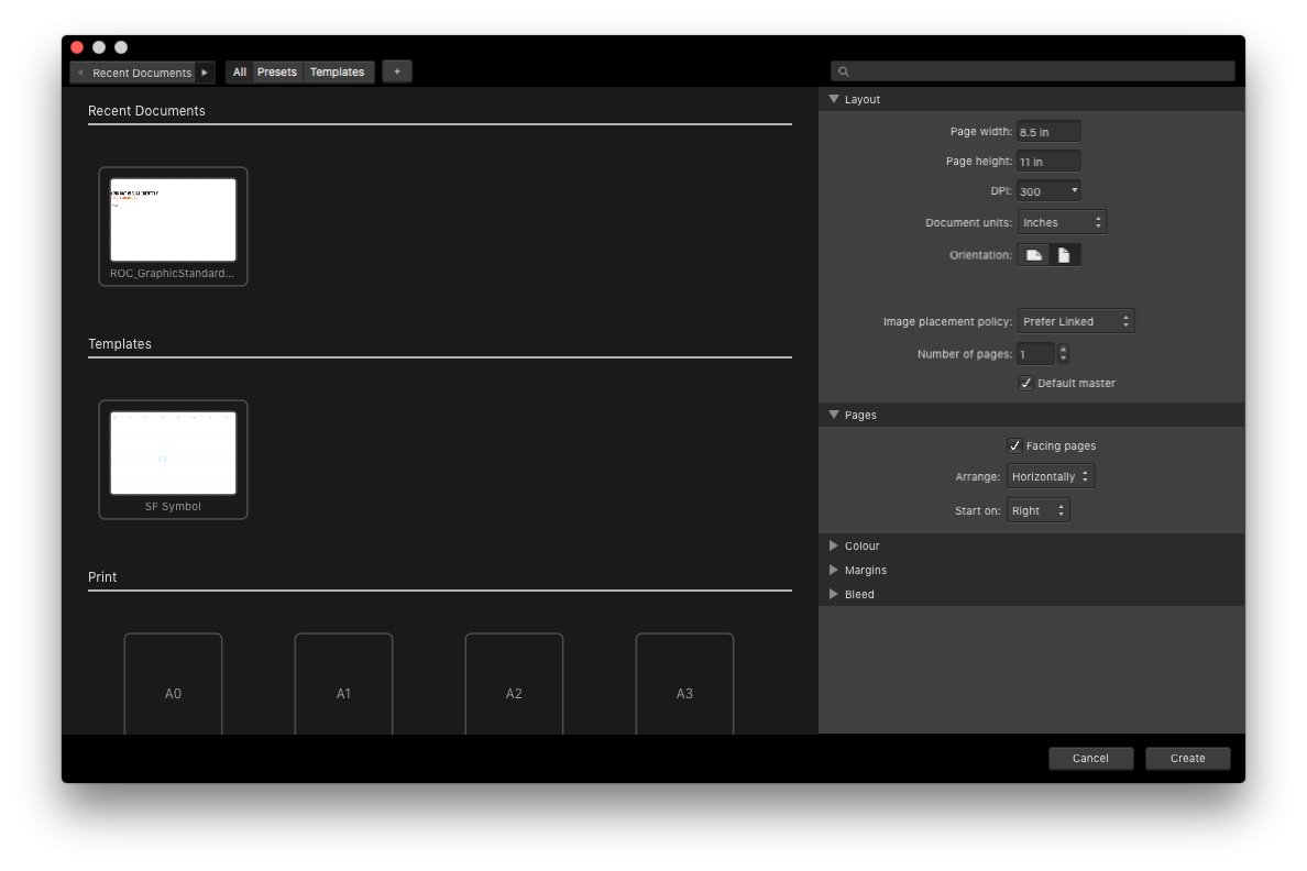
I was please to find that one existing Context Toolbar UI bug for Zoom has been fixed in the latest Publisher Beta. One can now see the entire downward arrow button for the pulldown menu (see first attachment below). However, I discovered a new Context Toolbar UI bug for the Horizontal Zoom Scale. Regardless of what zoom percentage is selected in the pop-up menu, the Horizontal Zoom Scale "needle" fails to move to a corresponding value. (See second attachment below.)
-
I'm not a technologist, but I'm all for common exchange file formats that free users from the tyranny of any one platform. It seems to be less of a technological problem than it is a network effect problem. Too many users (including large institutional users) have been seduced into buying integrated Adobe solutions making them the defacto industry standard, where it is just assumed that collaborative workflows between individuals, agencies, and their clients, will be based on the exchange of proprietary Adobe file formats. That's a tough nut to crack. Who would be in a position to enforce a common exchange file format for desktop publishing applications like Publisher, InDesign and Quark?
-
So great to hear the new Beta will be road-testing an IDML import feature. Should we eventually expect to see an IDML export feature as well so that IDML can be a useful exchange file format?
-
Hmmm. Well, probably not significant. I just thought I'd share that I saw some default Assets in the new Mac Beta. Out of curiosity, what kind of default assets would the original poster find useful?
-
Interestingly, the latest Beta of Publisher includes some asset items associated with their mock product catalog. Perhaps they'll include a useful set of default asset items with the next commercial release.
-
Pattern Swatches
Mark Oehlschlager replied to Designstuff123's topic in Pre-V2 Archive of Affinity on iPad Questions
@Bibi McMurray When you export your raster image Pattern tile, it will need to have sufficient pixel dimensions to account for future anticipated uses. Although, I suppose that if you were to create your Pattern tile artwork as vector art in Designer, and then were to save that as a source file, you then could re-export higher resolution versions at a later date. As I think about it further, you could design many Pattern tile designs as vector art in Designer, and then save each of them to a custom Pattern Tile Assets collection. That would act like a kind of Pattern Tile swatch collection. You could then drag any one of your favorite Pattern tiles out, scale as necessary, then export a new raster tile at the appropriate pixel dimension for your application. -
Pattern Swatches
Mark Oehlschlager replied to Designstuff123's topic in Pre-V2 Archive of Affinity on iPad Questions
Pattern tile swatches are not presently supported. However, there is a workaround: Design your pattern tile artwork and export the tile as a raster file – PNG, TIFF, or JPG. Select the Fill tool, and change the fill type to Bitmap, then navigate to and select your exported Pattern tile image. Set the Extend option to "Wrap" in order to get a repeating pattern. Use the Fill tool to grab the nodes that appear to control the scale and rotation of the repeating pattern tile. -
If you're in Photo, use the non-destructive Perspective live filter. If you're in Designer or Publisher, save and close the file. Reopen in Photo. Apply the non-destructive Perspective live filter. Save and close. Reopen in Designer or Publisher.
- 3 replies
-
- 1
-

-
- embedded document
- tranform
- (and 1 more)
-
@carniphage Does this video help?
-
Stock access to Unsplash is available in Publisher and in Photo, but not Designer.
-
Yes. I'm running Mac OS High Sierra and I'm also seeing the grey line running through the toolbar.
-
@Bob_Sloan What's with the nasty tone? If you have a genuine question because you want to understand and expand your knowledge, just ask politely. In this case, if you want to understand what 5K is, you could look it up on Wikipedia:
-
@Multi4G Olivio, are you on Twitter?
-
Custom light ray brushes are one solution. Another solution would be to draw vector shapes filled with White-to-Transparent gradients; set to Overlay or Soft Light blend modes; possibly reduced opacity; and finally with Gaussian Blur layer fx.
-
Just to refine and correct my statement above on Rendering Intents for conversion, here is what I find in the book, "Real World Color Management" by Bruce Fraser, et. al. : Perceptual tries to preserve the overall color appearance by changing all the colors in the source space so that they fit inside the destination space while preserving the overall color relationships, because our eyes are much more sensitive to the relationships between colors than they are to absolute color values. It's a good choice for images that contain significant out-of-gamut colors. Saturation just tries to produce vivid colors, without concerning itself with accuracy, by converting saturated colors in the source to saturated colors in the destination. It's good for pie charts and other business graphics, or for elevation maps where saturation differences in greens, browns, or blues show different altitudes or depths, but it's typically less useful when the goal is accurate color reproduction. Relative Colorimetric takes account of the fact that our eyes always adapt to the white of the medium we're viewing. It maps white in the source to white in the destination, so that white on output is the white of the paper rather than the white of source space. It then reproduces all the in-gamut colors exactly, and clips out-of-gamut colors to the closest reproducible hue. It's often a better choice for images than perceptual since it preserves more of the original colors. Absolute Colorimetric differs from relative colorimetric in that it doesn't map source white to destination white. Absolute colorimetric rendering from a source with a bluish white to a destination with yellowish-white paper puts cyan ink in the white areas to simulate the white of the original. Absolute colorimetric is designed mainly for proofing, where the goal is to simulate the output of one printer (including its white point) on a second device.