garrettm30
-
Posts
1,616 -
Joined
-
Last visited
Everything posted by garrettm30
-
 That makes it seem all the more an oversight. I wonder if this should be brought up as a bug: it is in Designer mode in Publisher and Affinity Designer on iPad, but not Affinity Designer on Desktop.
 -
I was surprised to find this is still an issue, because I thought it has been added to Designer for a long time. I had to specifically launch Designer to find out that it is still not there, because it is in the Designer mode of Publisher. When in Designer mode of Publisher, the menus change to the Designer menus, and you can find it right there in the View menu. But it is missing from actual Designer. I wonder if it was an oversight, since the menus of Publisher when in Desinger and Photo mode are supposed to match Affinity Designer and Affinity Photo, so it is odd and kind of misleading for there to be a Designer option that Affinity Designer actually does not have.
-
The default Mac behavior for full-screen apps is, unfortunately, to move the app out of full screen when the escape key is pressed. Presumably because of how often the escape is useful in Affinity apps, that default behavior has been deliberately blocked in most circumstances. In a thread started back in 2015, Serif staff member MattP explained, “I can keep hammering the escape key and it never leaves full screen,” and a few posts later made clear that this was by design (bold emphasis is mine): However, occasionally Affinity apps do exit full-screen mode with escape, and this seemingly random behavior has bugged me for a few years without my being able to determine how to trigger it. Finally, I found out that it will reliably exit full screen when escape is pressed any time a text input has focus, such as the horizontal scale input in the Character panel (Position & Transform section). In fact, the original thread I quoted from above was started because of this behavior, and after several backs and forth, the OP @eejits finally found a recipe (pressing escape while the opacity input in the Layers panel has focus). Once a recipe was finally identified, MattP said: However, we never got any followup, maybe because it is such an old post buried in the pre-V2 questions archive. My post is to request that that this issue finally be “fixed.” I am very tempted to post this as a bug, except I hesitate only because this is default Mac behavior. However, as Serif has chosen to deliberately prevent this behavior in most cases, this is at least an inconsistency worth considering. In the current form, I often end up accidentally leaving full screen multiple times a day if I accidentally hit escape too many times. And currently there is no way to remove focus from a text input by keyboard, except to move focus to another input by tab, which is no better. The only way is to remove focus seems to be to click out, but you have to be really careful where you “click out,” because that click action usually also does something else, like moving the insertion point or deselecting the selected text or object. I have discovered that I can click on certain UI dead spaces, such as the empty space in the Pages panel. But it is not the most intuitive, when escape is what decades of experience have taught us to use for such cases.
-
I liked that the two superscript options (faked superscripts in Position & Transform and font-supported superscripts in Typography) were formerly close to each other. I also use the Typography section much more often than Language (which I do use some) and Optical Alignment (which I never, ever use as a local override; only occasionally as a text style). This change does not overly hurt my feelings, but it does seem like a step backward, though a very minor one in my opinion.
-
Variable fonts with inheritance from parent styles
garrettm30 replied to garrettm30's topic in V2 Bugs found on macOS
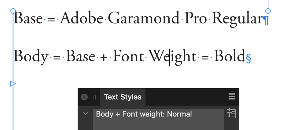
That is interesting, and I am not sure what to make of it. As a sanity check, I did redownload the file I uploaded to confirm I had not mistakenly uploaded a file that was not as I said, but no, it shows no overrides on my end. I have a hunch that it might have something to do with different versions of Adobe Garamond Pro, but I don't actually know how it could cause the problem. Clearly, there is some issue with these local overrides popping up. That aside, I wonder if you take your own document and then apply Text->Reapply Text Styles to the appropriate text, does that at least allow the font-weight as a text style attribute to work for you. I refer to your original statement here: Also, can you be sure you do not also have both a non-variable and variable version of Adobe Garamond Pro loaded? I have had issues with Publisher getting mixed up in such cases. -
When I was looking at the “style settings” readout in the “Edit Text Styles” dialog for the default character style Strong, I noticed several EPUB attributes: However, I can’t find anywhere in the Edit Text Styles dialog where these attributes may be controlled. My expectation would be that anything in that readout should be able to be controlled in the Edit Text Styles dialog. Or have I just missed it? Or is this an accidental inclusion for a feature not yet available? Because I am not aware of how to export as EPUB. Publisher 2.6.0, on Intel macOS 15.3.1

-
Variable fonts with inheritance from parent styles
garrettm30 replied to garrettm30's topic in V2 Bugs found on macOS
In the test file you sent, for some reason you have a local font-weight override that cancels the font-weight value of the paragraph styles: If I select all, clear overrides (Text->Reapply Text Styles), then it works as expected. Just a guess, but I suspect you did not intend to apply a font-weight override, but it quite possibly came if you had previously used a variable font on that text. Here is your file back with that one change. test-without-overrides.afpub Another way to demonstrate this bug is simple: try to apply the default "Strong" character style to text with a variable font. Nothing happens. Here is a video demonstration where I go into more detail in case anyone cares. character-styles-variable-fonts.mp4
-
Variable fonts with inheritance from parent styles
garrettm30 replied to garrettm30's topic in V2 Bugs found on macOS
It looks like you are thinking of something else. If I have followed what you are saying, you had to explicitly define the font family again in the child style and pick a font style. What should happen (following what works in regular, i.e. non variable, fonts) is that you set the font family in the parent, and in the child style, only alter the font weight without changing the font family or font style at all. If I understand, this is what you defined: Base: Font Family: Roboto Flex Font Style: Regular Heading 1: Parent: Base Font Family: Roboto Flex Font Style: Extra Light This is what should be possible, and indeed is how it works with non-variable fonts, but it does not work with variable fonts: Base: Font Family: Roboto Flex Font Style: Regular Heading 1: Parent: Base Font Weight: Extra Light The weakness with the approach of needing to redefine font family for every child style is that any change of font must again be changed for every style, rather than one change up the hierarchy that cascades downward. This includes character styles. In that case, I end up not only redefining font family but also needing to multiply character styles. I explain it in my video at the beginning, but no worries if you don't have to time to watch it—brevity is not my skill. It has been logged as a bug already, so now we just have the wait of typically unknown duration to endure. -
To add to that, it was also possible on Intel Mac in the first 2.6 betas, but it was removed part way through the beta cycle. It is not clear why it originally worked on Intel but now cannot. Presumably, something needed fixing or some improvement was made to the feature that could not easily be made to work on Intel with the tools they had available.
-
The issue of font weight not being respected for text styles with variable fonts is what I was trying to report in my thread on the subject, and it is the main difficulty I have with using variable fonts in Publisher. The bug tag AF-3268 was assigned to that issue, and I think AF-4280 is a duplicate. It is still not fixed in 2.6. I would love for this bug to get attention.
- 14 replies
-
- 2
-

-
- styles
- variable fonts
- (and 1 more)
-
That is an interesting hint. Am I wrong to infer that third-party plugins of various kinds will become a possibility?
-
Word count treats en and em dashes as hyphens
garrettm30 replied to MikeTO's topic in V2 Bugs found on macOS
Now beta 2861 is back to treating words joined by dashes as single words—back to the original problem. We may have different preferences on how to count hyphens, but I think we all agree that dashes should not cause the words on either side to be counted as a single word. In beta 2861, we have the curious behavior that word count of the same sentence will vary depending on whether the British or American convention of dashes for parenthetical expressions is chosen: The soldiers – well, most of them – defected and joined the rebels. (Publisher b2861 counts 13 words) The soldiers—well, most of them—defected and joined the rebels. (Publisher b2861 counts 9 words) (Example sentence taken from the Antidote style guide.) -
And we did use the feature on Intel Mac in the previous beta, so it should be technically possible. I suspect there is some technical compatibility issue with the library they are using, probably holding them back regarding where they want to go or how it works in certain circumstances, but it is not clear what.
-
For one long document, I have been pinning reference notes off canvas to body text. Every time I pin a new note object, I have to reset the offset. I have prepared a basic document to reproduce the issue. The recipe is simple: just unpin and pin the off-canvas object in the attached document over and over and watch its position move farther to the right. Off-Canvas Pinned Object Creep.afpub off-canvas pinned object creep.mp4 That is the simplest way to demonstrate, but what I am actually doing is adding multiple notes. Every time I deselect a pinned object, the rolling default changes, so when I pin the next note, it is farther away, and so forth. Here is another simple demonstration to show roughy the kind of behavior I encounter when I use multiple notes. off-canvas pinned object creep 2.mov Publisher 2.5.5 on macOS 14.6.1
-
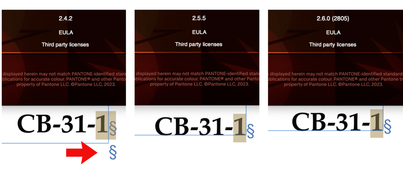
In the current Publisher 2.5.5 as well as the 2.6.0 beta (2805), the word count area has cut off text descenders when the UI font is large. In English, “words” has no descenders to show the problem, but “paragraphs” does: I notice that the text to the right, “Drag to marquee select…,” also has descenders and appears to be the same size, yet their descenders are not cut off. It seems to be an issue of vertical alignment: the word count text seems to be aligned a few pixels lower. Reporting from macOS 14.6.1
-
This bug may have already been solved before this current beta. Whenever I confirm a fix of an issue I reported, I always first check to see if I can still reproduce the issue as I originally reported. This time, I could not reproduce the issue in the current Publisher 2.5.5. I was only able to reproduce the issue when I restored from backup the version of Publisher I was using at the time of the report. In any case, it does appear the issue is fixed, both in the current version and in the 2.6 beta.
-
Meanwhile, my third suggestion of using the Fields panel, which I judged “hacky” back then, is not so bad now, since we can now create custom fields. Which option you might choose depends on the needs of the design. The Fields panel option works well if it is text that needs to be defined once and used multiple times as text, but where the format of the text can vary according to its current use. Symbols work for text as an object that stays the same but can be positioned in multiple places. Master pages work well as fixed page layout elements. A variation on the idea of using the Fields panel is to use a “running header,” which you might not have thought of because of the name. What Publisher calls “Running Header” in the Fields panel actually has a much broader use than simply running headers. It is basically a dynamic text variable. If the text you want to define changes throughout the document, then this might be what you want.
-
I am writing to confirm that the descender cutoff issue in Publisher 2.6.0 beta (2805) is resolved.
-
The Affinity Publisher copy appears to apply half-toning, like it is not full black, whereas the color of the text must be full black in the Pages document. I do not know whether that is the only issue, but I would start there. Try to get true black in Affinity for a like-for-like comparison. Also be aware of issues of printing a CMYK document on a home printer. Full CMYK black converts to dark gray in the RGB space that a lot of home printers work from. That being said, I do remember having some experiences of printing directly from Publisher. I do not remember the details at present, but I do remember having better luck by exporting to PDF and then printing the PDF, so there may be something more to it.
-
It seems this particular need could be solved if “GREP styles,” a rather common feature request, were ever implemented. In that case, it would still use custom character styles like Mike suggested, but it would be implicit in the paragraph style rather than manually applied.
-
Affinity Suite: Preflight Check
garrettm30 replied to Pyanepsion's topic in Feedback for the Affinity V2 Suite of Products
I would welcome that. Sometimes I have the problem where an issue is on a master page rather than a real page. For example, in one of my documents, my master page has a text frame that uses a text field: “Leçon <Running Header>,” and the placeholder overflows the frame. This becomes, for example, “Leçon 12” on an actual page, which has no trouble fitting the space. Since I never export a master page, this suggestion could help avoid that. -
That is generally true, but not always. For example, the first beta to 2.0.0 came with this official recommendation (emphasis in original, source😞 I think I have seen that a few times (I’m not sure of it), but it would mostly be true only of the sub-point updates. To best be sure, watch the official recommendation for the specific beta in question. ------------- Although I must preface what I am about to say that it may not be advised, I do want to clarify that it is not strictly true that documents saved in betas cannot be opened with previous stable versions. In my experience, there is usually (if you want to chance it) compatibility between the sub-point updates. For example, the current release Publisher 2.5.3 can open a document saved by beta 2.5.5. [Side note: I had to double-check on those numbers since it looks like 2.5.4 is missing.] I would say that the definitive answer is the big warning that comes up when you try to open a document from a release version in a beta: ------------- Ah, there’s the rub. I often open up a beta and try a few things for a few minutes, but I keep my main work on the release versions. And, yes, it does result in bugs that I could have caught in beta that instead I catch when I start doing real work. For example, a real variable fonts showstopper issue (for me) that I only discovered as soon as variable fonts hit release, leading to the comment: It’s a catch-22 situation, and I don’t have an answer for it. If I am about to work on a document that does not matter too much, then often I will try it in a beta just to have an opportunity to catch something, but how often does that really happen?
-
Paint Brush Tool works with mouse, not drawing tablet
garrettm30 replied to Nick B.'s topic in V2 Bugs found on macOS
I kept pursuing this, and now I can report back that I now have the tablet functioning with pressure sensitivity in Affinity. It had to do with getting the driver properly configured, so the problem had nothing to do with Affinity. Pressure also hadn’t been working even in the Huion-supplied “PenPressureTest” app. @Nick B. I don’t know if what I did could work for you, since your tablet uses a newer driver than mine and your OS is older than mine (I am on macOS 14.5 Sonoma). I ended up uninstalling everything and then tried to follow as nearly as possible the installation instructions at the Huion support site. They didn’t match my OS, but they did point me in the right direction. For me, I think it was that I probably not have the macOS security settings configured to allow the necessary helper app. These are the places in the System Settings (for you, System Preferences) that need to be active. Login Items -> Shenzhen Huion Animation Technology Privacy & Security -> Input Monitoring -> TabletDriver Privacy & Security -> Accessibility -> TabletDriver For me, I found it helpful to test pressure with the included PenPressureTest app inside the HuionDriver folder in the Applications folder, just to remove Affinity from the equation until I could be sure that the tablet itself is working properly with pressure. Once I did that, I had no trouble going back to Affinity and activating pressure. -
Word count treats en and em dashes as hyphens
garrettm30 replied to MikeTO's topic in V2 Bugs found on macOS
I am unaware of a style guide that uses en dash instead of hyphen in that case, but I don’t do my official proofreading in English, so I wouldn’t be surprised if you could find one. But I would tend to agree with Grammarly, as “well-used” in that case would be an example of a syntactic hyphen, where together the words act as a modifier, such as adjectivally, on another word. My style guide in Antidote explains it this way: Just for fun: in French, there are occasions where compound words can have both a hyphen and an en dash. These would be in a “nom propre surcomposé,” which I guess would be double compound proper nouns. This is a compound word where one of the elements itself is already a compound. For example, I studied French in the Saguenay–Lac-Saint-Jean region of Québec, which is a region around the Saint-Jean Lake and the Saguenay River that flows from it. Proper French typography is to use a dash between the two separate elements. ----- Back to the subject at hand, I don’t have a strong preference, but I would treat both hyphenated words and words separated by dashes as more than one word for the purposes of word count, because I would not normally be concerned with grammatical function of the words but rather copy length when needing a word count. Either way you slice it, it would get messy to try to get Affinity to get an accurate count of grammatical words that takes compounds into account, because English has many open compound words (high school, test tube, party dress, circuit panel, coat hanger) in addition to hyphenated compounds (fortune-teller, father-in-law, laid-back) and closed compounds (firefighter, cheesecake, healthcare). Then there is the difficulty of distinguishing, for example, between the proper noun “White House” and the common noun with an adjective “white house”; grammatically, the former is a compound word and the latter is two words. -
Paint Brush Tool works with mouse, not drawing tablet
garrettm30 replied to Nick B.'s topic in V2 Bugs found on macOS
Just out of curiosity, when you tried it with other apps, did you find that pressure sensitivity does work?