

Dazzler
-
Posts
218 -
Joined
-
Last visited
Posts posted by Dazzler
-
-
10 minutes ago, Sean P said:
Hi Alphacolor,
This is a result of anti-aliasing on the shapes causing a very slight bit of bleed from the shape below. You can modify the Coverage Map in the Blend Options dialog to remove this bleed.Aaah so that's what the coverage map does! I did play with that a few times and wondered what it did, but couldn't see anything happening - now I know
") .
.
-
If you use the layers panel you notice you can expand your picture frame layer. Do this and select the image layer within. Once you have the image selected you can use the move tool to select the side center handle and pull it out to stretch it sideways, or select the center top handle to pull it out heightways. It should stretch nicely, holding down CTRL whilst you drag will do it in opposite directions at the same time.
-
I just realised you can draw it out from the previous slice if you deselect the previous slice first - it's just the transform handles that are getting in the way. It will snap to the position and the height in this way, leaving you to just set the width. In photo this time!
@R C-R Yes of course you'd need to use some maths to get the width if you wanted to split the entire picture into equal segments. I was more referring to the positioning not the width. Even without the width snap it's going to be easier to use the snapping to position the slices rather than typing the calc into the x position. So the workflow would be to work out the desired width by dividing the picture width by number of slices (or whatever method - maybe you have a desired slice width instead), then draw the first slice and set it's height and width the the required settings, then deselect the first slice, draw a new slice out from the top right corner of the first slice, until it snaps at the correct height, set the width, then deselect and repeat with the subsequent slices, setting the width each time. Not too bad, but much easier to do in Designer with it's better snapping to width feature. -
1 hour ago, R C-R said:
How do you determine the width of the slices if not by using math of some sort? That was the only way I could figure out how to get all the slices to have equal widths, or for that matter to know how many slices were needed.
I could not get that to work. Not only was there no snap point for the same width for the next slice, I could not find any way to start dragging it out from the edge or corner of the previous slice -- all that would do is resize that slice.
Basically, snapping was useful only for setting heights & for moving slices next to each other once they were correctly sized.
You have to create the new slice to the right because as you say it doesn't like drawing it from the previous slice corner. You can then drag it back and snap it into place on the end of the previous slice.
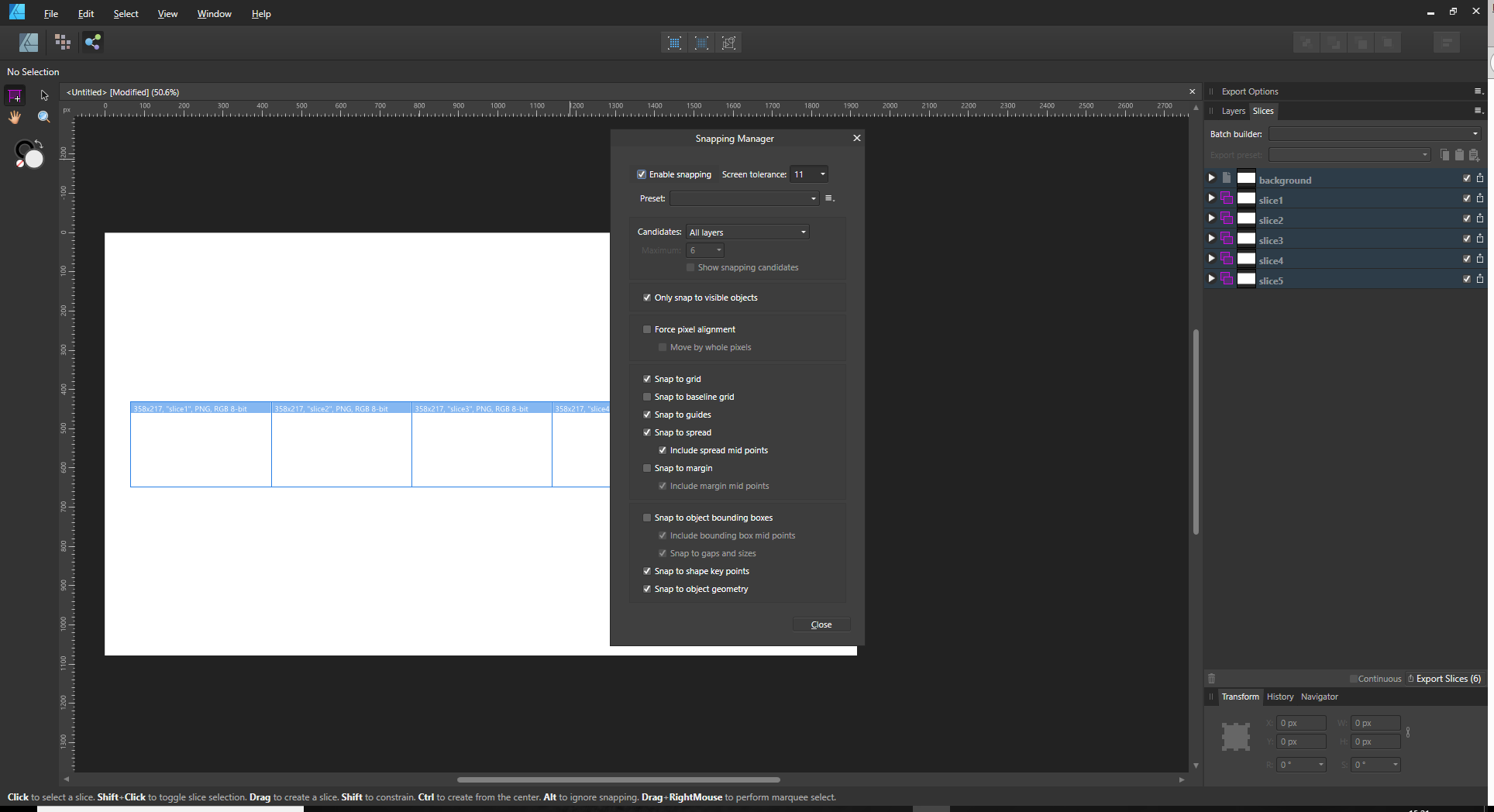
I have just realised that I was in Designer, not Photo, and weirdly that behaviour is not consistent between the two (I wonder why?) so the width snap doesn't seem to work in Photo, but works fine in Designer. Apologies for that confusion!Here are my snapping settings in Designer - for what it's worth.
-
25 minutes ago, R C-R said:
There may be some better way to do this but all I could think of is to manually create slices of the desired height, width, & position in the Export persona. This would be a lot simpler if there was a way to duplicate & reposition slices (like by alt-dragging on one with the Slice Tool) but I could not figure out how to do that.
What I had to do instead was create the first slice, snap it to the left edge & height of the pano, & then set its width in the Transform panel to the desired width (like 1080 px). The other slices were created the same way, except that I had to set each of their left edge x coordinates to the appropriate value -- like 1080+1 px, (1080*2)+1 px, & so on -- in the Transform panel.
This works but is far from ideal.
I would do the same, although I don't think it's that necessary to position them using maths like that, you can simply drag them together and they'll snap nicely next to each other. Also once you've set the width on the first slice, you should be able to drag create the others and as you do so there will be a snap point at the same width as the previous slice, so you can very quickly just drag create the rest of them. It's fairly swift that way, you just need to keep an eye on the snapping.
-
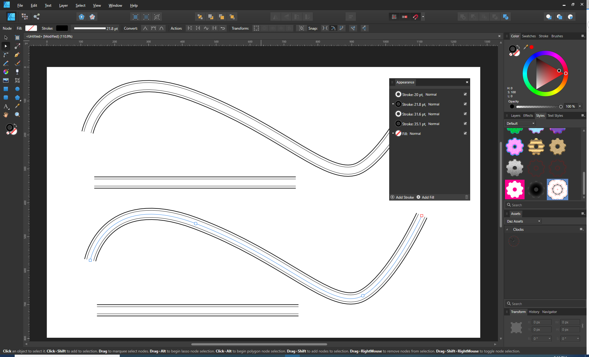
@michacassola
The pie tool can be used to create a segment of a doughnut like that. The inner orange handle pulls the centre out to create the ring whilst the other one decides the angle. Then you can create many and use the point transform tool to connect them as you've said. Just remember when you are connecting them to move the pivot point onto one of the end points first, then move it into place (all this using the point transform tool), then once it's snapped the the corresponding point on then end, rotate it to make it connect properly. Everything should snap quite nicely
-
I think I've just found my problem. I have a character style applied to the bullet to get a coloured bullet, and that is making the font size of the bullet bigger than the text, which has another character style, making it sit high.
I think I was trying to get a larger bullet size as well as colour, but I'd got confused in there somewhere and ended up with the same baseline settings applying to both the bullet and the line of text, meaning when I changed the bullet font size it sat high, but adjusting the baseline was affecting both the bullet and the text, stopping me from aligning it. I realise now that it's possible to have a separate character style on the bullet and the text itself, making alignment possible with the baseline setting.
-
Hi Lovely Affinity people!
Does anyone know if there's a way to correct an alignment issue on a bullet list. The text is sitting slightly lower than the bullet in my bulleted list. Is there anywhere to adjust this (either with a baseline setting that doesn't affect both bulet and text at the same time, or whatever)? I can't seem to find anything. Or am I going to have to create the bullets as a graphic and place them separately?
Cheers,Darren
-
Document > Rotate 90` clockwise
or
Document > Rotate 90` counter-clockwise
Should do the whole lot at once, unless you have some that are landscape and some portrait of course. -
I've just tried this too ... copied a curve from Illustrator CS4, pasted into Publisher, selected the curve layer then used the text tool to get text on a curve. It's backwards - just as Lozza reports. Reversing the curve or text just puts it on the other side of the line, but the letters are still flipped backwards (mirrored). It's as if there's a horizontal flip on the letters themselves - I certainly can't find a way to rectify this, short of recreating the line in Publisher, or flipping the whole object then adjusting the curve. I'd say it was a bug.
-
4 minutes ago, v_kyr said:
The OP uses Publisher, which doesn‘t have these appearance features.
Oops, sorry about that
... just ignore me. I might learn to read one day!
-
You may also be able to use the existing flare you originally had by clicking the cog in the layers panel with the lens flare layer selected, then on the graph for source layer ranges you can drag down the left hand side to make the darker areas become transparent. You can even add a curve here if you untick the linear box underneath, and you can also slide the right handle across the bottom to the right a bit to really make it more transparent. Just keep a careful eye on the flare though as you may very well make it look bad or really weak if you are too heavy with the curve/line. However, if it gets too weak you may be able to duplicate the layer to increase the strength back up.
It may work to some extent, but as others have said, it may be better to use a flare file that covers your area completely without the flare being too big. -
There's a another technique, possibly more involved but it gives good results. Doesn't work with every image, but in this case it works well.
Duplicate the background image so you have a copy of it on layers on the white background.
With that layer use filters > colors > erase white paper
This will remove all the white in the image (including the centre piece which you don't want, so we'll fix that next)Back on the background layer make a rectangular selection just inside the red outline (and completely clear of the corners), so it includes the text and play button. Now press ctrl + j to put that selection on it's own layer. This fills in the missing white bits in the centre region but doesn't add the white back into the corners.
Turn off the background layer leaving just the transparent layer and the layer you selected from the background.
Export as PNG, and you'll get a lovely clean semi transparent edge.
-
I can't find a setting for this either.
CTRL + 1 is a quick keyboard shortcut for showing at 100%. -
Ignore the second image ... I couldn't seem to delete it from the post. I realised it wasn't showing the appearance settings!
-
-
You can also do something similar by using mutliple strokes feature, but it relies on you not having transparency inbetween the lines, so depending on the job may not be suitable. Using the appearance panel you start with a thick black outline (thick enough to touch the outside edges of the two outer lines, then add another stroke which you make the background colour and slightly less thick than the first stroke (to make the outer lines the thickness you want them), then stack another black outline with a thickness less than the previous stroke, and then add another stroke with background colour to form the second set of lines. You can of course continue to add strokes in this way to make more lines, and you can also add dotted lines etc for creative effects.
Using this technique you can bend the line easily and it all goes with it.
You may have to choose the capping settings carefully to ensure you don't get lines on the sides where you don't want them.
You can also change the colours of the lines at a later stage easily enough too. -
Ok, just updated to the latest version 1.7.2, and it's back to normal again
-
37 minutes ago, Palatino said:
Sorry, correction: first new with check mark, then remove check mark.
Nope, no matter what I do I'm only getting one master appear! I can create new masters but I don't get them upon a new document anymore. I've tried checking, unchecking, new document, more checking, existing document more checking/unchecking, nothing seems to bring me back the Master B by default apart from me adding it in manually. Oh well, it's of little consequence anyway, I can just add one in if I need it.
-
Just now, Palatino said:
Yes. If you uncheck the box, two master pages will appear.
Not in my case ... but I'm pretty sure when I first used publisher it had the two masters, so I'm pretty sure I've changed some preference somewhere!
-
1 hour ago, Palatino said:
That's right. Unless you click here:
That's the 'facing pages' tickbox right? Even with that ticked I only get a single master created on a new document ...maybe I've changed something somewhere else tthat has remembered my setting.
-
Odd, I only get one when I open a new document. But the masters are basically used to put items onto (such as headers/footers with page numbers etc), that are then applied to pages that use that master (pages can have several masters applied to them). What this means is you can change the master later and pages that have that master will be updated to match. You can define multiple master pages and master pages can have master pages within them, so it's a very flexible setup.
-
That's actually a very good question and one I often ask myself ... what is the correct way to remove those annoying bright areas in the background? You can use curves / levels and all that but ultimately this tends to give you a 'just as disgusting' grey area instead of a white one, which rarely looks good. The inpainting tool may well be the best solution, but it does very much depend on the image. You can use gradients placed subtly over the top where the colours have been picked from areas around the bright area - that may work. Sometimes painting the areas back in with a brush can work but that obviously requires some painting talent. If you do use gradients / painting of new colours into the space then it's normally a good idea to add a subtle amount of noise into the new painted areas, so they match the original picture better.
Sometimes you can hide them by using additional pictures and bringing background details from those into the scene (either by placing the images and then masking, or by using the mutliple sources with the clone tool).
Ultimately, and I'm presuming we're talking about photography here, the best method is to take a better picture in the first place without the distracting background. Whilst it's possible to fix things like this, it's sometimes easier/quicker to just go and grab another shot where you pay a bit more attention to the background content and the exposure. Not always viable of course, depending on the nature of the shot, but worth bearing in mind. Doing this also makes you a better photographer as over time you'll develop an instinctual 'eye' for these sort of distracting things. -
I have all three products, and that's a fairly broad question to answer, but in general Publisher is just more geared up for producing final products, such as perhaps a book or PDF where you need things like master pages, and page numbering, and general laying out of pages, whereas the other products are more geared to creating the individual assets used in the final publication. Think of Publisher as the master station where all the other assets come together and form the final finished thing. The studio link is very cool, enabling switching between three personas (roughly the three products, but not in their entirety). Things like wrapping text around images, flowing text between multi column designs become very easy in Publisher.


Detail refinement
in Pre-V2 Archive of Desktop Questions (macOS and Windows)
Posted
I just did a quick test on Photo 1.7.2.471 (Windows) and my detail refinement stays put when I develop, however I don't have any RAW files here to test it on, only jpegs, if that makes any difference?