Yaco
-
Posts
28 -
Joined
-
Last visited
Everything posted by Yaco
-
I know, this is like Designer not being able to export vectors reliably. My workaround is to export a flattened pdf, but then everything gets rasterized which is really not what you want with something like Publisher.
-
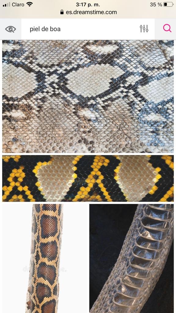
 Hi all! Do you know of a good, ideally free or inexpensive filter that can be used to turn a textured image, for example of snake skin, into a BW that children can color in? This is for a friend who has a social project for children, so time and money are limited, but we do think a photo filter is quicker and cheaper than commissioning an illustration. Attached is a sample of the kind of images she shared. Thanks !!
-
Has anyone had luck with this issue? Publisher is great to work with but this exporting issue is definitely a pain-point.
-
Hi, in Affinity Publisher, when I export the document to PDF, text is displaying as gibberish (see attached screenshot). The font is a standard Google font (Lato) , so there should be no licensing issues. What might be causing this, is there a way around it? Thanks!
-
I agree with this, and Wickster's example illustrates the issue perfectly. Aligning, centering, and simply looking at the selected items is simply better with a bounding box that fits the objects snuggly. It's definitely not something that comes up often but it makes a difference when it does. I really like the cycling button, if it oculd be sticky it'd make workflows more agile. if an improvement request can be made, that would be awesome @Chris B ! Cheers all
-
Color Swapping / Cycling
Yaco replied to Yaco's topic in Feedback for the V1 Affinity Suite of Products
Thanks all! @Aammppaa you're right, the actual feature suggestion is to be able to color swap between objects, however there's no question. Sorry if the explanation wasn't clear. To rephrase: It'd be useful and time-saving to be able to swap colors between objects. For example you select Graphic A + Graphic B » swap color tool » Graphic A + Graphic B I mention the existing fill-stroke swapping because it'd likely look and work in a similar fashion. -
After using Designer for a few months now, I've gotten comfortable and efficient with the interface, much more so than with Illustrator. Occasionally, I'll find a small bump and realize that affinity likely has a solution, and sure enough, I either find a tool I had not been aware of online or by myself, following the increasingly familiar Affinity design logic. One tool I keep thinking exists but doesn't though, is color swapping between objects. I love how color swapping looks and works between fill and stroke, which is especially smooth and cool on iPad. As an extension to that, I find the impulse to select 2 objects and swap their fill colors, or their stroke colors. I believe this would come in quite handy and feel very intuitive. As an extension, perhaps cycling might be good as well, basically selecting various objects and cycling their color through each one. When designing, this would greatly help with and incentivize exploration and experimentation. Cheers!
-
I find that everytime I need to design a header, I find myself scrounging for the latest, least confusing article with facebook's updated size specs and personal tricks to get Facebook's resizing to look halfway decent. In all lilkelyhood, something similar happens to others, with FB or other digital platforms. It would be useful for Facebook, Instagram, and any other commonly designed-for platforms and applications, to be available as presets. Besides standard sizing, export presets, such as JPG for instagram, or 2x size for facebook on retina displays, would also save time and make life easier. I like how Affinity has presets for different devices. This would be an extension to that, with Web Apps / Social Media / or some other category encompasing this group, as I'm only mentioning a couple platforms that come to mind at this moment. Much like we design for physical devices, we're also increasingly designing for digital environments and some are common enough that they might warrant a quick access within Affinity, in my experience and opinion. Cheers!
-
Hello @MEB, along those lines, is there a way to... A) ...turn text frames from one type to the other? B) ...resize text frames numerically using the transform panel? Ex: I made a graphic before learning this. I'm scaling it. Some of the text reflows, but I'd l'd really just like the wohle thing to scale using numerical precision. ... or is the only course of action, in order to resize numerically, to paste the text into Artistic Text and reinsert it into toe design? Thanks!
-
Thank you @MEB! Probably not. I’ll check. I’m used to this in raster-based/photoshop software , but not in vector programs / illustrator. Is there a way to force a vector graphic to remain the same real-world dimensions, regardless of document dpi?
-
Affinity Photo for iPad (1.6.10 - Beta)
Yaco replied to Andy Somerfield's topic in [ARCHIVE] Photo beta on iPad threads
@donka that’s awesome, thank you. Works exactly as you said it would. I’ll tinker with it! Please let me know if you put up a tutorial. A screencast might be a way to put put one up faster and more easily than writing an article or post would be. Loom has worked well for me and I believe it still has a free tier. cheers and thanks again for your kind help! -
Hello, when pasting a graphic from one AD file to the other, the graphic looks siginificantly smaller, even thought the documents are of similar size. Is there something in how I'm copying, or in the document setup, that might be causing this? It just occurred to me that it might be different resolution settings, so that height and width dimensions become adjusted upon pasting? Just a theory on what might be happening. Basically, under what conditions would pasting from one doc to another result in the pasted image becoming smaller? Another Affinity Designer using friend had the same issue, so asking for the two of us. Thanks!
-
Affinity Photo for iPad (1.6.10 - Beta)
Yaco replied to Andy Somerfield's topic in [ARCHIVE] Photo beta on iPad threads
Thank you Donka, just now noticed there was a reply! I am new to shortcuts and tried to do it myself though, and only got so far. So far I've installed, and if I hit the Share Icon (is that the same as the Open In icon you mention?) in, say, Photos app, I've added Shortcuts to the lower menu (where the gray icons "Save to Files", "Slideshow", etc. are). Your guidance is very much welcome! PS: The Shortcuts app itself looks / sounds quite intresting, thanks for the intro. -
Affinity Photo for iPad (1.6.10 - Beta)
Yaco replied to Andy Somerfield's topic in [ARCHIVE] Photo beta on iPad threads
Hello, unsure if this is the right place to post this, another thread seemed to say that it is. Are there plans to integrate with the share menu in iOS? This way, one could share an image from most apps, like Procreate or other creative apps, so as to share directly to affinity and start editing right away. This would make the workflow faster / more comfortable. Would be nice. -
Export Persona SVG
Yaco replied to Moacir Braga's topic in Pre-V2 Archive of Desktop Questions (macOS and Windows)
Never mind, now I can see SVG in the Export Options...I was only looking at the Export Presets since that's what i was using for Retina exports before. -
Export Persona SVG
Yaco replied to Moacir Braga's topic in Pre-V2 Archive of Desktop Questions (macOS and Windows)
@maenio That works Maenio! Do you know if several slices can be set to export to SVG simultaneously? It seems like each slice needs to have SVG chosen individually. -
I just noticed that when exporting slices for retina, a "@2x" suffix is added to the exported file name, so a system is already built in somewhat satisfy this kind of file differentiation. Hopefully they'll extend control over such suffixes / prefixes to users.
-
Agreed, When exporting, for example, the same logo with export variations, this becomes so useful. I am working on a project for a clinet with 45 different logos. That's due to color variations and organization subdivisions. I need to give them transparent and solid files, and a few years ago I also gave them high res and low res versions of the images. A prefix or suffix is needed to help the client differentiate between each file, especially if the image format is the same...and even if not, as the people using these files might not always know that png might have transparency and jpg definitely won't. This would be even mor eimportant for high res and low res versions.
- 18 replies
-
- 1
-

-
- ad
- affinity designer
- (and 6 more)
-
affinity designer My very first work with Affinity Design.
Yaco replied to StickMeInTheEye's topic in Share your work
Absolutely! There are bound to be coincidences and repeating elements in any aspect of creativity. Especially in the world of logos, where shapes are often bold and abstract. Even if the creators have never seen each other's work before, two separately developed solutions can wind up having similarities, because they have applied and been influenced by concepts and processes that took them in a similar direction. -
affinity designer My very first work with Affinity Design.
Yaco replied to StickMeInTheEye's topic in Share your work
Nice, great to have that first project up!! COLOR While I agree that yellow / black are warning colors (largely because it is the highest contrast color combination), it's a combination I think is used a lot in the construction industry...from signs to vehicles and hard hats. Just a matter of evaluating if association with those elements is a plus for your business, based on your company's profile. CITY OF MELBOURNE Just a heads up, the city of melbourne logo is similar in shape, though different in just about everything else in your branding. Still, probably good to keep an eye on them and make sure to conciously keep your branding in a separate direction than theirs, to avoid unwarranted comparisons. https://www.underconsideration.com/brandnew/archives/pieces_of_melbourne.php -
hello! When adding Vertical Guides, in order to select and drag them I have to tap some distance to the left of the guide for it to become "active". Tapping directly over the guide itself won't work. After some testing, the distance to the left is the same as the art board it was created on. The error also seems to happen some times, not always. Is it something I can control and I'm just doing this by accident, or is it a possible glitch in the app? Thank you, and thank you for such a wonderful app.