Smee Again
-
Posts
461 -
Joined
-
Last visited
Everything posted by Smee Again
-
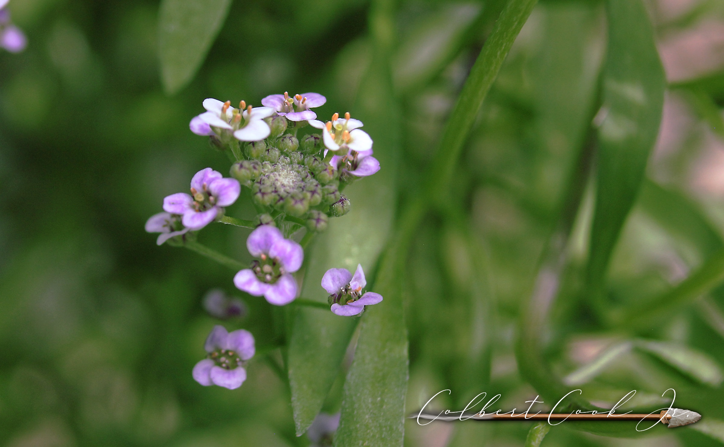
A bit of Sweet Allysum growing in our garden.

-

Layer opacity vs. fill
Smee Again replied to mso1977's topic in Feedback for Affinity Photo V1 on Desktop
Yep, there's a workaround "kind of". Gives better results than just fill opacity, but layer fill it isn't. -
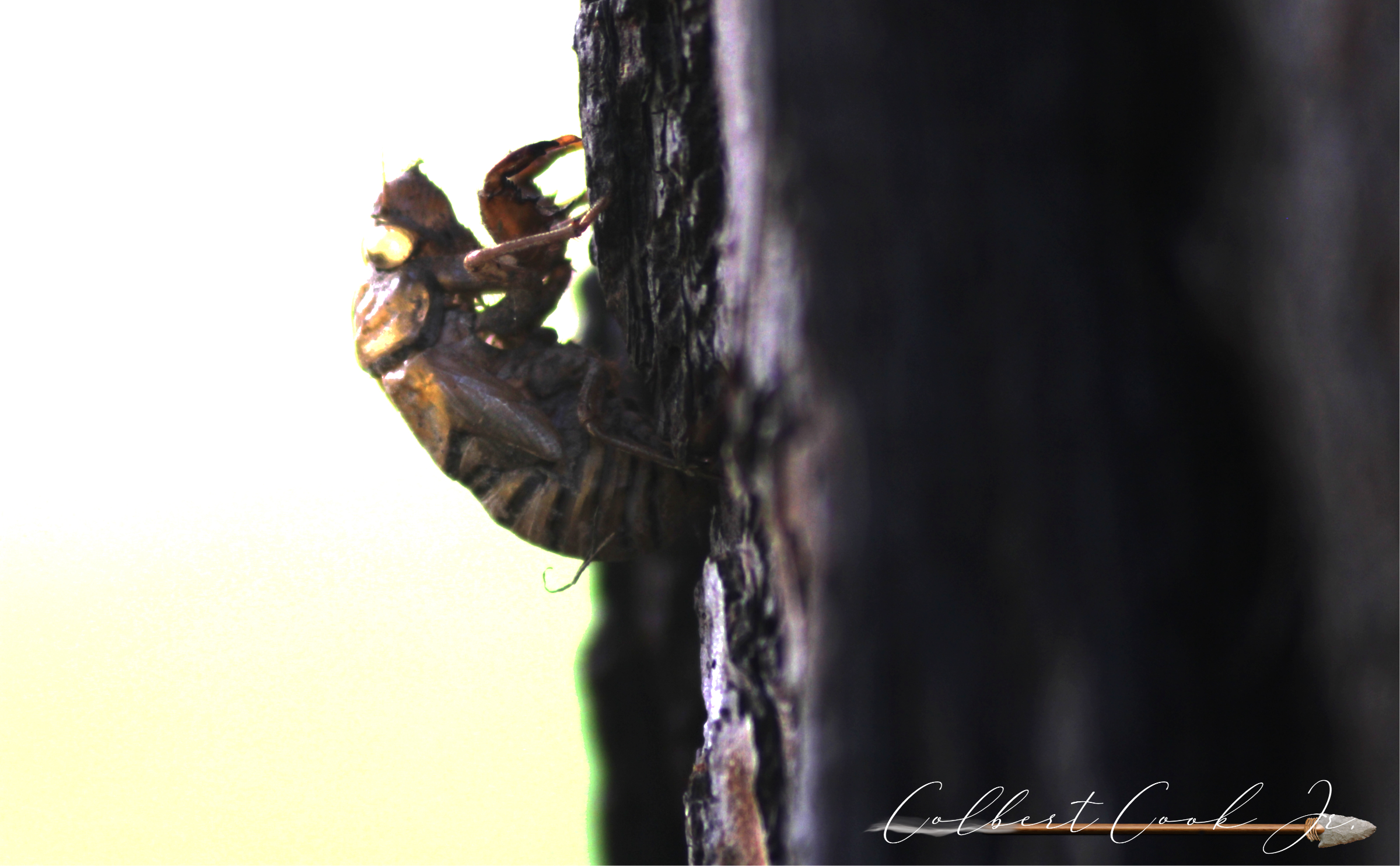
Couple shots of Cicadas . . . the quiet underground guys who go nuts when they get up to the surface. First image is a backlit exoskeleton. It's former owner was in a big hurry and lost a wing. Bet that put a damper on his celebration! Second image is of a Cicada that stopped by on my front steps to sing for us.
-
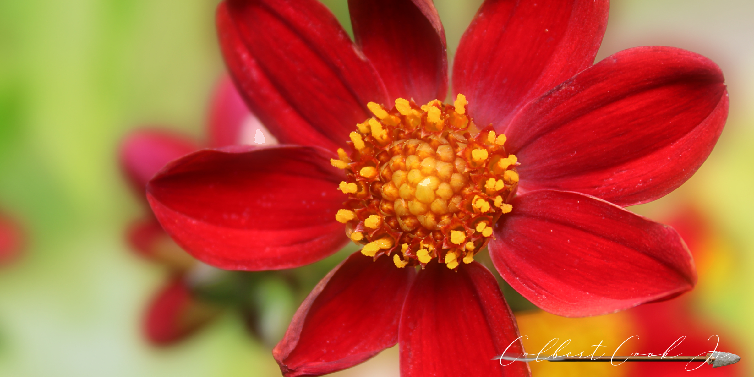
A couple more I edited today while the internet at my home was on hiatus . . . Honeysuckle from the south . . . where we know honeysuckle. Red Dahlia from our garden last year.
-
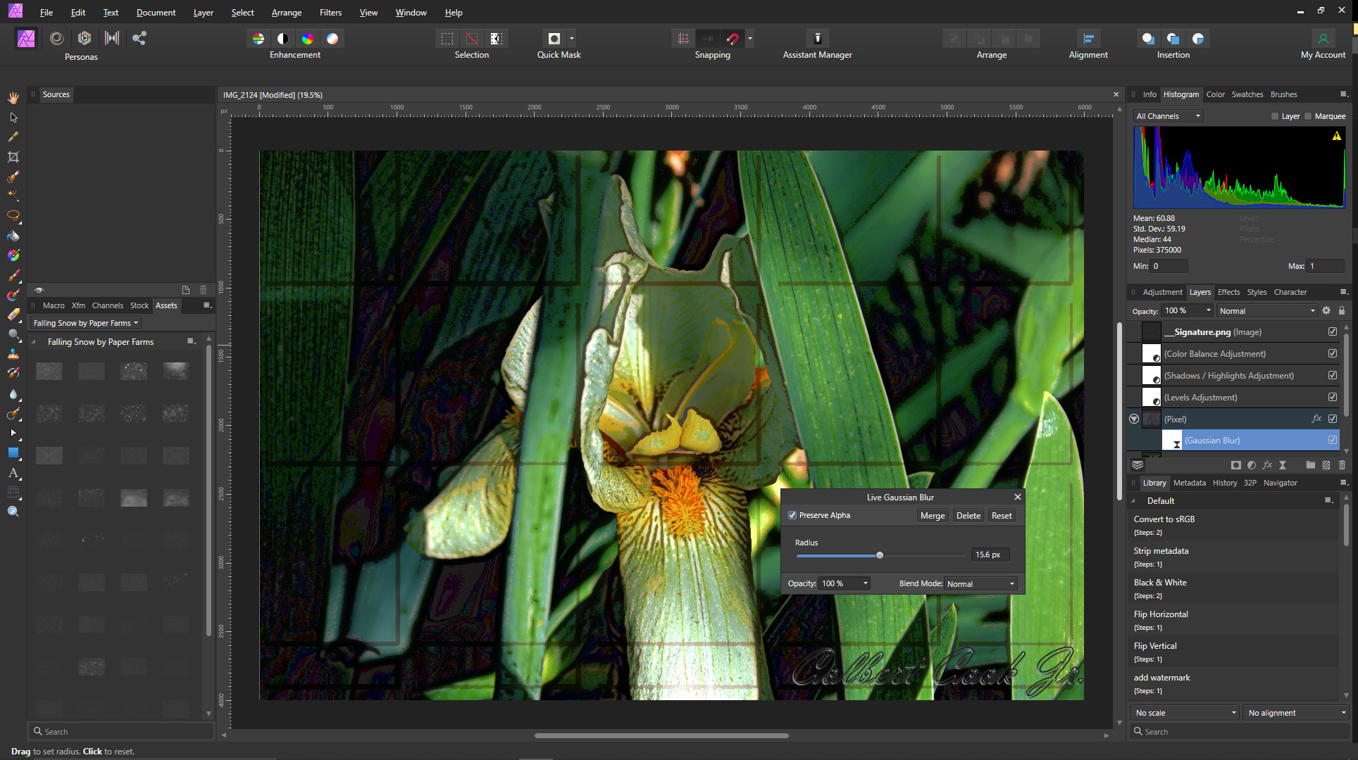
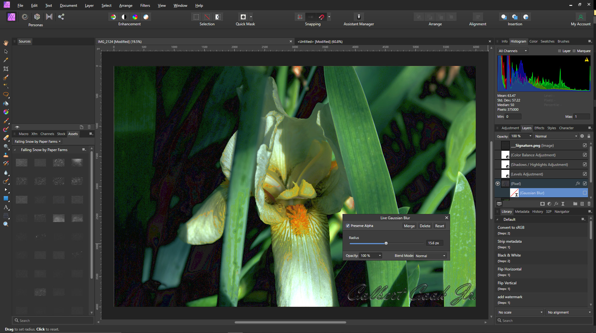
Added 3d effect to a copy of the original photo on a different layer. Then, to get the effect I was trying to create, I added a gaussian blur live filter. The result was a series of partial boxes over the entire image as seen below. Other than the boxes, the effect was what I was going for. When I turned off the gaussian blur, they went away, but so did the effect. Because of the error, I had to make changes. Removed the FX, applied the blur, merged then applied the FX, but the resulting image was very much different . . . and not just because the boxes were gone. Not sure if this is normal. Had similar problems (but not the same processing) in 1.09. but usually I would save the afphoto file, close the program then reopen the photo and the error would be gone. Now, that doesn't work.
-
How about an angry Iris . . .
-
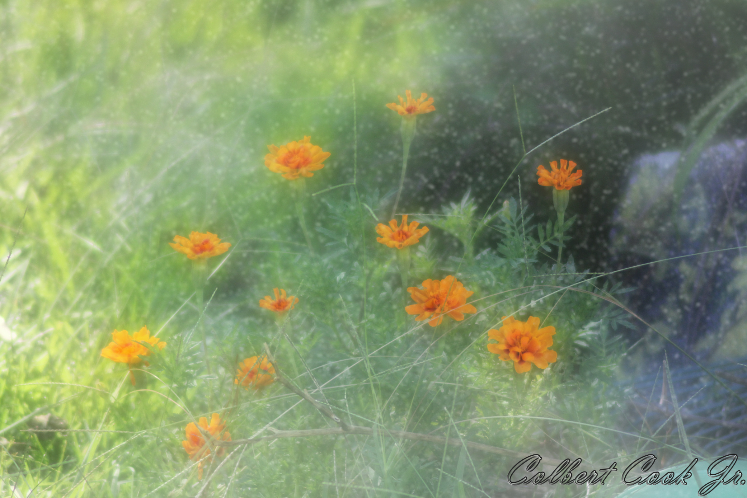
Ran across a really talented photographer over at 500px.com (https://500px.com/p/pastelworld?view=photos) who has an interesting way of working her flower images. Think I'm going to play around with it and see how she does it. This is a start in playing with it in Affinity. Used a snow overlay with gausian blur, orton glow, and some masking
-
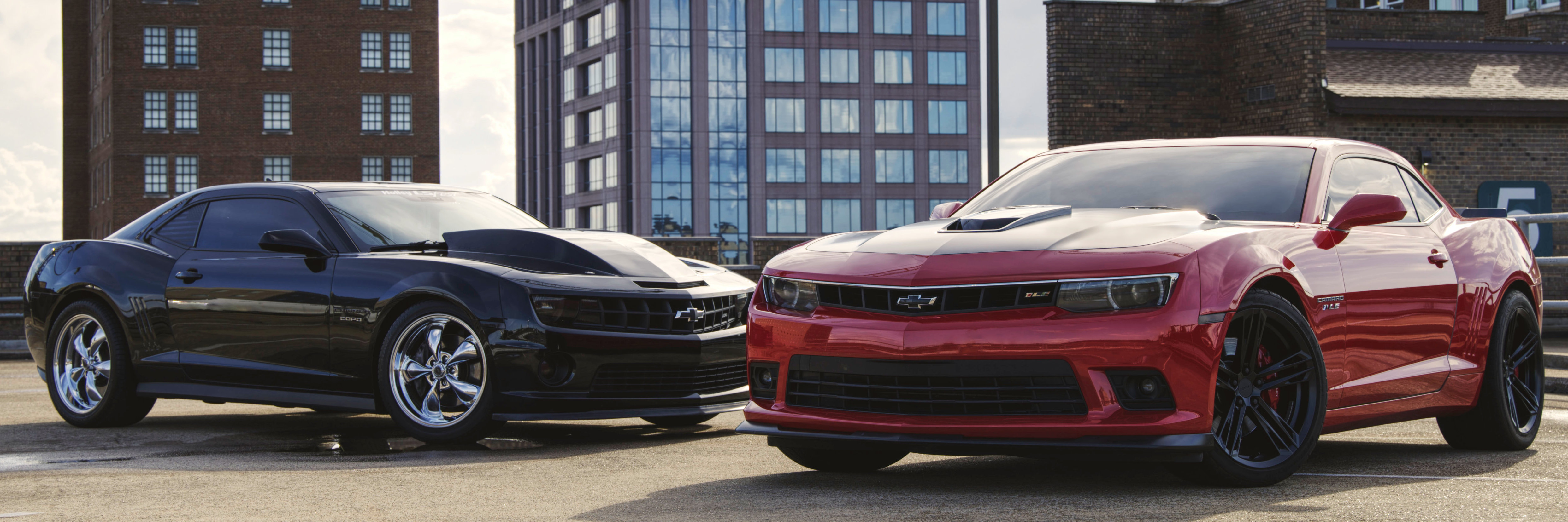
As I said, and I'll repeat again: BELLYBUTTONS - everybody's got one WARNING: PERSONAL OPINION FOLLOWS, READ AT YOUR OWN RISK! In my opinion, the cars are an afterthought in the photo. They have been pushed aside when they should be the stars rather than being pushed down by 3 boring buildings (wonder how fast they go?) that likely are over half a century old and definitely not very photogenic -- especially as composed (bellybuttons). To each his own. As for the second image, the HDR effect (as I originally said) really detracts from the image. It also looks like there may be a bit of an "orton effect" added which totally blows the shiny parts out of the water and ruins the image.
-
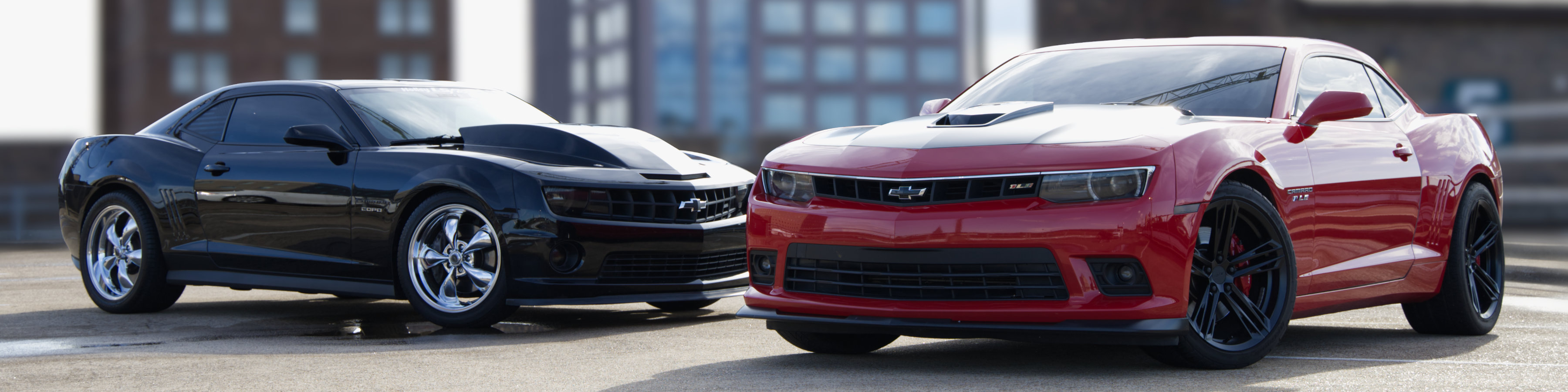
Not much time this evening, but here is my edit of your image. A bit too much sky reflection on the subjects . . . try a polarizing filter (around $25 @ B & H camera and video) which is what I used to use in the old film days. Perhaps not to the tastes of your customer, but a quick and dirty mask and my daughter really loved the 4:1 crop on this. Don't know what's wrong with her, but she likes the new Camaros, but as I said everyone has their own bellybutton different from everyone else's. Myself, I would much rather a Hellcat Challenger or something like my old 1968 Road Runner. Modern Camaros remind me of a grinning possum, butt ugly -- again, my opinion. Just a 63 year old man with waning eyesight. See what you think. Nice image you took, but these are the changes I would make if I had taken it.
-
No, I didn't crush the blacks . . . that happened when the base was removed. Since black is the absence of color, removing the blacks removes detail. Since one cannot add detail that has already been removed, I got as close to it as I could with what I had to work with. Most times when I see these images they have been produced by removing through levels (the quick and dirty method). Any time you move the black level above about 8% you completely lose at least one of the zones that Ansel Adams and others found so necessary to achieve perfect (or as near as possible with what they had) images he is so famous for. By compressing the color, you are the one removing details. However, that being said, if your customer likes images like that -- and pays for them -- then as I told one of my webdesign customers when he wanted me to remove someone from a group photo instead of re-shooting, "the customer's always right." Looks like crap, but as long as he pays who am I to criticize. On the other hand, those images just moved his site off my featured list on my company page. First image has only 9 zones. You can't bring back what isn't there. Try if you wish. Second image is all 11 zones (0-10 for those not sure). You can never make first image match second in detail in black areas . . . or white areas (I chopped both ends - which seems to be so popular today. Not some of my better work, but thought it would be a decent example to show what I"m talking about. (Toyota let me keep my rejects, and this one wasn't properly lit and had luminance noise as well as being shot with a Nikon 340L but works for what I was trying to show)
-
@AdamStanislav Very nice work. 👍
-
First of all, to the OP of this image . . . this is just OPINION. Just like belly buttons, everyone has one, and I am not telling you how to do anything. Generally, show cars use bold (not garish) colors . . . in order to achieve the effect in his image most folks just kill the bottom of the curve as noted by the "curves layer" in this image posted below. WARNING: Personal opinion follows! Read at your own risk . . . The lack of the bottom in this image is like listening to a good song without the bass. There's something missing and it really takes away from the "carguy" vibe the OP is going for. Just my opinion, nothing personal. Cars are the stars of the image . . . do what you want with the background, but the cars have to shine!
-
Shiny is good in show cars, unless you're going for the "rat rod" look. But I do think I detect a little HDR look. Doesn't work for most car shoots IMO.
-
As someone who enjoys American Muscle cars as well as classics, I like these images. Some of the angles I would have shot differently, but overall I like your work. Just a personal preference, I get thrown a curve when folks mute all the colors as was done in the last image. I would have cropped to a 1:3 ratio and made sure the colors came through. What do I know? Not much.
-
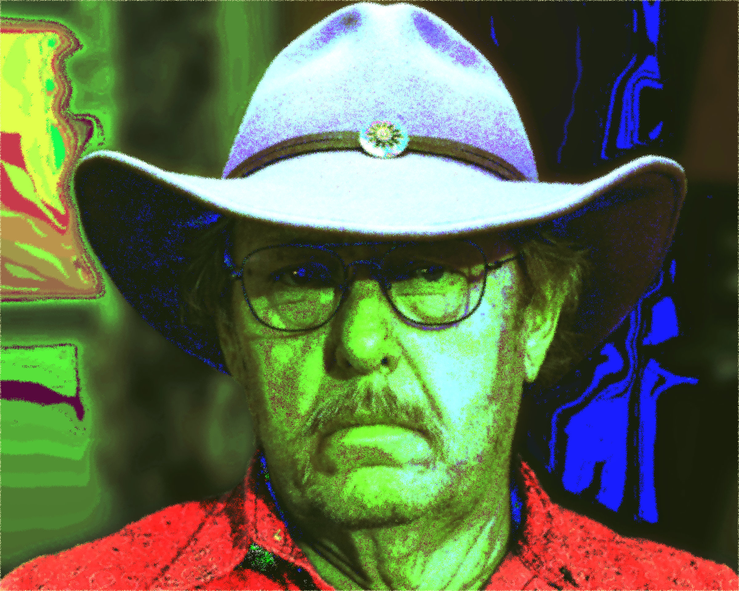
Another neat effect (besides just the lut) involved using blend modes (on this one, I used "divide") and a color fill layer between the LUT and the image then varying the color and opacity until you get what you're looking for. A self-portrait from last year. I was a "skip tracer" by trade . . . that a special kind of hunter. I hunted human beings who ran away from their debts and took the property. When I find them, they usually aren't happy. I got the money and/or property.I probably looked a lot like this to them when they met me. I loved my job!
-
Very cool effect! Thanks.
-
affinity designer In Vivo Lab Signs
Smee Again replied to EducationPrinciples's topic in Share your work
"Disposed of bucket" . . . shouldn't that be "Dispose of bucket"? -
Halftone Raster Brushes for Affinity Designer and Photo
Smee Again replied to azetina's topic in Resources
Only tried a couple, but nice fit for one of my projects. Thanks! -
I tend to use the opacity (because of the lack of a "Layer Fill" slider, but also vary them by use of different blend modes as well. A third way would by by "blend-if". Don't like the weird way blend-if is adjusted in Affinity, but it does work most of the time. It sometimes seems that the software can't remember which is the source layer and which is the underlying layer. Occasionally, both adjustments appear to be applying to only the source layer -- which doesn't really help.
-
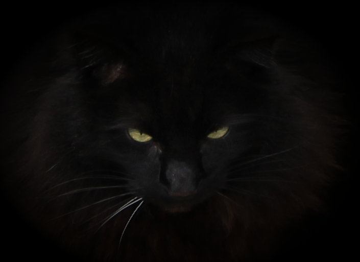
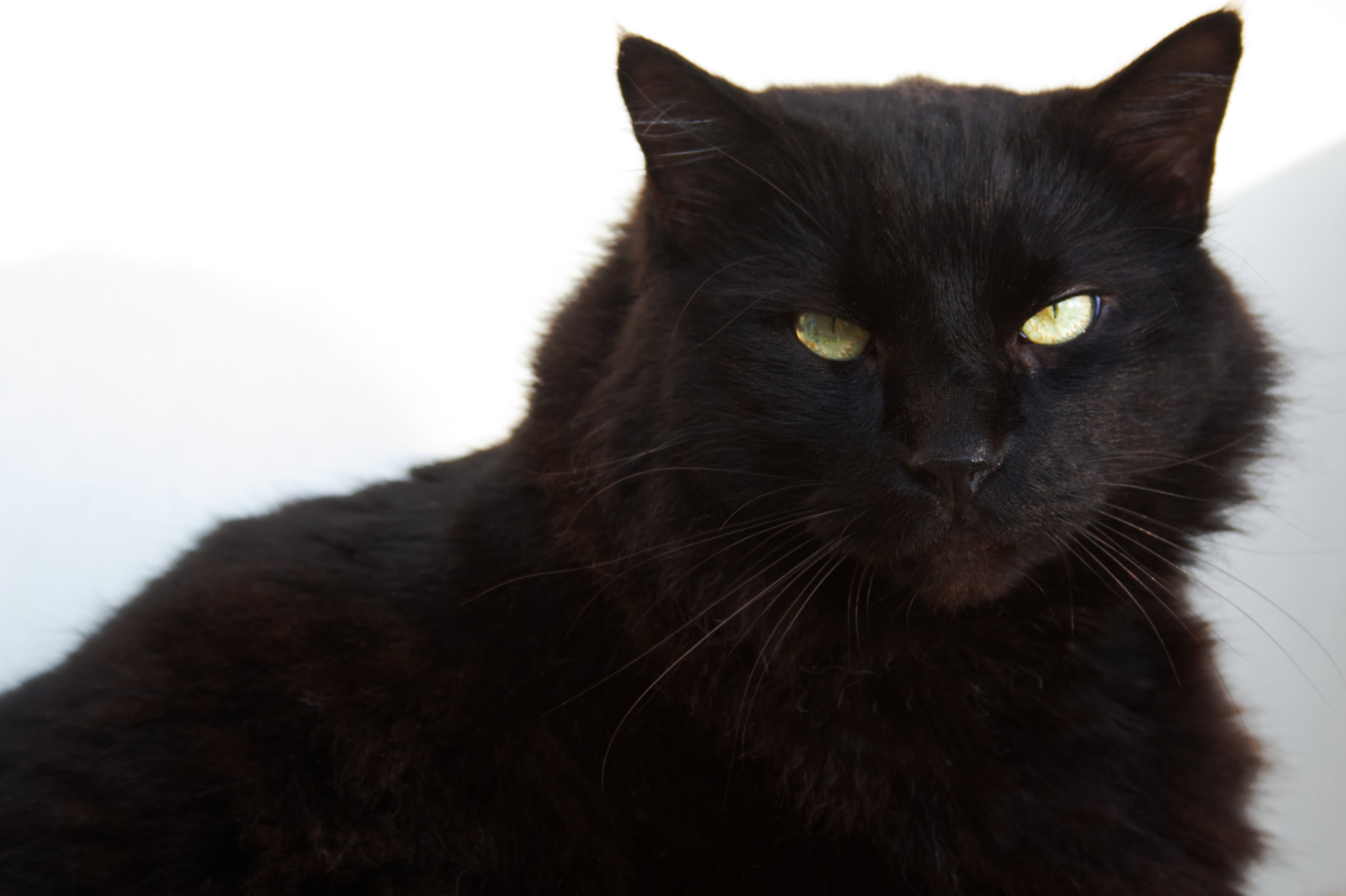
Don't know why, but as soon as he realizes that you are looking at him through the camera lens he gets upset. Sometimes he'll run away, other times he tells me what his opinion is with his eyes. He's even been known to get that Mckayla Maroni doesn't approve look. Just a couple of pics I dug up off my card in the last week. Not you again? Not impressed!
-
Nice work. Takes lots of images before you get to where you want to be, but there's no real room for criticism. Not sure if you used the crinkle effect on another layer, but if so, I might have used just a bit of gausian blur to soften the effect. But what do I know, I'm nowhere near where I want to be in my editing, but it a lot of fun.
-
Love honeybees. Thinking about putting in some hives next spring if my health gets better. Would just be nice to get outside with a camera again, but Dr says sun is bad for me while on chemo . . . But 6 hours in a car to get there and back is okay. I just can't figure that one out.
-
affinity photo [AP] Carrera 3.2 Red 1984 Solido 1:18
Smee Again replied to Kapuan's topic in Share your work
Nice work! Love that model, have one myself since about 2005 . . . but mine has the "whale tail" spoiler in all black. Unfortunately, mine needs a polish job before it looks as nice as yours. -
Very nice work. I do love the color. In the 1970's I painted my bedroom a shade of purple very very close to that one. That's as far as my parents would allow me to go. I wanted to do something a little more freaky, but dad reminded me that it was his house and if I wanted to stay there, I would be happy with it. Originally wanted to paint the walls and ceiling black then come back and paint stars and planets in florescent and "glow in the dark" paints so that my blacklights would make them pop. Wanted the purple to make a "stone pathway". The desired effect would have resembled walking on purple stones to stand in the void of space. Somehow he didn't see how cool that would have been. Sorry for hijacking your thread, but those colors brought back such a vivid memory. Maybe you could use the plant to become Jimi's hair (Jimi Hendrix) and create a really wild psychedelic poster that could transport some of us back to the Woodstock era.
-
Once more, very good work. I need to look into this. One thing Affinity photo is missing is a "layer fill slider" that would help to take advantage of the 8 special blend modes. If they ever add that feature, I believe it would improve what the end user could achieve with the luts you are able to create. I really like them, and they are fast even on my old machine -- a custom rig (gaming PC AMD Quadcore) I built in 2009 when my alienware bit the dust. Oh it will still outperform most "off the shelf" towers 12 years later, but it is starting to show its age with some of the newer software. Some other luts I've used take a few seconds to load so I'll ascribe that to the age of the computer.