Lorox
-
Posts
392 -
Joined
-
Last visited
Everything posted by Lorox
-
Designer - Text Style - Drop Caps
Lorox replied to q166132's topic in Pre-V2 Archive of Desktop Questions (macOS and Windows)
This is a font thing. I don't have the font from your document and the substituted font worked fine, the only way I can get the drop cap to misbehave as you demonstrated is to use Bernhard font. Actually it is a Leading thing. Change your leading from default to either % or Exactly... This is a bit weird, though, as I hadn't set the line height to "default", but I still had the same problem today (Publisher 1.9.3): 10pt text with 15pt leading ("exactly"), aligned to a baseline grid of 15pt: Instead of making the drop cap 2 lines high (as set in the drop cap options) it became 3 lines high (or 5 when 3 was set). I think this happened right after I activated the baseline alignment feature. However, when changing the leading to 14,99pt instead of 15pt (with baseline alignment still on) the drop cap changed to the desired (and set) height of 2 lines. Same when I set the line height to 150% instead of 15pt exactly (which with a 10pt font size should actually be equivalent). Now after a few clicks back and forth – even with leading (15pt exactly) and baseline grid adherence inherited from my general paragraph text style – it mysteriously still works. This is a bit puzzling as I don't really know any more what's different now than when I started observing that drop cap height glitch... -
Absolutely so! There's no reason a designer should be satisfied with just the way underlines are "built in" a font. Maybe the font's generic way will be OK for 90% of the cases you'll actually apply an underline, but there's those 10% where you want to do something really special – when you know that InDesign had allowed you to do exactly what you're imagining and Publisher (as the newer, more modern app it is) keeps your options to just a very small fraction of those you remember having under your fingers it's certainly disappointing.
-
Although I might be a bit reluctant myself to use Publisher (yet) for really extensive projects like complete books, I'd say that concerning preflight and packaging there ARE features in Publisher now which seem to do these jobs in a decent way. Haven't really put them to the test personally, though, with something really substantial...
-
Exactly! It's not a question of some presumably outdated workflow which has a demand for 1-bit-graphics but as an illustrator or designer you just want to be able to give your designs the look you want them to have. And in this respect 1-bit-graphics are as valuable as ever in getting there. The way Photoshop gives you different choices of how to convert greyscale images to 1-bit-graphics is so convenient, easy to handle and super useful for the visual effects you want to produce – I was definitely stunned when I discovered that Affinity Photo doesn't offer this (in my opinion) absolutely fundamental choice of pixel format...
-
1 bit TIFF/Bitmap support please
Lorox replied to Chris L's topic in Feedback for Affinity Photo V1 on Desktop
Maybe I missed it when scanning this topic. But one thing I've always loved and often used with Photoshop's bw/bitmap capacities is the ability to choose the way the resulting sw-"bitmap" files will be rendered – for example with a strict threshold between b and w or by diffusion dither or emulating a certain way of (preferably coarse) rasterization. With the exception of the one first mentioned I like to use these mostly as a stilistic or artistic choice but with the added value of setting a desired resolution (independent of the original source file) for export resp. change of colour mode AND – of course – being able to assign any colour later in InDesign. Accordingly I'd very much like to have similar options when exporting strictly black and white images from Affinity Photo. This has nothing to do with outdated vs. up-to-date workflow but with getting things/pictures to look like I want them to look – and without being forced to use one or more 3rd party apps for achieving this. -
Now that I've created these kinds of text styles of my own it strikes me that I cannot order these to my taste in the Text styles list. (I've got to admit that so far I haven't set up my – yet not so many – Publisher documents using some proper systematic). Although „Hierarchical“ , „By Type“ and the default alphabetical order seem to make some sense I'd wish you could do it in a user defined custom way... But that's another topic, after all. Yeah, that's true! Here you can taylor some finetuned classes for „underlines“ with defined colour, line thickness (etc.) and offset quite easily. Such a CSS class seems to me quite the equivalent of a character style in a desktop publishing environment. Looks to me like some proof that what we're discussing in this thread isn't really rocket science after all in terms of programming...

-
That's exactly how I see it. Applies to me as well – back in the day I did my first designs with FreeHand 2 on a Macintosh SE with a tiny greyscale display... We've come a long way since then, but – as we see – there's still some way ahead.
-
Nice trick – it took a while for me to understand what's going on here... Especially when the low line character is suddenly "transformed" to that fat orange underline of the entire word when you apply the "Underline" character style. But you always have to individuallyset the horizontal scaling of the character used for the effect according to the word you're using the effect on, do you? Meaning when you were to do it exactly the same way again on another word with a different length it won't fit immediately (as in the video) because of the given scaling in the text style?
-
It's always nice to watch the inventiveness of you guys when it comes to find workarounds to these issues in Publisher we keep findung (and fighting with). I guess I'd never come up with that idea of an underline stroke as pinned object... If you have just a few places in your design where you need this will be a great help, I guess. All the more as you can obviously format that line/curve very much to your liking (dotted, wavy – whatsoever). In the end, though, it's a separate object and once you change the font or font size you'll have to adjust it anew. But anyway, if there are just a few instances of this sort of character level "decoration", it comes in quite handy. So thanks for sharing the idea! Nevertheless for me it would be a huge improvement of Publisher's (and Designer's) typographic features if such things could be done via "normal" character styling (plus being able to save such a styling as a character style, of course). And well, you might say this kind of business is and has been a bit chunky in InDesign using the modal window and so on – BUT to be honest: I'd be glad to have it that way at all in Publisher (as I wrote elsewhere: it's been there in InDesign for 10+ years by now!)... Hope we'll be able to do likewise in Publisher in v2 eventually!
-
underline dotted
Lorox replied to ahnungsloser's topic in Pre-V2 Archive of Desktop Questions (macOS and Windows)
Leider funktionieren diese Workarounds mit den Decorations nur auf Absatzebene und nicht auf Zeichenebene... Ich wünsche mir sehr, dass spätestens mit Version 2 Möglichkeiten kommen, so etwas auch auf Zeichenebene (d.h. über entsprechende Optionen für Unterstreichungen) zu verwirklichen. Also etwa eine Unterstreichung eines einzelenen Zeichen oder Wortes im fortlaufenden Text mit (z.B.) einer gestrichelten/gepunkteten Linie einer bestimmten Stärke und einem bestimmten Abstand zur Grundlinie. InDesign kann das schon seit mehr als 10 Jahren und Serif sollte einem durch soclhe Versäumnisse in ihren Apps den Umstieg doch wirklich nicht schwerer machen als nötig... -
Almost one and a half year later there obviously still isn't a way in the Affinity apps to style underlines (on the character level). More often than not you'll find that the (only) default style you can assign (i.e. by just choosing the "Underline" text style) just hasn't the line thickness you'd like for that particular font and neither does it have the offset you'd prefer for a typographically satisfying effect. The options InDesign has been providing for more than 10 years by now certainly set the mark for what a decent professional desktop publishing app should offer in terms of typography and I REALLY hope Serif will take care of that with v2 of their apps. Otherwise it will be big disappointment...
-
Editing underline features
Lorox replied to MarekGFX's topic in Feedback for Affinity Publisher V1 on Desktop
That would be exactly what I would like to be addressed by Serif as soon as possible! It looks like that it has been confused by others here in this discussion with "decorations" on the paragraph level, which are significantly more advanced in the Affinity apps as of now (v1.9). On the character level, however, where "Underline", "Strikethrough" etc. live, there's still almost no way to customize any of those lines. More often than not the default provided by the program looks quite awkward in connection with the actual font in use. I think that just anybody who cares for decent typography absolutely needs to be able to tweak underline options on a character style level. So please, Serif, add this in version 2 – it will be highly appreciated! If I could ask for even more, I'd love to have the option(!) to have an underline applied "intelligently" by the program – i.e. skipping characters with descenders and so avoiding ugly "strikethroughs" of (just the) descenders. I guess there must be a way to automate such a behaviour as I recently saw underlined links on a webpage featuring the look I'm speaking of (see attachment). I don't really think this has been done by hand for each of the characters with no visible underline (g, comma, parentheses). You'd think: if this can be done for web by CSS or Javascript (or whatever), it should be possible for a desktop design app as well...
-
No document-wide replace font?
Lorox replied to Jeremy Bohn's topic in Feedback for Affinity Publisher V1 on Desktop
A good point! I have found myself thinking likewise, too. Not only as Publisher is concerned – also in Designer there are certain features missing that at least one or two from a pool of 5–10 "real world" Illustrators would point their fingers to after not too long a time working with the app (say: Line Width Tool, Image Tracer etc.). IMHO software designers just tend to think differently from "design designers" – about which features people would need (or not) and what's "cool" to have for some reason or other. And, of course, HOW thing are done (or should be done) – meaning how to structure a certain workflow through the design of the app's UI. I felt – for example – that some places for settings in the apps seem to be a bit almost randomly scattered over the UI although – in a "design designer's" way of thinking and working – they should actually be in closer logical vicinity. Being a real expert in one field of knowledge unfortunately sometimes prevents you from seeking solid advice on subjects you have not really all the experience and the sense for possible inconsistencies in. -
No document-wide replace font?
Lorox replied to Jeremy Bohn's topic in Feedback for Affinity Publisher V1 on Desktop
Maybe this all sort of works more or less if you have actually assigned Text Formats to all your type before. If not (as it often the case in smaller documents) it still is a real pain in the butt to have missing fonts reliably substituted all over the document. To me it seems absolutely pointless of Publisher to stop short of a possibility to (lastingly) "Assign“ the substitutions documentwide once you've made your choices in the Font Manager. Up to now I thought I was missing something or making a mistake somewhere – I actually cannot believe that this is "officially" still so awkward! I don't think that the whole Find and Replace business "on the document's surface" is a professional solution. What's needed is a "Find and Replace" within the internal document data which is triggered by an "Apply" button in the Font Manager – not more, but also no less. This is such a simple concept that it is definitely not useful to excuse its "non-implementation" by referring to some alleged "semi pro"-ness of Publisher. Just look at all of Serif's announcements and the way the app is advertised: it IS meant as a professional tool for print design after all and as such it is quite a shame that this – actually not so special – feature still poises such a problem in the everyday workflow. Don't get me wrong: I DO love the Affinity apps and I really DO try to make the transition from "Big A" but things like these tend to put my patience to a test nevertheless... -
I recently notice that I really do miss the option to access special characters (which I want to insert in a text) by way of a context menu (right mouse button). Being forced to always resort to the regular menu when I want to insert a special space, dash or break character turns out to be a bit cumbersome, if not tiring – especially when you're used to easy context menu access to these special characters after long years working in InDesign... I'd say it would be a nice feature for Publisher v2!
-
You have a point here – regrettably Freehand wasn't too good at exporting to PDF (but eventually you COULD establish a proper workflow and get your – generally working – PDFs to your printers' shops). Can't remember anymore, though, if that actually required FH MX to work... I think, however, I eventually switched to InDesign from FH9... For me working with transparency was sort of awkward in FH and so way back then I didn't use the concept very often. That has always been so much better in the Adobe apps (at least in my opinion). BTW (as I just think of it): Freehand already had conical gradients (just as Affinity has now) decades ago and it has always been quite a pain in the butt to achieve something similar in AI (Adobe didn't seem to care, though...). But then, thanks to Designer, Photo and Publisher, today it's me who doesn't care anymore if they finally implemented the option... But as you say: it IS mostly fun to work in the Affinity apps – especially regarding transparency – and I do not regret having (except for legacy files/projects) switched to Affinity. You have to get the hang of it, though, as the Serif/Affinity mindset IS quite different in certain aspects of doing some things (however "normal" they may seem at first).
-
Indeed! Once you've discovered (and remembered) them all it's certainly fun to check what you can actually do with them. Maybe I still have to shake off all these expectations of where exactly these diverse settings should be accessible when these (esxpectations) seem to derive from years and years of working in the Adobe apps... Teaching new tricks to an old horse can be a bit exasperating sometimes...
-
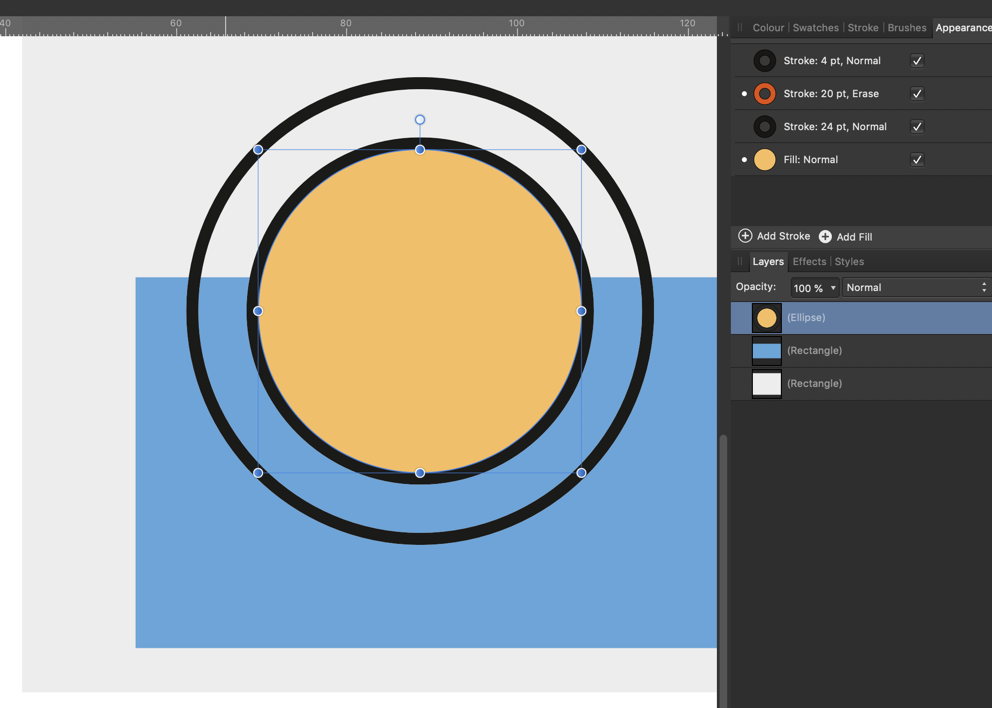
Mmhh... I was wondering for what kind ob object this might actually make sense and you're probably right: there are objects imaginable (see screenshot), where it's coming in handy to limit the Erase property to the object itself. On the other hand I'd still think it useful if you could use just an object's stroke to erase everything below it... You possibly cannot have it all, can you? It might get really mixed up if both modes were available at the same time...
-
Yeah, you're right – I must look like an absolute idiot... BUT coming from decades of InDesign I seem to accustomed to (all) settings of that kind being sort of aggregated in ONE logical and mostly intuitively plausible location where you can do what you need and have it all in sight. To me it is a weak point of the Affinity apps (as much as I like to use them!) that (useful!) settings which are closely related are scattered over several locations which you then have to visit and work one at a time to finally get what you want. I could try to get used to it, I will admit, but on the other hand it doesn't seem completely out of the way, that the Affinity apps' UI still tends to be somewhat quirky in places...
-
As I just wrote it sort of does (I did miss it up to now) – you CAN set the Blend mode but you CANNOT set any individual opacity (percentage) there... (this seems to be possible only in the Layers panel) Also I somehow cannot set JUST the stroke to Erase... Setting just the fill to Erase in the Appearance panel doesn't work either – it only becomes invisible (just as the stroke) and doesn't erase anything below. Looks like you have to go to the Layers panel and set the entire object to Erase if you need something of this kind...
-
Hi Alfred, thanks for reminding me! I actually missed that option as it seems to be available only in the Swatches palette (correct me if I'm wrong!). That being said it strikes me as being one of the inconsistencies which we still find in the Affinity UI – why on earth should I just look (only) there? (As it is related to the object itself or as such and not to the way (sliders, wheel or swatches) I assign colour to fills and strokes) I just see that you can actually set the Blend modes differently in the Appearance panel – but somehow setting just the stroke to Erase doesn't seem to work anyway. (Other blend mode work fine, though). As of now it's so easy to miss those (useful) options for setting things as they tend to be scattered over different panels – I wish this could be "unified" and made more logical in the future.
-
I think it would be quite helpful in some design situations if you you could independently use different transparency settings for the stroke and the fill of one and the same object: say a fill in Multiply mode with 60% opacity and simultaneously a stroke of a certain thickness that's set to Erase mode (or Colour with 80% opacity – or whatever). While you could of course achieve the same visual results with multiple stacked copies of an object which are just set differently each it will obviously get cumbersome quickly when you want to easily transform something that's visually appearing as one object but actually is a stack of several ones. If I remember right, you can do these independent settings in InDesign and Illustrator – so it shouldn't be rocket science after all. Lest I forget: Independent settings of this kind (plus ones for transformations) woud be highly appreciated as well for additional strokes and fills of an object which have been added via the Appearance panel.
-
Thanks MEB, I think I figured that out by now, but – to me at least – it's irritating nevertheless. And well, with vector masks you can actually do some interesting things when you add the "Erase" mode to the equation – as I seem to have found out. However there always seems to be some sort of very thin visible "seam" on the edges of the area where objects set to "Erase" border to those of regular visibility. This effectively lets me hesitate to use the feature so far... Maybe I have to try again but with v1.5 I think these "seams" even made their way into exported pixel formats. This seemed to indicate that these artefacts weren't just display glitches but rendering problems on an object basis.
-
Gradient with global colour
Lorox replied to jki's topic in Pre-V2 Archive of Desktop Questions (macOS and Windows)
Yeah, obviously selecting the Node Tool serves the purpose as well (as does selecting Rectangle, Circle (or whatever) or the Pen Tool). And well, after editing you have to save a new gradient swatch as you haven't actually been editing the old one. Accordingly there's no automatic change in objects having the old one assigned unless they have been selected first (which in complex illustrations may be quite a cumbersome task...). And yes, it wasn't all perfect with AI and ID (and I generally do love working in Designer, Photo and Publisher), but especially in terms of ergonomics the guys at Adobe got a lot of things right over the years. Speaking of this it strikes me every time as quite annoying in the Affinity Apps when I have to use the context menu e.g. only to just rename a colour swatch or a palette. Why can't we just double click on the name like we can (and always could) in the Layers Palette? This is so inconsistent in terms of UI and really deserves to be changed. Often it's in the small things, what makes you really comfortable using this or that app. Another example: I think that Inkscape has – its several known shortcomings set aside – a lot of really interesting features for a vector graphics app but the UI – to me at least – is some kind of an "ubercomplex" nightmare and accordingly I tend to avoid using it if I don't necessarily have to (e.g. for image tracing as Designer still hasn't got that feature). -
atomic, I'm completely with you here – I don't know why, but even as an experienced user of many desktop design apps over more than 20 years I find myself struggling, too, with some aspects of the way the Affinity apps handle masking. How I wanted to continue: What on earth is so difficult to implement here, that for a start I cannot simply create or assign a mask (or mask layer or whatever you may call it) to any object, group or layer and then paint with black and white (or grey, for that) on that mask (or put greyscale objects on that mask) with the simple effect that "white reveals, black conceals" as it has been for ages by now??? Any idiot can understand that after doing it twice, I'd say. Masking in Affinity, however, it obviously doesn't matter at all which colour you use while painting in a mask – ANY colour will conceal and you have change tools (to the Eraser Tool) to reveal parts you have accidentally hidden/concealed. This is SO unergonomic! BUT: All of a sudden – as I try to check again – it works exactly as you should expect!!! WTF is going on here? So: create an object, choose "Mask Layer" (button at the bottom of the Layers Panel) and you get a mask below the object where you can paint with black to conceal and overpaint with white to reveal again! Obviously this mask it's strictly some kind of a Pixel Layer and you cannot put any vector objects on it like you can in Illustrator (but then again you can't paint with pixels in Illustrator...). So you might say it's not better or worse as in Illustrator but just different... On the other hand: Where it gets weird IMHO is when you put another vector object above the one you want to mask and choose "Mask to below" via the context menu of the topmost object: quite contrary to at least my expectations what remains visible is just the overlapping area of the two objects and not what's NOT covered by the object you wanted to use to mask (partially hide) the object below with (intuitively I'd expect it to work exactly the other way round). And the colour of that top object doesn't matter at all... (Its transparency – if it's got some – does, however!) So if you want to hide/mask something by using vector objects you're forced to think not: "What do I want to hide?" but "What shall remain visible?" and then create the necessary objects accordingly... Anyway, some aspects still don't feel quite natural to me and I can only hope I'll really wrap my mind around it one day...