dannyg9
-
Posts
492 -
Joined
-
Last visited
Everything posted by dannyg9
-
Glad I scrolled down to the mountains! Brilliant work. Love the reflections on the underside of the wings.
-
Damn! You're right! I think, hopefully, most people would/will realize that space is not supposed to be there. Interesting. 4 people proofed that and didn't catch it.

-
Many thanks Slammer. Appreciated.
-
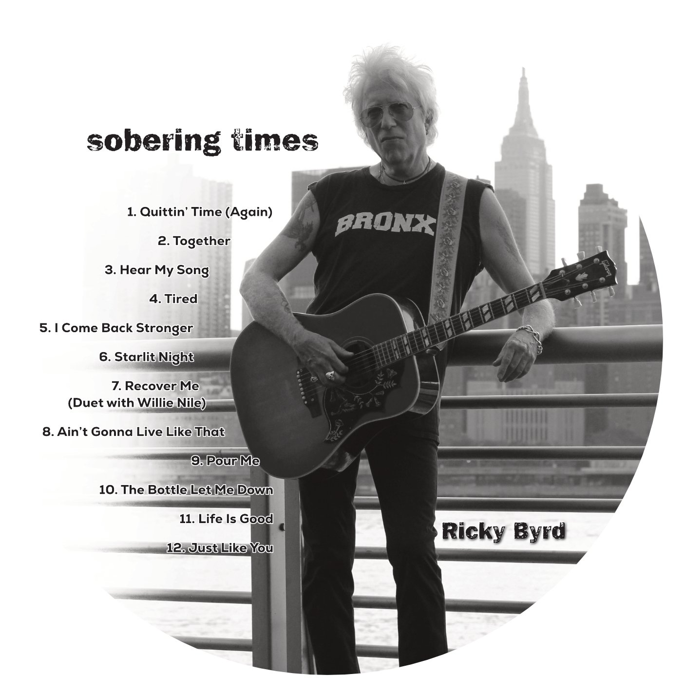
New CD Package for Ricky Byrd's latest release, "Sobering Times." Went through a thousand or so iterations of the cover (seems like it) which ended up being the BACK cover as Ricky liked a more recent photo (the one on the FRONT cover) as it has more attitude. I've worked with musicians all my life and this is part of the process. It's that odd sensibility of knowing what they want but only when they finally see physically what they have going on their heads. As a designer, it's my job to extract that vision and make it a reality.
-
I think the solution for many is inevitable. I've read many posts (Google "Postscript Fonts") in regards to Postscript font and the takeaway has been that OT is far superior. I'm not arguing that, it's just that I have about 7,000 + fonts (I would say half I'd never use unless a client requested something specific). So, I took the dive and purchased TransType 4 (A type conversion Utility) and have been in the process of converting all my fonts to OT format. So far so good. If I do get an error message or type is not appearing correctly in any of the Affinity Apps (almost exclusively Designer and Photo), I'll just do a quick search from within TransType to locate the postscript version, add that to the conversion window, convert, and then go to FontExplorer Pro and import the newly converted font. At the same time, I'll delete the original Postscript version from FontExplorer. It's a little "hiccup" in the course of working but in the end its all worth it as my font library and FontExplorer will be up to date. I did try a few online conversion methods and they weren't that great. If you've invested money into a font library, TransType is worth it. As a disclaimer, I have no personal interest in TransType. I've found that it's working best for me. If there's a better product out there, please post it.
-
Really nice work!
-

affinity designer 2ND drawing using affinity designer
dannyg9 replied to buko's topic in Share your work
Love it flat or otherwise. The only part that's optically bothering me is the front tire and the front fender. Not sure if its my eyes or the illustration. The top portion of the tire looks narrower as compared to the lower half. My eye wants to shift the black tire shape up and have half of the fender overlapping. I don't think moving the fender down will solve the disparity. The said, great job. All the parts look proportionately correct. Like the color scheme too. -
Love, love, love the black and white one. Perfectly captures her spirit and Art Deco.
-
Love it. From a design perspective, it has all the elements to make me stop and pick it up, if only to look at the cover. Doesn't need to be at eye level either as I'd see it if it were displayed on the bottom shelf. EVEN if the binding was the only part showing.
-
affinity designer classical vector guitar & head details
dannyg9 replied to Rela's topic in Share your work
Ah, no apologies. It's brilliant and again, guitar bodies have many shapes, although I've never seen one with that angularity. And if this is a first attempt, your work and this illustration will only get better. -
I sent a zip file of the problem fonts (about 8, I think). Since that time, I've been using TransType to convert postscript fonts to Open Type. I've loaded the converted fonts into FontExplorer Pro and so far, they're working well. I'm fairly certain that I was able to convert about 90% of my fonts (have about 8,000). Some I'll never use again, although should a request arrive for one of the obscure ones, I'll be able to accommodate. I've re-loaded my main fonts and the rest will be mostly on an "as needed" basis. I'm still perplexed as to why this really only happened in Designer and Photo. Haven't experienced type problems with Publisher.
-
affinity designer classical vector guitar & head details
dannyg9 replied to Rela's topic in Share your work
Looks beautiful. The only thing I would change is the roundness of the body shape. Now, if this is based on an actual guitar shape, I apologize, but to date, I've never seen that angularity in a body. I think the headstock is flawless. Love the nuanced details of the string ends curling and the multiple tuning key positions. -
Love it. So many variants of this painting over the years, but I love the updated version you've created.
-
Fantastic. I suppose to some with far more advanced skills in vector art than myself, that this may be fairly simple. To me it's genius and a learning moment.
-
I dreaded illustrator as I always felt it was like drawing with mittens on. I'm much more comfortable in Affinity Designer and I'm not sure if its just me but it feels much better than Illustrator and seems far more intuitive.
-
These are absolutely brilliant! Love the Red Strat (I've got one myself). Love the Les Paul as well and I like the fact you chose tobacco burst instead of the standard cherry sunburst. That said, how easy is it to change the burst coloring?
-
They remind me of the original Disney sketches for the Pirates of the Caribbean ride.
-
affinity designer Brand new... sharing my first designs.
dannyg9 replied to Jbones's topic in Share your work
Love the smoking beret man. I can see that developing into a series of characters. -
I sent zipped files to the original Dropbox you provided. Let me know if you receive them.
-
I think you should have a bunch now.
-
Hope these work. Not quite sure what happened with Dropbox. Let me know if the attachments work.
-
I uploaded about 15 fonts to the provided link. This is a fraction of the fonts I'm having problems with. Exocet, Coop Latin, Fink Roman, Fink Bold, Frankie, Halfway House, Huxley Vertical, Industria, Stakehouse, Strawhouse, Warehouse, Helvetica Neu (about 16 variations), Helvetica Compressed, and Helvetica Condensed.
-
Semi-update. Using TransType, I converted a Postscript 1 font to an Open Type version, and activated that (FontExplorer Pro), and that worked. Of course, this is based on one example, but I'm going forward with the undertaking of converting and updating my font collection (Oh, only about 7,000. I've been collecting for decades).
-
I replied to a previous post in regards to Activated Fonts not showing up in both Photo and Designer. Since that post I've upgraded Photo, Publisher, and Designer to versions 1.8.4. Publisher, to my experience, has no font problems. I activate a font, it appears. Photo and Designer are still not showing active fonts. I could understand if Publisher didn't show them as well, and I would therefore question the fonts themselves. Even QuarkXpress 2020 and Motion are showing all active fonts and fonts that I activate while in the program and also through auto-activation. I've restarted my Mac (MacBook Pro 2012 running Catalina 10.5.6), reset fonts under preferences in both Photo and Designer and the problem persists. I know I'm not the only user experiencing these problems as is evident from the previous thread.
-
That's true in some cases for me. The other end is that I have thousands of fonts and most of them are ps type 1. If you find a reliable program or resource that results in stable conversions, it would be much appreciated if you posted your solution.