-
Posts
11,711 -
Joined
-
Last visited
Everything posted by firstdefence
-

'Skia' font variations to PDF
firstdefence replied to micm's topic in Pre-V2 Archive of Desktop Questions (macOS and Windows)
You’re welcome. -

3D Tool for Text
firstdefence replied to tupack44's topic in Feedback for Affinity Designer V1 on Desktop
Both have been requested many times. There is a very clumsy way to make Pseudo 3D text in affinity but in reality it’s just many layers offset slightly. raster to vector can be done by a lot of apps outside of affinity. i doubt you’ll see any of these features before version 2 at least. -
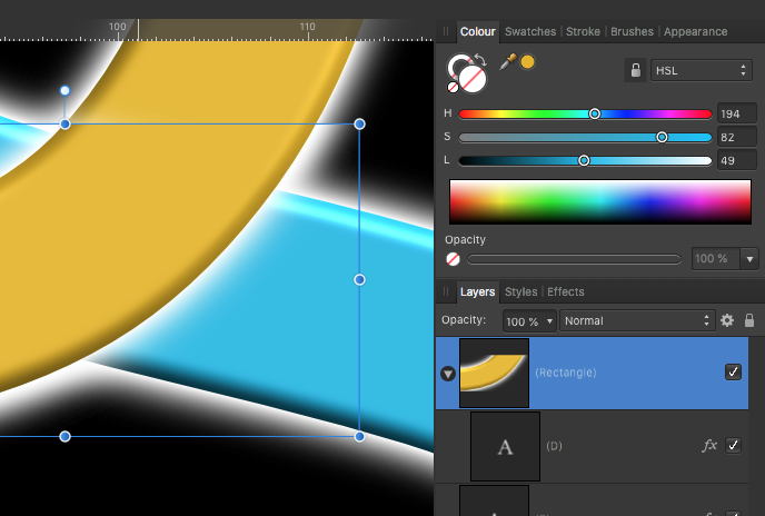
The ink pot catchlights have been moved out of place... ...they are all of the white objects in the layers panel, you can group them and with snapping enabled move them back into place, it would also be a good idea once the catchlights are back in place to group them with the green ink pot shape, like this. It always helps to group and rename the layers so you can easily read the file if you have to open it at a later date.
-

'Skia' font variations to PDF
firstdefence replied to micm's topic in Pre-V2 Archive of Desktop Questions (macOS and Windows)
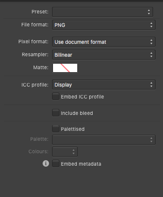
In the More section of Export, you have options to export the text as curves, embed fonts etc, you have the original afpub for editing, so you could use export text as curves. https://affinity.help/publisher/English.lproj/pages/Publishing/publishPDFFiles.html -

FORMAT DXF
firstdefence replied to SOLID WORLD's topic in Pre-V2 Archive of Desktop Questions (macOS and Windows)
The DXF format has been requested many times but this export option has not been added, there is no indication that it will ever be added so there is no ETA for it's addition to the export panel. -
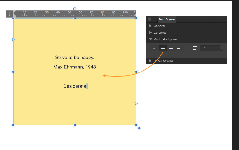
Joachim mentions Vertically centred, so the text is positioned in the centre of the text frame regardless of the height of the text frame.
- 7 replies
-
- apublisher
- exporting and importing styles
-
(and 2 more)
Tagged with:
-
How about trialing the software, it is fully functional for 10 days from first launch: https://affinity.serif.com/en-gb/photo/ scroll to the bottom of the screen to select the trial option.
- 1 reply
-
- 360°
- equirectangular projection
- (and 7 more)
-
Behaviour confirmed here, There is no Vertical Alignment in Text Styles either, someone might know of a way to emulate vertical alignment using the Text style options. Personally, I find it odd that you cannot edit a Style, so you cannot see any of the settings nor make adjustments post creation in a Style panel that shows what attributes are in that style.
- 7 replies
-
- apublisher
- exporting and importing styles
-
(and 2 more)
Tagged with:
-

Stroking text in Publisher
firstdefence replied to Anjux3's topic in Pre-V2 Archive of Desktop Questions (macOS and Windows)
Create a Character or Paragraph style and add a small outline, and apply it to the text box on the page you cannot manually add a stroke too. -

lined figure
firstdefence replied to Rolandas's topic in Pre-V2 Archive of Desktop Questions (macOS and Windows)
Another method if you are using Affinity Designer is to create a compound, the beauty in this is everything is still editable. -

lined figure
firstdefence replied to Rolandas's topic in Pre-V2 Archive of Desktop Questions (macOS and Windows)
Which app are you using? If you are using Affinity Designer You need to expand the stroke: (main menu at the top of the affinity app) Layer Expand Stroke, basically you are converting them from a curve/path that has a stroke into a thin shape that has a fill and can also have a stroke. Once you have expanded the stroke, you can boolean add them Layer > Geometry > Add and the subtract the shape from the lines. -
Affinity is always improving and at the moment the 1.8 beta version has a nice new document interface design, see image below. The 1.8 update has a way to go a way to go yet but it's definitely something to look forward to. People are very active on the beta forum helping to improve all the Affinity apps and this is the Publisher Beta forum: https://forum.affinity.serif.com/index.php?/forum/58-publisher-beta-on-windows/
-
I would have thought as long as the TV isn't set to stretch or zoom the images, simply setting the text to a pt size would suffice, bear in mind the text will be converted to pixels so any scaling will affect the texts proportions. Ultimately you will need to make a few test images with text to see what results you get.
-

Forum Upgrade [Tuesday 4th Feb]
firstdefence replied to Patrick Connor's topic in News and Information
Can you tone down the red forum upgrade banner it's quite distracting. Cheers


