

jackamus
-
Posts
2,390 -
Joined
-
Last visited
Posts posted by jackamus
-
-
34 minutes ago, Pšenda said:
Although the OP asked a month ago if any of the Serif developers understood "engineering drawing", today they are more correctly talking about "technical illustrations", where the use of standards is freer after all 🙂 Although not using snapping is quite a shame, because it would the given illustrations gained in accuracy and precision.
Ads soon as Serif allow nodes and handle to be visible when moving a guide I will change my tune.
-
1 hour ago, loukash said:
Be aware that there's a still unresolved bug carried over from v1 where strokes with "excessive" pressure curves go havoc when converted to outline, e.g. on PDF export.

Is there any special reason why you're using the Gaussian Blur layer effect on many of the curves? This will cause them to be rasterized on PDF export.
Yes. It's pretty logical.
")
You say its "logical" tell me why you think that?
-
48 minutes ago, firstdefence said:
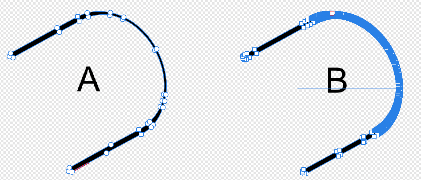
Image is just to show the difference between when I expanded the stroke in example A. compared to how example B has been rendered.
Yes that is exactly how I would expect Expanded Stroke to work as in A but not in B. In your opinion what do you think B is telling you?
-
54 minutes ago, firstdefence said:
I can't imagine a curve would just expand itself and personally I've never heard this happen in any app I've ever used over the last, well lets say a lot of years, I really don't think it's a bug because bugs are repeatable and usually get reported by multiple people. The only way to know what happened would have been to look at the history prior to the expansion but if the file has been closed since the history will be lost.
I would have to suggest you put this down to the universe messing with you as there is no way to be able to recreate the event and unless others come forward with a similar happening it will simply be a unique unexplainable occurrence.
Yes that's what I think however I will look to see if the History is still available.
-
All my technical illustrations were done using ADV1 and I have used the Pressure tool ever since AD was first published without any problems.
Regarding the Gaussian blur the illustration was a modified version of the attached image where Gaussian blur was used. I probably did not remove this effect when modifying the original drawing.
-
No. When I want to use it I usually go to Layers>Expand Stroke.
Should I report this as a possible bug?
-
Yes I realise that is what it looks like but there is no reason for me to do that when doing this kind of drawing. There are several places on different illustrations where this has happened. In one case I was able to to change it back to a single stroke.
This is something that has never happened before!
I cannot repeat how I changed it back again to correct in another place. Do you have any suggestions?
Would this show up in its History?
-
Usually when I comment on this forum I'm either asking a question or bitching about why handles and nodes disappear when moving a guide.
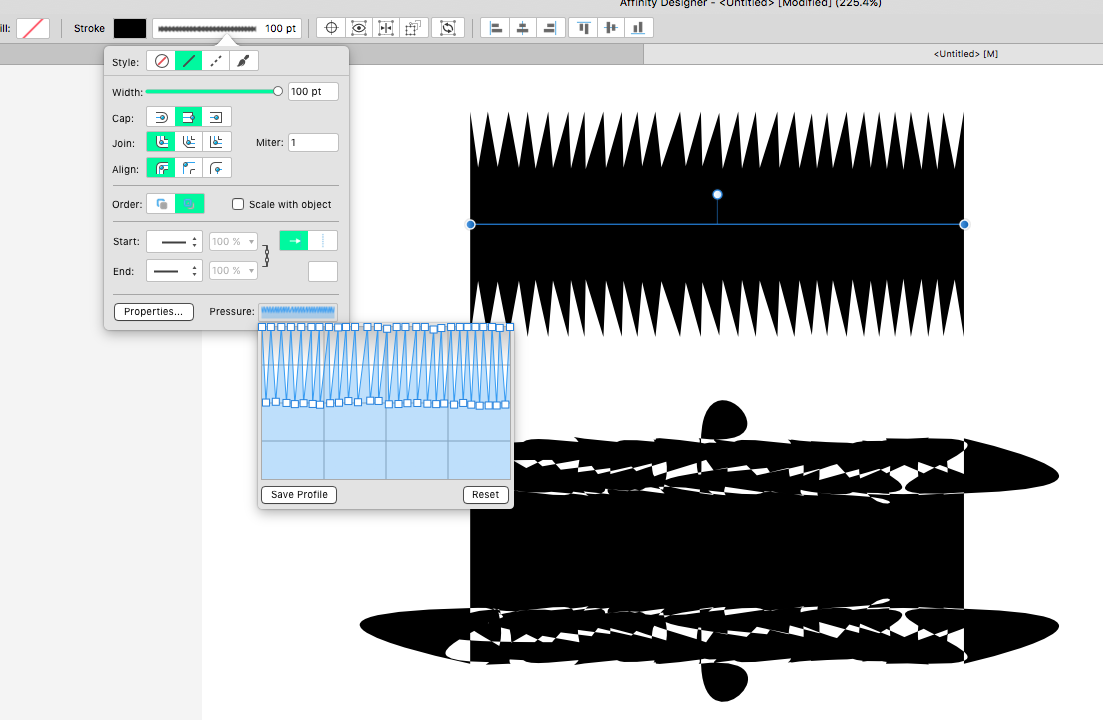
However today for a change I'm praising on of AD's features that I feel is very underrated, speaking as a technical illustrator that is! This is the 'Pressure' feature in the Stroke tab. I have attached a file that shows how much more of a 3D effect you get when using this feature especially on ellipses shown in the top illustration. The lower illustration is the kind of drawing you get from an expensive full CAD program. All the lines are the same thickness and it doesn't look very inspiring.
Aligning the ellipses with each other using guides and relying on snapping does not work very well as I've said many times in previous posts. Turning snapping on and off all the time in order to get nodes and handles to coincide with a guide is a waste of time. I work with snapping off. It would be a lot easier if the handles and nodes always remained visible when moving a guide whether snapping is used or not.
As an aside can anyone work out how I decide when to use thick and thin lines? There are no prizes except a pat-on-the-back for the anyone who can figure it out.
-
In the attached file I have had to reproduce 'B' in its original form 'A' when drawn in AD V1. Can any one explain how it changed from being a stroke to a filled shape and how I can change it back from B to A again?
-
Well said.
However I do understand how a thread can get very frayed at the ends. Although I was satisfied with the video there were others who had an opinion and that's OK
If starting this thread has helped others then the forum is doing its job. Many thanks to all who contributed.
- PaulEC, Old Bruce and debraspicher
-
 3
3
-
10 hours ago, firstdefence said:
Brilliant! Thank you very much - a video is worth a 1000 words and explains it much simpler. Now that I know this I withdraw my suggestion to the developers to create a Tone inserting tab as, in my case, it is not necessary now.
Regarding the rearranging the shapes into new layers that's because I am sloppy when doing technical drawings and just draw as if I was still working on a drawing board! At my age old habits die hard!
-
I did exactly as you describe above but when I used ctrl/cmd+j I just get a bleep as though I was doing something illegal. Can you do a video for me please?
-
I can't get your instruction to work! I drew a line at 45º now what do you mean 'drag as far as you like'? Are you talking about it's length or the distance of the area to be covered?
-
This sounds a bit complicated!
I think my original posting has been over-reacted to!
I have attached a file showing a cross section of a box with crudely drawn hatching. I'm looking for a very simple way to do this as an extra feature in AD.
-
13 hours ago, iconoclast said:
I experimented a lot with this Letraset stuff in my early days at the school of arts (about thirtyfive years ago) and I liked it. Because of that I created some Assets for Designer using GIMP some time ago. Different Halftones in steps of 10%. GIMPs old Halftone filter was very good for such things. Unfortunately the new one isn't. Some time ago StuartRC uploaded such assets here in the Ressources forum. Halftones in DC-Comic-Style (hope it's the right link). Maybe they are what you are looking for. And if you search the web for it, you will probably also find Halftone Brushes (Pixel Brushes) for Photoshop, that work in Affinity Photo too.
Possibly it is better to create such Assets with Designer as vectors, because the dots of small sized lighter sheets are not really spheres, but pixelated, if you use bitmaps for it.
Yes I agree that a vector based feature would be better than a bitmap.
-
13 hours ago, Old Bruce said:
There is (if you have Photo that is) the Halftone filter layer.
I don't use AP much and I wouldn't want to swap between AD for drawing and AP for applying tones.
-
13 hours ago, firstdefence said:
So basically halftone styles on a sheet.
That's correct but I deliberately didn't use 'Halftone' as I thought users might not know what I meant.
-
13 hours ago, Old Bruce said:
I had to use something like you're describing. They came in different "Lines per Inch", off the top of my head I recall 85, 100, 200 and 300. Then they were further divided into Percentages of 10% to 90%. Used a lot of 85 lines per inch 30% and 50%. We printed on extremely cheap newsprint.
We used them to simulate grey tones in ads or editorial copy. We only used the dots, don't recall seeing the lines or circles in the shop, probably too 'niche' for our newspaper.
That's exactly what I was referring to. It would be great if AD could offer a vector feature like those.
-
6 hours ago, thomaso said:
Don't the V2 features "Move Data Entry" + "Quick Grid" or the "Bitmap Fill" / "Vector Flood Fill" do what you want to achieve?
If you don't need seamless size variations then @StuartRc's patterns might also meet your needs.
I'm not sure how I would use bitmap tones in a vector drawing. I imagined the tones to be vectors.
-
Childhood! LOL that dates me!
My suggestion is that it would be a useful feature to add to AD if there was a way to add these kind of tones to shapes. In my case I am referring to technical drawings where hatching and cross-hatching or dots can be added to fill a shape rather than a continuous tone as is currently available. I imagine another 'Tone filling Tab' where you gave control of the size of the lines, thickness, angle and frequency. The same would apply to dots except there would also be a variable 'Pitch' distance between the dots.
Can you understand what I am explaining or do you want to see an example?
-
This question is directed at the moderators. Do any of the moderators and developers remember 'Zipatone' or 'Benday' Before these complimented 'Leteraset' They were A4 size sheets of very thin film that had all manner of line and dot tones that could be applied to illustrations.
If there are then please respond and I'll explain why.
-
Just done it!.
-
Hi Walt, I am using 2.3 and I found the background change box. Thanks.
-
I have created an asset which are dimensions lines for applying to engineering drawings (because AD haven't yet added them as a useful feature) and the lines are black. It is impossible to see them against the dark grey background. Is there a UI feature to change the background colour of studio tabs?
The pressure tool
in Affinity on Desktop Questions (macOS and Windows)
Posted
British Standards did not create a 'standard' for technical illustrations because it is an 'artistic' concept. It would like trying to apply a set of standards for paintings!